Remove 2015 Remove KPI Remove Visualization
article thumbnail

Top 10 Management Reporting Best Practices To Create Effective Reports

datapine

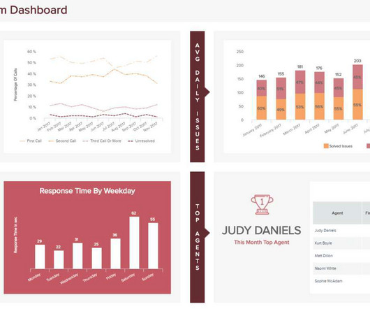
When these reports are backed up with powerful visualizations developed with a dashboard creator , no information can stay hidden, eliminating thus the possibility of human errors and negative business impact. For example, a junior sales manager and a junior marketing manager are both going to want to see different KPIs.

Reporting 263
article thumbnail

Introduction To The Basic Business Intelligence Concepts

datapine

Business intelligence concepts refer to the usage of digital computing technologies in the form of data warehouses, analytics and visualization with the aim of identifying and analyzing essential business-based data to generate new, actionable corporate insights. Just look at these numbers: according to CloudTweaks, in 2015 there were 2.5

Insiders

Sign Up for our Newsletter

This site is protected by reCAPTCHA and the Google Privacy Policy and Terms of Service apply.

article thumbnail

A Guide To Starting A Career In Business Intelligence & The BI Skills You Need

datapine

The Bureau of Labor Statistics also states that in 2015, the annual median salary for BI analysts was $81,320. To simplify things, you can think of back-end BI skills as more technical in nature and related to building BI platforms, like online data visualization tools. This beats projections for almost all other occupations.

article thumbnail

Upcoming Power BI Workshop in Huntington Beach, CA – Apr 10, 2015

Ms SQL Girl

Actionable Visualization In Power BI. Apr 10, 2015 7:45 AM – 5:15 PM. Early bird (until Apr 1, 2015) $99.00. The first step before creating data visualization using Power View and Pivot Tables/Charts in Excel, we need to acquire the data from various data sources. I look forward to seeing you there!

article thumbnail

Performance Dashboard: Facilitate The Performance of Your Business

FineReport

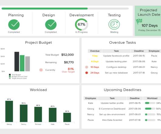
Performance dashboard is a data visualization tool for management, which is often used to measure employees’ performance, while helping business personnel measure, monitor, and manage the key activities and processes required to achieve business goals. How to reasonably determine the training and promotion of employees?

article thumbnail

Data Science at The New York Times

Domino Data Lab

It’s a visual problem so it works both in our MSE and it works by your eyeballs. For visualization we’re not building our own dashboards. However, in 2014, 2015 the editors were falling in love with Slack. And it works. But here’s another one that works and it works and it works. We’re using Chartio.