Remove 2017 Remove Reporting Remove Snapshot
article thumbnail

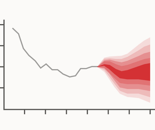
Chart Snapshot: Fan Charts

The Data Visualisation Catalogue

The Inflation Report projections: understanding the fan chart — By Erik Britton, Paul Fisher and John Whitley of the Bank’s Conjunctural Assessment and Projections Division. Fan charts around GDP projections based on probit models of downturn risk — OECD CPI inflation projection & GDP projection for May 2017.

article thumbnail

The Need for Analytic and Algorithm Governance is Growing

Andrew White

I wrote a blog in 2017 titled, The Inflated Price of Perfect Information. In the Economist this week there is “ How Price-bots can conspire against consumers – and how trustbusters might thwart them “ This article reports on an illicit cooperation between price bots setting gas prices in the US.

Insiders

Sign Up for our Newsletter

This site is protected by reCAPTCHA and the Google Privacy Policy and Terms of Service apply.

article thumbnail

EHR/EMR Software Development Recommendations in a Health Market Governed By Big Data

Smart Data Collective

In 2017, the global market for healthcare analytics was valued at $16.9 Now that you have a snapshot of the differences between EMR, EHR, and PHR, let’s talk about how to create a doctor-friendly EHR system. Big data has had a tremendous affect on the healthcare sector. By the year 2025, that figure is projected to grow to $67.82

article thumbnail

Don’t Start from Scratch! Make One of these Dashboards Instead

Depict Data Studio

” University Monthly Reports In this blog post , you’ll see how I transformed a university library’s monthly report. ” I write, “The pie charts and bar charts above were only giving the viewers a single snapshot in time. This dashboard also communicates more than just progress towards goals.

article thumbnail

What Is Data Intelligence?

Alation

For years, analysts in enterprises had struggled to find the data they needed to build reports. They said, “If I’m building a report for an executive audience, to guide crucial decision making, I want to make sure the data foundations in that report are solid!”. HBR Review May/June 2017. And the support stopped there.

article thumbnail

Chart Snapshot: Area Unit Charts

The Data Visualisation Catalogue

Tools that can generate Area Unit Charts: Amit Kapoor’s Block: Multiple , Rectangular (Vega-Lite) Datylon Flourish 1 , Flourish 2 ZingChart (JS) Vizzlo Examples of Area Unit Charts Adyen’s full year 2018 FTE growth (873 FTE in 2018 and 668 FTE in 2017).

article thumbnail

ERP modernization: Still a make-or-break project for CIOs

CIO Business Intelligence

In 2017, after exploring other ERP systems, whittling down a list of around 80 vendors, and defining its business requirements, Allegis selected NetSuite — and it didn’t go well. “We We really liked [NetSuite’s] architecture and that it’s in the cloud, and it hit the vast majority of our business requirements,” Shannon notes.