This site uses cookies to improve your experience. To help us insure we adhere to various privacy regulations, please select your country/region of residence. If you do not select a country, we will assume you are from the United States. Select your Cookie Settings or view our Privacy Policy and Terms of Use.
Cookie Settings
Cookies and similar technologies are used on this website for proper function of the website, for tracking performance analytics and for marketing purposes. We and some of our third-party providers may use cookie data for various purposes. Please review the cookie settings below and choose your preference.
Used for the proper function of the website
Used for monitoring website traffic and interactions
Cookie Settings
Cookies and similar technologies are used on this website for proper function of the website, for tracking performance analytics and for marketing purposes. We and some of our third-party providers may use cookie data for various purposes. Please review the cookie settings below and choose your preference.
Strictly Necessary: Used for the proper function of the website
Performance/Analytics: Used for monitoring website traffic and interactions
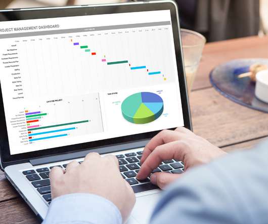
Dashboards are the lifeblood of modern businesses, providing a clear, concise view of critical metrics. This article explores 20 diverse Power BI dashboard examples, showcasing how data can be transformed into actionable insights.
Overview Dashboards are ubiquitous in the industry. Every analyst should be well versed with how to create dashboards Excel is an excellent tool for. The post 5 Powerful Excel Dashboards for Analytics Professionals appeared first on Analytics Vidhya.
This article was published as a part of the Data Science Blogathon Introduction I have been using Pandas with Python and Plotly to create some of the most stunning dashboards for my projects. The post How to Create Stunning and Interactive Dashboards in Excel? appeared first on Analytics Vidhya. I […].
This article was published as a part of the Data Science Blogathon Introduction I have been associated with Analytics Vidya from the 3rd edition of Blogathon. The post Guide For Data Analysis: From Data Extraction to Dashboard appeared first on Analytics Vidhya.
But today, dashboards and visualizations have become table stakes. Turning analytics into a source of revenue means integrating advanced features in unique, hard-to-steal ways. Download this white paper to discover which features will differentiate your application and maximize the ROI of your analytics.
This article was published as a part of the Data Science Blogathon Introduction Dash is an open-source web framework for creating analyticaldashboards and data visualizations. It helps data analysts to deploy dashboards and serve these dashboards to the main web application. appeared first on Analytics Vidhya.
Tableau Desktop then presents this data to tell a story, while Tableau Server allows you to share these visuals with the intended audience. […] The post How to Integrate Google Gemini into Tableau Dashboards? appeared first on Analytics Vidhya.
The post Dynamic Dashboards using Google Data Studio appeared first on Analytics Vidhya. ArticleVideo Book This article was published as a part of the Data Science Blogathon. Numbers have an important story to tell.
ArticleVideo Book Objective The dashboard is a powerful concept that allows the user to see the insights hidden deeper in the data. The post Create Your First Dashboard in Tableau appeared first on Analytics Vidhya.
But today, dashboards and visualizations have become table stakes. Discover which features will differentiate your application and maximize the ROI of your embedded analytics. Brought to you by Logi Analytics. Think your customers will pay more for data visualizations in your application? Five years ago they may have.
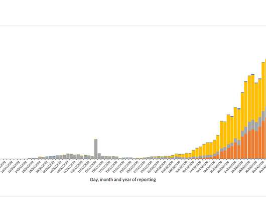
The post Top 20 Visualization Dashboards for Mapping COVID-19 appeared first on Analytics Vidhya. Introduction The best way to track the COVID-19 outbreak is by using data and visualization. The COVID-19 patterns are sometimes contradictory and this is.
Enter data dashboards – one of history’s best innovations in business intelligence. To help you understand this notion in full, we’re going to explore a data dashboard definition, explain the power of dashboard data, and explore a selection of data dashboard examples. What Is A Data Dashboard? click to enlarge**.
The answer is modern agency analytics reports and interactive dashboards. In this article, we will cover every fundamental aspect to take advantage of agency analytics. Starting with its definition, following with the benefits of agency reports, a list of tools, and a set of agency dashboard examples.
This is where the power of business dashboards comes into play. Dashboards often are the best way to gain insight into an organization and its various departments, operations and performance. Well-built, focused dashboards easily serve up summaries and reports of the BI that’s most critical to the organization.
When your customers come to your app, what do they see: clunky, outdated dashboards or a sleek, modern interface? If your embedded analytics are looking stale, leverage these free graphics libraries to take your embedded analytics offerings above and beyond.
Introduction In Data Visualization, Dashboard is the great Graphical User Interfaces that. The post Create Interactive Dashboards with Streamlit and Python appeared first on Analytics Vidhya. This article was published as a part of the Data Science Blogathon.
The rise of innovative, interactive, data-driven dashboard tools has made creating effective dashboards – like the one featured above – swift, simple, and accessible to today’s forward-thinking businesses. Dashboard design should be the cherry on top of your business intelligence (BI) project. Consider your end goal.
The post Building an Interactive Dashboard using Bokeh and Pandas appeared first on Analytics Vidhya. Companies are extracting useful information from such generated data to make important business decisions. Exploratory Data analysis can help […].
CFO dashboards exist to enhance the strategic as well as the analytical efforts related to every financial aspect of your business. Here, we’ll explore the dynamics of reports for CFOs, look at CFO reporting tools, and consider real-world examples of both CFO dashboards and reports. What Is A CFO Dashboard?
Organizations look to embedded analytics to provide greater self-service for users, introduce AI capabilities, offer better insight into data, and provide customizable dashboards that present data in a visually pleasing, easy-to-access format.
Introduction Azure Synapse Analytics is a cloud-based service that combines the capabilities of enterprise data warehousing, big data, data integration, data visualization and dashboarding. The post Getting Started with Azure Synapse Analytics appeared first on Analytics Vidhya.
Introduction Microsoft Excel is one of the best tools one can use to analyse data, make stunning charts, plots and dashboards, and basically play with data. The post Create an Interactive Sales Dashboard from Scratch on Microsoft Excel appeared first on Analytics Vidhya. So my dear audience, let us […].
The post Space Weather Dashboard – Build Your Own Custom Dashboard to Analyze and Predict Space Weather appeared first on Analytics Vidhya. Introduction – Part 1 As the collective global human population is working to get through the pandemic caused by Covid-19, it offers a stark.
Embedding dashboards, reports and analytics in your application presents unique opportunities and poses unique challenges. We interviewed 16 experts across business intelligence, UI/UX, security and more to find out what it takes to build an application with analytics at its core.
With a powerful dashboard maker , each point of your customer relations can be optimized to maximize your performance while bringing various additional benefits to the picture. Your Chance: Want to build professional CRM reports & dashboards? Your Chance: Want to build professional CRM reports & dashboards?
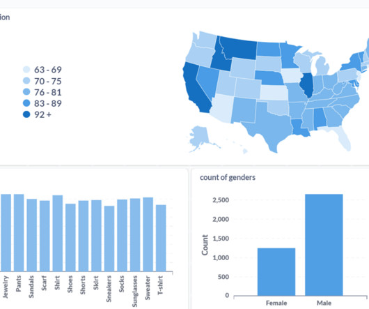
Introduction I have built a covid-19 dashboard using Streamlit python. The post Building a Covid-19 Dashboard using Streamlit and Python appeared first on Analytics Vidhya. ArticleVideos This article was published as a part of the Data Science Blogathon.
Try Metabase, an open-source Business Intelligence (BI) tool for creating interactive dashboards from large datasets. Learning […] The post Open-Source BI Tool Metabase for Data Visualization and Analytics appeared first on Analytics Vidhya. Introduction Are you a passionate data professional exploring new tools?
Business applications range from customer fraud detection to personalization with extensive data analyticsdashboards. The post The Origin of Big Data Analytics appeared first on Analytics Vidhya. They also lead to more efficient operations. Computing power and automation capability are essential for big […].
Every data-driven project calls for a review of your data architecture—and that includes embedded analytics. Before you add new dashboards and reports to your application, you need to evaluate your data architecture with analytics in mind. Expert guidelines for a high-performance, analytics-ready modern data architecture.
This blog is a tutorial for building intuitive frontend interfaces for Machine Learning models using two popular open-source libraries […] The post Streamlit vs Gradio – A Guide to Building Dashboards in Python appeared first on Analytics Vidhya.
Recently, Google announced the addition of an abuse detection dashboard. The dashboard is driven by cutting-edge machine learning algorithms and made for its Apigee API management service.
The post Building a Covid-19 Vaccination Dashboard in Tableau appeared first on Analytics Vidhya. ArticleVideo Book This article was published as a part of the Data Science Blogathon. Introduction Tableau is a powerful Data Visualization software, and much.
Spreadsheets finally took a backseat to actionable and insightful data visualizations and interactive business dashboards. The rise of self-service analytics democratized the data product chain. Suddenly advanced analytics wasn’t just for the analysts. The analytics trends in data quality grew greatly this past year.
But today, dashboards and visualizations have become commonplace. Turning embedded analytics into a source of revenue means integrating advanced features in unique, hard-to-steal ways. Discover which features will differentiate your application and maximize the ROI of your embedded analytics. Five years ago they may have.
Soon businesses of all sizes will have so much amount of information that dashboard software will be the most invaluable resource a company can have. That’s why we welcome you to the world of interactive dashboards. Your Chance: Want to test interactive dashboard software for free? What Is An Interactive Dashboard?
In my past perspectives, I’ve written about the evolution from data at rest to data in motion and the fact that you can’t rely on dashboards for real-time analytics. As well, analytics are becoming more and more intertwined with operations.
Amazon Kinesis Data Analytics for SQL is a data stream processing engine that helps you run your own SQL code against streaming sources to perform time series analytics, feed real-time dashboards, and create real-time metrics. AWS has made the decision to discontinue Kinesis Data Analytics for SQL, effective January 27, 2026.
With this integration, you can now seamlessly query your governed data lake assets in Amazon DataZone using popular business intelligence (BI) and analytics tools, including partner solutions like Tableau. To capture the JDBC connection parameters, follow these steps: On the project page, review the connection options under ANALYTICS TOOLS.
Embedding dashboards and reports aren’t enough. Futureproof your application by offering instant, actionable insights that will give you and your customers a competitive advantage.
In recent years, analytical reporting has evolved into one of the world’s most important business intelligence components, compelling companies to adapt their strategies based on powerful data-driven insights. What Is An Analytical Report? Your Chance: Want to build your own analytical reports completely free? Let’s get started.
When encouraging these BI best practices what we are really doing is advocating for agile business intelligence and analytics. In our opinion, both terms, agile BI and agile analytics, are interchangeable and mean the same. What Is Agile Analytics And BI? Agile Business Intelligence & Analytics Methodology.
2) What Is A Content Dashboard? 4) Content Dashboards Examples. Modern content performance reports in the shape of an interactive online dashboard present an intuitive and accessible way to assess your content’s success and its ROI in real-time and in one centralized location. What Is A Content Dashboard?
1) What Is Business Intelligence And Analytics? If someone puts you on the spot, could you tell him/her what the difference between business intelligence and analytics is? We already saw earlier this year the benefits of Business Intelligence and Business Analytics. What Is Business Intelligence And Analytics?
Which sophisticated analytics capabilities can give your application a competitive edge? In its 2020 Embedded BI Market Study, Dresner Advisory Services continues to identify the importance of embedded analytics in technologies and initiatives strategic to business intelligence.
We organize all of the trending information in your field so you don't have to. Join 42,000+ users and stay up to date on the latest articles your peers are reading.
You know about us, now we want to get to know you!
Let's personalize your content
Let's get even more personalized
We recognize your account from another site in our network, please click 'Send Email' below to continue with verifying your account and setting a password.


Let's personalize your content