This site uses cookies to improve your experience. To help us insure we adhere to various privacy regulations, please select your country/region of residence. If you do not select a country, we will assume you are from the United States. Select your Cookie Settings or view our Privacy Policy and Terms of Use.
Cookie Settings
Cookies and similar technologies are used on this website for proper function of the website, for tracking performance analytics and for marketing purposes. We and some of our third-party providers may use cookie data for various purposes. Please review the cookie settings below and choose your preference.
Used for the proper function of the website
Used for monitoring website traffic and interactions
Cookie Settings
Cookies and similar technologies are used on this website for proper function of the website, for tracking performance analytics and for marketing purposes. We and some of our third-party providers may use cookie data for various purposes. Please review the cookie settings below and choose your preference.
Strictly Necessary: Used for the proper function of the website
Performance/Analytics: Used for monitoring website traffic and interactions
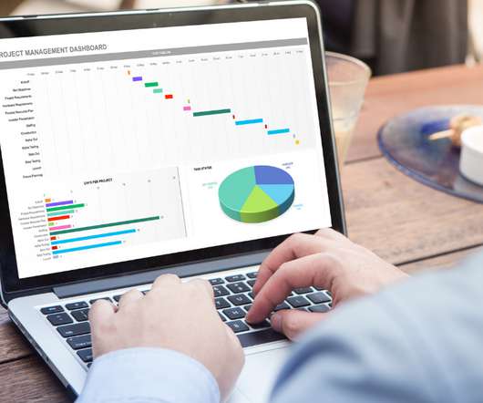
This article was published as a part of the Data Science Blogathon Introduction I have been using Pandas with Python and Plotly to create some of the most stunning dashboards for my projects. The post How to Create Stunning and Interactive Dashboards in Excel? The post How to Create Stunning and Interactive Dashboards in Excel?
This article was published as a part of the Data Science Blogathon Introduction I have been associated with Analytics Vidya from the 3rd edition of Blogathon. The post Guide For Data Analysis: From Data Extraction to Dashboard appeared first on Analytics Vidhya.
This article was published as a part of the Data Science Blogathon Introduction Dash is an open-source web framework for creating analyticaldashboards and data visualizations. It helps data analysts to deploy dashboards and serve these dashboards to the main web application. appeared first on Analytics Vidhya.
ArticleVideo Book This article was published as a part of the Data Science Blogathon. The post Dynamic Dashboards using Google Data Studio appeared first on Analytics Vidhya. Numbers have an important story to tell.
This article was published as a part of the Data Science Blogathon. Introduction In Data Visualization, Dashboard is the great Graphical User Interfaces that. The post Create Interactive Dashboards with Streamlit and Python appeared first on Analytics Vidhya.
This article was published as a part of the Data Science Blogathon image source: Author The Importance of Data Visualization A huge amount of data is being generated every instant due to business activities in globalization. The post Building an Interactive Dashboard using Bokeh and Pandas appeared first on Analytics Vidhya.
This article was published as a part of the Data Science Blogathon. Introduction Azure Synapse Analytics is a cloud-based service that combines the capabilities of enterprise data warehousing, big data, data integration, data visualization and dashboarding.
This article was published as a part of the Data Science Blogathon. The post Building Explainer Dashboards in Python appeared first on Analytics Vidhya. The post Building Explainer Dashboards in Python appeared first on Analytics Vidhya.
This article was published as a part of the Data Science Blogathon. Business applications range from customer fraud detection to personalization with extensive data analyticsdashboards. The post The Origin of Big Data Analytics appeared first on Analytics Vidhya. They also lead to more efficient operations.
ArticleVideos This article was published as a part of the Data Science Blogathon. Introduction I have built a covid-19 dashboard using Streamlit python. The post Building a Covid-19 Dashboard using Streamlit and Python appeared first on Analytics Vidhya.
ArticleVideo Book This article was published as a part of the Data Science Blogathon. The post Building a Covid-19 Vaccination Dashboard in Tableau appeared first on Analytics Vidhya. Introduction Tableau is a powerful Data Visualization software, and much.
This article was published as a part of the Data Science Blogathon. Data and analytics have become critical for firms to remain competitive. Reports, dashboards, and analytics tools are used by business users to derive insights […].
This article was published as a part of the Data Science Blogathon. What is equally important here is the ability to communicate the data and insights from your predictive models through reports and dashboards. The post Building your First Power BI Report from Scratch appeared first on Analytics Vidhya. And […].
This article was published as a part of the Data Science Blogathon. These data sets create shareable reports, dashboards, and apps for data visualization, evaluation, […]. These data sets create shareable reports, dashboards, and apps for data visualization, evaluation, […].
This article was published as a part of the Data Science Blogathon Introduction Most drivers nowadays are quite familiar with all the indicators on their car dashboard. The post Track Your Trip Through an OBD system Using Python appeared first on Analytics Vidhya.
This article was published as a part of the Data Science Blogathon. Introduction With this Tableau tutorial, you’ll learn how to visualize data and derive valuable insights from raw data, making dashboards, reports, tables, and more. Tableau is a […]. Tableau is a […].
ArticleVideo Book This article was published as a part of the Data Science Blogathon Photo by __ drz __ on Unsplash AnalyticsDashboards and Web. The post Streamlit for ML Web Applications: Customer’s Propensity to Purchase appeared first on Analytics Vidhya.
When encouraging these BI best practices what we are really doing is advocating for agile business intelligence and analytics. In our opinion, both terms, agile BI and agile analytics, are interchangeable and mean the same. What Is Agile Analytics And BI? Agile Business Intelligence & Analytics Methodology.
2) What Is A Content Dashboard? 4) Content Dashboards Examples. Modern content performance reports in the shape of an interactive online dashboard present an intuitive and accessible way to assess your content’s success and its ROI in real-time and in one centralized location. What Is A Content Dashboard?
This article was published as a part of the Data Science Blogathon. Introduction Power BI is one of the most popular data visualization and analytics software product developed by Microsoft. The post Top 10 Power BI Interview Questions in 2022 appeared first on Analytics Vidhya. Source: [link] […].
This article was published as a part of the Data Science Blogathon. You may run different types of analytics, from dashboards and visualizations to big data processing, real-time analytics, and machine […]. The post A Detailed Introduction on Data Lakes and Delta Lakes appeared first on Analytics Vidhya.
This article was published as a part of the Data Science Blogathon. Introduction to AWS Config It can be easy to forget alerts in your AWS account’s health dashboard, even though you might want to check one particular alert. appeared first on Analytics Vidhya. The post What is AWS Config? The post What is AWS Config?
Internally, making data accessible and fostering cross-departmental processing through advanced analytics and data science enhances information use and decision-making, leading to better resource allocation, reduced bottlenecks, and improved operational performance. Eliminate centralized bottlenecks and complex data pipelines.
ArticleVideo Book This article was published as a part of the Data Science Blogathon. Introduction Visual analytics can tell the users the story of data. The post Data Preparation for Analysis : Towards Creating your Tableau Dashboard?—?Part Part 1 appeared first on Analytics Vidhya.
Instead, they rely on up-to-date dashboards that help them visualize data insights to make informed decisions quickly. Manually handling repetitive daily tasks at scale poses risks like delayed insights, miscataloged outputs, or broken dashboards. At a large volume, it would require around-the-clock staffing, straining budgets.
Now that you’re sold on the power of data analytics in addition to data-driven BI, it’s time to take your journey a step further by exploring how to effectively communicate vital metrics and insights in a concise, inspiring, and accessible format through the power of visualization. click for book source**. click for book source**.
An online BI dashboard. Thanks to specific business intelligence best practices for dashboard design. Exclusive Bonus Content: Download Our Free Dashboard Checklist! Get the free guide with great tips for your dashboard implementation! What Is The Definition Of A BI Dashboard? How can you create one?
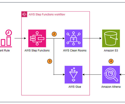
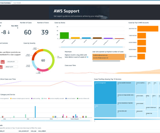
Imagine having to manage support cases for these accounts without a unified dashboard. This post demonstrates how you can build an analytics pipeline to push support cases created in individual member AWS accounts into a central account. Visualize the data in a QuickSight dashboard in the central account.
It is painfully heartbreaking to realize that a very small tiny number of people who have access to web analytics tools actually use them. Create a Customized Dashboard – Earn Love, Drive Change. #2. In-Page Analytics – Re-imagine Traveling Through Data. #5. Quit Google Analytics: Move Beyond Tool/Creativity Limitations.
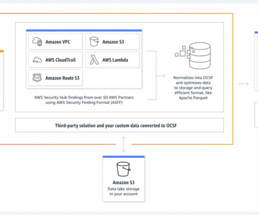
OpenSearch Service is a fully managed and scalable log analytics framework that is used by customers to ingest, store, and visualize data. In OpenSearch Dashboards, choose Security in the navigation pane. In OpenSearch Dashboards, navigate to the Dashboards page. Choose Import. The following screenshot shows an example.
To put the power of business intelligence into perspective, here are 4 key insights you should know: Businesses using analytics are five times more likely to make better, quicker decisions, according to an article published on BetterBuys. By 2025, the global BI and analytics market is expected to soar to a worth of $147.19
An extraordinary amount of time, effort, $$$ are spent on building dashboards/scorecards for CMOs… Yet, the end result, nearly always, is a useless data puke. CMO dashboards end up being useless when capabilities exceed needs. Personal Bias: I prefer the word Scorecard over Dashboard. It turns out boiling the ocean is hard.
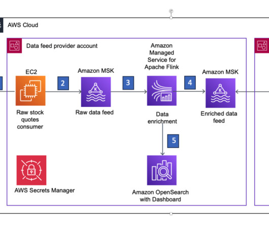
In this post, we demonstrate how you can publish an enriched real-time data feed on AWS using Amazon Managed Streaming for Kafka (Amazon MSK) and Amazon Managed Service for Apache Flink. Amazon Opensearch stores the data, and OpenSearch Dashboards allows applications to query the data at any point in the future.
Analytics is at the forefront of social media marketing. The market for social media analytics was worth $3.58 Analytics wasn’t a big deal in the early days of social media marketing, but has become more important since. This is why big data and analytics has moved to the forefront of the profession. billion this year.
Business intelligence (BI) dashboards have grown very popular over the past few years as a means of communicating key organizational objectives and tracking performance against them. BI dashboards provide a vivid visual representation that can be intuitively understood by virtually anyone in the organization, very quickly.
Organizations across every industry have been and continue to invest heavily in data and analytics. But like oil, data and analytics have their dark side. According to CIO’s State of the CIO 2022 report, 35% of IT leaders say that data and business analytics will drive the most IT investment at their organization this year.
Organizations with legacy, on-premises, near-real-time analytics solutions typically rely on self-managed relational databases as their data store for analytics workloads. Near-real-time streaming analytics captures the value of operational data and metrics to provide new insights to create business opportunities.
The pipelines and workflows that ingest data, process it and output charts, dashboards, or other analytics resemble a production pipeline. According to a recent Gartner survey, data teams spend only 22% of their time on “data innovation, data monetization and enhanced analytics insights.” Production DataOps. Source: DataKitchen.
In essence, a domain is an integrated data set and a set of views, reports, dashboards, and artifacts created from the data. The domain also includes code that acts upon the data, including tools, pipelines, and other artifacts that drive analytics execution. A horizontal data pipeline spans the domains and delivers analytics to users.
From our unique vantage point in the evolution toward DataOps automation, we publish an annual prediction of trends that most deeply impact the DataOps enterprise software industry as a whole. As a result, enterprises will examine their end-to-end data operations and analytics creation workflows. Data Gets Meshier.
Amazon Redshift , launched in 2013, has undergone significant evolution since its inception, allowing customers to expand the horizons of data warehousing and SQL analytics. First query response times for dashboard queries have significantly improved by optimizing code execution and reducing compilation overhead.
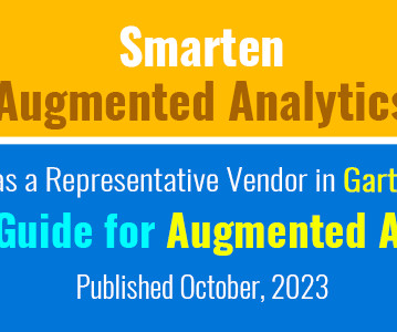
Smarten is pleased to announce that its Smarten Augmented Analytics solution is included as a Representative Vendor in the Market Guide for Augmented AnalyticsPublished October 2, 2023 (ID G00780764).
Data analytics is at the forefront of the modern marketing movement. Christian Welborn recently published an article on taking a data-driven approach to GTM. There are a number of reasons that data analytics is transforming the direction of GTM marketing in 2021. Data Analytics Tools To Use For A Winning GTM Strategy.
We have already given you our top data visualization books , top business intelligence books , and best data analytics books. With a MySQL dashboard builder , for example, you can connect all the data with a few clicks. Originally published in 2018, the book has a second edition that was released in January of 2022.
We organize all of the trending information in your field so you don't have to. Join 42,000+ users and stay up to date on the latest articles your peers are reading.
You know about us, now we want to get to know you!
Let's personalize your content
Let's get even more personalized
We recognize your account from another site in our network, please click 'Send Email' below to continue with verifying your account and setting a password.


Let's personalize your content