This site uses cookies to improve your experience. To help us insure we adhere to various privacy regulations, please select your country/region of residence. If you do not select a country, we will assume you are from the United States. Select your Cookie Settings or view our Privacy Policy and Terms of Use.
Cookie Settings
Cookies and similar technologies are used on this website for proper function of the website, for tracking performance analytics and for marketing purposes. We and some of our third-party providers may use cookie data for various purposes. Please review the cookie settings below and choose your preference.
Used for the proper function of the website
Used for monitoring website traffic and interactions
Cookie Settings
Cookies and similar technologies are used on this website for proper function of the website, for tracking performance analytics and for marketing purposes. We and some of our third-party providers may use cookie data for various purposes. Please review the cookie settings below and choose your preference.
Strictly Necessary: Used for the proper function of the website
Performance/Analytics: Used for monitoring website traffic and interactions
This is where interactive weekly reports come into the picture. Armed with powerful visualizations and real-time data, modern weekly summary reports enable businesses to closely monitor their performance and the progress of their strategies to extract relevant insights and optimize their processes to ensure constant growth.
Visualizing the data and interacting on a single screen is no longer a luxury but a business necessity. That’s why we welcome you to the world of interactive dashboards. But before we delve into the bits and pieces of our topic, let’s answer the basic questions: What is an interactive dashboard, and why you need one?
Spreadsheets finally took a backseat to actionable and insightful data visualizations and interactive business dashboards. The rise of self-service analytics democratized the data product chain. Suddenly advanced analytics wasn’t just for the analysts. The analytics trends in data quality grew greatly this past year.
That being said, in this post, we will explain what is a dashboard in business, the features of strategic, tactical, operational and analytical dashboards, and expound on examples that these different types of dashboards can be used. Through dashboards, organizations can quickly identify current and historical performance.
In recent years, analytical reporting has evolved into one of the world’s most important business intelligence components, compelling companies to adapt their strategies based on powerful data-driven insights. What Is An Analytical Report? Your Chance: Want to build your own analytical reports completely free? Let’s get started.
When encouraging these BI best practices what we are really doing is advocating for agile business intelligence and analytics. In our opinion, both terms, agile BI and agile analytics, are interchangeable and mean the same. What Is Agile Analytics And BI? Agile Business Intelligence & Analytics Methodology.
Whatever your niche or industry, working with dynamic keyperformanceindicators (KPIs) will empower you to track and improve your performance in a number of key areas, accelerating your commercial success in the process. We offer a 14 day free trial. Benefit from a great tracking system today!
Exclusive Bonus Content: Ready to make analytics straightforward? Data dashboards provide a centralized, interactive means of monitoring, measuring, analyzing, and extracting a wealth of business insights from relevant datasets in several key areas while displaying aggregated information in a way that is both intuitive and visual.
The rise of innovative, interactive, data-driven dashboard tools has made creating effective dashboards – like the one featured above – swift, simple, and accessible to today’s forward-thinking businesses. For a truly effective dashboard design, selecting the right keyperformanceindicators (KPIs) for your business needs is a must.
To help you understand the potential of analysis and how you can use it to enhance your business practices, we will answer a host of important analytical questions. This is one of the most important data analytics techniques as it will shape the very foundations of your success. Harvest your data. Omit useless data.
This thought was in my mind as I was reading Lean Analytics a new book by my friend Alistair Croll and his collaborator Benjamin Yoskovitz. In this post, we’ll look at each of the four steps in the Lean Analytics Cycle in more detail. Let’s look at some case studies that will really help to drive the Lean Analytics Cycle home.
There is no disputing that data analytics is a huge gamechanger for companies all over the world. Therefore, you need sophisticated customer analytics to analyze complex customer behavior. This article will go over the concept of customer service analytics and some of the uses and advantages it could provide to a business.
CFO dashboards exist to enhance the strategic as well as the analytical efforts related to every financial aspect of your business. A CFO dashboard tool provides a panoramic view of all of the information an ambitious modern CFO needs to perform their job to the best of their abilities. We offer a 14-day free trial.
Since humans process visual information 60.000 times faster than text , the workflow can be significantly increased by utilizing smart intelligence in the form of interactive, and real-time visual data. The key is to gather information and adjust to user needs and business goals, as shown in the picture below. Source: newgenapps.com *.
Moreover, within just five years, the number of smart connected devices in the world will amount to more than 22 billion – all of which will produce colossal sets of collectible, curatable, and analyzable data, claimed IoT Analytics in their industry report. What does this mean? How Do I Prepare A KPI Report? 2) Select your KPIs.
Using business intelligence and analytics effectively is the crucial difference between companies that succeed and companies that fail in the modern environment. Your Chance: Want to try a professional BI analytics software? Experts say that BI and data analytics makes the decision-making process 5x times faster for businesses.
Essentially, KeyPerformanceIndicators or KPIs measure performance or progress based on specific business goals and objectives. A pivotal element to consider is the word “key”, meaning they only track what is truly relevant for the company’s strategic decisions. What Are KPIs? What Are Metrics?
“Without big data analytics, companies are blind and deaf, wandering out onto the web like deer on a freeway.” – Geoffrey Moore. Their graphical nature allows for easy interaction with invaluable information. We live in the age of information. And, as a business, if you use your data wisely, you stand to reap great rewards.
A CRM dashboard is a centralized hub of information that presents customer relationship management data in a way that is dynamic, interactive, and offers access to a wealth of insights that can improve your consumer-facing strategies and communications. Try our professional dashboard software for 14 days, completely free!
Visualization plays an important part in data analytics and helps interpret big data in a real-time structure by utilizing complex sets of numerical or factual figures. Recent studies discovered that the use of visualizations in data analytics could shorten business meetings by 24%. back on every dollar spent. Know Your Audience.
As such, we have to find approaches to data analytics and business intelligence. Industry or sector aside, real time business intelligence and analytics are invaluable to the ongoing success of your business. Download our executive, pocket-sized guide to real time BI and analytics! What Is Real Time Analytics?
We will discuss report examples and templates you can use to create your own report, use its features in an interactive way, and discover relevant inputs for your specific industry. In the process, we will use an online data visualization software that lets us interact with, and drill deeper into bits and pieces of relevant data.
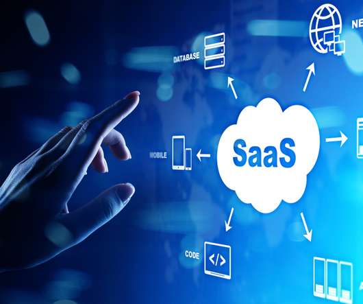
Data analytics technology is becoming a more important aspect of business models in all industries. They need to leverage analytics strategically to maximize their revenue. Data Analytics is an Invaluable Part of SaaS Revenue Optimization. There are entire analytics interfaces dedicated exclusively to SaaS companies.
Exclusive Bonus Content: Ready to use data analytics in your restaurant? In a previous study into big data examples in real life, we explored how the catering industry could benefit from the use of restaurants analytics – a topic that we’re going to delve deeper into here. What Are Restaurant Analytics?
By understanding your core business goals and selecting the right keyperformanceindicator ( KPI ) and metrics for your specific needs, you can use an information technology report sample to visualize your most valuable data at a glance, developing initiatives and making pivotal decisions swiftly and with confidence.
The ideal business intelligence and analytics solution includes traditional BI features, modern BI and analytics components and a full suite of reporting capabilities that are easy for your team to use, and will produce clear, concise results for fact-based decision-making. Every business has unique reporting and documentation needs.
Keyperformanceindicators are the most crucial metrics that serve as a compass for navigating the path forward on every marketing road map. All about Dashboards: Put in simple language, dashboards are marketing data analytics tools that collect and organizes KPIs. This is complicated, because they all work well together.
They collect data from various departments of the company tracking keyperformanceindicators ( KPIs ) and present them in an understandable way. Managerial reports use a lot of the same data as financial reports, but presented in a more useful way, for example via interactive management dashboards.
Data analytics and visualization help with many such use cases. Here is where data analytics and visualization come into play. While most people are unfamiliar with these terms, investing in data analytics and visualization can mean the difference between success and failure. What Is Data Analytics?
A CEO dashboard is an interactive platform that visualizes data to empower business leaders to track, measure, analyze, and monitor business performance in a number of areas, enabling them to make data-driven decisions and see the big business picture. Let’s get started. What Is A CEO Dashboard?
Compiling analysis results with the help of interactive dashboards and charts is one of the main features SaaS solution can offer. Whether you need to develop an IT report or tackle deeper into the financial analytics side of the business, a dashboard will prove its worth when you see all your data in a clean, interactive screen.
Business intelligence concepts refer to the usage of digital computing technologies in the form of data warehouses, analytics and visualization with the aim of identifying and analyzing essential business-based data to generate new, actionable corporate insights. Data access, analytics, and presentation. But more on that later.
Decisions like whether or not to expand a certain division or add a big contractor are understood to require painstaking data analytics, research and planning before execution. Data analytics helps you make the best choices for your business and customers. Big data has been highly beneficial to business. Understand Your Business.
Storytelling through data is the process of transforming data-driven analyses into a widely-accessible visual format to influence a business decision, strategy, or action by utilizing analytical information that, ultimately, turn into actionable insights. As you’re no doubt aware—in business, time is money.
Dynamic (or real time) reports offer 24/7 access to the most up to date information while enabling the user to interact with data through functionalities such as interactive features and other capabilities in order to conduct basic and advanced analysis of data. What Is Dynamic & Real Time Reporting?
For example, chatbots and virtual assistants that raise the containment rate affect the content and quantity of interactions that ultimately reach agents, changing the nature of the skills they need and the keyperformanceindicators that measure success.
Depending on the reward structure within an organization, some parties might be less likely to challenge models that help elevate their own specific keyperformanceindicators (KPIs). As a first step, the authors list modifications that impact users and thus need to be managed: modifications to analyticalperformance (i.e.,
Smarten is pleased to announce the launch of its Mobile Application for Smarten Augmented Analytics. Smarten CEO, Kartik Patel says, “The availability of Smarten augmented analytics on a mobile device encourages user adoption and provides support for business intelligence investments and data democratization.”
8) Revenue And Sales Interactive Management Overview. This is a really fun interactive sales graph, as it lets you see your revenue and sales according to different time periods that you select. In particular, the monthly view is extremely helpful. Download our free executive summary and boost your sales strategy! click to enlarge**.
Using the right marketing KPIs (keyperformanceindicators) is a good start – what is now left is finding a way to organize it all in a way that makes sense and brings value. It shows how targets are performing in a monthly view, but the user can easily set this marketing dashboard to a yearly time frame.
Data analytics isn’t just for the Big Guys anymore; it’s accessible to ventures, organizations, and businesses of all shapes, sizes, and sectors. The power of data analytics and business intelligence is universal. The best entrepreneurs are combining intuition with analytics. There may be push back.
By utilizing recruiting KPIs presented through the medium of visual and interactive HR dashboards , it’s possible to use recruitment metrics to better interpret and evaluate a variety of talent acquisition factors that aid in hiring processes. What Is Recruitment Analytics? And why should you care? Let’s get started.
All areas of your modern-day business – from supply chain success to improved reporting processes and communications, interdepartmental collaboration, and general organization innovation – can benefit significantly from the use of analytics, structured into a live dashboard that can improve your data management efforts. Interactivity.
Moreover, companies that use BI analytics are five times more likely to make swifter, more informed decisions. As BI professional Martin at the BI Cortex explains: “Some people are made to spend long hours writing code… However, I quickly got really fidgety, longing for some human interaction. billion by the end of 2021.
We organize all of the trending information in your field so you don't have to. Join 42,000+ users and stay up to date on the latest articles your peers are reading.
You know about us, now we want to get to know you!
Let's personalize your content
Let's get even more personalized
We recognize your account from another site in our network, please click 'Send Email' below to continue with verifying your account and setting a password.


Let's personalize your content