This site uses cookies to improve your experience. To help us insure we adhere to various privacy regulations, please select your country/region of residence. If you do not select a country, we will assume you are from the United States. Select your Cookie Settings or view our Privacy Policy and Terms of Use.
Cookie Settings
Cookies and similar technologies are used on this website for proper function of the website, for tracking performance analytics and for marketing purposes. We and some of our third-party providers may use cookie data for various purposes. Please review the cookie settings below and choose your preference.
Used for the proper function of the website
Used for monitoring website traffic and interactions
Cookie Settings
Cookies and similar technologies are used on this website for proper function of the website, for tracking performance analytics and for marketing purposes. We and some of our third-party providers may use cookie data for various purposes. Please review the cookie settings below and choose your preference.
Strictly Necessary: Used for the proper function of the website
Performance/Analytics: Used for monitoring website traffic and interactions
Metadata layer Contains metadata files that track table history, schema evolution, and snapshot information. In many operations (like OVERWRITE, MERGE, and DELETE), the query engine needs to know which files or rows are relevant, so it reads the current table snapshot. This is optional for operations like INSERT.
Initially, data warehouses were the go-to solution for structured data and analytical workloads but were limited by proprietary storage formats and their inability to handle unstructured data. In practice, OTFs are used in a broad range of analytical workloads, from business intelligence to machine learning.
When interacting with S3, RocksDB is designed to improve checkpointing efficiency; it does this through incremental updates and compaction to reduce the amount of data transferred to S3 during checkpoints, and by persisting fewer large state files compared to the many small files of the default state store, reducing S3 API calls and latency.
Enter the host, user, and password, which are the same as those used by your Vantage instance (or ClearScape Analytics™ environment). The sample dbt project included converts raw data from an app database into a dimensional model, preparing customer and purchase data for analytics. In this example, we have used airbyte.
The importance of publishing only high-quality data cant be overstatedits the foundation for accurate analytics, reliable machine learning (ML) models, and sound decision-making. The metadata of an Iceberg table stores a history of snapshots. The data is visualized using matplotlib for interactive data analysis.
Data lakes are a powerful architecture to organize data for analytical processing, because they let builders use efficient analytical columnar formats like Apache Parquet , while letting them continue to modify the shape of their data as their applications evolve with open table formats like Apache Iceberg. improvement in performance.
Soon businesses of all sizes will have so much amount of information that dashboard software will be the most invaluable resource a company can have. Visualizing the data and interacting on a single screen is no longer a luxury but a business necessity. That’s why we welcome you to the world of interactive dashboards.
This is where interactive weekly reports come into the picture. Try our professional reporting software for 14 days, completely free! Powered by interactive visualizations, managers use these reports to outline the progress of the week and find improvement opportunities for the future. What Is A Weekly Report?
Your Chance: Want to test a professional KPI tracking software for free? KPI tracking is a definitive means of monitoring your most relevant key performance indicators for increased business success with the help of modern KPI software. KPI tracking software gives businesses the tools to set informed goals and benchmarks.
CRM software will help you do just that. Try our professional dashboard software for 14 days, completely free! At its core, CRM dashboard software is a smart vessel for data analytics and business intelligence – digital innovation that hosts a wealth of insightful CRM reports. Let’s begin.
CFO dashboards exist to enhance the strategic as well as the analytical efforts related to every financial aspect of your business. In essence, a CFO dashboard is the analytical nerve center for all of your most invaluable financial data. If a CFO KPI dashboard is the analytical framework, the reports are your analytical eyes.
The digestible visual displays associated with call center reporting not only help to simplify analysis, thereby significantly reducing data consumption time – but the interactive nature of these reports empowers users to extract invaluable real-time data with ease. Your Chance: Want to test a call center dashboard software for free?
there are two answers that go hand in hand: good exploitation of your analytics, that come from the results of a market research report. Your Chance: Want to test a market research reporting software? Such dashboards are extremely convenient to share the most important information in a snapshot. Let’s get started.
Business intelligence reporting, or BI reporting, is the process of gathering data by utilizing different software and tools to extract relevant insights. It is not crucial to establish a whole department to manage and implement this process – numerous presentation software can help on the way. What Is BI Reporting?
We will discuss report examples and templates you can use to create your own report, use its features in an interactive way, and discover relevant inputs for your specific industry. In the process, we will use an online data visualization software that lets us interact with, and drill deeper into bits and pieces of relevant data.
Managerial reports use a lot of the same data as financial reports, but presented in a more useful way, for example via interactive management dashboards. However, the use of dashboards, big data, and predictive analytics is changing the face of this kind of reporting. Who are my most profitable clients?
Number 6 on our list is a sales graph example that offers a detailed snapshot of sales conversion rates. 8) Revenue And Sales Interactive Management Overview. This is a really fun interactive sales graph, as it lets you see your revenue and sales according to different time periods that you select. 6) Sales Conversion.
Table of Contents 1) Benefits Of Big Data In Logistics 2) 10 Big Data In Logistics Use Cases Big data is revolutionizing many fields of business, and logistics analytics is no exception. According to studies, 92% of data leaders say their businesses saw measurable value from their data and analytics investments.
While traditional reports often include a summary, body, and conclusion in a written format, this post will focus on interactive monthly reports created with a professional dashboard creator. Your Chance: Want to test modern reporting software for free? Let’s get started! What Is A Monthly Report?
All areas of your modern-day business – from supply chain success to improved reporting processes and communications, interdepartmental collaboration, and general organization innovation – can benefit significantly from the use of analytics, structured into a live dashboard that can improve your data management efforts. Interactivity.
Finally, we will show how to combine those metrics with the help of modern KPI software and create professional supply chain dashboards. Try our modern logistics analyticssoftware for 14 days, completely free! Try our modern logistics analyticssoftware for 14 days, completely free! What Are Supply Chain Metrics?
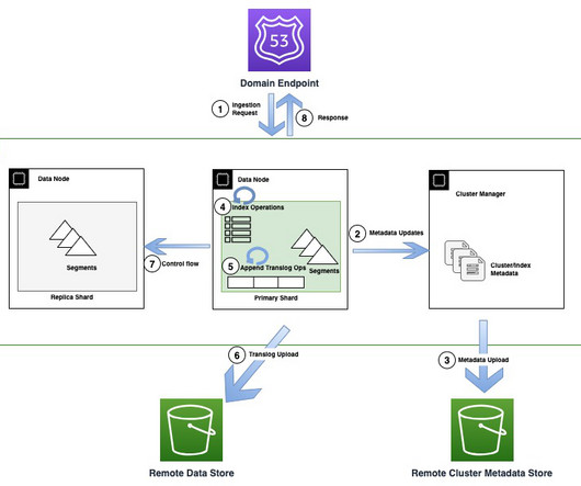
Today, customers widely use OpenSearch Service for operational analytics because of its ability to ingest high volumes of data while also providing rich and interactiveanalytics. As your operational analytics data velocity and volume of data grows, bottlenecks may emerge. Rohin Bhargava is a Sr.
Your Chance: Want to test accounting reporting software for free? Usually, these reports are considered to be financial statements which include: a balance sheet: is a snapshot of a business at a specific time and shows the ending assets, liability, and equity balances as of the balance sheet date. What Are Accounting Reports?
When analytics and dashboards are inaccurate, business leaders may not be able to solve problems and pursue opportunities. If you have been in the data profession for any length of time, you probably know what it means to face a mob of stakeholders who are angry about inaccurate or late analytics. Data errors impact decision-making.
The Iceberg table keeps track of the snapshots. consumer_iceberg$snapshots" limit 10; We can observe that we have generated multiple snapshots. Use time travel to find the table snapshot. Jack Ye is a software engineer of the Athena Data Lake and Storage team at AWS. Use the Query editor to run one query at a time.
Storytelling through data is the process of transforming data-driven analyses into a widely-accessible visual format to influence a business decision, strategy, or action by utilizing analytical information that, ultimately, turn into actionable insights. As you’re no doubt aware—in business, time is money.
What do they want from this type of software? should be your priority questions if you’ve decided to build custom healthcare software for your medical practice or implement an existing solution. In 2017, the global market for healthcare analytics was valued at $16.9 And what are the major barriers to doctors’ use of EHRs?
Moreover, within just five years, the number of smart connected devices in the world will amount to more than 22 billion – all of which will produce colossal sets of collectible, curatable, and analyzable data, claimed IoT Analytics in their industry report. What does this mean? Now, let’s look at how to create a KPI report.
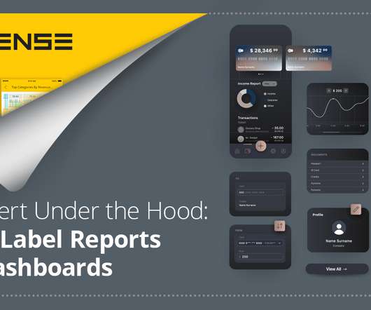
What are white-labeled reports White-label reports: Under the hood Exploring white-label dashboards Use case snapshots Horsepower under the hood. Every company is working toward harnessing data and analytics in its own way in order to stay relevant in a changing business world. Every company is becoming a data company.
Thanks to the right KPI software , it is much easier to identify trends and setting goals that will ultimately increase productivity, drive growth, and boost profits. With the help of a dashboard designer , you can simply drag-and-drop your values and create interactive visualizations that will point out errors immediately.
A static report offers a snapshot of trends, data, and information over a predetermined period to provide insight and serve as a decision-making guide. A KPI reporting software can even automate and offer the most recent data in all your reports. Exclusive Bonus Content: Get our free summary to create better reports!
Information technology reports are the interactive eyes you need to help your department run more smoothly, cohesively, and successfully. Using an IT analyticssoftware is extremely useful in the matter: by gathering all your data in a single point-of-truth, you can easily analyze everything at once and create actionable IT dashboards.
Over the past decade, the successful deployment of large scale data platforms at our customers has acted as a big data flywheel driving demand to bring in even more data, apply more sophisticated analytics, and on-board many new data practitioners from business analysts to data scientists. Key Design Goals .
We wanted to include interactive, real-time visualizations to support recruiters from one of our government clients. Our previous solution offered visualization of key metrics, but point-in-time snapshots produced only in PDF format. We also saved 75% on our annual external software costs.
Equipped with financial analyticssoftware , you can easily produce these daily, weekly, and monthly reports. These reports are more digestible when they are generated through online data visualization tools that have numerous interactive dashboard features, to ensure that your business has the right meaningful financial data.
Explore our sales analyticssoftware for a 14-days free trial today! These relate to direct actions you should take such as knowing your customer preferences and being aware of any major market changes, but also to the analytics process such as tracking the right metrics and defining clear goals beforehand.
If you want to convey crucial information to decision-makers in the easiest and most effective way possible, you need to embrace the power of interactive dashboards. At datapine, we believe the goal of each interactive dashboard you create should be better, faster, and stronger decision making while telling a story.
This article will review the best 10 dashboard tools covering different areas, including open source and free software. FineReport is a business dashboard reporting software., with both on-premise software and SaaS reporting version. FineReport is a business dashboard reporting software., Welcome to take advantage of it!
Without big data analytics, companies are blind and deaf, wandering out onto the Web like deer on a freeway. Companies that use data analytics are five times more likely to make faster decisions, based on a survey conducted by Bain & Company. Geoffrey Moore, Author of Crossing the Chasm & Inside the Tornado.
by BILL RICHOUX Critical decisions are being made continuously within large software systems. Through this example, we discuss some of the special considerations impacting a data scientist when designing solutions to improve decision-making deep within software infrastructure. user behaviors/interests, the internet, etc.).
It enables data engineers, data scientists, and analytics engineers to define the business logic with SQL select statements and eliminates the need to write boilerplate data manipulation language (DML) and data definition language (DDL) expressions. The following diagram illustrates the architecture.
Here, we’ll examine 18 essential KPIs for social media, explore the dynamics and demonstrate the importance of social metrics in the modern business age with the help of a KPI software , and, finally, wrapping up with tips on how to set KPIs and make the most of your social platforms. Let’s get going. What Are Social Media KPIs?
Iceberg is a 100% open-table format, developed through the Apache Software Foundation , which helps users avoid vendor lock-in and implement an open lakehouse. . Time Travel: Reproduce a query as of a given time or snapshot ID, which can be used for historical audits and rollback of erroneous operations, as an example. Time travel.
Here, we’ll explore customer data management, offering a host of practical tips to help you embrace the power of customer data management software the right way. With the help of a decision support software , you may also expand this further into departments so that everyone is up-to-date on the right approach to customer data management.
We organize all of the trending information in your field so you don't have to. Join 42,000+ users and stay up to date on the latest articles your peers are reading.
You know about us, now we want to get to know you!
Let's personalize your content
Let's get even more personalized
We recognize your account from another site in our network, please click 'Send Email' below to continue with verifying your account and setting a password.


Let's personalize your content