This site uses cookies to improve your experience. To help us insure we adhere to various privacy regulations, please select your country/region of residence. If you do not select a country, we will assume you are from the United States. Select your Cookie Settings or view our Privacy Policy and Terms of Use.
Cookie Settings
Cookies and similar technologies are used on this website for proper function of the website, for tracking performance analytics and for marketing purposes. We and some of our third-party providers may use cookie data for various purposes. Please review the cookie settings below and choose your preference.
Used for the proper function of the website
Used for monitoring website traffic and interactions
Cookie Settings
Cookies and similar technologies are used on this website for proper function of the website, for tracking performance analytics and for marketing purposes. We and some of our third-party providers may use cookie data for various purposes. Please review the cookie settings below and choose your preference.
Strictly Necessary: Used for the proper function of the website
Performance/Analytics: Used for monitoring website traffic and interactions
“By visualizing information, we turn it into a landscape that you can explore with your eyes. 90% of the information transmitted to the brain is visual. Data visualization methods refer to the creation of graphical representations of information. That’s where data visualization comes in. A sort of information map.
Spreadsheets finally took a backseat to actionable and insightful data visualizations and interactive business dashboards. The rise of self-service analytics democratized the data product chain. Suddenly advanced analytics wasn’t just for the analysts. The analytics trends in data quality grew greatly this past year.
That being said, in this post, we will explain what is a dashboard in business, the features of strategic, tactical, operational and analytical dashboards, and expound on examples that these different types of dashboards can be used. Through dashboards, organizations can quickly identify current and historical performance.
In recent years, analytical reporting has evolved into one of the world’s most important business intelligence components, compelling companies to adapt their strategies based on powerful data-driven insights. What Is An Analytical Report? Your Chance: Want to build your own analytical reports completely free? Let’s get started.
When encouraging these BI best practices what we are really doing is advocating for agile business intelligence and analytics. In our opinion, both terms, agile BI and agile analytics, are interchangeable and mean the same. What Is Agile Analytics And BI? Agile Business Intelligence & Analytics Methodology.
Exclusive Bonus Content: Ready to make analytics straightforward? Data dashboards provide a centralized, interactive means of monitoring, measuring, analyzing, and extracting a wealth of business insights from relevant datasets in several key areas while displaying aggregated information in a way that is both intuitive and visual.
Data analytics and visualization help with many such use cases. Here is where data analytics and visualization come into play. While most people are unfamiliar with these terms, investing in data analytics and visualization can mean the difference between success and failure. What Is Data Analytics?
Whatever your niche or industry, working with dynamic keyperformanceindicators (KPIs) will empower you to track and improve your performance in a number of key areas, accelerating your commercial success in the process. To track KPIs is to gain greater business intelligence. What Are The Benefits Of KPI Tracking?
Moreover, within just five years, the number of smart connected devices in the world will amount to more than 22 billion – all of which will produce colossal sets of collectible, curatable, and analyzable data, claimed IoT Analytics in their industry report. Pick a couple of indicators that will track and assess the performance.
Analytical: These particular dashboards contain large streams of comprehensive data that allow analysts to drill down and extract insights to help the company to progress at an executive level. For a truly effective dashboard design, selecting the right keyperformanceindicators (KPIs) for your business needs is a must.
CFO dashboards exist to enhance the strategic as well as the analytical efforts related to every financial aspect of your business. A CFO dashboard tool provides a panoramic view of all of the information an ambitious modern CFO needs to perform their job to the best of their abilities. Benefit from great CFO dashboards & reports!
Here we take the time to define business report, explore visual report examples, and look at how to write one for various needs, goals, and objectives. In the process, we will use an online data visualization software that lets us interact with, and drill deeper into bits and pieces of relevant data. Let’s get started.
Finally, we will show you a real-life example so you can get a visual overview and a clearer picture of the points discussed in this article. At its core, CRM dashboard software is a smart vessel for data analytics and business intelligence – digital innovation that hosts a wealth of insightful CRM reports. Let’s begin.
A vast majority of occasions where data is presented (reports, executive dashboards, conference presentations, or just plain here's a automated emailed thingy from Google Analytics ) end up being abject failures because most of the discussion is still about the data. Ditch the text, visualize the story. An important point first.
Using business intelligence and analytics effectively is the crucial difference between companies that succeed and companies that fail in the modern environment. Your Chance: Want to try a professional BI analytics software? Experts say that BI and data analytics makes the decision-making process 5x times faster for businesses.
Modern dashboard software makes it simpler than ever to merge and visualize data in a way that’s as inspiring as it is accessible. Knowing what story you want to tell (analyzing the data) tells you which data visualization type to use. Let’s assume you have the right data and the right data visualization software. Distribution.
To help you understand the potential of analysis and how you can use it to enhance your business practices, we will answer a host of important analytical questions. This is one of the most important data analytics techniques as it will shape the very foundations of your success. Harvest your data. Omit useless data.
As such, we have to find approaches to data analytics and business intelligence. Industry or sector aside, real time business intelligence and analytics are invaluable to the ongoing success of your business. Download our executive, pocket-sized guide to real time BI and analytics! What Is Real Time Analytics?
“Without big data analytics, companies are blind and deaf, wandering out onto the web like deer on a freeway.” – Geoffrey Moore. The user can, then, oversee a number of key areas by displaying historical trends, actionable insights, and real-time information in a digestible, presentational format. We live in the age of information.
One additional element to consider is visualizing data. Since humans process visual information 60.000 times faster than text , the workflow can be significantly increased by utilizing smart intelligence in the form of interactive, and real-time visual data. Implementation in any industry or department.
Essentially, KeyPerformanceIndicators or KPIs measure performance or progress based on specific business goals and objectives. A pivotal element to consider is the word “key”, meaning they only track what is truly relevant for the company’s strategic decisions. What Are KPIs? What Are Metrics?
By taking an online data visualization approach to handling your company’s strategic activities, big or small, you will make your business more cohesive, collaborative, intelligent and profitable – and project management dashboards will help you do just that. Armed with this knowledge, you can gain a significant edge on the competition.
By gaining centralized access to business data and presenting it in a visual way that follows a logical path and provides invaluable insights on a particular area or subject, you stand to set yourself apart from your competitors and become a leader in your field. What Is Data Storytelling? b) Improve processes with plotting.
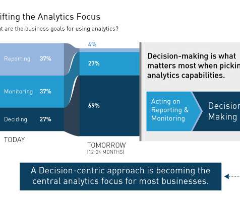
Some years ago we did some research on the landscape of analytics capabilities. While there seem to be as many reasons for adopting analytic capabilities as there are organizations adopting analytics, the reality is that three key business needs are driving analytic adoption – reporting, monitoring and deciding: Reporting.
It is painfully heartbreaking to realize that a very small tiny number of people who have access to web analytics tools actually use them. Produce built-in visualization magic. In-Page Analytics – Re-imagine Traveling Through Data. #5. Matched Query Type, Keyword Position, Day Parts: Sexier PPC Analytics. #7. " Boom!
A CEO dashboard is an interactive platform that visualizes data to empower business leaders to track, measure, analyze, and monitor business performance in a number of areas, enabling them to make data-driven decisions and see the big business picture. The right design & visualizations. Enable data-driven decisions.
4) How to Select Your KPIs 5) Avoid These KPI Mistakes 6) How To Choose A KPI Management Solution 7) KPI Management Examples Fact: 100% of statistics strategically placed at the top of blog posts are a direct result of people studying the dynamics of KeyPerformanceIndicators, or KPIs. What Is KPI Management?
By understanding your core business goals and selecting the right keyperformanceindicator ( KPI ) and metrics for your specific needs, you can use an information technology report sample to visualize your most valuable data at a glance, developing initiatives and making pivotal decisions swiftly and with confidence.
The Use and Benefits of Low-Code No-Code Development in Business Intelligence (BI) and Predictive Analytics Solutions Introduction In this article, we will discuss Low-Code and No-Code Development (LCNC) and the use of the Low Code and No Code approach for business intelligence (BI) tools and predictive analytics solutions.
Just imagine how useful it would be in a non-analytical environment like a museum. And I don't want you to think that the problem is that the above is a dashboard in a digital analytics tool and has just two graphs. Here's another example: Those of you who've read Web Analytics 2.0 They are data pukes.
Business intelligence concepts refer to the usage of digital computing technologies in the form of data warehouses, analytics and visualization with the aim of identifying and analyzing essential business-based data to generate new, actionable corporate insights. They enable powerful data visualization. The data warehouse.
Developing analytic apps is a bold new direction for product teams. The Toolbox is where we talk development best practices, tips, tricks, and success stories to help you build the future of analytics and empower your users with the insights and actions they need. Understanding Javascript data visualization libraries.
We have written about management reporting methods that can be utilized in the modern practice of creating powerful analysis, bringing complex data into simple visuals, and employ them to make actionable decisions. Your Chance: Want to visualize & track operational metrics with ease? How To Select Operational Metrics And KPIs?
Exclusive Bonus Content: Ready to use data analytics in your restaurant? In a previous study into big data examples in real life, we explored how the catering industry could benefit from the use of restaurants analytics – a topic that we’re going to delve deeper into here. What Are Restaurant Analytics?
Armed with powerful visualizations and real-time data, modern weekly summary reports enable businesses to closely monitor their performance and the progress of their strategies to extract relevant insights and optimize their processes to ensure constant growth. Try our professional reporting software for 14 days, completely free!
This gives to that sales graph an overall sense of visual contrast which makes it much more digestible at a glance. A perfect example of how to present sales data, this profit-boosting sales chart offers a panoramic snapshot of your agents’ overall upselling and cross-selling efforts based on revenue and performance.
By asking the right questions, utilizing sales analytics software that will enable you to mine, manipulate and manage voluminous sets of data, generating insights will become much easier. This genie (who we’ll call Data Dan) embodies the idea of a perfect data analytics platform through his magic powers.
Your Chance: Want to visualize & track supply chain metrics with ease? Try our modern logistics analytics software for 14 days, completely free! Supply chain metrics are defined by establishing specific parameters which are used in quantifying and defining supply chain performance. What Are Supply Chain Metrics?
Visual marketing dashboards are prime examples of using big data effectively in marketing. In this day and age, all businesses must pay especially close consideration to the performance of their marketing metrics dashboard. Keyperformanceindicators are critical metrics and data that are easy to read and display for further analysis.
A SaaS dashboard consolidates and visualizes critical SaaS metrics, covering sales, marketing, finance, consumer support, management, and development to offer an unobstructed panoramic view of the SaaS business and achieve better business performance and profit. What Is A SaaS Dashboard? 1) Data management. Let’s take a closer look.
By utilizing recruiting KPIs presented through the medium of visual and interactive HR dashboards , it’s possible to use recruitment metrics to better interpret and evaluate a variety of talent acquisition factors that aid in hiring processes. What Is Recruitment Analytics? That’s where recruitment metrics come in. Let’s get started.
To help you on your quest towards analytical enlightenment, we’re going to explore data driven decision making, study the importance of data driven decision making, and examine some real-world examples of turning insight into business-boosting action. “Information is the oil of the 21st Century, and analytics is the combustion engine.”
They collect data from various departments of the company tracking keyperformanceindicators ( KPIs ) and present them in an understandable way. However, the use of dashboards, big data, and predictive analytics is changing the face of this kind of reporting. 4) Make your report visually pleasing through focus.
3) Top 15 Warehouse KPIs Examples 4) Warehouse KPI Dashboard Template The use of big data and analytics technologies has become increasingly popular across industries. Every day, more and more businesses realize the value of analyzing their own performance to boost strategies and achieve their goals. 2) Why Do You Need Warehouse KPIs?
We organize all of the trending information in your field so you don't have to. Join 42,000+ users and stay up to date on the latest articles your peers are reading.
You know about us, now we want to get to know you!
Let's personalize your content
Let's get even more personalized
We recognize your account from another site in our network, please click 'Send Email' below to continue with verifying your account and setting a password.


Let's personalize your content