This site uses cookies to improve your experience. To help us insure we adhere to various privacy regulations, please select your country/region of residence. If you do not select a country, we will assume you are from the United States. Select your Cookie Settings or view our Privacy Policy and Terms of Use.
Cookie Settings
Cookies and similar technologies are used on this website for proper function of the website, for tracking performance analytics and for marketing purposes. We and some of our third-party providers may use cookie data for various purposes. Please review the cookie settings below and choose your preference.
Used for the proper function of the website
Used for monitoring website traffic and interactions
Cookie Settings
Cookies and similar technologies are used on this website for proper function of the website, for tracking performance analytics and for marketing purposes. We and some of our third-party providers may use cookie data for various purposes. Please review the cookie settings below and choose your preference.
Strictly Necessary: Used for the proper function of the website
Performance/Analytics: Used for monitoring website traffic and interactions
Tracking the success metrics based on your needs, and the time frame you select while comparing your values can be done with simple yet effective scorecards. What Is A KPI Scorecard? A KPI scorecard is a term used to describe a statistical record that measures progress or achievement towards a set performance indicator.
A social media dashboard is an invaluable management tool that is used by professionals, managers, and companies to gather, optimize, and visualize important metrics and data from social channels such as Facebook, Twitter, LinkedIn, Instagram, YouTube, etc. Social media KPI scorecard. What Is A Social Media Dashboard?
Collecting big amounts of data is not the only thing to do; knowing how to process, analyze, and visualize the insights you gain from it is key. Your Chance: Want to visualize & track inventory KPIs with ease? Your Chance: Want to visualize & track inventory KPIs with ease? But let’s get back to our visual example.
Analytical Reports This report type contains a mix of useful information to facilitate the decision-making process through a mix of qualitative and quantitative insights as well as real-time and historical data. With this information in hand, businesses can build strategies based on analytical evidence and not simple intuition.
An extraordinary amount of time, effort, $$$ are spent on building dashboards/scorecards for CMOs… Yet, the end result, nearly always, is a useless data puke. Personal Bias: I prefer the word Scorecard over Dashboard. In my writing, in my keynotes, you’ll hear Scorecard. Application #1: Paid Media CMO Scorecard Module.
In the coming year, based on current announcements , Google Analytics is set to go through an almost unprecedented amount of evolution. My favorite is Visitor Analytics, and visitor level segmentation that will be pervasive throughout the product. My postulation is that by this time next year the tool will be almost unrecognizable. [My
It is painfully heartbreaking to realize that a very small tiny number of people who have access to web analytics tools actually use them. Produce built-in visualization magic. In-Page Analytics – Re-imagine Traveling Through Data. #5. Matched Query Type, Keyword Position, Day Parts: Sexier PPC Analytics. #7.
Power BI is Microsoft’s interactive data visualization and analytics tool for business intelligence (BI). You can drill into data, create a variety of visualizations, and (literally) ask questions about it using AI. Power BI’s rich reports or dashboards can be embedded into reporting portals you already use.
Corporate (or enterprise) dashboards are dynamic digital and visual tools that offer a comprehensive working insight into a wide range of corporate or company’s metrics and data, focused on monitoring, optimization, and achievement of strategic goals. What Is A Corporate Dashboard? 10 Benefits Of Dynamic Corporate Dashboards.
Your digital marketing KPIs can help marketers with additional essential multi-stage interaction and analytics tools. This includes considering the website, automation tools, social media, customer database, and analytics platforms in more detail. The value of this tool lies in its visual nature. Refine Digital Channels.
Online Analytical Processing (OLAP) is crucial in modern data-driven apps, acting as an abstraction layer connecting raw data to users for efficient analysis. The scope of data analytics has grown, and more user personas are now seeking to extract insights themselves. You can use Amazon Managed Service for Apache Flink service.
An operational scorecard is a mechanism used to evaluate and measure the quality of data processed and validated by AWS Glue Data Quality rulesets. We can query and submit the Athena data to QuickSight to create visuals for the dashboard. The crawler builds a Data Catalog, so the data can be queried using Athena.
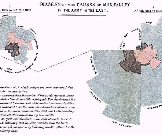
Editors note: This blog was originally published in October 2013, and has been completely revamped and updated for accuracy, relevancy, and comprehensiveness in September 2019 Prior to the 17th century, data visualization existed mainly in the realm of maps, displaying land markers, cities, roads, and resources.
One of the greatest innovations in the business intelligence and analytics industry. If you are curious about how monitoring dashboards work, in this insightful guide we will cover every relevant aspect related to these powerful analytical tools. Choose the right type of visual. Enter monitoring dashboards.
Moreover, BI platform allows users to customize dashboards, create beautiful data visualizations, build scorecards, and compare them with key performance indicators (KPIs). It was honorable mentioned in Gartner 2021 Magic Quadrant for Analytics and Business Intelligence Platforms. FineReport.
As our organization grew rapidly, we built new tools to scale analytical insights into our customers’ sales and delivery mechanisms. We’ve made a big impact with QuickSight because it doesn’t require in-depth knowledge about data visualizations to build dashboards and provide insights, empowering our users to build what they need.
With the help of KPI reports , all of these targets can be visualized together to get a complete picture across departments. Additionally, you can look into future trends with the help of a market research analytics tool and find deeper insights regarding benchmarks in your industry. Assess KPI progress and readjust.
In this article, we will explore the importance of Big Data, why enterprises need Big Data tools, how to choose the right Big Data analytics tools and provide a list of the top 10 Big Data analytics tools available today. Descriptive Analytics is used to determine “what happened and why.” What is Big Data?
With the introduction of Artificial Intelligence and Machine Learning, as well as data visualization tools, designed for charting, dashboards and performance scorecards. Your team must assess your need for augmented analytics and mobile access, including all the issues and requirements noted below.
REFLECTIONS FROM THE GARTNER BI & ANALYTICS SUMMIT I hate to admit that the last time I attended the Gartner BI & Analytics Summit, Howard Dresner was still the host. For me personally, it was an amazing return this year to the now appropriately re-named, Gartner BI & Analytics Summit held in Grapevine, Texas.
Using OBIEE as Discoverer’s replacement is intended to help unlock the power of your information with robust reporting, ad hoc query and analysis, OLAP, dashboard, and scorecard functionality that offers the end user an experience that comes with visualization, collaboration, alert capabilities, and more. But does OBIEE stack up?
As the data visualization, big data, Hadoop, Spark and self-service hype gives way to IoT, AI and Machine Learning, I dug up an old parody post on the business intelligence market circa 2007-2009 when cloud analytics was just a disruptive idea. Balanced scorecards, GIS, analytic apps, extranets.
Just yesterday, Saleforce announced its intention to buy smart data discovery vendor, BeyondCore, a new Visionary entrant to this year’s BI and Analytics Magic Quadrant ! The user explores data via visualizations and natural language generated narration. It’s been an exciting two weeks in the world of BI! Why BeyondCore is Disruptive.
Typical use cases for DynamoDB are an ecommerce application handling a high volume of transactions, or a gaming application that needs to maintain scorecards for players and games. Deriving business insights by identifying year-on-year sales growth is an example of an online analytical processing (OLAP) query.
With the advent of Mobile Business Intelligence (BI) the average business user and team member gained access to crucial analytical tools on mobile devices and tablets. They operate seamlessly on all manner of devices without compromised displays or performance.
The outcome of book smart is rarely better for analytics practitioners then folks trying to learn how to fly an airplane from how-to books. This is all the way from Aug 2009: Web Analytics Career Advice: Play In The Real World! And, happily, it has almost all of the Google Analytics features implemented correctly.
GPUs Graphic processing units were first developed to speed up rendering complex visual scenes but lately developers have been discovering that the chips can also accelerate algorithms that have nothing to do with games or 3D worlds. Main constituents: Enterprises like medical care or banking that deal with personal information and crime.
In this modern, turbulent market, predictive analytics has become a key feature for analytics software customers. Predictive analytics refers to the use of historical data, machine learning, and artificial intelligence to predict what will happen in the future.
Visualizations in business intelligence software are often dismissed as a commodity interchangeable and easy to overlook. Visualizations are the gateway to understanding; theyre how users interact with and interpret the insights derived from all the data gathering, preparation, and analysis. But this perspective misses the mark.
We organize all of the trending information in your field so you don't have to. Join 42,000+ users and stay up to date on the latest articles your peers are reading.
You know about us, now we want to get to know you!
Let's personalize your content
Let's get even more personalized
We recognize your account from another site in our network, please click 'Send Email' below to continue with verifying your account and setting a password.


Let's personalize your content