This site uses cookies to improve your experience. To help us insure we adhere to various privacy regulations, please select your country/region of residence. If you do not select a country, we will assume you are from the United States. Select your Cookie Settings or view our Privacy Policy and Terms of Use.
Cookie Settings
Cookies and similar technologies are used on this website for proper function of the website, for tracking performance analytics and for marketing purposes. We and some of our third-party providers may use cookie data for various purposes. Please review the cookie settings below and choose your preference.
Used for the proper function of the website
Used for monitoring website traffic and interactions
Cookie Settings
Cookies and similar technologies are used on this website for proper function of the website, for tracking performance analytics and for marketing purposes. We and some of our third-party providers may use cookie data for various purposes. Please review the cookie settings below and choose your preference.
Strictly Necessary: Used for the proper function of the website
Performance/Analytics: Used for monitoring website traffic and interactions
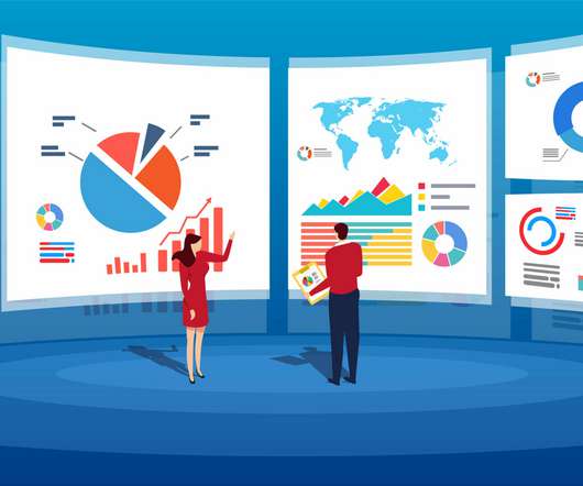
“By visualizing information, we turn it into a landscape that you can explore with your eyes. 90% of the information transmitted to the brain is visual. Data visualization methods refer to the creation of graphical representations of information. That’s where data visualization comes in. A sort of information map.
Whatever your niche or industry, working with dynamic keyperformanceindicators (KPIs) will empower you to track and improve your performance in a number of key areas, accelerating your commercial success in the process. To track KPIs is to gain greater business intelligence. What Are The Benefits Of KPI Tracking?
Here we take the time to define business report, explore visual report examples, and look at how to write one for various needs, goals, and objectives. In the process, we will use an online data visualization software that lets us interact with, and drill deeper into bits and pieces of relevant data. Let’s get started.
Data analytics and visualization help with many such use cases. Here is where data analytics and visualization come into play. While most people are unfamiliar with these terms, investing in data analytics and visualization can mean the difference between success and failure. Keyperformanceindicators ( KPIs ) help with that.
Through dashboards, organizations can quickly identify current and historical performance. By integrating these keyperformanceindicators (KPIs) and goals into their dashboards, companies can proactively identify issues, minimize costs and strive to exceed performance expectations. Digital age needs digital data.
Finally, we will show you a real-life example so you can get a visual overview and a clearer picture of the points discussed in this article. This most value-driven CRM dashboard and a powerful piece of CRM reporting software host a cohesive mix of visual KPIs. Let’s begin. Sales Activity. Average Contract Value.
For a truly effective dashboard design, selecting the right keyperformanceindicators (KPIs) for your business needs is a must. Your KPIs will help to shape the direction of your dashboards as these metrics will display visual representations of relevant insights based on specific areas of the business.
Ditch the text, visualize the story. Advanced, sophisticated visualizations are important. Hence all the insights-free data visualizations floating around the web that are totally value-deficient, even as they are pretty. Then, go express your inner visualization beast. :). [My The article is a bit dry, but valuable.
Spreadsheets finally took a backseat to actionable and insightful data visualizations and interactive business dashboards. Companies are no longer wondering if data visualizations improve analyses but what is the best way to tell each data-story. 2) Data Discovery/Visualization. Data exploded and became big.
As a direct result, less IT support is required to produce reports, trends, visualizations, and insights that facilitate the data decision making process. This is a testament to the importance of online data visualization in decision making. Data driven business decisions make or break companies.
We have written about management reporting methods that can be utilized in the modern practice of creating powerful analysis, bringing complex data into simple visuals, and employ them to make actionable decisions. Your Chance: Want to visualize & track operational metrics with ease? How To Select Operational Metrics And KPIs?
A CEO dashboard is an interactive platform that visualizes data to empower business leaders to track, measure, analyze, and monitor business performance in a number of areas, enabling them to make data-driven decisions and see the big business picture. The right design & visualizations.
By gaining centralized access to business data and presenting it in a visual way that follows a logical path and provides invaluable insights on a particular area or subject, you stand to set yourself apart from your competitors and become a leader in your field. Download our free executive summary and start creating your stories!
By the end of this article, making stunning and useful managerial reports will be second nature to you. They collect data from various departments of the company tracking keyperformanceindicators ( KPIs ) and present them in an understandable way. Exclusive Bonus Content: Get our free guide to creating better reports!
Business intelligence concepts refer to the usage of digital computing technologies in the form of data warehouses, analytics and visualization with the aim of identifying and analyzing essential business-based data to generate new, actionable corporate insights. They enable powerful data visualization. Benchmarking is more accurate.
Visual marketing dashboards are prime examples of using big data effectively in marketing. In this day and age, all businesses must pay especially close consideration to the performance of their marketing metrics dashboard. In this article, we will discuss what l needs to be included in marketing reporting dashboards.
Your Chance: Want to visualize & track supply chain metrics with ease? Supply chain metrics are defined by establishing specific parameters which are used in quantifying and defining supply chain performance. Your Chance: Want to visualize & track supply chain metrics with ease? What Are Supply Chain Metrics?
A great way to start analyzing your data is to create a dashboard of keyperformanceindicators (KPIs). Visualize Your Data. Visualizing data can be a powerful tool that helps you quickly make sense of complex or large amounts of information. Invest in Data Security.
We will explore even more examples of monthly reports later in the article. Our monthly reports are on top illustrated with beautiful data visualizations that provide a better understanding of the metrics tracked. Exclusive Bonus Content: Reap the benefits of the top reports in finance! What Is Included In The Financial Report?
Visualizing the data and interacting on a single screen is no longer a luxury but a business necessity. They enable you to easily visualize your data, filter on-demand, and slice and dice your data to dig deeper. Maps are important data visualizations and at datapine, we love utilizing them in our dashboards.
Salesforce report is a management tool that offers a visual representation of essential sales-based data through a centralized cloud-based reporting platform with the goal to enhance critical elements of a business, including marketing, sales, commerce, and service. 3) Choose your visualizations. What Is A Salesforce Report?
Capable of displaying keyperformanceindicators (KPIs) for both quantitative and qualitative data analyses, they are ideal for making the fast-paced and data-driven market decisions that push today’s industry leaders to sustainable success. Business dashboards are the digital age tools for big data.
Collect and prioritize pain points and keyperformanceindicators (KPIs) across the organization. Identify keyperformanceindicators (KPIs). KPIs indicate areas businesses are on the right track and where improvements are needed. Rely on interactive data visualizations. Choose a sponsor.
Real time BI is the application of analytics and data processing tools to gain insight into relevant data and visualizations as they’re created. As visualized data presents itself, real time analysis empowers the user to draw swift conclusions that are both informed and accurate. Top 5 Articles By Sold Items. click to enlarge**.
To simplify things, you can think of back-end BI skills as more technical in nature and related to building BI platforms, like online data visualization tools. For example, you could be the one to extract actionable insights from specific retail KPIs that need to be visualized and presented during a meeting. BI developer.
Using the right marketing KPIs (keyperformanceindicators) is a good start – what is now left is finding a way to organize it all in a way that makes sense and brings value. As a Forbes article states , “there’s no such thing as ‘set it and forget it’ [in digital marketing]”. How do you know that?
The Use and Benefits of Low-Code No-Code Development in Business Intelligence (BI) and Predictive Analytics Solutions Introduction In this article, we will discuss Low-Code and No-Code Development (LCNC) and the use of the Low Code and No Code approach for business intelligence (BI) tools and predictive analytics solutions.
This article aims to provide a reference for the choice of enterprises. Scorecards use excellent visual effects to present keyperformanceindicators (KPIs), which can help companies compare predicted targets with actual conditions to measure and manage business performance. business intelligence.
A BI dashboard — or business intelligence dashboard — is an information management tool that uses data visualization to display KPIs (keyperformanceindicators) tracked by a business to assess various aspects of performance while generating actionable insights. What Is The Purpose Of Using A BI Dashboard?
BI users analyze and present data in the form of dashboards and various types of reports to visualize complex information in an easier, more approachable way. Renowned author Bernard Marr wrote an insightful article about Shell’s journey to become a fully data-driven company. Let’s look at our first use case. click to enlarge**.
Aubree Smith has a great article on Sprout Social highlighting the benefits of leveraging them together. Business intelligence typically includes data mining, reporting, data visualization, and performance analytics to provide a clear view of a company’s performance, opportunities, and challenges.
Phase 3: Data Visualization. With the data analyzed and stored in spreadsheets, it’s time to visualize the data so that it can be presented in an effective and persuasive manner. Hopefully, this article spoke to you and provided both encouragement and insights. During this phase, data is cleaned, analyzed, and assessed.
In this article, I would like to introduce what reporting is and give you some examples to clarify the key concepts. Among all reports, the dashboard report is the most typical application that uses various visual elements. So it is often used as a visual representation of the company’s keyperformanceindicators (KPI).
That said, in this article, we will go through both agile analytics and BI starting from basic definitions, and continuing with methodologies, tips, and tricks to help you implement these processes and give you a clear overview of how to use them. Evaluate your keyperformanceindicators.
Simply put, data management is a sophisticated process involving various stages, such as data storage, processing, analysis, and visualization. To derive data management’s ROI, your organization can use your relevant keyperformanceindicators (KPIs). Learn more about data architectures in my article here.
This article aims to provide a reference for the choice of enterprises. As a business intelligence tool, dashboards visualize large amounts of data in the form of charts, which can help companies monitor relevant information at a glance. However, many users are confused with the difference between scorecard vs. dashboard.
No matter what your newsfeed may be, it’s likely peppered with articles about the wonders of artificial intelligence. And rightly so. Observability can go further to tell you what will happen and what to do about it ahead of time. 3 primary use cases AIOps addresses three areas of concern: IT health, cybersecurity, and sustainability.
Data visualization is a powerful tool that can help improve decision-making across several industries, including business, finance, healthcare, and more. By allowing users to more easily understand and interpret data, data visualization can help make more informed and accurate decisions, leading to improved outcomes and increased success.
Moreover, BI platform allows users to customize dashboards, create beautiful data visualizations, build scorecards, and compare them with keyperformanceindicators (KPIs). The examples of BI reports in this article are all built-in templates made by FineReport. BI Platform Interface (by FineReport). FineReport.
Dashboard reporting refers to putting the relevant business metrics and KPIs in one interface, presenting them visually, dynamic, and in real-time, in the dashboard formats. With the advent of modern dashboard reporting tools, you can conveniently visualize your data into dashboards and reports and extract insightful information from it.
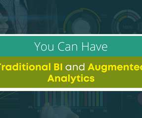
In this article, we look at the benefits of combining a business intelligence and augmented analytics approach and how your business can have both in one solution. Multidimensional KeyPerformanceIndicators (KPIs). Traditional and Modern BI Tools and Benefits. Deep-Dive Analytics. Social BI tools for data sharing.
A business dashboard offers at-a-glance insights based on keyperformanceindicators (KPIs) and is an intuitive and visually pleasing way to consume data. Interactive visualizations are especially relevant when you have a broad target audience. The top viewed articles by visitors. Total email subscribers.
Look at your data source and divide all content into three categories: Tracked indicators: data that you will follow regularly but will not be used as performance measures. KPI (KeyPerformanceIndicator)-the indicator you will use to measure performance. Untracked metrics: data you will not track.
In Part II of our three-article series we discuss search analytics and how it can improve self-serve data discovery. Part 1 of 3 articles) ‘ and watch for the next article in the series, ‘What is Natural Language Processing & How Does it Benefit a Business? Part 2 of 3 articles).
We organize all of the trending information in your field so you don't have to. Join 42,000+ users and stay up to date on the latest articles your peers are reading.
You know about us, now we want to get to know you!
Let's personalize your content
Let's get even more personalized
We recognize your account from another site in our network, please click 'Send Email' below to continue with verifying your account and setting a password.


Let's personalize your content