This site uses cookies to improve your experience. To help us insure we adhere to various privacy regulations, please select your country/region of residence. If you do not select a country, we will assume you are from the United States. Select your Cookie Settings or view our Privacy Policy and Terms of Use.
Cookie Settings
Cookies and similar technologies are used on this website for proper function of the website, for tracking performance analytics and for marketing purposes. We and some of our third-party providers may use cookie data for various purposes. Please review the cookie settings below and choose your preference.
Used for the proper function of the website
Used for monitoring website traffic and interactions
Cookie Settings
Cookies and similar technologies are used on this website for proper function of the website, for tracking performance analytics and for marketing purposes. We and some of our third-party providers may use cookie data for various purposes. Please review the cookie settings below and choose your preference.
Strictly Necessary: Used for the proper function of the website
Performance/Analytics: Used for monitoring website traffic and interactions
ArticleVideo Book This article was published as a part of the Data Science Blogathon Introduction In applied Statistics and Machine Learning, Data Visualization is one. The post Must Known Data Visualization Techniques for Data Science appeared first on Analytics Vidhya.
ArticleVideo Book This article was published as a part of the Data Science Blogathon Let us see a short intro about this blog, Descriptive Statistics. The post Descriptive statistics | A Beginners Guide! appeared first on Analytics Vidhya.
From foundational concepts to advanced techniques, this article is your comprehensive guide. R, an open-source tool, empowers data enthusiasts to explore, analyze, and visualize data with precision.
This article was published as a part of the Data Science Blogathon R programing language was developed for statistical computing and graphics which makes it one of the desired candidates for Data Science and Analysis. The post Programming in R – From Variables to Visualizations appeared first on Analytics Vidhya.
Introduction This article explores violin plots, a powerful visualization tool that combines box plots with density plots. It explains how these plots can reveal patterns in data, making them useful for data scientists and machine learning practitioners.
This article was published as a part of the Data Science Blogathon. Overview In this article, I will share my thoughts on the below. The post Interpreting P-Value and R Squared Score on Real-Time Data – Statistical Data Exploration appeared first on Analytics Vidhya.
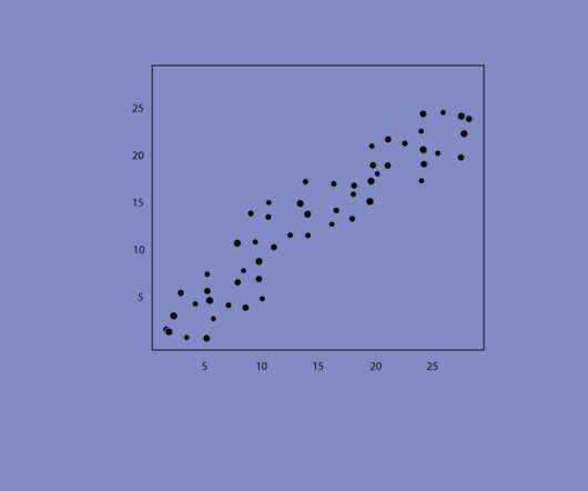
This article was published as a part of the Data Science Blogathon. Introduction Have you ever been tasked with visualizing the relationship between each. The post Creating Linear Model, It’s Equation and Visualization for Analysis appeared first on Analytics Vidhya.
Data visualization in infographics is a dynamic way to do so. This article delves into data visualization within infographics and showcases ways to present information both aesthetically and comprehensively. What is Data Visualization?
This article was published as a part of the Data Science Blogathon. These include statistics, machine learning, probability, data visualization, data analysis, and behavioral questions. Introduction You may be asked questions on various topics in a data science interview.
Introduction Within the domain of data visualization, heatmaps distinguish themselves for their adeptness in portraying intricate data sets in a visually intuitive manner. This article discusses the nuances of crafting and tailoring […] The post How to Plot Heatmaps in Seaborn?
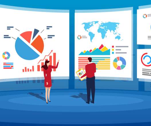
Table of Contents 1) The Benefits Of Data Visualization 2) Our Top 27 Best Data Visualizations 3) Interactive Data Visualization: What’s In It For Me? 4) Static vs. Animated Data Visualization Data is the new oil? ” – David McCandless Humans are visual creatures. This very notion is the core of visualization.
This article was published as a part of the Data Science Blogathon. We use summary statistics and graphical tools to get to know our data and understand what we may deduce from them during EDA. […].
This article reflects some of what Ive learned. Imagine generating complex narratives from data visualizations or using conversational BI tools that respond to your queries in real time. Tableau, Qlik and Power BI can handle interactive dashboards and visualizations. The hype around large language models (LLMs) is undeniable.
ArticleVideo Book This article was published as a part of the Data Science Blogathon Introduction Many engineers have never worked in statistics or data science. The post Know the basics of Exploratory Data Analysis appeared first on Analytics Vidhya.
ArticleVideo Book This article was published as a part of the Data Science Blogathon Introduction In the last blog we looked at a test to. Use, Implementation and Visualization appeared first on Analytics Vidhya. The post Decoding the Chi-Square Test?-?Use,
Overview Motivation to Learn R Covering the BASICS & MUST KNOW Concepts in R Introduction Since you are reading this article, I am assuming that right now you are in your journey of becoming a data scientist. There is a high possibility that you already are aware of some of the data visualization and analytics […].
This article was published as a part of the Data Science Blogathon. These graphs project the statistical information about the distribution using the rectangle blocks that, in turn, will launch […]. Introduction Histograms are one of the best plots which can iterate through the distribution of the dataset.
Data visualization has become a major part of life for those looking to make use of the large swathes of data available in the modern world. That’s where data visualization comes in. Data visualization is, to put it simply, converting hard data and lists of numbers or facts, into an easier to comprehend form.
According to the US Bureau of Labor Statistics, demand for qualified business intelligence analysts and managers is expected to soar to 14% by 2026, with the overall need for data professionals to climb to 28% by the same year. The Bureau of Labor Statistics also states that in 2015, the annual median salary for BI analysts was $81,320.
Today’s article comes from Maryfrances Porter, Ph.D. & — Thank you to Ann Emery, Depict Data Studio, and her Simple Spreadsheets class for inviting us to talk to them about the use of statistics in nonprofit program evaluation! . Why Nonprofits Shouldn’t Use Statistics. & Alison Nagel, Ph.D And here’s why!
Through the art of streamlined visual communication, data dashboards permit businesses to engage in real-time and informed decision-making and are key instruments in data interpretation. For a more in-depth review of scales of measurement, read our article on data analysis questions. There is always an arbitrary zero point.
While some experts try to underline that BA focuses, also, on predictive modeling and advanced statistics to evaluate what will happen in the future, BI is more focused on the present moment of data, making the decision based on current insights. But let’s see in more detail what experts say and how can we connect and differentiate the both.
A data scientist must be skilled in many arts: math and statistics, computer science, and domain knowledge. No matter your skill, career level, or title, the ability to analyze, organize, and visualize data are vital skills in our world of quickly growing and ever-changing data. Statistics and programming go hand in hand.
3 Tips for Visualizing Social Change Data. In the podcast, we discussed three tips for coalitions, foundations, and nonprofits that are visualizing social change data. You can read more about data placemats in this article that Veena and I wrote for the American Evaluation Association. Listen to the Podcast.
In particular, the Times argues that AI-generated summaries of news articles are a substitute for the original articles and damage its business. As The New York Times article referenced at the start of this piece notes, “The most prized data, A.I. They want to get paid for their work and preserve their existing business.
The human brain processes visual data better than any other kind of data, which is good because about 90% of the information our brains process is visual. Visual processing and responses both occur more quickly compared to other stimuli. The brain processes data in visuals or images faster than data in text or rows of numbers.
Stories inspire, engage, and have the unique ability to transform statistical information into a compelling narrative that can significantly enhance business success. According to a study performed by Skyword, content that features a mix of words and visuals drives 34% more engagement than text-only articles, blog posts, or whitepapers.
To this end, I’ve used the knowledge of data visualization to design dashboard templates for five scenarios, hoping to help relevant organizations or enterprises effectively monitor the epidemic situation and carry out prevention and control work. Employee travel statistics dashboard. Top 16 Types of Chart in Data Visualization.
Visualizing data in charts, graphs, dashboards, and infographics is one of the most powerful strategies for getting your numbers out of your spreadsheets and into real-world conversations. But it can be overwhelming to get started with data visualization. If so, this step-by-step data visualization guide is for you!
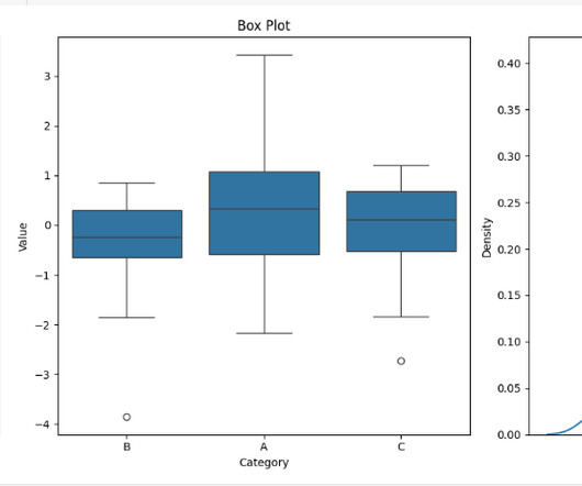
We have previously written about the benefits of data visualization, including its advantages with content marketing. We felt we were overdue for another article on this topic, so we wanted to talk about a particular type of technology that can be beneficial – box plots.
The business can harness the power of statistics and machine learning to uncover those crucial nuggets of information that drive effective decision, and to improve the overall quality of data. Read our free article, ‘ Why Is Natural Language Processing Important To Enterprise Analytics? ’.
This article was published as a part of the Data Science Blogathon. Introduction: Probabilistic Graphical Models (PGM) capture the complex relationships between random variables. The post Complete R Tutorial To Build Probabilistic Graphical Models! appeared first on Analytics Vidhya.
They are Statistical infographics, Informational infographics, Timeline infographics, Process infographics, Geographic infographics, Comparison infographics, Hierarchical infographics, List infographics, and Resume infographics. Most Popular Data Visualization Examples of Infographics. Early Infographics. Pic Source from DOMO.
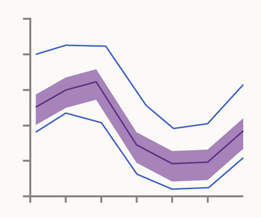
While this visualisation technique is a variation of the classic Box Plot , a Functional Box Plot is visually very different and instead plots a combination of lines and areas to communicate the various data ranges. Median Curve: The median curve represents the most central observation and serves as a robust statistic for centrality.
This seems to be emerging as a feature, not a bug, and hopefully it’s obvious to you why they called their IEEE opinion piece Generative AI Has a Visual Plagiarism Problem. Also, training models doesn’t seem to me to infringe copyright because it doesn’t yet produce output! To see this, let’s consider another example, that of MegaFace.
ArticleVideo Book This article was published as a part of the Data Science Blogathon. When we learn Data Science as beginners we came across. The post 3 Central Tendency Measures – Mean, Mode, Median appeared first on Analytics Vidhya.
There is a near infinite variety of visualization methods within our field. Santiago Ortiz’s article, 45 ways to communicate two quantiles , shows us a stunning expanse for just two numbers. FlowingData has given us 9 ways to visualize proportions and 11 ways for changes over time. SUBSCRIBE TO OUR BLOG.
[Note: To make it easy for you to read this article offline and to share it with others, I’ve made a PDF version available as well.]. Almost all data visualizations are multivariate (i.e., Three graphical approaches are currently available for displaying multiple variables: Encode each variable using a different visual attribute.
ArticleVideo Book This article was published as a part of the Data Science Blogathon Introduction Exploratory data analysis is an approach to analyzing data sets. The post Exploratory Data Analysis : A Beginners Guide To Perform EDA appeared first on Analytics Vidhya.
The Bureau of Labor Statistics estimates that the number of data scientists will increase from 32,700 to 37,700 between 2019 and 2029. Previously, such problems were dealt with by specialists in mathematics and statistics. Statistics, mathematics, linear algebra. Data Mining Techniques and Data Visualization.
Data science needs knowledge from a variety of fields including statistics, mathematics, programming, and transforming data. Mathematics, statistics, and programming are pillars of data science. In data science, use linear algebra for understanding the statistical graphs. It is the building block of statistics.
True, it might seem difficult to reconcile R’s decline with strong interest in AI and ML, but consider two factors: first, ML and statistics are not the same thing, and, second, R is not, primarily, a developer-oriented language. R was designed for use in academic, scientific, and, more recently, commercial use cases.
Overall, clustering is a common technique for statistical data analysis applied in many areas. It refers to a statistical model that identifies the evolution of observable events and groups the elements. As a visualization tool – PCA is great at showing a bird’s view of the process. We have, and it’s a hell of a task.
According to content marketing statistics, 32% of marketers say visual images are the most important form of content for their business, which is probably why you’re here. If you are not sure where to start when creating awesome eye-catching visuals for your digital marketing, then you should keep reading. Consistency.
We organize all of the trending information in your field so you don't have to. Join 42,000+ users and stay up to date on the latest articles your peers are reading.
You know about us, now we want to get to know you!
Let's personalize your content
Let's get even more personalized
We recognize your account from another site in our network, please click 'Send Email' below to continue with verifying your account and setting a password.


Let's personalize your content