This site uses cookies to improve your experience. To help us insure we adhere to various privacy regulations, please select your country/region of residence. If you do not select a country, we will assume you are from the United States. Select your Cookie Settings or view our Privacy Policy and Terms of Use.
Cookie Settings
Cookies and similar technologies are used on this website for proper function of the website, for tracking performance analytics and for marketing purposes. We and some of our third-party providers may use cookie data for various purposes. Please review the cookie settings below and choose your preference.
Used for the proper function of the website
Used for monitoring website traffic and interactions
Cookie Settings
Cookies and similar technologies are used on this website for proper function of the website, for tracking performance analytics and for marketing purposes. We and some of our third-party providers may use cookie data for various purposes. Please review the cookie settings below and choose your preference.
Strictly Necessary: Used for the proper function of the website
Performance/Analytics: Used for monitoring website traffic and interactions
The post Understanding BarPlots in Python : Beginner’s Guide to Data Visualization appeared first on Analytics Vidhya. ArticleVideo Book This article was published as a part of the Data Science Blogathon Introduction We all love exploring data. Representing data and interpreting or.
Image Courtesy: Bar Chart Animation with Plotly library Introduction We all love animation! The post Bar Racing Advance Charts with Plotly appeared first on Analytics Vidhya. This article was published as a part of the Data Science Blogathon. We live in a big data era where everything is a click […].
The post Construct various types of Bar Race Charts with Plotly appeared first on Analytics Vidhya. ArticleVideo Book This article was published as a part of the Data Science Blogathon [link] g Introduction Machine Learning is a hot topic nowadays.
Overview of Parallel Coordinates Plot While using visualizations, one compact visualization showing the relation between multiple variables has an upper hand over multiple visualizations – one for each variable. When you are trying to visualize high dimensional numerical data instead of multiple bar/line […].
While basic plots like bar charts and scatter plots are essential, delving into advanced visualizations can unlock deeper insights and enhance your storytelling. Introduction Matplotlib is a fundamental Python library, empowers you to create various visualizations to explore and communicate your data effectively.
For visualizing any form of data, we all might have used pivot tables and charts like bar charts, histograms, pie charts, scatter plots, line charts, […]. The post Exploring Data Visualization in Altair: An Interesting Alternative to Seaborn appeared first on Analytics Vidhya.
Table of Contents 1) What Are Bar Charts & Graphs? We started this series with gauge charts , now it’s the turn of one of the most common charts: the bar chart. What Are Bar Charts & Graphs? The bars on a bar chart can be horizontal or vertical, but the vertical version is most commonly known as a column chart.
It uses different symbols such as bars, lines, columns, tables, box plots, maps, and more, to give meaning to the information, making it easier to understand than raw data. For instance, percentages are better viewed through a pie or bar chart while data that is changing over time is better viewed over a line chart.
Area Bars Bar’c Box and Whisker Bubble Charts Bump To visualize rankings over time. Overlapping Bars & Columns Pie Charts Population Pyramids Scatter Plots Series of Matching Dashboards One per student, per school, per state, etc. Create one template and let Excel handle the rest.
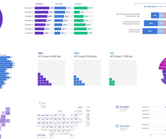
Barcode Plot. Bee Swarm Box Plot. Box-Percentile Plot. Density Plot. Dot Distribution Plot. HDR Box Plot. Notched Box Plot. Ridgeline Plot. Sina Plots. Stem & Leaf Plot. Violin Plot. Grouped Bar Chart. Side by Side Bar Chart. Stacked Bar Chart.
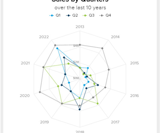
We already discussed bar charts , column charts , and area charts. Well, the most important differentiation is the fact that they use a distinct method to plot the data, and we’ll dive into this topic below. How do you plot a spider chart? This is done by plotting one polygon as the actual performance and another as the target.
Bar charts. Scatter plots. Bar graphs. A great feature of line charts is that you can combine them with other types of data visualization, such as bar graphs. Using a double y-axis, one for the bar graph and one for the line, allows you to show two elements of your story in one graph. 5) Bar Graphs.
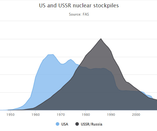
We have already dived into gauge charts , bar charts , and column charts , and today is the turn of area charts. An area chart, also known as a mountain chart, is a data visualization type that combines the appearance of a line chart and a bar chart. Let’s get started with the area chart definition! What Is An Area Chart?
We have already covered bar charts , column charts , spider charts , area charts , and gauge charts ; today is the turn of line charts. In this case, the vertical axis (y) represents the values of the data points, and the horizontal one (x) represents the time across which the data points are plotted.
To demonstrate the potential new content structure being implemented on an existing visualisation reference page, here’s an example provided for Bar Charts : Bar Chart. Other names: Bar Graph, BarPlot. Each category is assigned its own bar and the length of each bar is proportional to the value it represents.
Data Storytelling in a Bar Chart. The Default Bar Chart. The Traditional Bar Chart. We would: Enlarge the font Enlarge the bars (by decreasing the gap width ) Remove the border Add labels (optional—if we think our audiences would want specificity) Adjust the scale Use brand colors Use brand fonts. ” for themselves.
To get a view of how these rankings have changed over the past five years, let’s look at the data through a Bump Chart: Straight away we can see that the Box & Whisker Plot page has remained in first place for four years in a row now. The Bubble Chart page has remained strong and the Error Bars page continues to grow in strength.
We all know how to make Bar-Plots, Scatter Plots, and Histograms, yet we don’t pay much attention to beautify them. However, a good visualization is annoyingly hard to make. Moreover, it takes time and effort when it comes to present these visualizations to a bigger audience. This hurts us?-?our
Also known as an Arrow Plot, Arrow Chart, Change Graph, Difference Graph , or Arrow Bar Chart. A Change Bar Chart is a visualisation that compares multiple categories at two distinct points in time or between different conditions. The longer bars or lines help to illustrate where the largest amount of change has taken place.
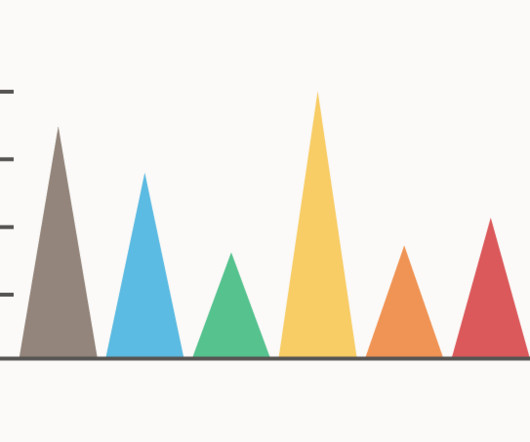
A Triangle Bar Chart is a variation of the traditional Bar Chart or Column Chart. Instead of using bars to represent discreet data, triangles are used as a more novel aesthetic. These triangles can be plotted either vertically or horizontally.
Andrew’s sharing examples of slider plots and step-by-step instructions for making them in Excel. I call them “slider plots.”. Full disclosure: I didn’t know until after I developed these, but Stephanie Evergreen posted a rough sketch version of this idea using auto-calculated standard error bars back in 2017. –Ann.
They help users explore data through visual elements like charts, graphs, plots, maps, and other visualizations. There are a variety of data visualization techniques for univariate analysis, including Box Plot, Histogram, PDF, CDF. Data visualization techniques for bivariate analysis are Scatter Plot and Heatmap. value_counts().plot.pie(explode=[0.05,0.05,0.05],autopct='%1.1f%%',shadow=True,figsize=(8,8))
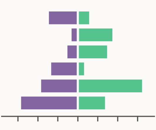
Also known as Side-by-Side Bar Chart, Back-to-Back Bar Chart, Paired Bar Chart, Butterfly Chart, Bilateral Bar Graph, Deviation Bar Graph. A Diverging Bar Chart is a visualisation of (typically) two contrasting data series displayed horizontally and side-by-side.
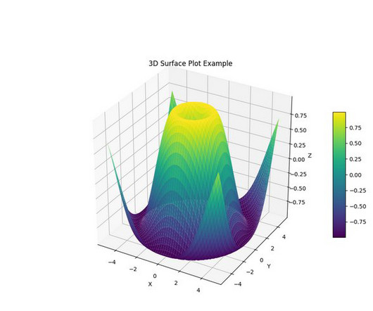
aspect=10) # Set labels and title ax.set_xlabel('X') ax.set_ylabel('Y') ax.set_zlabel('Z') ax.set_title('3D Surface Plot Example') %matplot plt As illustrated by the preceding examples, you can use any compatible visualization library by installing the required modules and then using the %matplot magic command.
That said, some of the most accomplished entrepreneurs and executives find it difficult to digest more than a pie chart, bar chart, or a neatly presented visual, nor do they have the time to delve deep into data. Moreover, lines make it simple to plot multiple series together. e) Bar or column chart. click to enlarge**.
Well, a scatter plot could be the basis of that but you would need to build the whole map somehow. They hacked Excel by using a standard feature such as the scatter plot. It was done by understanding how scatter plots are built. Scatter plots place your data in certain positions, based on the x,y coordinates provided.
We have more than 10 kinds of visualization views commonly used, including text tables, maps, pie charts, horizontal bars, stacked bars, tree views, scatter plots, histograms, Gantt charts, scatter charts, bubble charts, etc. The plotting style is similar to MATLAB, so it is called Matplotlib. From Google.
Now, we can depict the same data in a bar chart as well, where the vertical axis represents the names of the countries and the horizontal axis represents the number of manufacturing units. Pareto diagram is basically a combination of bar and chart. Once you get the numbers, you can order it in distribution table format. Pareto Diagram.
Plot the Data To start, just plot the data against a scale. Barcode Chart or Rug Plot. Just a simple line plotted for every point, usually with some transparency or a colour scale to deal with multiple points of the same value. Much like the Rug Plot but with circles or dots instead of lines. Unit Chart.
Generally speaking, the horizontal axis of the bar chart is the time dimension, and users habitually believe that there is a time trend. When you need to compare data, especially when comparing more than two whole components, be sure to use a bar chart or a column chart. Scatter Plot. Generally speaking, no more than 10.
However, this year I decided to try something different (instead of a Bump Chart) and use a Race Bar Chart to show how the ranking and page views have changed since 2017: With the help of small multiple Line Graphs, we can see if any growth has happened over the past six years based on the number of page views: These charts highlight quite dramatically (..)
Common analytics report chart types include interactive bar charts, line charts, bubble plots, area charts, and maps. The human brain favors strong narratives or a plot it can follow, so if your analysis report format is developed with storytelling in mind, you will make your business analysis report efforts far more powerful.
You might be thinking that I’m ignoring a visual attribute that could easily be added to this bubble plot: positions along the Z axis. the length of a bar in a bar graph). the direction in which bubbles move in an animated bubble plot). varying speeds in the movement of bubbles in an animated bubble plot).
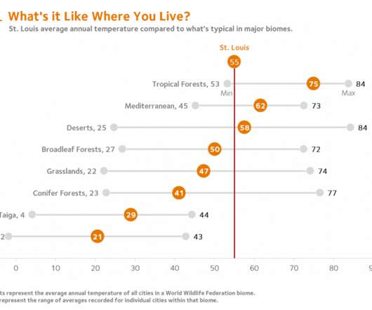
A simple table or a scatter plot serves the purpose quite well. By combining a single point scatter plot and error bars, a reference line can be inserted to mark local conditions. At a basic level, students can compare temperature and precipitation data for their local community with data for other cities around the world.
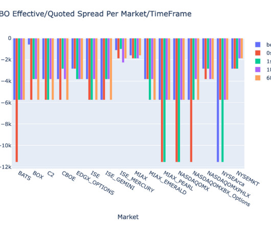
Each data frame contains quotes for one of the five time intervals for each data feed (BBO, NBBO): bbo = c[c['MarketParticipant'].isin(['BBO'])] isin(['BBO'])] bbo_bef = bbo[bbo['ReceiptTimestamp'] (tt+60000000000)] nbbo = c[~c['MarketParticipant'].isin(['BBO'])]
Maybe you’re already familiar with dot plots… Maybe you’re already using them… Maybe you can make ’em in your sleep… Or maybe you have no idea what I’m even talking about! (If You’ll learn about the differences between clustered bar charts and dot plots. This video is for you.)
If they’re brand new to dataviz, stick with the traditional charts like pie charts, bar charts, and line charts—otherwise they’ll spend more timing ooh-ing and aah-ing over the chart’s novelty than paying attention to the information contained in the chart. and implications of findings) than in statistical significance. New to Dataviz?
Lines, bars, pies… stress… choose the best-fit. #6. It is not a post about expressing your inner Excel geek with the most advanced remastered sparklines or conditional scatter plots. Then use three different bars to represent each stage of the process, and to fill each up to represent the percentages.
Below is a table with some statistics between the two years: Straight away you can see that the Box & Whisker Plot and Density Plot reference pages have still maintained their 1 st and 2 nd place positions from the previous year. The rest have either fallen off at some point or have jumped up from lower positions.
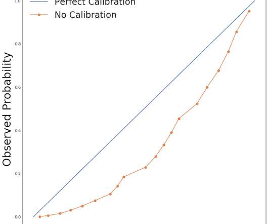
To examine the difference between these two models, let’s consider the expected quadratic loss function, which we can decompose as$$ E[(hat{p}-Y)^2] = E[(hat{p} - pi(hat{p}))^2] - E[(pi(hat{p}) - bar{pi})^2] + bar{pi} (1 - bar{pi}) $$where $pi(hat{p})$ is $Pr(Y | hat{p})$ and $bar{pi}$ is $Pr(Y)$.
Categories and values (see below) are plotted on axes. Throughout I use the word “category” to refer to something discrete that is plotted on an axis, for example France, Germany, Italy and The UK, or 2016, 2017, 2018 and 2019. With a few exceptions, the Charts described below plot values against categories.
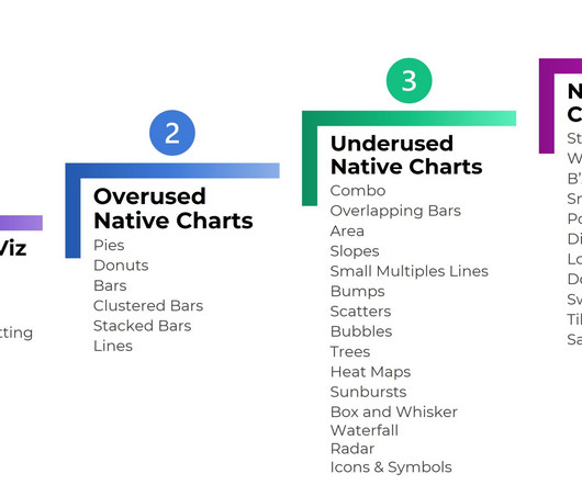
Level 1: Exploratory Viz We can make sparklines, data bars, and heat tables within seconds. Level 2: Overused Native Charts These are the familiar faces: Pies Donuts Bars and columns Clustered bars and clustered columns Stacked bars and stacked columns Line graphs What are Native Charts? Easy to make!
The boxplot, also known as a box-and-whisker plot, is a commonly used chart type in daily work and research. While most are familiar with bar charts, line graphs, pie charts, scatter plots, and Gantt charts , creating professional reports often requires utilizing more specialized and practical chart types like the boxplot.
Its dashboards, reports, and visualizations go far beyond bar and pie charts, but you don’t need to be a designer to create them. But with Power BI, you can simply drag a slider bar to show the impact of changes. You can drill into data, create a variety of visualizations, and (literally) ask questions about it using AI.
We organize all of the trending information in your field so you don't have to. Join 42,000+ users and stay up to date on the latest articles your peers are reading.
You know about us, now we want to get to know you!
Let's personalize your content
Let's get even more personalized
We recognize your account from another site in our network, please click 'Send Email' below to continue with verifying your account and setting a password.


Let's personalize your content