This site uses cookies to improve your experience. To help us insure we adhere to various privacy regulations, please select your country/region of residence. If you do not select a country, we will assume you are from the United States. Select your Cookie Settings or view our Privacy Policy and Terms of Use.
Cookie Settings
Cookies and similar technologies are used on this website for proper function of the website, for tracking performance analytics and for marketing purposes. We and some of our third-party providers may use cookie data for various purposes. Please review the cookie settings below and choose your preference.
Used for the proper function of the website
Used for monitoring website traffic and interactions
Cookie Settings
Cookies and similar technologies are used on this website for proper function of the website, for tracking performance analytics and for marketing purposes. We and some of our third-party providers may use cookie data for various purposes. Please review the cookie settings below and choose your preference.
Strictly Necessary: Used for the proper function of the website
Performance/Analytics: Used for monitoring website traffic and interactions
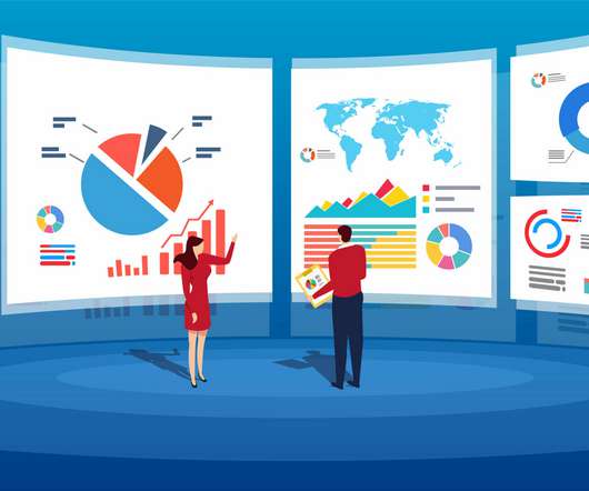
“By visualizing information, we turn it into a landscape that you can explore with your eyes. 90% of the information transmitted to the brain is visual. Concerning professional growth, development, and evolution, using data-driven insights to formulate actionable strategies and implement valuable initiatives is essential.
However, computerization in the digital age creates massive volumes of data, which has resulted in the formation of several industries, all of which rely on data and its ever-increasing relevance. Data analytics and visualization help with many such use cases. It is the time of bigdata.
Once you’ve set your data sources, started to gather the raw data you consider to offer potential value, and established clearcut questions you want your insights to answer, you need to set a host of keyperformanceindicators (KPIs) that will help you track, measure, and shape your progress in a number of key areas.
Data dashboards provide a centralized, interactive means of monitoring, measuring, analyzing, and extracting a wealth of business insights from relevant datasets in several key areas while displaying aggregated information in a way that is both intuitive and visual. How Data Dashboards Are Used In BI.
“Without bigdata analytics, companies are blind and deaf, wandering out onto the web like deer on a freeway.” – Geoffrey Moore. And, as a business, if you use your data wisely, you stand to reap great rewards. Data brings a wealth of invaluable insights that could significantly boost the growth and evolution of your business.
There are a lot of ways that organizations can leverage bigdata. Most of them don’t have difficulty collecting the data they need to make more informed decisions. However, they often struggle to conceptualize the data and present it in a format that supports their conclusions. There are a lot of benefits of bigdata.
There are three elements to our "bigdata" efforts, or unhyped normal data efforts: Data Collection, Data Reporting, and Data Analysis. Eliminate distractions, make data the hero! #5. Consolidate data, be as honest as you can be. #7. Ditch the text, visualize the story.
A modern data report offers a host of interactive data charts and visualizations you can use to your advantage. If you choose the right chart types – those that represent the information you’re looking to convey with your data analysis report – you will enhance communication and productivity.
Bigdata has been incredibly important in the marketing profession. Marketers need to rely heavily on bigdata technology to reach customers more effectively. Bigdata technology isn’t just important for making better insights. Here the information is usually collected from multiple data sources.
Bigdata plays a crucial role in online data analysis , business information, and intelligent reporting. Companies must adjust to the ambiguity of data, and act accordingly. The data-driven world doesn’t have to be overwhelming, and with the right BI tools , the entire process can be easily managed with a few clicks.
Data exploded and became big. Spreadsheets finally took a backseat to actionable and insightful datavisualizations and interactive business dashboards. The rise of self-service analytics democratized the data product chain. 2) Data Discovery/Visualization. We all gained access to the cloud.
“Without bigdata, you are blind and deaf and in the middle of a freeway.” – Geoffrey Moore, management consultant, and author. In a world dominated by data, it’s more important than ever for businesses to understand how to extract every drop of value from the raft of digital insights available at their fingertips.
This gives to that sales graph an overall sense of visual contrast which makes it much more digestible at a glance. A perfect example of how to present sales data, this profit-boosting sales chart offers a panoramic snapshot of your agents’ overall upselling and cross-selling efforts based on revenue and performance.
The purpose is not to track every statistic possible, as you risk being drowned in data and losing focus. Thanks to their real-time nature, you don’t need to struggle with the permanent synchronization: all your data is always up-to-date.
In fact, according to eMarketer, 40% of executives surveyed in a study focused on data-driven marketing, expect to “significantly increase” revenue. Not to worry – we’ll not only explain the link between bigdata and business performance but also explore real-life performance dashboard examples and explain why you need one (or several).
Business dashboards are the digital age tools for bigdata. Capable of displaying keyperformanceindicators (KPIs) for both quantitative and qualitative data analyses, they are ideal for making the fast-paced and data-driven market decisions that push today’s industry leaders to sustainable success.
Allow me to visualize the problem above, and leverage that visualization to present the solution. In order to make smart decisions about the data you need four things. As you might have guessed, you are at the very right of the above visual, with most access to data, the ability to analyze it ( inshallah! )
They collect data from various departments of the company tracking keyperformanceindicators ( KPIs ) and present them in an understandable way. In essence, data reporting is a specific form of business intelligence that has been around for a while. 4) Make your report visually pleasing through focus.
The term ‘bigdata’ alone has become something of a buzzword in recent times – and for good reason. But today, the development and democratization of business intelligence software empowers users without deep-rooted technical expertise to analyze as well as extract insights from their data. We read about it everywhere.
Over the past 5 years, bigdata and BI became more than just data science buzzwords. Without real-time insight into their data, businesses remain reactive, miss strategic growth opportunities, lose their competitive edge, fail to take advantage of cost savings options, don’t ensure customer satisfaction… the list goes on.
3) Top 15 Warehouse KPIs Examples 4) Warehouse KPI Dashboard Template The use of bigdata and analytics technologies has become increasingly popular across industries. Every day, more and more businesses realize the value of analyzing their own performance to boost strategies and achieve their goals.
Without bigdata analytics, companies are blind and deaf, wandering out onto the Web like deer on a freeway. Companies that use data analytics are five times more likely to make faster decisions, based on a survey conducted by Bain & Company. 90% of the information transmitted to the brain is visual.
To simplify things, you can think of back-end BI skills as more technical in nature and related to building BI platforms, like online datavisualization tools. Front-end analytical and business intelligence skills are geared more towards presenting and communicating data to others. b) If You’re Already In The Workforce.
By taking a closer look at the numbers, you can identify trends and insights to help inform decisions about using the best data. A great way to start analyzing your data is to create a dashboard of keyperformanceindicators (KPIs). Visualize Your Data. Invest in Data Security.
This can include a multitude of processes, like data profiling, data quality management, or data cleaning, but we will focus on tips and questions to ask when analyzing data to gain the most cost-effective solution for an effective business strategy. Today, bigdata is about business disruption.
AWS Glue has made this more straightforward with the launch of AWS Glue job observability metrics , which provide valuable insights into your data integration pipelines built on AWS Glue. However, you might need to track keyperformanceindicators across multiple jobs. Graph lines are visualized per job.
Let’s briefly describe the capabilities of the AWS services we referred above: AWS Glue is a fully managed, serverless, and scalable extract, transform, and load (ETL) service that simplifies the process of discovering, preparing, and loading data for analytics.
The Problems With Data Believe it or not, there are some significant problems associated with organizations having too much data, or working with more data than they can reasonably handle. If you’re obsessed with numerical data, you could easily be led to misleading conclusions. For example: Fixation on KPIs.
That is because graphical representations of data make it easier to convey important information to different audiences. That said, there is still a lack of charting literacy due to the wide range of visuals available to us and the misuse of statistics. Let’s dive into them.
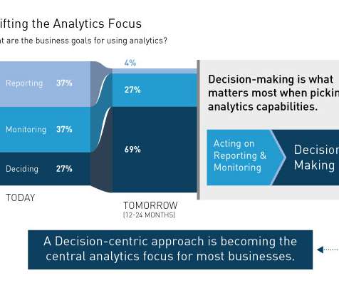
The research looked at the increasingly broad portfolio of analytic capabilities available to enterprises – everything from traditional Business Intelligence (BI) capabilities like reporting and ad-hoc queries to modern visualization and data discovery capabilities as well as advanced (predictive) analytics. Monitoring.
Exclusive Bonus Content: Ready to use data analytics in your restaurant? Get our free bite-sized summary for increasing your profits through data! Data offers the power to gain an objective, accurate, and comprehensive view of your restaurant’s daily functions. Let’s start by looking at the definition. Panoramic vision.
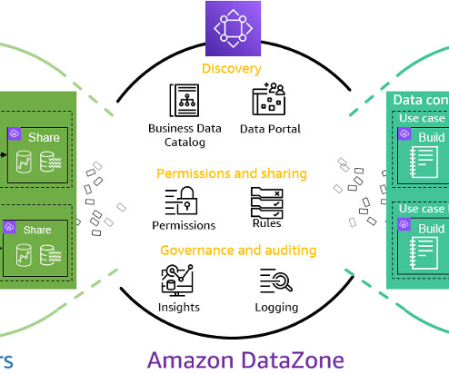
To address the issue of data quality, Amazon DataZone now integrates directly with AWS Glue Data Quality, allowing you to visualizedata quality scores for AWS Glue Data Catalog assets directly within the Amazon DataZone web portal. After applying the rules, the pipeline validates the data against those rules.
Businesses in the travel industry can analyze historical trends on travel peak travel seasons and customer KeyPerformanceIndicators (KPI) and can adjust services, amenities, and packages to match customer needs. Expanding bigdata. Enhanced data discovery and visualization.
Data analytics is the backbone in many modern organizations. Companies need to analyze data to optimize their business models in a variety of ways. They have found that bigdata has changed their business models in countless ways. UI/UX designer. Front-end + back-end (or full-stack).
Datavisualization is a powerful tool that can help improve decision-making across several industries, including business, finance, healthcare, and more. In this article, we will explore five ways in which datavisualization can enhance the decision-making process.
Look at your data source and divide all content into three categories: Tracked indicators: data that you will follow regularly but will not be used as performance measures. Untracked metrics: data you will not track. However, these data should be available for future analysis. Choose a qualified BI tool.
Using the right marketing KPIs (keyperformanceindicators) is a good start – what is now left is finding a way to organize it all in a way that makes sense and brings value. First things first – organizing and prioritizing your marketing data. 3) Online Advertising Performance. How do you know that?
Now, QuickSight supports creating threshold alerts on tables and pivot tables—our most popular visual types. This allows readers and authors to track goals or keyperformanceindicators (KPIs) and be notified via email when they are met. Then select a visual and choose Next.
Using a hybrid AI or machine learning (ML) model, you can train it on enterprise and published data, including newly acquired assets and sites. Through interactive dialog, it can generate visual analytics and promptly deliver content to your team.
The data points that characterize a time series are recorded in an orderly fashion and are chronological in nature. This class of data is present in every industry and is common at the core of many business requirements or keyperformanceindicators (KPIs). The following screenshot shows sample visualizations.
Solution overview In this post, we walk through a call center analytics solution that provides insights into the call center’s performance in near-real time through metrics that determine agent efficiency in handling calls in the queue. The near-real-time insights can then be visualized as a performance dashboard using OpenSearch Dashboards.
Facing the era of bigdata, we witness that large screens not only transmit data signals or images directly to the screen, but also conduct data analysis of information, so as to achieve efficient display. It also supports a large number of different data sources, and boasts many features as below: Features.
Given the volume of SaaS apps on the market (more than 30,000 SaaS developers were operating in 2023) and the volume of data a single app can generate (with each enterprise businesses using roughly 470 SaaS apps), SaaS leaves businesses with loads of structured and unstructured data to parse. What are application analytics?
First… it is important to realize that bigdata's big imperative is driving big action. Second… well there is no second, it is all about the big action and getting a big impact on your bottom-line from your big investment in analytics processes, consulting, people and tools. . #9:
We organize all of the trending information in your field so you don't have to. Join 42,000+ users and stay up to date on the latest articles your peers are reading.
You know about us, now we want to get to know you!
Let's personalize your content
Let's get even more personalized
We recognize your account from another site in our network, please click 'Send Email' below to continue with verifying your account and setting a password.


Let's personalize your content