This site uses cookies to improve your experience. To help us insure we adhere to various privacy regulations, please select your country/region of residence. If you do not select a country, we will assume you are from the United States. Select your Cookie Settings or view our Privacy Policy and Terms of Use.
Cookie Settings
Cookies and similar technologies are used on this website for proper function of the website, for tracking performance analytics and for marketing purposes. We and some of our third-party providers may use cookie data for various purposes. Please review the cookie settings below and choose your preference.
Used for the proper function of the website
Used for monitoring website traffic and interactions
Cookie Settings
Cookies and similar technologies are used on this website for proper function of the website, for tracking performance analytics and for marketing purposes. We and some of our third-party providers may use cookie data for various purposes. Please review the cookie settings below and choose your preference.
Strictly Necessary: Used for the proper function of the website
Performance/Analytics: Used for monitoring website traffic and interactions
Blogs Podcasts Whitepapers and Guides Tools and Calculators Webinars Sample Reports The Evolution of the CFO into the Chief DataStoryteller View Insight Now Our Favorite CFO Blogs The Venture CFO Blog Link: [link] Are you looking for blog posts for CFOs by CFOs? Then you have come to the right place.
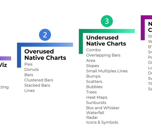
2) Charts And Graphs Categories 3) 20 Different Types Of Graphs And Charts 4) How To Choose The Right Chart Type Data and statistics are all around us. That is because graphical representations of data make it easier to convey important information to different audiences. Below we will discuss the graph and chart categories.
Concerning professional growth, development, and evolution, using data-driven insights to formulate actionable strategies and implement valuable initiatives is essential. Data visualization methods refer to the creation of graphical representations of information. That’s where data visualization comes in.
Modern dashboard software makes it simpler than ever to merge and visualize data in a way that’s as inspiring as it is accessible. Knowing who your audience is will help you to determine what data you need. Knowing what story you want to tell (analyzing the data) tells you which data visualization type to use.
2) When & When Not To Use Tables 4) Types Of Table Charts 5) How To Make A Table Chart 6) Table Graph Examples Visual representations of data are all around us. This is especially valuable in a business context, where data has become a company’s biggest competitive advantage. What Is A Table Graph?
A business dashboard offers at-a-glance insights based on key performance indicators (KPIs) and is an intuitive and visually pleasing way to consume data. Unlike early predecessors, they give presenters the ability to engage audiences with real-time data. How familiar they are with the data or KPIs.
Remove legends and directly label the data. And, it’s the most problematic for data visualization. Use DataStorytelling. Use datastorytelling , which I define as: writing takeaway titles instead of topical titles and. Color-Code by Category. Here are some common data phrases, re-written.
At Cloudera, an example of this leap is our first virtual Data Impact Awards , which was held in November last year. . One of our stand out moments of the awards was the introduction of the “Data Impact Achievement Award”. As an organisation, UOB has proven its fundamental understanding that the future is data-driven.
We live in a constantly-evolving world of data. That means that jobs in data big data and data analytics abound. The wide variety of data titles can be dizzying and confusing! The growth in the range of data job titles is a testament to the value that these experts bring to their organizations.
In this blog post, you’ll see 8 different types of icon use. Finally, we’ll color-code by category : blue for one group, and green for another. You’d obviously use your brand colors, not mine, but the technique is the same: one hue per category. I am a fan of using realistic icons to humanize the data.
Perhaps you now see why I’ve pivoted my career to Storytelling with data over the last couple of years. :). The solution was to leverage real-time signals like bad weather, flight delays at 5,145 airports, and other such data, combine that with ML powered algorithms to automate ads and messaging in the proximity of local airports.
4 Levels of Excel Vizardry I’ve taught data visualization in Excel a dozen different ways over the years. Level 1: Exploratory Viz We can make sparklines, data bars, and heat tables within seconds. I’ve blogged about these skills over and over and over because they’re the perfect launchpad. First, dip a toe in.
This is part of Ontotext’s AI-in-Action initiative aimed at enabling data scientists and engineers to benefit from the AI capabilities of our products. RED’s focus on news content serves a pivotal function: identifying, extracting, and structuring data on events, parties involved, and subsequent impacts.
The first of two data visualization workshops with @AnnKEmery is underway! And learning how we learn–the courses on cognition, memory, perception, and brain biology–are critical in my everyday work as a data visualization designer and speaker. Communicating Data in University Settings: APA Format. inch margins!
Media outlets are reporting that their COVID-19 data visualizations are their most viewed pages. This is our flagship data visualization course. Live Office Hours sessions, new modules, lifetime access, guest speakers discussing COVID-19 data, & more. Data visualization isn’t supposed to feel daunting.
If you are in the data business – my bread, butter and tofu – you often carry the burden of being the bearer of bad news. Negative data. Sadly still, negative data to the person/team receiving it. A decade ago, data people delivered a lot less bad news because so little could be measured with any degree of confidence.
Well, sort of—I changed the numbers and state names for this blog post.). Then, the second page (or second slide) can dive into disaggregated data. Analyze the Data. After we narrowed down the intended audience, we analyzed the data. Much more actionable than the original raw data, don’t you agree?
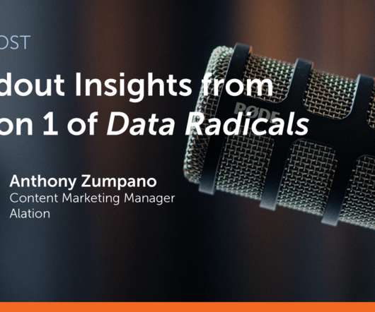
What do The Sopranos, Breaking Bad, and Data Radicals have in common? (No, That’s why I’m excited for the second season of Data Radicals , which launches on February 15. She told me they first started looking at their data at one of their cafeterias [in France] and saw an increase in the sale of breakfast sausage.
1) What Is Data Discovery? 2) Why is Data Discovery So Popular? 3) Data Discovery Tools Attributes. 5) How To Perform Smart Data Discovery. 6) Data Discovery For The Modern Age. We live in a time where data is all around us. Being a data-driven organization starts with understanding your data.
As in, the former is in the business of providing data, the latter in the business of understanding the performance implied by the data. We send out our multi-tab spreadsheets, our best Google Analytics custom reports , our great dashboards full of data , and more to the tactical layer of data clients.
Table of Contents 1) The Benefits Of Data Visualization 2) Our Top 27 Best Data Visualizations 3) Interactive Data Visualization: What’s In It For Me? 4) Static vs. Animated Data Visualization Data is the new oil? No, data is the new soil.” ” – David McCandless Humans are visual creatures.
While there is talk of the first filing being delayed until 2026, this still only leaves limited time to build robust systems and processes for gathering, verifying, and reporting comprehensive ESG data. Read our blog for more details information on CSRD requirement timelines.
We organize all of the trending information in your field so you don't have to. Join 42,000+ users and stay up to date on the latest articles your peers are reading.
You know about us, now we want to get to know you!
Let's personalize your content
Let's get even more personalized
We recognize your account from another site in our network, please click 'Send Email' below to continue with verifying your account and setting a password.


Let's personalize your content