This site uses cookies to improve your experience. To help us insure we adhere to various privacy regulations, please select your country/region of residence. If you do not select a country, we will assume you are from the United States. Select your Cookie Settings or view our Privacy Policy and Terms of Use.
Cookie Settings
Cookies and similar technologies are used on this website for proper function of the website, for tracking performance analytics and for marketing purposes. We and some of our third-party providers may use cookie data for various purposes. Please review the cookie settings below and choose your preference.
Used for the proper function of the website
Used for monitoring website traffic and interactions
Cookie Settings
Cookies and similar technologies are used on this website for proper function of the website, for tracking performance analytics and for marketing purposes. We and some of our third-party providers may use cookie data for various purposes. Please review the cookie settings below and choose your preference.
Strictly Necessary: Used for the proper function of the website
Performance/Analytics: Used for monitoring website traffic and interactions
Take a comfortable seat, enjoy the power of interactive business dashboards , leave your spreadsheets behind, and utilize the advantages of interactive dashboard design and its features. Real-time dashboards enable real-time data and that is the beauty and power of business intelligence at its core.
2) BI vs BA As Seen Through Football. 3) BI And BA Main Differences. 4) How Do BI And BA Apply To Business? 5) BI And BA Use-Case Scenarios. 6) BI And BA Examples. Try our professional BI and analytics software for 14 days free! BI is looking in the rearview mirror and using historical data.
With this thought in mind, BI tools develop multiple solutions to assist businesses in dealing with their information in the most efficient way possible. Try our professional BI reporting software for 14 days, completely free! Drill down and drill throughs are two powerful features of BI reporting tools.
2) Pros & Cons Of Bar Charts 3) When To Use A Bar Graph 4) Types Of Bar Charts 5) Bar Graphs & Charts Best Practices 6) Bar Chart Examples In today’s fast-paced analytical landscape, data visualization has become one of the most powerful tools organizations can benefit from to be successful with their analytical efforts.
The secret is out, and has been for a while: In order to remain competitive, businesses of all sizes, from startup to enterprise, need business intelligence (BI). You can have the most robust BI infrastructure in place. This is where the power of business dashboards comes into play. Digital age needs digital data.
Your Chance: Want to test a powerful agency analytics software? Your Chance: Want to test a powerful agency analytics software? datapine is an excellent BI software focused on delivering powerful online analysis features with a friendly interface, making it easy to use for anyone. What Are Agency Analytics?
Zero-ETL integration with Amazon Redshift reduces the need for custom pipelines, preserves resources for your transactional systems, and gives you access to powerful analytics. dbt Cloud is a hosted service that helps data teams productionize dbt deployments. Name the file sources.yml , then choose Create.
Today’s digital data has given the power to an average Internet user a massive amount of information that helps him or her to choose between brands, products or offers, making the market a highly competitive arena for the best ones to survive. 1) Blog Traffic And Blog Leads Report. Structure your metrics. click to enlarge**.
While there are several different types of processes that are implemented based on individual data nature, the two broadest and most common categories are “quantitative analysis” and “qualitative analysis”. The varying scales include: Nominal Scale: non-numeric categories that cannot be ranked or compared quantitatively.
A few years ago, I had encouraged a BI Director to create a BI dashboard showing the key financial metrics of their company and to show it to the CEO. Its not that finance people dont want or need BI dashboards, its that their needs are different to say someone in sales, marketing, operations or HR.
This genie (who we’ll call Data Dan) embodies the idea of a perfect data analytics platform through his magic powers. Nominal – you organize your data in non-numeric categories that cannot be ranked or compared quantitatively. Let’s say that you have access to an all-knowing business genie who can see into the future.
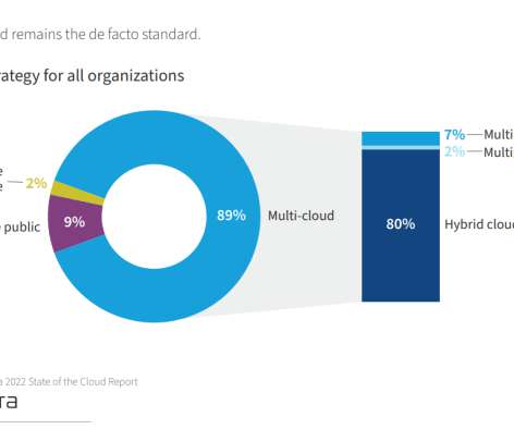
We have already predicted in our BI trends article the importance and implementation of the cloud in companies like Alibaba, Amazon, Google and Microsoft. The IT industry broke it into three categories to help better define use cases. Now, we’re going to dig a little deeper. The capabilities and breadth of the cloud are enormous.
First, locate the value scale axis and the category axis, to identify what is being visualised. Each category is assigned its own bar and the length of each bar is proportional to the value it represents. Colour-coding can be assigned to the bars to distinguish each category in the dataset. ” in each category.
Today, there are online data visualization tools that make it easy and fast to build powerful market-centric research dashboards. The first market research KPI in this most powerful report example comes in the form of unaided brand awareness. Primary KPIs: a) Unaided Brand Awareness. c) Brand image.
A Barcode Plot is a chart used to visualise the data distribution across multiple categories by plotting short stripes along an axis. There are two main kind of Barcode Plot: first, the kind that plots a series of “barcodes” to compare the distributions between various categories across a single dimension.
2) When To Use Spider Graphs 3) Types Of Radar Charts 4) Radar Graph Best Practices 5) Spider Chart Examples If you are reading this blog post then you must be somewhat aware of the value of data visualization. Sales Our second example is a multiple grouping spider web diagram tracking the revenue by product category.
To help eradicate that knowledge gap, at datapine, we are putting together a series of blog posts that do a deep dive into each type of graph and chart with their most common use cases and a list of examples and best practices. In this case, the area graph is elevated by adding secondary axes with an additional category.
These are powerful tools that you can apply to increase internal business performance. This powerful KPI from this most critical financial report sample serves to express the difference between budgeted and genuine figures for a particular accounting category. Do you want to improve your business’s financial health today?
2) Charts And Graphs Categories 3) 20 Different Types Of Graphs And Charts 4) How To Choose The Right Chart Type Data and statistics are all around us. Below we will discuss the graph and chart categories. These categories will build a solid foundation that will help you pick the right visual for your analytical aims.
One of our most powerful business dashboards , the supply chain dashboard boasts a digestible, functional, and visual representation of all key areas of supply chain performance, from inventory accuracy and turnover to the inventory-to-sales ratio. That’s where the power of the dashboard comes into play.
With the help of the right logistics analytics tools, warehouse managers can track powerful metrics and KPIs and extract trends and patterns to ensure everything is running at its maximum potential. Now, let’s look at some benefits to keep putting the power of warehouse key performance indicators into perspective. Lets get started!
You will be able to make sense of all the financial data and metrics as they will be split into actionable categories and presented in an intuitive, scannable fashion, no matter the metric you need to include and analyze. For optimizing reports and detail analysis, you can check our blog article about financial report examples.
Also, we will give a brief introduction of what business analysts should do and the tools often used for BI&A. Business intelligence and analytics (BI&A) and the related field of big data analytics have emerged as an increasingly important area in the business communities. BI Dashboard (by FineReport). Definition.
Discover the power of visual data analysis with our 14-days free trial. One of the most common types of visuals, the bar chart is often used to compare two or more values in the same category such as which product is sold the most in the women’s department. Discover the power of visual data analysis with our 14-days free trial.
Fortunately, we live in a digital age rife with statistics, data, and insights that give us the power to spot potential issues and inefficiencies within the business. Download our guide to find out about the power of procurement reports! Download our guide to find out about the power of procurement reports!
The data dictionary remains a crucial tool for BI teams to organize their metadata. The implementation of automation in data technology has made these tools even more powerful. Importance of a Data Dictionary Tool in BI. Our blog post will help you figure it out! Take Me to the Blog Post.
It is composed of various accounts, these accounts represent categories that show where your money is going and where is it coming from. Examples of accounts payable include transportation and logistics, production materials, energy/power, and building leasings, among others. So, let’s take a step back and see what can be done.
The fundamental categories that differentiate these questions are based on: Relationship. Data-driven storytelling is a powerful force as it takes stats and metrics and puts them into context through a narrative that everyone inside or outside of the organization can understand. Distribution. Composition. Comparison of data.
While there’s no quickfire solution or definitive answer to this question, we can say that investing in data-driven solutions, reporting tools , and leveraging the power of restaurant analytics will help you succeed in this most cutthroat of industries. You’ll be able to divide your menu items into 4 categories: 1.
That is why, at datapine, we are putting together a series of blog posts that do a deep-dive into the different types of graphs and charts to help our audience understand the role each visual plays in their analytical journey and how they can be used to extract the maximum potential out of their data. What Is A Table Graph?
After consuming a number of YouTube videos, blog posts, articles, and playing around with ChatGPT, I felt the need to write down my thoughts and observations on the topic. Point #3 is kind of pointless or badly written because the category names should already be in the category axis.
The emergence of real-time cloud-based BI reporting tools has changed the data reporting game. The right BI platform can blend multiple data sources into one report and analysis: enhancing business insights and better-informed decision making. Numerous types of data visualization have proven to be extremely powerful.
If you want to convey crucial information to decision-makers in the easiest and most effective way possible, you need to embrace the power of interactive dashboards. Do they want to get more social reach on the blog posts your company is putting out? Do they care about helping their staff get more sales and leads?
The solution to this problem is to ensure that your BI and analytics platform can handle as many sources and forms of data as possible, both on-premises and on the cloud , so that you don’t neglect or miss any of it. Furthermore, systems powered by AI and augmented analytics continuously learn what people choose to do with data.
In a data-driven business environment, it’s increasingly vital to harness the power of data to develop actionable insights and make the best decisions. As a result, BI and analytics teams are important for empowering everyone to explore data and use analytic apps to take data-driven actions, wherever they are within an organization.
IDC, BARC, and Gartner are just a few analyst firms producing annual or bi-annual market assessments for their research subscribers in software categories ranging from data intelligence platforms and data catalogs to data governance, data quality, metadata management and more.
The data dictionary remains a crucial tool for BI teams to organize their metadata. The implementation of automation in data technology has made these tools even more powerful. Importance of a Data Dictionary Tool in BI. Our blog post will help you figure it out! Take Me to the Blog Post.
One of my favorite parts of the annual IBIS event is the Dashboard Awards as every year I love to see the amazing dashboard solutions organizations have created with BI tools. Here are the categories and the winners: The 2021 Best Business Dashboard Award. The 2021 Limitless BI Dashboard Award. Congratulations!
bi-survey.com has launched an innovative market overview with the clear goal of offering our visitors the fastest and most intelligent way to browse through the Azure Analytics ecosystem and find added value as well as the right partner for their initiatives. Additionally, you can promote your webinars for free. What does the website offer?
The basic idea is of course that the amount of the circle taken up by each sector is proportional to the count of items associated with each category, A through E. They show how a number of categories contribute to a whole figure, but they only show relative figures (percentages of the whole if you like) and not the absolute figures.
Also, we will give a brief introduction of what business analysts should do and the tools often used for BI&A. Business intelligence and analytics (BI&A) and the related field of big data analytics have emerged as an increasingly important area in the business communities. BI Dashboard (by FineReport). Definition.
Today, through a strategic partnership, Signals Analytics and Sisense are making it easy to incorporate external data analytics into a company’s main BI environment. Combining internal and external data unlocks powerful insights that can drive innovation, product development, marketing, partnerships, acquisitions, and more.
Even if you are in the super-jaded category, this will help you present something to your boss's boss that will get them to finally understand what you do! Then go to Google (or Yandex or Baidu or Seznam ) and type in your top category queries, see who shows up in organic and paid search listings. What are their key strengths?
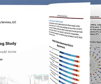
This achievement is a testament not only to our legacy of helping to create the data catalog category but also to our continued innovation in improving the effectiveness of self-service analytics. In their Wisdom of Crowds® Data Catalog Market Study, Dresner assessed data catalog solutions from the perspective of business intelligence (BI).
We organize all of the trending information in your field so you don't have to. Join 42,000+ users and stay up to date on the latest articles your peers are reading.
You know about us, now we want to get to know you!
Let's personalize your content
Let's get even more personalized
We recognize your account from another site in our network, please click 'Send Email' below to continue with verifying your account and setting a password.


Let's personalize your content