This site uses cookies to improve your experience. To help us insure we adhere to various privacy regulations, please select your country/region of residence. If you do not select a country, we will assume you are from the United States. Select your Cookie Settings or view our Privacy Policy and Terms of Use.
Cookie Settings
Cookies and similar technologies are used on this website for proper function of the website, for tracking performance analytics and for marketing purposes. We and some of our third-party providers may use cookie data for various purposes. Please review the cookie settings below and choose your preference.
Used for the proper function of the website
Used for monitoring website traffic and interactions
Cookie Settings
Cookies and similar technologies are used on this website for proper function of the website, for tracking performance analytics and for marketing purposes. We and some of our third-party providers may use cookie data for various purposes. Please review the cookie settings below and choose your preference.
Strictly Necessary: Used for the proper function of the website
Performance/Analytics: Used for monitoring website traffic and interactions
Take a comfortable seat, enjoy the power of interactive business dashboards , leave your spreadsheets behind, and utilize the advantages of interactive dashboard design and its features. Thankfully, it’s also time to take a step back from your spreadsheets and slides. With modern reporting tools , there is no need to do so.
It could also make sense to utilize business intelligence software , especially since datasets in recent years have expanded in so much volume that spreadsheets can no longer provide quick and intelligent solutions needed to acquire a higher quality of data. Which scales apply to your different datasets? The values simply express an order.
This type of analysis is not feasible with traditional paper reports and spreadsheet tools. Determining which overarching category your dashboard sits in is the first order of business. Now that we have separated the dashboards into two large categories, let’s dig deeper. So What Types Of Dashboards Work Best For You?
Apparently, the CEO was not impressed and told him that he didnt want to see colors and pretty interactive charts, he just wanted a spreadsheet! Needless to say, the CEO had an accounting background and was a finance guy used to numbers and spreadsheets.
Rather than adding streams of tenuous data to a static spreadsheet, a full market research report brings the results of market-driven research to life, giving users a data analysis tool to create actionable strategies from a range of consumer-driven insights. This market survey report sample KPI focuses on aided brand awareness.
2) Charts And Graphs Categories 3) 20 Different Types Of Graphs And Charts 4) How To Choose The Right Chart Type Data and statistics are all around us. Below we will discuss the graph and chart categories. These categories will build a solid foundation that will help you pick the right visual for your analytical aims.
You can learn more about adding intentional gaps in this blog post. Bold the Key Words & Color-Code by Category For extra skimmability, we bolded a few key words. Separate colors for separate categories of information. Color-coding by category is one of my all-time favorite dataviz techniques!
Before: Compiling the Data in a Spreadsheet. I decided because I had one time point and wanted to compare categories (i.e., I remembered that in the Dashboard Design course Ann had a video on how to compare categories using heatmaps. Here’s a blog post tutorial you can read.). teams) that bars would likely be best.
Due to the way the human brain processes information, presenting insights in charts or graphs to visualize significant amounts of complex data is more accessible than relying on spreadsheets or reports. Data visualizations relieve them from that burden by providing easy access to relevant performance insights. e) Bar or column chart.
I started to write a blog post with screenshots about sections… but that felt impossible. Sections help us organize our slides into meaningful groups, categories, chunks, buckets, or chapters of a presentation. I personally like using sections so I can think about an entire category of slides that should be shown or hidden.).
Throughout years these reports have been created and managed through traditional means of data management such as spreadsheets or static presentations but companies need to hurl these stone-age practices and start utilizing modern online reporting software that will transform your results, and ultimately, increase profits.
In a previous blog , we have covered how Pandas Profiling can supercharge the data exploration required to bring our data into a predictive modelling phase. For example, are the numbers we are seeing actually referring to categories or are the dates provided in a specific format? import dtale masses2 = df.copy().
The fundamental categories that differentiate these questions are based on: Relationship. Data visualization is based on painting a picture with your data rather than leaving it sitting static in a spreadsheet or table. Distribution. Composition. Comparison of data. Spider charts. Bar charts. Columned visualizations. Scatter plots.
If you’ve read this blog before, or heard me speak, then you know that designing data visualization makeovers is one of my favorite activities of all time. I color-coded by category (one color for increases, another color for decreases). I intentionally sorted the categories into those that increased and those that decreased.
After consuming a number of YouTube videos, blog posts, articles, and playing around with ChatGPT, I felt the need to write down my thoughts and observations on the topic. Point #3 is kind of pointless or badly written because the category names should already be in the category axis.
All BI teams are capable of producing a data dictionary, whether they use data dictionary SQL tools or Excel, but manual methods, such as the creation of a spreadsheet, are less reliable and far more time-consuming than an automated data dictionary tool. Our blog post will help you figure it out! Take Me to the Blog Post.
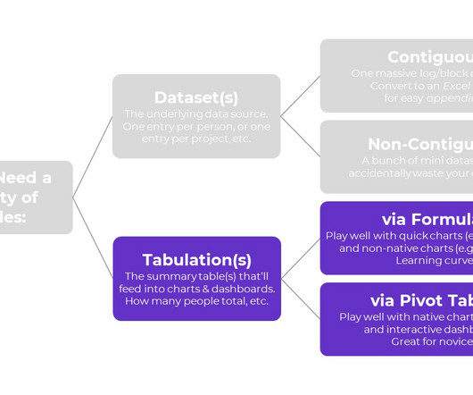
Step 1: Build the Clean, Contiguous Dataset From previous blog posts , you know that table is a tricky term. You can learn more about cleaning, recoding, and transforming datasets inside Simple Spreadsheets , my prerequisite course. You can learn more about the pros and cons of each approach in this blog post.
Editor's note: The Google Sheets add-on described in this blog post is no longer supported externally by Google. While big data remains a focus of this blog, there are exciting innovations happening in other areas as well. After all, working with data in spreadsheets involves serious limitations, with scale being an obvious one.
The IT industry broke it into three categories to help better define use cases. Traditional spreadsheets no longer serve their purpose, there is just too much data to store, manage and analyze. The capabilities and breadth of the cloud are enormous. It’s completely free!
When Google talked about releasing this tool in its blog, the brand pointed out that if you don’t protect user data, you risk losing people’s trust. The website breaks down the types of charts into categories. Kubernetes. It offers numerous styles to consider, ranging from bar charts to heatmaps.
Even without access to the raw data (let's say I'm a busy McKinsey blog post writer), you can make a couple of simple changes to the graph to make it cleaner and less sloppy… Clean up the title, rephrase it. Then we have it for the company and its category. Move the y-axis description to the right place.
Instead, we’ll group the individual questions into categories. And I’m definitely cringing again during the blogging process. And I grouped the survey questions into categories and then color-coded by category (Staff in turquoise, Clients in purple, Caseworkers in red, and so on). Clustered bars aren’t inherently evil.
In this blog post, we’ll cover 10 skills that can make your next data project easier, faster, and error-free. This is a little jargony for a blog post, so if you’d like to learn more, let me know. I’ve got video resources in everyday language inside our Simple Spreadsheets course. But it doesn’t have to be a headache, either.
fall under this category. For example, defining information such as schema or rules about the minimum and maximum valid values in a spreadsheet which is analyzed by a tool play a significant role in minimizing the unnecessary burden laid on data ingestion. Videos, pictures etc.
In this blog post, we will delve into the concept of zero-based budgeting, exploring its definition, advantages, disadvantages, implementation steps, and tools needed. By evaluating each expense category, decision-makers gain better visibility into the cost structure of the organization.
If you’ve ever worked with publicly available government data, you probably know the headache and eye strain that comes with trying to make sense of a huge spreadsheet. In this blog post, I’m going to explain how you can easily create a customized chart that will make your federal grant data conversations a breeze. Sorting the Data .
However, their manual planning and budgeting process in spreadsheets posed several challenges, including lack of control, delayed data, poor execution, and the need for continuous follow-up with IT for actual data. For Al Rabie —a prominent juice manufacturing company in the Middle East—their reality was no different.
Often times, reports are piled with large volumes of spreadsheets and presentation slides that can create an obscure view on the presented data, and increase the possibility of (unintentional) errors. Gaining access to these business touchpoints will equip you with the best possible ingredients to stay competitive on the market.
Spreadsheet software like Excel, Google Sheets, or traditional database management systems all mainly deal with quantitative data. This means it describes the characteristics or qualities of data units, such as “what type,” “which category,” “who” (or “which persona”).
All BI teams are capable of producing a data dictionary, whether they use data dictionary SQL tools or Excel, but manual methods, such as the creation of a spreadsheet, are less reliable and far more time-consuming than an automated data dictionary tool. Our blog post will help you figure it out! Take Me to the Blog Post.
Formulas: Necessary for Tabulating Numbers In Simple Spreadsheets , we talk about the calculations needed for different types of variables: nominal, ordinal, interval, and ratio. When it comes to formulas, we can put these variables into two buckets: numbers and categories. In other words, we don’t have to write any formulas!
Ever wonder why you can pick out detail in an image with ease while staring at spreadsheets makes your head hurt? The length or height of bars is proportional to the frequency of the category. We can count the values of various categories using bar plots. A bar plot is a plot that presents categorical data with rectangular bars.
Broadly speaking it is important to internalize that humans are going to get out of the campaign business (campaign management, content, offers, manual spreadsheet massaging, handful of keywords/pages/whatever focus, etc.). In Analytics and Optimization, almost everything we do today would fit in the category of frequent high-volume tasks.
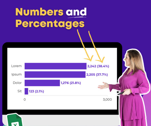
I have hundreds of blog posts and YouTube videos and conference presentations all about accessibility in dataviz. For example, you can add the category name. We did category, we did value, we did percentage. Right now, it’s category, comma, number, comma, percentage. Scroll down on your spreadsheet.
When you’re working in the weeds of a spreadsheet, it can be hard to step back and find the bigger picture. Well, sort of—I changed the numbers and state names for this blog post.). Their spreadsheet was essentially organized like this: Analyze the Audience. Download the Spreadsheet. They rated each site’s progress.
These can include day-to-day files like Excel spreadsheets or Word documents or system files and directories that contain critical data needed to restore a system or application. Database backups: The third category of backups are database backups.
On this blog, you’ve seen numerous attempts by me to remedy the dilemma. Or, that if an Agency is providing a 40 tab, font size 8, spreadsheet full of numbers that they must have done a lot of work – hence better value for money. Roughly compute what percentage of the team’s time was spent in each category. What do you see?
This blog post will break down how to use quantitative and qualitative data, as well as some common methods for analyzing the data to uncover quality insights. It generally falls into one of two categories: Descriptive statistics or inferential statistics. Creating categories. Subscribe to Alation's Blog. Coding the text.
Practice along with me using the spreadsheets, handouts, and ebook. Learn about scaling, shading, collapsing categories, and building diverging or small multiples charts. The videos were easy to follow along and the detailed blog posts with Excel hacks saved me a ton of time. This is our flagship data visualization course.
Too often, companies manage data in spreadsheets or individual databases. The three categories of NPS are: Detractors: These are unhappy customers who can disparage and hurt your brand by sharing negative experiences. Subscribe to Alation's Blog. Legacy Technologies and Manual Processes.
If you are a regular reader of this blog, : ), then you are more than likely fall in the business side of the house rather than the technology side of the house. Dimension Widening – hello sweet simple data from spreadsheets, data warehouses/CRM systems! Notice I said partial. :). Universal Analytics is seeped in technical ese.
And if you’re tired, like I clearly am just scroll down below the video, because I’m going to give you this spreadsheet with the template that I’m using so you can just download it and just punch in your numbers and not have to start from scratch. We’re going to have category [00:04:00] A, B, C, D. Let me know.
Yes, that additional $6 mil is not as hard to accomplished for an imaginative focused team – in fact you can get that from implementing half of the recommendations in this blog post. Present a yummy spreadsheet that quantifies the cost of inaction , how much money you’ll lose by not delivering a 25% improvement every week.
We send out our multi-tab spreadsheets, our best Google Analytics custom reports , our great dashboards full of data , and more to the tactical layer of data clients. In fact 86.4% of all Analyst careers fail due to a lack of this critical last mile skill! It is really 88%. : ). Old timey gas station pumps? A new race of aliens?
We organize all of the trending information in your field so you don't have to. Join 42,000+ users and stay up to date on the latest articles your peers are reading.
You know about us, now we want to get to know you!
Let's personalize your content
Let's get even more personalized
We recognize your account from another site in our network, please click 'Send Email' below to continue with verifying your account and setting a password.


Let's personalize your content