This site uses cookies to improve your experience. To help us insure we adhere to various privacy regulations, please select your country/region of residence. If you do not select a country, we will assume you are from the United States. Select your Cookie Settings or view our Privacy Policy and Terms of Use.
Cookie Settings
Cookies and similar technologies are used on this website for proper function of the website, for tracking performance analytics and for marketing purposes. We and some of our third-party providers may use cookie data for various purposes. Please review the cookie settings below and choose your preference.
Used for the proper function of the website
Used for monitoring website traffic and interactions
Cookie Settings
Cookies and similar technologies are used on this website for proper function of the website, for tracking performance analytics and for marketing purposes. We and some of our third-party providers may use cookie data for various purposes. Please review the cookie settings below and choose your preference.
Strictly Necessary: Used for the proper function of the website
Performance/Analytics: Used for monitoring website traffic and interactions
“By visualizing information, we turn it into a landscape that you can explore with your eyes. And when you’re lost in information, an information map is kind of useful.” – David McCandless. Data visualization methods refer to the creation of graphical representations of information. A sort of information map. Did you know?
Graphs and knowledge graphs are all around us. We use them every day without realizing. For example, GPS, social media, cell phone handoffs are modeled as graphs while data catalogs, data lineage and MDM tools leverage knowledge graphs for linking metadata with semantics.
1) What Is Data Interpretation? 2) How To Interpret Data? 3) Why Data Interpretation Is Important? 4) Data Analysis & Interpretation Problems. 5) Data Interpretation Techniques & Methods. 6) The Use of Dashboards For Data Interpretation. What Is Data Interpretation? Table of Contents.
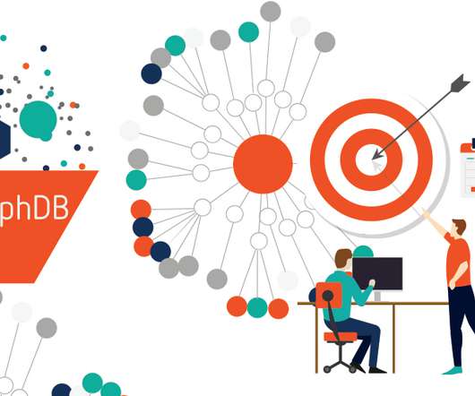
The term “knowledge graph” (KG) has been gaining popularity for quite a while now. Today, as the number of decision-makers recognizing the importance of more dynamic, contextually aware and intelligent information architectures is growing, so is the number of companies with solutions based on knowledge graphs.
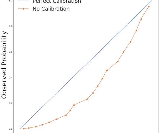
by LEE RICHARDSON & TAYLOR POSPISIL Calibrated models make probabilistic predictions that match real world probabilities. Calibration applies in many applications, and hence the practicing data scientist must understand this useful tool. One useful property of these predictions is calibration. What is calibration?
It is painfully heartbreaking to realize that a very small tiny number of people who have access to web analytics tools actually use them. I mean really use the tools. Ravaging data. Leverage Custom Alerts – Let Data Kick Your Butt Into Action. #3. Leverage Custom Alerts – Let Data Kick Your Butt Into Action. #3.
dbt is an open source, SQL-first templating engine that allows you to write repeatable and extensible data transforms in Python and SQL. dbt is predominantly used by data warehouses (such as Amazon Redshift ) customers who are looking to keep their data transform logic separate from storage and engine.
An article in the Investor’s Business Daily titled “ Dow Jones Futures Jump As Virus Cases Slow; Why This Stock Market Rally Is More Dangerous Than The Coronavirus Market Crash ” (April 6, 2020, by Ed Carson) brought this concern to mind when I read the following table of numbers and the accompanying commentary: U.S. points, or 7.73%).
There’s been a lot of criticism that knowledge graphs are too complex. In Computer Science, we are trained to use the Okham razor – the simplest model of reality that can get the job done is the best one. So, why do we recommend knowledge graphs, which are perceived to be complex, to our customers?
As an end-user, when you use OpenSearch’s search capabilities, you generally have a goal in mind—something you want to accomplish. Along the way, you use OpenSearch to gather information in support of achieving that goal (or maybe the information is the original goal).
An armored Knowledge Graph platform with enough power to enrich an entire planet. An armored Knowledge Graph platform with enough power to enrich an entire planet. Jem Rayfield races home aboard his starship, custodian of the stolen plans that can save your people and restore freedom within the enterprise… Contents.
The more applications that an enterprise deploys, the more data that exists for collecting and analyzing. Yet, this data isn’t worth much without the right tools for monitoring, optimizing, storing and—crucially—putting the data into context. This capability enables the APIs to collect telemetry data.
According to a West Monroe Partners’ survey, 68% of business and technology leaders surveyed don’t believe their competitors are leveraging data successfully. Obviously, when it comes to your competitive market space, your business does not want to exist in that 68% of the pie chart!
With growing pressure on data scientists, every organization needs to ensure that their teams are empowered with the right tools. Data science notebooks have become a crucial part of the data science practice. Data science notebooks have become a crucial part of the data science practice.
Last week, Quest released erwin Data Intelligence by Quest version 12.0, a pivotal release for erwin Data Intelligence customers. Industry analysts, data domain field experts and erwin Data Intelligence customer advisory board members have all shown positive early reactions to its new capabilities in several key areas.
In my sixth year of self-employment, the demand for data visualization skills is stronger than ever. Are you ready to take your organization’s data communications skills to the next level? The once-a-year enrollment period is now open for Great Graphs: Transform Spreadsheets into Stories. What’s Included. We’ll go broad?
If you are a regular reader of this blog, you are quite familiar with this sentiment. Your business is unique. You can download them into your Google Analytics account via one click (along with some lovely Advanced Segments and a Dashboard). Your life will be simpler. Hostname [Domains with your GA code].
When you are done reading the post, you'll be super mad that your marketing strategy is not more influenced by your competitor's data! Regular readers of the blog know of my deep love for competitive intelligence analysis. My first blog post on the topic of CIA was on 14th Aug 2006!
When I work with companies, I do my very best to bring my deep and undying passion for creativity and digital awesomeness to them. One manifestation of that is the stories I tell by comparing and contrasting the client's digital existence with others I consider best of breed. There are 7 in total. I really do.
We are all blessed with more data than we know what to do with, and all for the price of a few lines of JavaScript added to your website. In this type of an environment, I've frequently stressed the value of identifying targets for your key performance indicators. Own data benchmarks. Competitor data benchmarks.
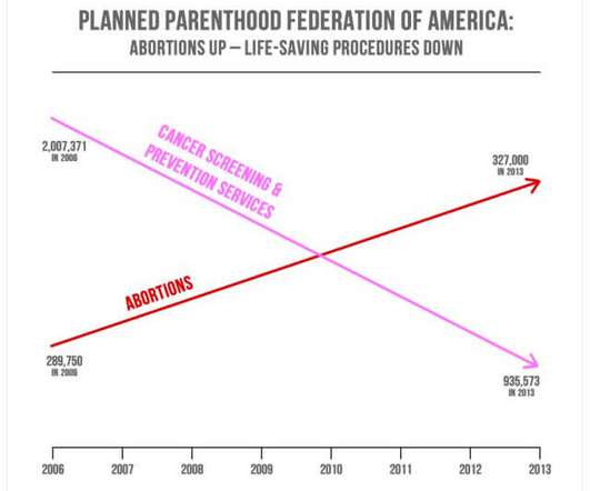
1) Misleading Data Visualization Examples. 3) The Impact Of Bad Data Visualizations. But while that may be the case, people are duped by data visualizations every day. Bad data visualizations come in many forms, with some more obvious than others. Your Chance: Want to create your own data visualizations for free?
Statistics are infamous for their ability and potential to exist as misleading and bad data. Exclusive Bonus Content: Download Our Free Data Integrity Checklist. Get our free checklist on ensuring data collection and analysis integrity! While numbers don’t lie, they can in fact be used to mislead with half-truths.
The saying “knowledge is power” has never been more relevant, thanks to the widespread commercial use of big data and data analytics. The rate at which data is generated has increased exponentially in recent years. Essential Big Data And Data Analytics Insights. million searches per day and 1.2
Yes, data is important. While there is a great deal of appreciation for the power of metrics/data, I've come to realize that Sr. Leaders don't quite appreciate the deep, and often corrosive, consequences of choosing metric x over metric y as a key performance indicator (KPI). Helps make marketing better.
I trimmed down the interview for you here: [link] What’s Inside 0:00 Welcome 4:50 Spilled ranges: What makes interactive data visualizations like this possible in Excel 8:33 How to make interactive parallel coordinates in Excel (via a scatter plot!?!) Carlos is the best. We accidentally talked for almost 2 hours (!!)
I believe deeply in the value of making data accessible. In service of that belief, there are few things that bring me as much joy as visualizing data (smart segmentation comes close). By design none of them from the world of digital analytics, though I’ll stay connected to that world from a how could you use this idea perspective.
We organize all of the trending information in your field so you don't have to. Join 42,000+ users and stay up to date on the latest articles your peers are reading.
You know about us, now we want to get to know you!
Let's personalize your content
Let's get even more personalized
We recognize your account from another site in our network, please click 'Send Email' below to continue with verifying your account and setting a password.


Let's personalize your content