This site uses cookies to improve your experience. To help us insure we adhere to various privacy regulations, please select your country/region of residence. If you do not select a country, we will assume you are from the United States. Select your Cookie Settings or view our Privacy Policy and Terms of Use.
Cookie Settings
Cookies and similar technologies are used on this website for proper function of the website, for tracking performance analytics and for marketing purposes. We and some of our third-party providers may use cookie data for various purposes. Please review the cookie settings below and choose your preference.
Used for the proper function of the website
Used for monitoring website traffic and interactions
Cookie Settings
Cookies and similar technologies are used on this website for proper function of the website, for tracking performance analytics and for marketing purposes. We and some of our third-party providers may use cookie data for various purposes. Please review the cookie settings below and choose your preference.
Strictly Necessary: Used for the proper function of the website
Performance/Analytics: Used for monitoring website traffic and interactions
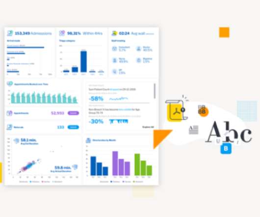
Enter data dashboards – one of history’s best innovations in business intelligence. To help you understand this notion in full, we’re going to explore a data dashboard definition, explain the power of dashboard data, and explore a selection of data dashboard examples. What Is A Data Dashboard? click to enlarge**.
The rise of innovative, interactive, data-driven dashboard tools has made creating effective dashboards – like the one featured above – swift, simple, and accessible to today’s forward-thinking businesses. Dashboard design should be the cherry on top of your business intelligence (BI) project. Consider your end goal.
CFO dashboards exist to enhance the strategic as well as the analytical efforts related to every financial aspect of your business. Here, we’ll explore the dynamics of reports for CFOs, look at CFO reporting tools, and consider real-world examples of both CFO dashboards and reports. Benefit from great CFO dashboards & reports!
With a powerful dashboard maker , each point of your customer relations can be optimized to maximize your performance while bringing various additional benefits to the picture. Your Chance: Want to build professional CRM reports & dashboards? Your Chance: Want to build professional CRM reports & dashboards?
In this blog, we explore 5 key principles that exist to ensure you create a relevant dashboard that guides and simplifies the user experience, makes it as easy as possible to interpret what is presented no matter its complexity, and increases the adoption of BI.
This blog is a tutorial for building intuitive frontend interfaces for Machine Learning models using two popular open-source libraries […] The post Streamlit vs Gradio – A Guide to Building Dashboards in Python appeared first on Analytics Vidhya.
Exclusive Bonus Content: Reap the benefits of dashboards for CEOs! CEO dashboards and CEO reports are the answer. By leveraging the power of an online dashboard , an executive story can be written effortlessly, and within minutes. What Is A CEO Dashboard? Mobility through 24/7 mobile dashboard access.
By taking an online data visualization approach to handling your company’s strategic activities, big or small, you will make your business more cohesive, collaborative, intelligent and profitable – and project management dashboards will help you do just that. Download right here our free guide and get started with dashboards!
This is where the power of business dashboards comes into play. Dashboards often are the best way to gain insight into an organization and its various departments, operations and performance. Well-built, focused dashboards easily serve up summaries and reports of the BI that’s most critical to the organization.
The answer is modern agency analytics reports and interactive dashboards. Starting with its definition, following with the benefits of agency reports, a list of tools, and a set of agency dashboard examples. Agencies benefit from interactive dashboard tools to prove the success of their strategies and campaigns to clients.
That said, if you’re looking to evolve your empire, increase brand awareness, and boost your bottom line, embracing business performance dashboards and big data should be at the top of your priority list. You need data-driven decisions, and a dashboard for business performance will make sure you reap the best possible rewards.
The good news is that you can utilize both with the help of a modern and professional SQL dashboard. That said, in this post, we will take a detailed look into what is a SQL dashboard, how to create one (or several), and provide you with visual examples that will represent the undeniable power that SQL has on offer.
Soon businesses of all sizes will have so much amount of information that dashboard software will be the most invaluable resource a company can have. That’s why we welcome you to the world of interactive dashboards. Your Chance: Want to test interactive dashboard software for free? What Is An Interactive Dashboard?
We won’t delve into details about the career prospects of this C-level position but we will present COO dashboards and reports that are critical for helping chief operating officers across the world to effectively manage their time, company, operational processes, and results. How to create a COO dashboard? What is a COO report?
Gathering data and information from one or multiple platforms and creating a comprehensive social media dashboard is equally important as creating the social content itself. Here we will present a social media dashboard definition, a guide on how to create one, and finalize with social media dashboard templates at the end of the article.
By utilizing recruiting KPIs presented through the medium of visual and interactive HR dashboards , it’s possible to use recruitment metrics to better interpret and evaluate a variety of talent acquisition factors that aid in hiring processes. Exclusive Bonus Content: What are recruiting metrics & dashboards for?
And the best way to do so is by using digital dashboards and a modern online reporting tool. What Is A Call Center Dashboard? Online data visualization tools are the fast track to improved customer service intelligence, and robust contact center dashboards exist for that very purpose. We offer a 14-day free trial.
Digital dashboards not only help you to drill down into the insights that matter most to your business, but they also offer an interactive visual representation that assists in swifter, more informed decision-making as well as the discovery of priceless new insights. Your Chance: Want to build your own digital dashboard with a few clicks?
A customer retention dashboard and metrics depicted in a neat visual will help you in monitoring, analyzing, and managing multiple customer-centric points and how they echo in your business. Your Chance: Want to build a dashboard for customer retention? Try our professional dashboard software for 14 days, completely free!
2) What Is A Content Dashboard? 4) Content Dashboards Examples. As a content manager, you most likely spend most of your time writing quality blogs, email newsletters, and social media posts, all in an effort to ensure the business is growing and achieving its goals. What Is A Content Dashboard? Table of Contents.
That’s where SaaS dashboards enter the fold. A SaaS dashboard is a powerful business intelligence tool that offers a host of benefits for ambitious tech businesses. Exclusive Bonus Content: Your Definitive Guide to SaaS & Dashboards! Geet our bite-sized free summary and start building your dashboards!
Whatever your sector or niche, if you want to remain adaptable and get one step ahead of the competition, working with the right data-driven tools and utilizing a corporate dashboard is essential. That’s where corporate dashboards come in. Your Chance: Want to create your own dynamic corporate dashboard? 1) CFO dashboard.
2) Benefits Of White Label Reports 3) Key White Label Reporting Features 4) White Label Dashboards & Report Examples In today’s competitive business environment, building a brand that is trusted, recognizable, and loved by many is not an easy task. Your Chance: Want to build your own white label reports & dashboards?
1) What Is A Small Business Dashboard? 3) Why Do You Need Small Business Dashboards. 4) Small Business Dashboard & KPIs Examples. Enter small business dashboards and metrics. BI dashboard tools provide smaller businesses with valuable insights regarding their operations thanks to real-time access to data.
Now With Actionable, Automatic, Data Quality Dashboards Imagine a tool that can point at any dataset, learn from your data, screen for typical data quality issues, and then automatically generate and perform powerful tests, analyzing and scoring your data to pinpoint issues before they snowball. New Quality Dashboard & Score Explorer.
1) What Is A Monitoring Dashboard? 2) Why Do You Need Monitoring Dashboards? 3) Tips For Monitoring Dashboard Design. 4) Monitoring Dashboard Templates. Enter monitoring dashboards. Your Chance: Want to test a modern monitoring dashboard software? What Is A Monitoring Dashboard? Table of Contents.
A few years ago, I had encouraged a BI Director to create a BI dashboard showing the key financial metrics of their company and to show it to the CEO. Its not that finance people dont want or need BI dashboards, its that their needs are different to say someone in sales, marketing, operations or HR.
The importance of this finance dashboard lays within the fact that every finance manager can easily track and measure the whole financial overview of a specific company while gaining insights into the most valuable KPIs and metrics. SaaS management dashboard. click to enlarge**. Explore our 14-day free trial. click to enlarge**.
Blogs Podcasts Whitepapers and Guides Tools and Calculators Webinars Sample Reports The Evolution of the CFO into the Chief Data Storyteller View Insight Now Our Favorite CFO Blogs The Venture CFO Blog Link: [link] Are you looking for blog posts for CFOs by CFOs? Then you have come to the right place.
On the other hand, if you’re in the HR industry, then an HR dashboard could be the best answer you’re looking for. At this stage, you have developed your plan, set the timeframe, identified and communicated with relevant stakeholders, and now it’s time to choose the right dashboard tool. Concentrate on technicalities. Budget-friendly.
As we have already talked about in our previous blog post on sales reports for daily, weekly or monthly reporting, you need to figure out a couple of things when launching and executing a marketing campaign: are your efforts paying off? 1) Blog Traffic And Blog Leads Report. Annual Marketing Report Examples. click to enlarge**.
Often this is done through innovative dashboard software , visualizing once complicated tables and graphs in such ways that more people can initiate good data driven business decisions. For example, you need to have your finances under control at all costs: Open Financial Overview Dashboard in Fullscreen.
In this blog post, we’re going to give a bit of background and context about management reports, and then we’re going to outline 10 essential best practices you can use to make sure your reports are effective. However, the use of dashboards, big data, and predictive analytics is changing the face of this kind of reporting.
Today, there are online data visualization tools that make it easy and fast to build powerful market-centric research dashboards. How To Present Your Results: 3 Market Research Example Dashboards. When it comes to sharing the most important information, research dashboards are invaluable. Let’s take a closer look.
3) “The Big Book Of Dashboards: Visualizing Your Data Using Real-World Business Scenarios” by Steve Waxler, Jeffrey Shaffer, and Andy Cotgreave. Our next best book to learn data visualization is the “The Big Book Of Dashboards”. It is a definitive reference for anyone who wants to master the art of dashboarding.
A host of business intelligence concepts are executed through intuitive, interactive tools and dashboards – a centralized space that provides the ability to drill down into your data with ease. Data dashboarding and reporting. 4) Data dashboarding and reporting. But more on that later. The data warehouse. 1) The raw data.
Finally, we will show how to combine those metrics with the help of modern KPI software and create professional supply chain dashboards. You can even include supply delivery metrics in your performance dashboard focused on the supply chain, and monitor it more closely. Supply Chain Management Dashboard Examples. Return Reason.
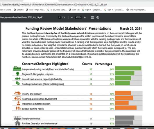
This guest post comes from Amadu Sidi Bah, who’s graduated from our Simple Spreadsheets, Great Graphs, Report Redesign, and Dashboard Design courses. I then quickly realized by enrolling In the Dashboard Design training course, the foundational data viz skill were laying asleep in me only to be woken up at a slightest chance.
Each information can be gathered into a single, live dashboard , that will ultimately secure a fast, clear, simple, and effective workflow. As seen in the example above, this sales performance dashboard can give you a complete overview of sales targets and insights on whether the team is completing their individual objectives.
Typically presented in the form of an interactive dashboard , this kind of report provides a visual representation of the data associated with your predetermined set of key performance indicators – or KPI data, for short. Set up a report which you can visualize with an online dashboard. Consider your data sources.
Ad hoc reporting, also known as one-time ad hoc reports, helps its users to answer critical business questions immediately by creating an autonomous report, without the need to wait for standard analysis with the help of real-time data and dynamic dashboards. Easy to use: .
Use digital dashboards: When considering the question “what is an analytical report,” it’s important to think about the best medium in terms of usability and presentation. By using an online dashboard , you will be able to gain access to dynamic metrics and data in a way that’s digestible, actionable, and accurate.
Note: While using Postman or Insomnia to run the API calls mentioned throughout this blog, choose AWS IAM v4 as the authentication method and input your IAM credentials in the Authorization section. Navigate to the OpenSearch Dashboard’s endpoint connected with your OpenSearch Service domain. curl -XGET _cat/indices?
In the matter, data analysis and dashboard designer software is a precious ally. We will finish by presenting a business dashboard that will show how those metrics work together when depicting an inventory data-story. Inventory Metrics Examples On Dynamic Dashboards. a) Inventory analytics dashboard for supply chain.
We organize all of the trending information in your field so you don't have to. Join 42,000+ users and stay up to date on the latest articles your peers are reading.
You know about us, now we want to get to know you!
Let's personalize your content
Let's get even more personalized
We recognize your account from another site in our network, please click 'Send Email' below to continue with verifying your account and setting a password.


Let's personalize your content