This site uses cookies to improve your experience. To help us insure we adhere to various privacy regulations, please select your country/region of residence. If you do not select a country, we will assume you are from the United States. Select your Cookie Settings or view our Privacy Policy and Terms of Use.
Cookie Settings
Cookies and similar technologies are used on this website for proper function of the website, for tracking performance analytics and for marketing purposes. We and some of our third-party providers may use cookie data for various purposes. Please review the cookie settings below and choose your preference.
Used for the proper function of the website
Used for monitoring website traffic and interactions
Cookie Settings
Cookies and similar technologies are used on this website for proper function of the website, for tracking performance analytics and for marketing purposes. We and some of our third-party providers may use cookie data for various purposes. Please review the cookie settings below and choose your preference.
Strictly Necessary: Used for the proper function of the website
Performance/Analytics: Used for monitoring website traffic and interactions
Soon businesses of all sizes will have so much amount of information that dashboard software will be the most invaluable resource a company can have. Visualizing the data and interacting on a single screen is no longer a luxury but a business necessity. That’s why we welcome you to the world of interactivedashboards.
The rise of innovative, interactive, data-driven dashboard tools has made creating effective dashboards – like the one featured above – swift, simple, and accessible to today’s forward-thinking businesses. Dashboard design should be the cherry on top of your business intelligence (BI) project. Consider your end goal.
Enter data dashboards – one of history’s best innovations in business intelligence. To help you understand this notion in full, we’re going to explore a data dashboard definition, explain the power of dashboard data, and explore a selection of data dashboard examples. What Is A Data Dashboard? click to enlarge**.
CFO dashboards exist to enhance the strategic as well as the analytical efforts related to every financial aspect of your business. Here, we’ll explore the dynamics of reports for CFOs, look at CFO reporting tools, and consider real-world examples of both CFO dashboards and reports. Benefit from great CFO dashboards & reports!
With a powerful dashboard maker , each point of your customer relations can be optimized to maximize your performance while bringing various additional benefits to the picture. Your Chance: Want to build professional CRM reports & dashboards? Your Chance: Want to build professional CRM reports & dashboards?
The answer is modern agency analytics reports and interactivedashboards. Starting with its definition, following with the benefits of agency reports, a list of tools, and a set of agency dashboard examples. Explore our 14 days free trial & benefit from interactive agency reports! What Are Agency Analytics?
Exclusive Bonus Content: Reap the benefits of dashboards for CEOs! CEO dashboards and CEO reports are the answer. By leveraging the power of an online dashboard , an executive story can be written effortlessly, and within minutes. What Is A CEO Dashboard? Mobility through 24/7 mobile dashboard access.
This is where the power of business dashboards comes into play. Dashboards often are the best way to gain insight into an organization and its various departments, operations and performance. Well-built, focused dashboards easily serve up summaries and reports of the BI that’s most critical to the organization.
This is where interactive weekly reports come into the picture. Powered by interactive visualizations, managers use these reports to outline the progress of the week and find improvement opportunities for the future. We will see these interactive reports in action throughout the post. What Is A Weekly Report?
That said, if you’re looking to evolve your empire, increase brand awareness, and boost your bottom line, embracing business performance dashboards and big data should be at the top of your priority list. You need data-driven decisions, and a dashboard for business performance will make sure you reap the best possible rewards.
The good news is that you can utilize both with the help of a modern and professional SQL dashboard. That said, in this post, we will take a detailed look into what is a SQL dashboard, how to create one (or several), and provide you with visual examples that will represent the undeniable power that SQL has on offer.
We won’t delve into details about the career prospects of this C-level position but we will present COO dashboards and reports that are critical for helping chief operating officers across the world to effectively manage their time, company, operational processes, and results. How to create a COO dashboard? What is a COO report?
By utilizing recruiting KPIs presented through the medium of visual and interactive HR dashboards , it’s possible to use recruitment metrics to better interpret and evaluate a variety of talent acquisition factors that aid in hiring processes. Exclusive Bonus Content: What are recruiting metrics & dashboards for?
And the best way to do so is by using digital dashboards and a modern online reporting tool. What Is A Call Center Dashboard? Online data visualization tools are the fast track to improved customer service intelligence, and robust contact center dashboards exist for that very purpose. We offer a 14-day free trial.
Digital dashboards not only help you to drill down into the insights that matter most to your business, but they also offer an interactive visual representation that assists in swifter, more informed decision-making as well as the discovery of priceless new insights. Try our professional dashboard software for 14 days, completely free!
2) What Is A Content Dashboard? 4) Content Dashboards Examples. As a content manager, you most likely spend most of your time writing quality blogs, email newsletters, and social media posts, all in an effort to ensure the business is growing and achieving its goals. What Is A Content Dashboard? Table of Contents.
That’s where SaaS dashboards enter the fold. A SaaS dashboard is a powerful business intelligence tool that offers a host of benefits for ambitious tech businesses. Exclusive Bonus Content: Your Definitive Guide to SaaS & Dashboards! Geet our bite-sized free summary and start building your dashboards!
A customer retention dashboard and metrics depicted in a neat visual will help you in monitoring, analyzing, and managing multiple customer-centric points and how they echo in your business. Your Chance: Want to build a dashboard for customer retention? Try our professional dashboard software for 14 days, completely free!
Whatever your sector or niche, if you want to remain adaptable and get one step ahead of the competition, working with the right data-driven tools and utilizing a corporate dashboard is essential. That’s where corporate dashboards come in. Your Chance: Want to create your own dynamic corporate dashboard? 1) CFO dashboard.
2) Benefits Of White Label Reports 3) Key White Label Reporting Features 4) White Label Dashboards & Report Examples In today’s competitive business environment, building a brand that is trusted, recognizable, and loved by many is not an easy task. Your Chance: Want to build your own white label reports & dashboards?
We will discuss report examples and templates you can use to create your own report, use its features in an interactive way, and discover relevant inputs for your specific industry. In the process, we will use an online data visualization software that lets us interact with, and drill deeper into bits and pieces of relevant data.
1) What Is A Monitoring Dashboard? 2) Why Do You Need Monitoring Dashboards? 3) Tips For Monitoring Dashboard Design. 4) Monitoring Dashboard Templates. Enter monitoring dashboards. Your Chance: Want to test a modern monitoring dashboard software? What Is A Monitoring Dashboard? Table of Contents.
By gaining the ability to gather, organize and analyze the metrics that are most important to your organization, you stand to make your business empire more intelligent than ever before – and executive reporting and business dashboards will help you do just that. Exclusive Bonus Content: Executive Dashboards & Reports: A Summary.
A few years ago, I had encouraged a BI Director to create a BI dashboard showing the key financial metrics of their company and to show it to the CEO. Apparently, the CEO was not impressed and told him that he didnt want to see colors and pretty interactive charts, he just wanted a spreadsheet!
To successfully gain control and improve a company’s technological needs, CTO dashboards and reports are needed as invaluable tools that consolidate multiple data points and support chief officers in strategic developments as well as online data analysis efforts, empowering their status of champions for new solutions.
If you want to convey crucial information to decision-makers in the easiest and most effective way possible, you need to embrace the power of interactivedashboards. A business dashboard offers at-a-glance insights based on key performance indicators (KPIs) and is an intuitive and visually pleasing way to consume data.
In this blog post, we’re going to give a bit of background and context about management reports, and then we’re going to outline 10 essential best practices you can use to make sure your reports are effective. However, the use of dashboards, big data, and predictive analytics is changing the face of this kind of reporting.
1) What Is A Small Business Dashboard? 3) Why Do You Need Small Business Dashboards. 4) Small Business Dashboard & KPIs Examples. Enter small business dashboards and metrics. BI dashboard tools provide smaller businesses with valuable insights regarding their operations thanks to real-time access to data.
Today, there are online data visualization tools that make it easy and fast to build powerful market-centric research dashboards. On a typical market research results example, you can interact with valuable trends, gain an insight into consumer behavior, and visualizations that will empower you to conduct effective competitor analysis.
As we have already talked about in our previous blog post on sales reports for daily, weekly or monthly reporting, you need to figure out a couple of things when launching and executing a marketing campaign: are your efforts paying off? To know if you are successful, you first need to define success and track it. 1) Web Analytics Report.
Ad hoc reporting, also known as one-time ad hoc reports, helps its users to answer critical business questions immediately by creating an autonomous report, without the need to wait for standard analysis with the help of real-time data and dynamic dashboards. Easy to use: .
Mobile technology has changed the way we interact with the world around us, and when it comes to analyzing valuable business insights, mobile dashboards offer the freedom and flexibility to turn stats into success while you’re on the go. What Is A Mobile Dashboard? Why Are Mobile Dashboards Important?
An online BI dashboard. Thanks to specific business intelligence best practices for dashboard design. Exclusive Bonus Content: Download Our Free Dashboard Checklist! Get the free guide with great tips for your dashboard implementation! What Is The Definition Of A BI Dashboard? How can you create one?
Want to make an interactivedashboard in Microsoft Excel? Interactive (a.k.a. dynamic) dashboards are a great option for technical audiences that have the time and interest to explore the data for themselves. They’ll look something like this: Interactivedashboards are easy to create — sort of.
On the other hand, if you’re in the HR industry, then an HR dashboard could be the best answer you’re looking for. At this stage, you have developed your plan, set the timeframe, identified and communicated with relevant stakeholders, and now it’s time to choose the right dashboard tool. Concentrate on technicalities. Budget-friendly.
Since humans process visual information 60.000 times faster than text , the workflow can be significantly increased by utilizing smart intelligence in the form of interactive, and real-time visual data. Each information can be gathered into a single, live dashboard , that will ultimately secure a fast, clear, simple, and effective workflow.
Use digital dashboards: When considering the question “what is an analytical report,” it’s important to think about the best medium in terms of usability and presentation. By using an online dashboard , you will be able to gain access to dynamic metrics and data in a way that’s digestible, actionable, and accurate.
This is possible thanks to the user-friendly approach of modern online data analysis tools that allow an average user, without the need for any technical knowledge, to use data in the shape of interactive graphs and charts in their decisions making process. Gauge charts can be effectively used with a single value or data point. d) Area chart.
While traditional reports often include a summary, body, and conclusion in a written format, this post will focus on interactive monthly reports created with a professional dashboard creator. All these reports were carefully created with an intuitive BI dashboard software. What Is The Purpose Of Monthly Reporting?
c) Dashboard Features. Business intelligence tools provide you with interactive BI dashboards that serve as powerful communication tools to keep teams engaged and connected. 3) Dashboards. Here you will find some of the main BI tool features related to dashboard management: a) Built-in dashboard templates.
Spreadsheets finally took a backseat to actionable and insightful data visualizations and interactive business dashboards. Today, managers and workers need to interact differently as they face an always-more competitive environment. Over the past decade, business intelligence has been revolutionized.
A host of business intelligence concepts are executed through intuitive, interactive tools and dashboards – a centralized space that provides the ability to drill down into your data with ease. Data dashboarding and reporting. 4) Data dashboarding and reporting. But more on that later. The data warehouse. 1) The raw data.
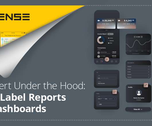
What are white-labeled reports White-label reports: Under the hood Exploring white-label dashboards Use case snapshots Horsepower under the hood. The ability to add best-in-class dashboards to your app but brand them as your own gives your app a new pathway to success without expending serious dev time. What are white-labeled reports?
We organize all of the trending information in your field so you don't have to. Join 42,000+ users and stay up to date on the latest articles your peers are reading.
You know about us, now we want to get to know you!
Let's personalize your content
Let's get even more personalized
We recognize your account from another site in our network, please click 'Send Email' below to continue with verifying your account and setting a password.


Let's personalize your content