This site uses cookies to improve your experience. To help us insure we adhere to various privacy regulations, please select your country/region of residence. If you do not select a country, we will assume you are from the United States. Select your Cookie Settings or view our Privacy Policy and Terms of Use.
Cookie Settings
Cookies and similar technologies are used on this website for proper function of the website, for tracking performance analytics and for marketing purposes. We and some of our third-party providers may use cookie data for various purposes. Please review the cookie settings below and choose your preference.
Used for the proper function of the website
Used for monitoring website traffic and interactions
Cookie Settings
Cookies and similar technologies are used on this website for proper function of the website, for tracking performance analytics and for marketing purposes. We and some of our third-party providers may use cookie data for various purposes. Please review the cookie settings below and choose your preference.
Strictly Necessary: Used for the proper function of the website
Performance/Analytics: Used for monitoring website traffic and interactions
Visualizing the data and interacting on a single screen is no longer a luxury but a business necessity. That’s why we welcome you to the world of interactive dashboards. But before we delve into the bits and pieces of our topic, let’s answer the basic questions: What is an interactive dashboard, and why you need one?
Now that you’re sold on the power of data analytics in addition to data-driven BI, it’s time to take your journey a step further by exploring how to effectively communicate vital metrics and insights in a concise, inspiring, and accessible format through the power of visualization. They can be fun and interactive, too.
This is where interactive weekly reports come into the picture. Armed with powerful visualizations and real-time data, modern weekly summary reports enable businesses to closely monitor their performance and the progress of their strategies to extract relevant insights and optimize their processes to ensure constant growth.
“By visualizing information, we turn it into a landscape that you can explore with your eyes. 90% of the information transmitted to the brain is visual. Data visualization methods refer to the creation of graphical representations of information. That’s where data visualization comes in. A sort of information map.
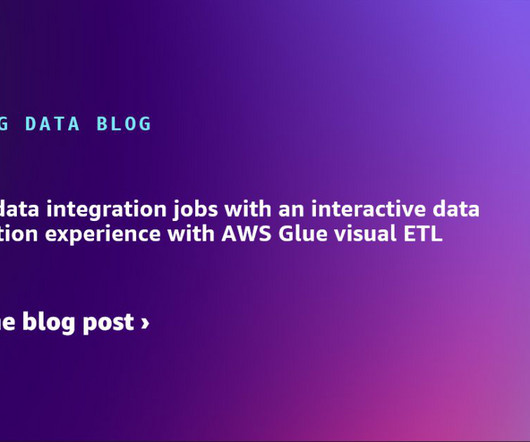
We are excited to announce a new capability of the AWS Glue Studio visual editor that offers a new visual user experience. Now you can author data preparation transformations and edit them with the AWS Glue Studio visual editor. Within the new experience, you can choose from hundreds of prebuilt transformations.
The rise of innovative, interactive, data-driven dashboard tools has made creating effective dashboards – like the one featured above – swift, simple, and accessible to today’s forward-thinking businesses. If your dashboard is visually organized , users will easily find the information they need. Flat design is really trendy nowadays.
5) The Role Of Visuals In Accountant Reports. To do so, however, you need several tools: a good accounting software, but also a solid online data visualization tool. We will go deeper into the role of visuals for efficient financial analysis, but first, let’s take a deeper look into the common types of financial reports.
In todays data-driven world, securely accessing, visualizing, and analyzing data is essential for making informed business decisions. For instance, a global sports gear company selling products across multiple regions needs to visualize its sales data, which includes country-level details.
Modern dashboard software makes it simpler than ever to merge and visualize data in a way that’s as inspiring as it is accessible. Knowing what story you want to tell (analyzing the data) tells you which data visualization type to use. Let’s assume you have the right data and the right data visualization software. Distribution.
Data dashboards provide a centralized, interactive means of monitoring, measuring, analyzing, and extracting a wealth of business insights from relevant datasets in several key areas while displaying aggregated information in a way that is both intuitive and visual. Lack of different data visualization types. click to enlarge**.
We will discuss report examples and templates you can use to create your own report, use its features in an interactive way, and discover relevant inputs for your specific industry. Here we take the time to define business report, explore visual report examples, and look at how to write one for various needs, goals, and objectives.
Finally, we will show you a real-life example so you can get a visual overview and a clearer picture of the points discussed in this article. Professional CRM reporting technologies are interactive, customizable, and offer a wealth of potential when it comes to telling an effective story with your data. Let’s begin.
Data visualization has become a major part of life for those looking to make use of the large swathes of data available in the modern world. That’s where data visualization comes in. Data visualization is, to put it simply, converting hard data and lists of numbers or facts, into an easier to comprehend form.
In this blog post, we’re going to give a bit of background and context about management reports, and then we’re going to outline 10 essential best practices you can use to make sure your reports are effective. 4) Make your report visually pleasing through focus. Who are my most profitable clients? 6) Go digital!
Moreover, a host of ad hoc analysis or reporting platforms boast integrated online data visualization tools to help enhance the data exploration process. Typically, ad hoc data analysis involves discovering, presenting, and actioning information for a smaller, more niche audience and is slightly more visual than a standard static report.
Serving as a central, interactive hub for a host of essential fiscal information, CFO dashboards host dynamic financial KPIs and intuitive analytical tools, as well as consolidate data in a way that is digestible and improves the decision-making process. CFO dashboard KPIs offer a digestible visual representation of what matters most.
The answer is modern agency analytics reports and interactive dashboards. Explore our 14 days free trial & benefit from interactive agency reports! Agencies benefit from interactive dashboard tools to prove the success of their strategies and campaigns to clients. What Are Agency Analytics?
Spreadsheets finally took a backseat to actionable and insightful data visualizations and interactive business dashboards. Companies are no longer wondering if data visualizations improve analyses but what is the best way to tell each data-story. 2) Data Discovery/Visualization. Data exploded and became big.
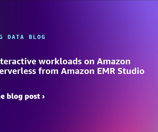
Starting from release 6.14, Amazon EMR Studio supports interactive analytics on Amazon EMR Serverless. EMR Studio is an integrated development environment (IDE) that makes it straightforward for data scientists and data engineers to develop, visualize, and debug analytics applications written in PySpark, Python, and Scala.
We can also see below a visual business intelligence project template which can be used in any finance department or company: **click to enlarge**. The final BI project template looked similar to this visual: **click to enlarge**.
The traditional types of reporting don’t meet the requirements of today’s data management nor can they produce efficiency like an interactive dashboard where sets of data are presented in a complementary way. Cloud-based, real-time online data visualization software enables fast, data-driven action by decision-makers. Have no fear!
Today, there are online data visualization tools that make it easy and fast to build powerful market-centric research dashboards. On a typical market research results example, you can interact with valuable trends, gain an insight into consumer behavior, and visualizations that will empower you to conduct effective competitor analysis.
A CEO dashboard is an interactive platform that visualizes data to empower business leaders to track, measure, analyze, and monitor business performance in a number of areas, enabling them to make data-driven decisions and see the big business picture. The right design & visualizations. Let’s get started.
In some cases, you will need a coding solution where you can build your own queries, but in others, you will also look for a visual representation of your realational data. How To Create SQL Dashboards – Coding & Visuals. The good news is that you can utilize both with the help of a modern and professional SQL dashboard.
One additional element to consider is visualizing data. Since humans process visual information 60.000 times faster than text , the workflow can be significantly increased by utilizing smart intelligence in the form of interactive, and real-time visual data. Implementation in any industry or department.
But with dynamic, interactive dashboard reporting software , your structure will be far simpler and more holistic. A modern data report offers a host of interactive data charts and visualizations you can use to your advantage.
Robust analysis platforms will not only allow you to pull critical data from your most valuable sources while working with dynamic KPIs that will offer you actionable insights; it will also present the information in a digestible, visual, interactive format from one central, live dashboard. Visualize your data.
By gaining centralized access to business data and presenting it in a visual way that follows a logical path and provides invaluable insights on a particular area or subject, you stand to set yourself apart from your competitors and become a leader in your field. Download our free executive summary and start creating your stories!
2) Pros & Cons Of Bar Charts 3) When To Use A Bar Graph 4) Types Of Bar Charts 5) Bar Graphs & Charts Best Practices 6) Bar Chart Examples In today’s fast-paced analytical landscape, data visualization has become one of the most powerful tools organizations can benefit from to be successful with their analytical efforts.
We have written about management reporting methods that can be utilized in the modern practice of creating powerful analysis, bringing complex data into simple visuals, and employ them to make actionable decisions. Your Chance: Want to visualize & track operational metrics with ease? How To Select Operational Metrics And KPIs?
While traditional reports often include a summary, body, and conclusion in a written format, this post will focus on interactive monthly reports created with a professional dashboard creator. Armed with powerful data visualizations, managers and team members use these reports to track progress and performance against their business goals.
Data visualization is a fundamental step for successful data analysis. By giving your information a visual context, you make it more understandable and prepared to identify trends, patterns, or problems. In this post, we will introduce you to one of the most straightforward types of data visualizations, the gauge chart.
This gives to that sales graph an overall sense of visual contrast which makes it much more digestible at a glance. 8) Revenue And Sales Interactive Management Overview. This is a really fun interactive sales graph, as it lets you see your revenue and sales according to different time periods that you select. click to enlarge**.
That’s why using a modern dashboard tool is vital for monitoring and analyzing multiple touchpoints and presenting data in real-time, visually, and with strong interactivity levels so any operational activity can’t be left unnoticed. That said, in essence, we will discuss: What is a COO dashboard? What is a COO report?
Online data visualization is taking precedence in business operations, creating more efficient and faster workspaces. By presenting financial data graphically, you will not only make the most out of your monetary information, but simple visuals will do half of the explaining for you. That said, let’s get started.
Business intelligence tools provide you with interactive BI dashboards that serve as powerful communication tools to keep teams engaged and connected. Through powerful data visualizations, managers and team members can get a bigger picture of their performance to optimize their processes and ensure healthy project development.
Digital dashboards not only help you to drill down into the insights that matter most to your business, but they also offer an interactivevisual representation that assists in swifter, more informed decision-making as well as the discovery of priceless new insights. But, with so much data and such little time, where do you even begin?
Business intelligence concepts refer to the usage of digital computing technologies in the form of data warehouses, analytics and visualization with the aim of identifying and analyzing essential business-based data to generate new, actionable corporate insights. They enable powerful data visualization. But more on that later.
The gap between a bad and good data visualization is small. The gap between a good and great data visualization is a vast chasm! We’ll start by looking at the two sets of humans who are at the root of the conflict of obsessions and then learn to assess how effective any data visualization is in an entirely new way. causality 3.
Automated reports completely eliminate traditional means of communicating data since they rely on business reporting software that uses cutting edge business intelligence, technology and smart features such as interactivity, a drag-and-drop interface, and predictive analytics, among others. At what frequency do I need to send my reports?
As we have already talked about in our previous blog post on sales reports for daily, weekly or monthly reporting, you need to figure out a couple of things when launching and executing a marketing campaign: are your efforts paying off? 1) Blog Traffic And Blog Leads Report. 1) Marketing CMO report. click to enlarge**.
Exciting and futuristic, the concept of computer vision is based on computing devices or programs gaining the ability to extract detailed information from visual images. Visual analytics: Around three million images are uploaded to social media every single day. Artificial Intelligence (AI).
For example, if you enjoy computer science, programming, and data but are too extroverted to program all day long, you could work in a more human-oriented area of intelligence for business, perhaps involving more face-to-face interactions than most programmers would encounter on the job. b) If You’re Already In The Workforce. BI developer.
From automated reporting, predictive analytics, and interactive data visualizations, reporting on data has never been easier. Your Chance: Want to start building your own interactive reports today? Drill down is an analytical practice that allows you to visualize granular levels of data in one chart. What Is A Drill Down?
We organize all of the trending information in your field so you don't have to. Join 42,000+ users and stay up to date on the latest articles your peers are reading.
You know about us, now we want to get to know you!
Let's personalize your content
Let's get even more personalized
We recognize your account from another site in our network, please click 'Send Email' below to continue with verifying your account and setting a password.


Let's personalize your content