This site uses cookies to improve your experience. To help us insure we adhere to various privacy regulations, please select your country/region of residence. If you do not select a country, we will assume you are from the United States. Select your Cookie Settings or view our Privacy Policy and Terms of Use.
Cookie Settings
Cookies and similar technologies are used on this website for proper function of the website, for tracking performance analytics and for marketing purposes. We and some of our third-party providers may use cookie data for various purposes. Please review the cookie settings below and choose your preference.
Used for the proper function of the website
Used for monitoring website traffic and interactions
Cookie Settings
Cookies and similar technologies are used on this website for proper function of the website, for tracking performance analytics and for marketing purposes. We and some of our third-party providers may use cookie data for various purposes. Please review the cookie settings below and choose your preference.
Strictly Necessary: Used for the proper function of the website
Performance/Analytics: Used for monitoring website traffic and interactions
Whatever your niche or industry, working with dynamic keyperformanceindicators (KPIs) will empower you to track and improve your performance in a number of key areas, accelerating your commercial success in the process. Keyperformance provides a panoramic snapshot of your business’s essential activities.
The key metrics featured at the top left of this cutting-edge CFO report template include cover gross profit, EBIT, operational expenses, and net income — a perfect storm of financial information. By placing your focus on the right keyperformanceindicators, you will be able to evolve your business efforts exponentially.
Additionally, CRM dashboard tools provide access to insights that offer a concise snapshot of your customer-driven performance and activities through a range of features and functionalities empowered by online data visualization tools. A CRM report, or CRM reporting, is the presentational aspect of customer relationship management.
Typically presented in the form of an interactive dashboard , this kind of report provides a visual representation of the data associated with your predetermined set of keyperformanceindicators – or KPI data, for short. We’ve covered keyperformanceindicators in addition to the power and importance of these kinds of reports.
It provides a brief snapshot of the entire business. digital performance. It also handy explanations of the metrics, with key context where necessary. The so what based on data you've summarized and snapshotted. I do not think unwell of them, you''ll find plenty, what I now call CDPs, on this blog.
Like helpdesk KPIs, service desk metrics and keyperformanceindicators are designed to assist in the continued growth, success, and improvement of your business’s consumer-facing efforts. Together with helpdesk metrics, service desk KPIs will help to make every one of your customer service touchpoints the best it can be.
Every serious business uses keyperformanceindicators to measure and evaluate success. Business intelligence reporting will help you streamline your procurement strategy by offering clear-cut visualizations based on all key functions within the department. Operational optimization and forecasting. click to enlarge**.
According to a study performed by Skyword, content that features a mix of words and visuals drives 34% more engagement than text-only articles, blog posts, or whitepapers. One of the most effective ways of transforming quantitative data into a results-driven narrative is by working with keyperformanceindicators (KPIs).
By understanding your core business goals and selecting the right keyperformanceindicator ( KPI ) and metrics for your specific needs, you can use an information technology report sample to visualize your most valuable data at a glance, developing initiatives and making pivotal decisions swiftly and with confidence.
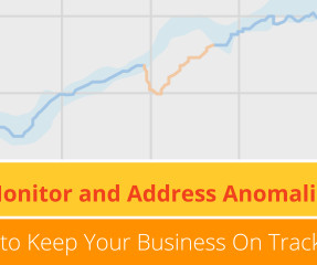
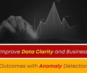
Smarten announces the launch of SnapShot Anomaly Monitoring Alerts for Smarten Augmented Analytics. SnapShot Monitoring provides powerful data analytical features that reveal trends and anomalies and allow the enterprise to map targets and adapt to changing markets with clear, prescribed actions for continuous improvement.
A SaaS company report example that packs a real informational punch, this particular report format offers a panoramic snapshot of the insights and information every ambitious software-as-a-service business needs to succeed. click to enlarge**. You won’t regret it!
Number 6 on our list is a sales graph example that offers a detailed snapshot of sales conversion rates. A perfect example of how to present sales data, this profit-boosting sales chart offers a panoramic snapshot of your agents’ overall upselling and cross-selling efforts based on revenue and performance. 6) Sales Conversion.
In this blog post, we’re going to give a bit of background and context about management reports, and then we’re going to outline 10 essential best practices you can use to make sure your reports are effective. Management reporting is a source of business intelligence that helps business leaders make more accurate, data-driven decisions.
A static report offers a snapshot of trends, data, and information over a predetermined period to provide insight and serve as a decision-making guide. Let’s further clarify the key differences between static and real time reporting. Exclusive Bonus Content: Get our free summary to create better reports! What Is Static Reporting?
Tracking relevant keyperformanceindicators weekly will improve the decision-making process while keeping every relevant stakeholder engaged with the data. If you want to see several metrics for different functions, industries, and platforms browse our list of keyperformanceindicators examples.
Each dashboard created should be a live snapshot of your business. Combining and connecting these snapshots takes your BI to the next level. Let’s say one of your dashboards contains a high-level keyperformanceindicators (KPI) tab that provides snapshots of all your departments.
Costs are one of the supply chain keyperformanceindicators that shows relevant costs that are associated with supply chain management. A pivotal supply chain KPI, the inventory velocity, or IV, provides a visual snapshot of the percentage of inventory that’s projected for consumption within the next period or quarter.
Evidence: While this may seem like an abstract concept, when it comes to data analytics, the more panoramic a snapshot you can access, the better. Set your keyperformanceindicators (KPIs). This brings us to our next point. Download our guide to boost your business efforts and jump to success!
c) Financial Performance Report Template And KPIs. This particular monthly financial report template provides you with an overview of how efficiently you are spending your capital while providing a snapshot of the main metrics on your balance sheet. The higher the Net Profit Margin, the better. click to enlarge**. click to enlarge**.
A product performance dashboard offers a wide range of information in one central location, allowing organizations to drill down into important product metrics and keyperformanceindicators (KPIs) without the need to log in to separate tools or platforms. click to enlarge**.
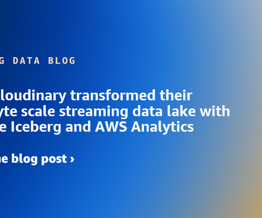
In this blog post, we dive into different data aspects and how Cloudinary breaks the two concerns of vendor locking and cost efficient data analytics by using Apache Iceberg, Amazon Simple Storage Service (Amazon S3 ), Amazon Athena , Amazon EMR , and AWS Glue. SparkActions.get().expireSnapshots(iceTable).expireOlderThan(TimeUnit.DAYS.toMillis(7)).execute()
Incremental Sales Calculation As mentioned, incremental sales are used by businesses as a keyperformanceindicator to measure the financial success of their promotional efforts. But how do you calculate the impact of your promotional strategies? Keep reading to find out!
Even without access to the raw data (let's say I'm a busy McKinsey blog post writer), you can make a couple of simple changes to the graph to make it cleaner and less sloppy… Clean up the title, rephrase it. Move the y-axis description to the right place. Lesson 5: Lines, bars, pies… stress… choose the best-fit.
When your augmented analytics solution is designed to be a self-serve, business user application, you can support the transition of team members to Citizen Data Scientists with interactive tools to gather information, establish metrics and keyperformanceindicators (KPIs) and identify volatility of results and anomalies in the results.
Under scrutiny to demonstrate the value they add to a company’s strategy, many human resources (HR) departments are turning to analytics supported by keyperformanceindicators (KPIs) and metrics. Read this blog post for a deeper dive into the basics. Assessing HR Goals. Not sure what the difference.
A business dashboard offers at-a-glance insights based on keyperformanceindicators (KPIs) and is an intuitive and visually pleasing way to consume data. Do they want to get more social reach on the blog posts your company is putting out? Do they care about helping their staff get more sales and leads?
Augmented Analytics with anomaly monitoring and alerts allows you to establish keyperformanceindicators (KPIs) and to set up alerts and thresholds so that you will know as soon as something important occurs. Discover the power of Smarten SnapShot Anomaly Monitoring And Alerts , and Augmented Analytics Products.
In this blog, we discuss how Kubernetes observability works, and how organizations can use it to optimize cloud-native IT architectures. Kubernetes tends to capture data “snapshots,” or information captured at a specific point in the lifecycle. How does observability work? Revise them as needed. • Centralize logging.
An analytic application, on the other hand, displays keyperformanceindicators (KPIs) that enable active monitoring of performance, efficiency, or other business metrics and actions. A traditional report is typically static data presented in tabular or text format with basic graphs and charts.
The key is monitoring the right metrics. Metrics are specific measures of an aspect of service performance, such as availability or latency. Keyperformanceindicators (KPIs) are linked to business goals and are used to judge a team’s progress toward those goals. What is a KPI in an SLA?
That means there is a huge opportunity for sales departments to use analyzed data to improve and streamline performance — especially in the sales arena, where keyperformanceindicators (KPIs) like cost per lead, customer acquisition cost, and year-over-year growth rule the lives of front-line Account Development Reps (ADRs) and VPs alike.
Using anomaly alerts and monitoring tools, business team members can quickly establish keyperformanceindicators (KPIs) and personalized alerts and reports to monitor and measure results with powerful, clear, concise results that help users to understand and manage the variables that impact their targets and their results.’
A cool dashboard is not only visually pleasing, but it also offers a level of logical organization that makes it easier to drill down into specific keyperformanceindicators (KPIs), trends, or patterns. A cool dashboard boasting eye-catching displays and actionable functionality. Primary KPIs: Cost per Acquisition (CPA).
Dashboard storytelling is the process of presenting data in effective visualizations that depict the whole narrative of keyperformanceindicators, business strategies and processes in the form of an interactive dashboard on a single screen, and in real-time. .” – Margaret Atwood. What Is Dashboard Storytelling?
We organize all of the trending information in your field so you don't have to. Join 42,000+ users and stay up to date on the latest articles your peers are reading.
You know about us, now we want to get to know you!
Let's personalize your content
Let's get even more personalized
We recognize your account from another site in our network, please click 'Send Email' below to continue with verifying your account and setting a password.


Let's personalize your content