This site uses cookies to improve your experience. To help us insure we adhere to various privacy regulations, please select your country/region of residence. If you do not select a country, we will assume you are from the United States. Select your Cookie Settings or view our Privacy Policy and Terms of Use.
Cookie Settings
Cookies and similar technologies are used on this website for proper function of the website, for tracking performance analytics and for marketing purposes. We and some of our third-party providers may use cookie data for various purposes. Please review the cookie settings below and choose your preference.
Used for the proper function of the website
Used for monitoring website traffic and interactions
Cookie Settings
Cookies and similar technologies are used on this website for proper function of the website, for tracking performance analytics and for marketing purposes. We and some of our third-party providers may use cookie data for various purposes. Please review the cookie settings below and choose your preference.
Strictly Necessary: Used for the proper function of the website
Performance/Analytics: Used for monitoring website traffic and interactions
Introduction Creating visually engaging content can be a time-consuming task for bloggers and creators. But what if Blog Creation with AI could do it all for you? After crafting a compelling article, finding the right images is often a separate challenge.
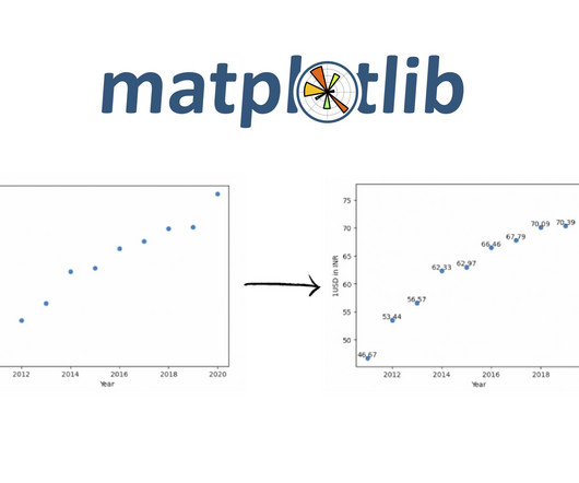
Introduction Scatter plots are a powerful tool in a data scientist’s arsenal, allowing us to visualize the relationship between two variables. This blog will explore the ins and outs of creating stunning scatter Plot Visualization in Python using matplotlib.
This experience includes visual ETL, a new visual interface that makes it simple for data engineers to author, run, and monitor extract, transform, load (ETL) data integration flow. You can use a simple visual interface to compose flows that move and transform data and run them on serverless compute. For Operation , choose ==.
Introduction DreamFusion, the revolutionary AI-driven technology capable of converting text into 3D visuals using 2D diffusion techniques, has recently been honored with the prestigious Best Paper Award at ICLR-2023.
Now that you’re sold on the power of data analytics in addition to data-driven BI, it’s time to take your journey a step further by exploring how to effectively communicate vital metrics and insights in a concise, inspiring, and accessible format through the power of visualization. That’s a colossal number of books on visualization.
“By visualizing information, we turn it into a landscape that you can explore with your eyes. 90% of the information transmitted to the brain is visual. Data visualization methods refer to the creation of graphical representations of information. That’s where data visualization comes in. A sort of information map.
This integration enables our customers to seamlessly explore data with AI in Tableau, build visualizations, and uncover insights hidden in their governed data, all while leveraging Amazon DataZone to catalog, discover, share, and govern data across AWS, on premises, and from third-party sources—enhancing both governance and decision-making.”
This article was published as a part of the Data Science Blogathon Image 1In this blog, We are going to talk about some of the advanced and most used charts in Plotly while doing analysis. All you need to know is Plotly for visualization! The post Performing EDA of Netflix Dataset with Plotly appeared first on Analytics Vidhya.
5) The Role Of Visuals In Accountant Reports. To do so, however, you need several tools: a good accounting software, but also a solid online data visualization tool. We will go deeper into the role of visuals for efficient financial analysis, but first, let’s take a deeper look into the common types of financial reports.
This blog post explores GhostFaceNets through captivating visuals and insightful illustrations, aiming to educate, motivate, and spark creativity. The journey is not just a blog post, but a unique exploration of […] The post GhostFaceNets: Efficient Face Recognition on Edge Devices appeared first on Analytics Vidhya.
ArticleVideo Book This article was published as a part of the Data Science Blogathon Introduction In the last blog we looked at a test to. Use, Implementation and Visualization appeared first on Analytics Vidhya. The post Decoding the Chi-Square Test?-?Use,
In todays data-driven world, securely accessing, visualizing, and analyzing data is essential for making informed business decisions. For instance, a global sports gear company selling products across multiple regions needs to visualize its sales data, which includes country-level details. A Python virtual environment.
It’s a versatile tool used in various applications, from scientific computing to data analysis and data visualization. In this blog, we’ll explore the ins and outs of numpy.linspace() and how you […] The post What is numpy.linspace() in Python? appeared first on Analytics Vidhya.
Data visualization has become a major part of life for those looking to make use of the large swathes of data available in the modern world. That’s where data visualization comes in. Data visualization is, to put it simply, converting hard data and lists of numbers or facts, into an easier to comprehend form.
Amazon DataZone recently announced the expansion of data analysis and visualization options for your project-subscribed data within Amazon DataZone using the Amazon Athena JDBC driver. Refer to the detailed blog post on how you can use this to connect through various other tools. Get started with our technical documentation.
It can be used for something as visual as reducing traffic jams, to personalizing products and services, to improving the experience in multiplayer video games. This is something that you can learn more about in just about any technology blog. We would like to talk about data visualization and its role in the big data movement.
From Cattle to Clarity: Visualizing Thousands of Data Pipelines with Violin Charts Most data teams work with a dozen or a hundred pipelines in production. Is there a way that you can visualize what is happening in production quickly and easily? The shape of each violin lets you visually spot when something is different.
Finally, we will show you a real-life example so you can get a visual overview and a clearer picture of the points discussed in this article. This most value-driven CRM dashboard and a powerful piece of CRM reporting software host a cohesive mix of visual KPIs. Let’s begin. Sales Activity. Average Contract Value.
Here we take the time to define business report, explore visual report examples, and look at how to write one for various needs, goals, and objectives. In the process, we will use an online data visualization software that lets us interact with, and drill deeper into bits and pieces of relevant data. Let’s get started.
For example, you can split a marketing dashboard into sections referring to different parts of the website like product pages, blog, terms of use, etc. Your KPIs will help to shape the direction of your dashboards as these metrics will display visual representations of relevant insights based on specific areas of the business.
We can also see below a visual business intelligence project template which can be used in any finance department or company: **click to enlarge**. The final BI project template looked similar to this visual: **click to enlarge**.
Data dashboards provide a centralized, interactive means of monitoring, measuring, analyzing, and extracting a wealth of business insights from relevant datasets in several key areas while displaying aggregated information in a way that is both intuitive and visual. Lack of different data visualization types.
CFO reports provide a mix of visual KPIs geared towards helping financial officers make confident, informed decisions based on a variety of core financial activities. The berry ratio is a CFO KPI that visualizes and quantifies the ratio of gross profit in relation to operating expenses. What Is A CFO Report? 3) CFO-centric design.
We are excited to announce a new capability of the AWS Glue Studio visual editor that offers a new visual user experience. Now you can author data preparation transformations and edit them with the AWS Glue Studio visual editor. You can configure all these steps in the visual editor in AWS Glue Studio.
By gaining centralized access to business data and presenting it in a visual way that follows a logical path and provides invaluable insights on a particular area or subject, you stand to set yourself apart from your competitors and become a leader in your field. Download our free executive summary and start creating your stories!
Data visualization is a fundamental step for successful data analysis. By giving your information a visual context, you make it more understandable and prepared to identify trends, patterns, or problems. In this post, we will introduce you to one of the most straightforward types of data visualizations, the gauge chart.
We have written about management reporting methods that can be utilized in the modern practice of creating powerful analysis, bringing complex data into simple visuals, and employ them to make actionable decisions. Your Chance: Want to visualize & track operational metrics with ease? How To Select Operational Metrics And KPIs?
By taking an online data visualization approach to handling your company’s strategic activities, big or small, you will make your business more cohesive, collaborative, intelligent and profitable – and project management dashboards will help you do just that. Armed with this knowledge, you can gain a significant edge on the competition.
This blog post details how you can extract data from SAP and implement incremental data transfer from your SAP source using the SAP ODP OData framework with source delta tokens. Create an ETL job to ingest data from SAP In the AWS Glue console, create a new Visual Editor AWS Glue job. Go to the AWS Glue console.
A CEO dashboard is an interactive platform that visualizes data to empower business leaders to track, measure, analyze, and monitor business performance in a number of areas, enabling them to make data-driven decisions and see the big business picture. The right design & visualizations. Enable data-driven decisions.
In this blog post, we’re going to give a bit of background and context about management reports, and then we’re going to outline 10 essential best practices you can use to make sure your reports are effective. 4) Make your report visually pleasing through focus. 7) Strike a balance with your data visualizations. 6) Go digital!
2) Pros & Cons Of Bar Charts 3) When To Use A Bar Graph 4) Types Of Bar Charts 5) Bar Graphs & Charts Best Practices 6) Bar Chart Examples In today’s fast-paced analytical landscape, data visualization has become one of the most powerful tools organizations can benefit from to be successful with their analytical efforts.
Spreadsheets finally took a backseat to actionable and insightful data visualizations and interactive business dashboards. Companies are no longer wondering if data visualizations improve analyses but what is the best way to tell each data-story. 2) Data Discovery/Visualization. Data Discovery/Visualization.
This blog post aims to answer these questions and more. Introduction Data Science is everywhere in the 21st century and has emerged as an innovative field. But what exactly is Data Science? And why should one consider specializing in it?
That is because visuals make it easier to convey and understand critical information, breaching the knowledge gap between audiences across industries. That being said, for data visualizations to be successful and avoid misleading your audience, it is necessary to understand the different use cases for each visual.
Collecting big amounts of data is not the only thing to do; knowing how to process, analyze, and visualize the insights you gain from it is key. Your Chance: Want to visualize & track inventory KPIs with ease? Your Chance: Want to visualize & track inventory KPIs with ease? But let’s get back to our visual example.
From the latest developments to guiding people through the thorns of career, Analytics Vidhya has it all in its blog archives. Introduction Analytics Vidhya has been at the helm when it comes to publishing high-quality content since the beginning of its inception.
With automatic scorecards generated for your table groups, you can visualize data hygiene instantly. This game-changing capability brings more profound insights and greater control over your data health. New Quality Dashboard & Score Explorer.
That interactivity is indeed what drives a profitable result by visually depict important data which can be accessed by different departments. Cloud-based, real-time online data visualization software enables fast, data-driven action by decision-makers. Let’s see this through a visual example. Digital age needs digital data.
Moreover, a host of ad hoc analysis or reporting platforms boast integrated online data visualization tools to help enhance the data exploration process. Typically, ad hoc data analysis involves discovering, presenting, and actioning information for a smaller, more niche audience and is slightly more visual than a standard static report.
Visualizing the data and interacting on a single screen is no longer a luxury but a business necessity. They enable you to easily visualize your data, filter on-demand, and slice and dice your data to dig deeper. Maps are important data visualizations and at datapine, we love utilizing them in our dashboards.
You can navigate to the projects Data page to visually verify the existence of the newly created table. Additionally, the notebook provides a chart view to visualize query results as graphs. Lets try a quick visualization to analyze the rating distribution. Under Create job , choose Visual ETL. option("url", jdbcurl).option("dbtable",
Today, there are online data visualization tools that make it easy and fast to build powerful market-centric research dashboards. On a typical market research results example, you can interact with valuable trends, gain an insight into consumer behavior, and visualizations that will empower you to conduct effective competitor analysis.
In this blog, we will delve into the definitions of Data Science and AI, explore […]. Introduction Data Science and Artificial Intelligence (AI) are two of the most rapidly growing and exciting technological fields today.
We organize all of the trending information in your field so you don't have to. Join 42,000+ users and stay up to date on the latest articles your peers are reading.
You know about us, now we want to get to know you!
Let's personalize your content
Let's get even more personalized
We recognize your account from another site in our network, please click 'Send Email' below to continue with verifying your account and setting a password.


Let's personalize your content