This site uses cookies to improve your experience. To help us insure we adhere to various privacy regulations, please select your country/region of residence. If you do not select a country, we will assume you are from the United States. Select your Cookie Settings or view our Privacy Policy and Terms of Use.
Cookie Settings
Cookies and similar technologies are used on this website for proper function of the website, for tracking performance analytics and for marketing purposes. We and some of our third-party providers may use cookie data for various purposes. Please review the cookie settings below and choose your preference.
Used for the proper function of the website
Used for monitoring website traffic and interactions
Cookie Settings
Cookies and similar technologies are used on this website for proper function of the website, for tracking performance analytics and for marketing purposes. We and some of our third-party providers may use cookie data for various purposes. Please review the cookie settings below and choose your preference.
Strictly Necessary: Used for the proper function of the website
Performance/Analytics: Used for monitoring website traffic and interactions
This article was published as a part of the Data Science Blogathon. Overview In this article, we will be dealing with Walmart’s sales dataset and will follow all the data analysis steps on the same and as a result, will try to get some business-related insights from the operations we will be performing on this dataset. […].
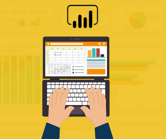
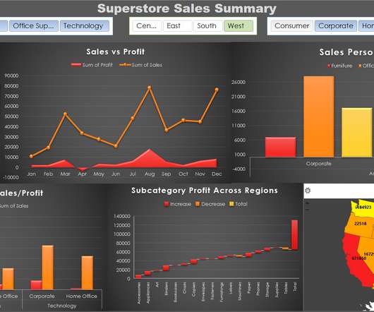
This article was published as a part of the Data Science Blogathon. Microsoft‘s businessanalytics product, Power BI, delivers interactive data visualization BI capabilities that allow users to see and share data and insights throughout their organisation. What is Power BI?
This article was published as a part of the Data Science Blogathon. Explore the simple path to become a great visual data storyteller Are. The post A Quick Guide to Become a Data Analyst appeared first on Analytics Vidhya.
This article was published as a part of the Data Science Blogathon Introduction I have been using Pandas with Python and Plotly to create some of the most stunning dashboards for my projects. In recent times, I have switched to learning Excel as it was a prerequisite in every company I had to apply to. I […].
This article was published as a part of the Data Science Blogathon. Introduction Data and Information about a Customer are important for all businesses and companies. For a business to be data-driven, a Company needs to be highly data-driven and focus highly on customer analytics. It […].
To put the power of business intelligence into perspective, here are 4 key insights you should know: Businesses using analytics are five times more likely to make better, quicker decisions, according to an article published on BetterBuys. By 2025, the global BI and analytics market is expected to soar to a worth of $147.19
A BI dashboard — or business intelligence dashboard — is an information management tool that uses data visualization to display KPIs (key performance indicators) tracked by a business to assess various aspects of performance while generating actionable insights. Advanced businessanalytics tools come in all shapes and sizes.
Agile analytics (or agile business intelligence) is a term used to describe software development methodologies used in BI and analytical processes in order to establish flexibility, improve functionality, and adapt to new business demands in BI and analytical projects.
Under the Transparency in Coverage (TCR) rule , hospitals and payors to publish their pricing data in a machine-readable format. The availability of machine-readable files opens up new possibilities for data analytics, allowing organizations to analyze large amounts of pricing data.
Catchy headlines, backlinks to relevant influencer content, the seamless placement of a numbered or bulleted and visuals are some of the key drivers of successful digital content. It’s our consumer demands that are communicated to businesses via KPI examples , dictating how the brands or businesses craft and develop the content they publish.
Microsoft Power BI is a businessanalytics tool, which is a collection of apps, connectors, and software services that work together to turn unrelated sources of data into coherent information. It helps in transforming enterprise data into rich visuals. This causes a fundamental difference in the way data is stored or published.
Pro: Stunning Data Visualization . Unparalleled capabilities of visualizing information are on top of the list of Tableau software benefits. Using unique visualization technology, we can quickly analyze data by expressing the analysis results using colors, shapes, and sizes. Pro: R script visualization. From Google.
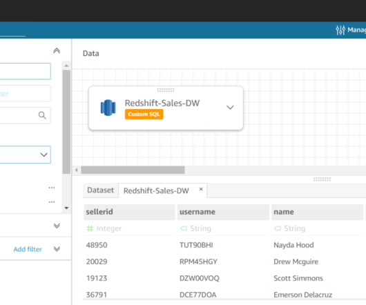
Amazon Redshift is the most widely used data warehouse in the cloud, best suited for analyzing exabytes of data and running complex analytical queries. Amazon QuickSight is a fast businessanalytics service to build visualizations, perform ad hoc analysis, and quickly get business insights from your data.
In my sixth year of self-employment, the demand for data visualization skills is stronger than ever. This training program is about classic data visualization principles? advanced techniques like applying data visualization principles to reports, slideshows, infographics, and dashboards. What’s Included. We’ll go broad?
They need strong data exploration and visualization skills, as well as sufficient data engineering chops to fix the gaps they find in their initial study. AMPs are produced by Cloudera Fast Forward Labs, a team of ML/AI Research Engineers focused on making the recently possible in machine learning practical and usable by business today.
A BI dashboard — or business intelligence dashboard — is an information management tool that uses data visualization to display KPIs (key performance indicators) tracked by a business to assess various aspects of performance. Defining business dashboard needs. It also offers intuitive data crunching.
A BI dashboard — or business intelligence dashboard — is an information management tool that uses data visualization to display KPIs (key performance indicators) tracked by a business to assess various aspects of performance. DEFINING BUSINESS DASHBOARD NEEDS. It also offers intuitive data crunching.
I went through four years of personal hell as a PASS Board member, taking s**t from people who just did not believe that business analysis, businessanalytics or similar related technologies such as Power BI had any place at the PASS table. I have visualized the data below so you can see it below.
Microsoft Power BI is a businessanalytics tool, which is a collection of apps, connectors, and software services that work together to turn unrelated sources of data into coherent information. It helps in transforming enterprise data into rich visuals. This causes a fundamental difference in the way data is stored or published.
Microsoft Power BI is a businessanalytics tool, which is a collection of apps, connectors, and software services that work together to turn unrelated sources of data into coherent information. It helps in transforming enterprise data into rich visuals. This causes a fundamental difference in the way data is stored or published.
Power BI is a businessanalytics tool that helps enterprises handle the data from multiple sources, turning data into interactive insights through data visualization. It leverages many of the same features available in Excel, so users with Office experience will find it easy to adapt to this visualization tool.
A BI dashboard — or business intelligence dashboard — is an information management tool that uses data visualization to display KPIs (key performance indicators) tracked by a business to assess various aspects of performance. DEFINING BUSINESS DASHBOARD NEEDS. It also offers intuitive data crunching.
A BI dashboard — or business intelligence dashboard — is an information management tool that uses data visualization to display KPIs (key performance indicators) tracked by a business to assess various aspects of performance. DEFINING BUSINESS DASHBOARD NEEDS. It also offers intuitive data crunching.
If your role in business demands that you stay abreast of changes in businessanalytics, you are probably familiar with the term Smart Data Discovery. You may also have read the recent Gartner report entitled, ‘Augmented Analytics Is the Future of Data and Analytics’ , Published 27 July 2017, by Rita L.
Our call for speakers for Strata NY 2019 solicited contributions on the themes of data science and ML; data engineering and architecture; streaming and the Internet of Things (IoT); businessanalytics and data visualization; and automation, security, and data privacy. Another related term, “data pipeline” (at No.
He also really informed a lot of the early thinking about data visualization. It involved a lot of work with applied math, some depth in statistics and visualization, and also a lot of communication skills. Those workflows would feedback into your businessanalytics. You also saw much more strategic use of data science.
Due to this book being published recently, there are not any written reviews available. Boasting inspiring real-world examples and a comprehensive glossary of terms, this data analysis book is a must-read for anyone looking to embark on a lifelong journey toward analytical enlightenment.
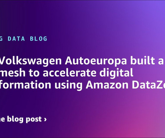
Understanding Volkswagen Autoeuropa’s challenges At the time of writing this post, Volkswagen Autoeuropa has already implemented more than 15 successful digital use cases in the context of real-time visualization, business intelligence, industrial computer vision, and AI. Publish data assets (Amazon DataZone portal).
That’s why today’s smart business leaders are using data-driven storytelling to make an impact on the people around them. Raw Data, Visualizations, and Data Storytelling. Monetizing Analytics Features: Why Data Visualizations Will Never Be Enough. The Role of Data Visualizations. Access Resource.
Step 2: Communicate Your Tax Analyses More Effectively with Dashboards and Visualizations. The current solution publishes reports that are rich with data, but lacks a more modern user experience, such as providing interactive dashboards, tables, and charts. Paint a vivid financial picture using sophisticated visualizations.
Real-Time Analytics Pipelines : These pipelines process and analyze data in real-time or near-real-time to support decision-making in applications such as fraud detection, monitoring IoT devices, and providing personalized recommendations. Visualizations can reveal trends, outliers, and potential correlations.
Keeping your information clear and to the point by using plain language and enticing visuals can help you draft a report that both shines and communicates effectively. Use Visuals for Your KPIs. Board management software can be an ideal solution for gaining fantastic visuals easily that allow your information to shine.
How Embedded Dashboards Work Embedded Dashboards work by embedding data visualizations and analytics tools into existing applications or systems. Popular Data Visualizations in Embedded Dashboards Data can be represented visually in a variety of ways in an embedded dashboard.
With the help of operational reporting software that delivers interactive visualizations and actionable insights from SAP data, your teams and leaders can respond to volatile market conditions and outpace your competition. These insights create answers to business questions. Live demo tailored to your business requirements.
A smart design combined with straightforward visualizations allow this template to communicate volumes. offers another high-level perspective, ideal for line-of-business managers or top executives. Step 7: Translate Information Visually. Live demo tailored to your business requirements. important KPIs ?and KPIs Overview.
Rich Visualizations Finance teams know the numbers in a report tell a story–but it’s much easier for non-technical viewers to understand when presented via visual elements. As such, a combined solution that offers different ways to interact with the same data might be the best fit for your business.
For a visual breakdown of the insights learned from insightsoftware’s recent polls. Live demo tailored to your business requirements. Interested in BusinessAnalytics and Dashboards. Get a Demo. Discover which solutions are best suited for your needs. No high pressure sales pitch. Interested in Financial Reporting.
Protect Your Application with These 7 Hallmarks of a Secure Analytics Solution. Analytics and data visualizations have the power to elevate a software product, such that it takes on a powerful new role in the lives of its users. A library of stock reports and data visualizations is no longer sufficient. Download Now.
Business intelligence empowers businesses to get the most out of their data by providing tools to analyze information, streamline operations, track performance, and inform decision-making. In the Microsoft Dynamics ecosystem, Power BI generates easy-to-read visualizations that help stakeholders perform key analysis.
By integrating Vizlib, businesses can truly maximize their Qlik investment, improving decision-making efficiency and gaining deeper insights from their data. The Growing Importance of Data Visualization In the era of big data, the ability to visualize information has become a cornerstone of effective businessanalytics.
Small teams with limited resources just cannot keep up with the demand for product content and are forced into publishing products before they are 100% buyer ready.PIM enables you to integrate supplier data faster and automate enrichment based on business rules. Publish with Ease Publishing from a PIM is easy.
BI and analytics are both umbrella terms referring to a type of data insight software. Many providers use them interchangeably, but some use them in conjunction, claiming to offer both business intelligence and businessanalytics. One school of thought distinguishes BI and businessanalytics along these past/future lines.
This was bolstered by insightsoftware’s acquisition of Dundas Data Visualization, Inc., adding deeper functionality that has strengthened Logi’s self-service data analytics and visualizations. We’ve made several acquisitions in the embedded analytics family recently, including Izenda and Exago. Interested in Power BI.
Angles for Deltek offers better options, including the following user gains: A comprehensive library of extensible, interactive business views that will rapidly meet 80 percent of your finance team’s operational reporting needs. Interactive reports, visualizations, and dashboards that cover common financial and operational reporting needs.
We organize all of the trending information in your field so you don't have to. Join 42,000+ users and stay up to date on the latest articles your peers are reading.
You know about us, now we want to get to know you!
Let's personalize your content
Let's get even more personalized
We recognize your account from another site in our network, please click 'Send Email' below to continue with verifying your account and setting a password.


Let's personalize your content