This site uses cookies to improve your experience. To help us insure we adhere to various privacy regulations, please select your country/region of residence. If you do not select a country, we will assume you are from the United States. Select your Cookie Settings or view our Privacy Policy and Terms of Use.
Cookie Settings
Cookies and similar technologies are used on this website for proper function of the website, for tracking performance analytics and for marketing purposes. We and some of our third-party providers may use cookie data for various purposes. Please review the cookie settings below and choose your preference.
Used for the proper function of the website
Used for monitoring website traffic and interactions
Cookie Settings
Cookies and similar technologies are used on this website for proper function of the website, for tracking performance analytics and for marketing purposes. We and some of our third-party providers may use cookie data for various purposes. Please review the cookie settings below and choose your preference.
Strictly Necessary: Used for the proper function of the website
Performance/Analytics: Used for monitoring website traffic and interactions
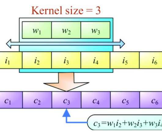
Introduction Exploratory DataAnalysis is a method of evaluating or comprehending data in order to derive insights or key characteristics. EDA can be divided into two categories: graphical analysis and non-graphical analysis. EDA is a critical component of any data science or machine learning process.
This article was published as a part of the Data Science Blogathon Introduction Text classification is a machine-learning approach that groups text into pre-defined categories.
Announcing DataOps Data Quality TestGen 3.0: Open-Source, Generative Data Quality Software. It assesses your data, deploys production testing, monitors progress, and helps you build a constituency within your company for lasting change. Imagine an open-source tool thats free to download but requires minimal time and effort.
This article was published as a part of the Data Science Blogathon. Introduction to Sentiment Analysis This article talks about Twitter Sentiment Analysis Problem. Sentiment analysis (also […].
One often encounters datasets with categorical variables in dataanalysis and machine learning. By transforming categorydata into numerical labels, label encoding enables us to use them in various algorithms. […] The post How to Perform Label Encoding in Python? This is where label encoding comes into play.
In our cutthroat digital age, the importance of setting the right dataanalysis questions can define the overall success of a business. That being said, it seems like we’re in the midst of a dataanalysis crisis. Your Chance: Want to perform advanced dataanalysis with a few clicks?
More than half of respondent organizations identify as “mature” adopters of AI technologies: that is, they’re using AI for analysis or in production. The sample is far from tech-laden, however: the only other explicit technology category—“Computers, Electronics, & Hardware”—accounts for less than 7% of the sample.
Introduction Data visualization is a crucial aspect of dataanalysis, aiding in comprehending and communicating complex datasets. Among the myriad visualization techniques available, area charts stand out for effectively representing quantitative data over time or categories.
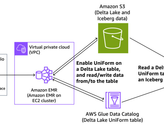
The landscape of big data management has been transformed by the rising popularity of open table formats such as Apache Iceberg, Apache Hudi, and Linux Foundation Delta Lake. These formats, designed to address the limitations of traditional data storage systems, have become essential in modern data architectures.
1) What Is Data Interpretation? 2) How To Interpret Data? 3) Why Data Interpretation Is Important? 4) DataAnalysis & Interpretation Problems. 5) Data Interpretation Techniques & Methods. 6) The Use of Dashboards For Data Interpretation. What Is Data Interpretation? Table of Contents.
I previously explained that data observability software has become a critical component of data-driven decision-making. Data observability addresses one of the most significant impediments to generating value from data by providing an environment for monitoring the quality and reliability of data on a continual basis.
Visualizing the data and interacting on a single screen is no longer a luxury but a business necessity. A professional dashboard maker enables you to access data on a single screen, easily share results, save time, and increase productivity. That’s why we welcome you to the world of interactive dashboards.
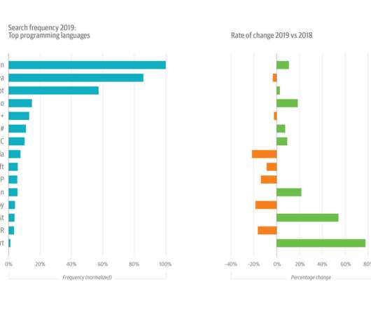
It’s also the data source for our annual usage study, which examines the most-used topics and the top search terms. [1]. This year’s growth in Python usage was buoyed by its increasing popularity among data scientists and machine learning (ML) and artificial intelligence (AI) engineers. A drill-down into data, AI, and ML topics.
The rise of innovative, interactive, data-driven dashboard tools has made creating effective dashboards – like the one featured above – swift, simple, and accessible to today’s forward-thinking businesses. Dashboard design should be the cherry on top of your business intelligence (BI) project. Now, it’s time for the fun part.
For example, while 45% of larger enterprises report that financial analysis is performed very well, only 29% of midsize organizations achieve that level. In addition to all of an organizations ERP systems, data might be collected from CRM, sales and operations software. Cloud-based systems, in particular, are far easier to maintain.
I wrote an extensive piece on the power of graph databases, linked data, graph algorithms, and various significant graph analytics applications. You should still get the book because it is a fantastic 250-page masterpiece for data scientists!) How does one express “context” in a data model? It’s all here.
2) Pros & Cons Of Bar Charts 3) When To Use A Bar Graph 4) Types Of Bar Charts 5) Bar Graphs & Charts Best Practices 6) Bar Chart Examples In today’s fast-paced analytical landscape, data visualization has become one of the most powerful tools organizations can benefit from to be successful with their analytical efforts.
I want to expand a little on Jeffs analysis and put some customer experience (CX) context around conversational automation (or CA from here on out). Not to be extra confusing, but the category is sometimes called conversational AI.) The software provider landscape is analyzed in the ISG Buyers Guide for Conversational Automation.
In his article “ Machine Learning for Product Managers ,” Neal Lathia distilled ML problem types into six categories: ranking, recommendation, classification, regression, clustering, and anomaly detection. is that there is often a problem with data volume. The disadvantage of working in a consumer company?—especially
We suspected that data quality was a topic brimming with interest. The responses show a surfeit of concerns around data quality and some uncertainty about how best to address those concerns. Key survey results: The C-suite is engaged with data quality. Data quality might get worse before it gets better.
In todays data-driven world, tracking and analyzing changes over time has become essential. As organizations process vast amounts of data, maintaining an accurate historical record is crucial. History management in data systems is fundamental for compliance, business intelligence, data quality, and time-based analysis.
Today, there are online data visualization tools that make it easy and fast to build powerful market-centric research dashboards. They come in handy to manage the results, but also the most important aspect of any analysis: the presentation of said results, without which it becomes hard to make accurate, sound decisions.
3) The Role Of Data Drilling In Reporting. It is no secret that the business world is becoming more data-driven by the minute. Every day, more and more decision-makers rely on data coming from multiple sources to make informed strategic decisions. In general, data drills can be added to any chart or data visualization.
These required specialized roles and teams to collect domain-specific data, prepare features, label data, retrain and manage the entire lifecycle of a model. Companies can enrich these versatile tools with their own data using the RAG (retrieval-augmented generation) architecture. An LLM can do that too.
Amazon Redshift is a fully managed, AI-powered cloud data warehouse that delivers the best price-performance for your analytics workloads at any scale. It provides a conversational interface where users can submit queries in natural language within the scope of their current data permissions. Your data is not shared across accounts.
Exclusive Bonus Content: Download Data Implementation Tips! It helps managers and employees to keep track of the company’s KPIs and utilizes business intelligence to help companies make data-driven decisions. Organizations can also further utilize the data to define metrics and set goals. Digital age needs digital data.
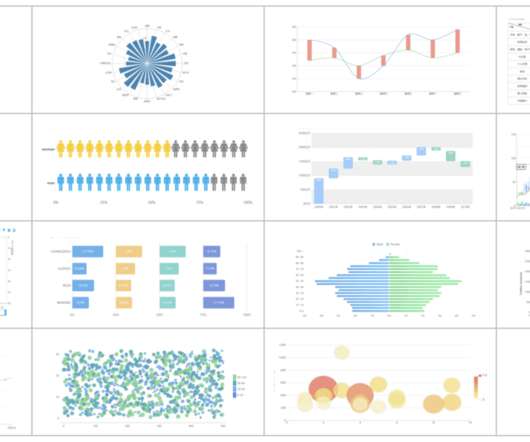
2) Charts And Graphs Categories 3) 20 Different Types Of Graphs And Charts 4) How To Choose The Right Chart Type Data and statistics are all around us. That is because graphical representations of data make it easier to convey important information to different audiences. Below we will discuss the graph and chart categories.
Traditionally, financial dataanalysis could require deep SQL expertise and database knowledge. Now with Amazon Bedrock Knowledge Bases integration with structured data, you can use simple, natural language prompts to query complex financial datasets. or Give me details of all accounts for a specific customer.
Broadcom and Google Clouds continued commitment to solving our customers most pressing challenges stems from our joint goal to enable every organizations ability to digitally transform through data-powered innovation with the highly secure and cyber-resilient infrastructure, platform, industry solutions and expertise.
In total, there were 15 posts created, each with a particular category and color theme. This wasn’t a comprehensive list of charts and categories, but they were a decent introductory guide for selecting a chart type for your needs. Data Over Time. Charts used to communicate data related to geographical regions.
As we close in on the two-year anniversary of the project, I asked Talby where interest in the project has come from, and he graciously shared geo-demographic data of visitors to the project’s homepage : Figure 1. Spark NLP geo-demographic data of visitors. Slide by Ben Lorica, data courtesy of David Talby.
2024 Gartner Market Guide To DataOps We at DataKitchen are thrilled to see the publication of the Gartner Market Guide to DataOps, a milestone in the evolution of this critical software category. It handles connector management and workflow impact analysis and maintains audit logs. One way to look at this is as a Venn diagram.
Free data visualization tools are professional in different categories: dashboard, chart, maps, network, and so on. Today, let’s review the top free data visualization tools on the market. What are the Benefits of Using Free Data Visualization Tools? Some of the free data visualization tools have their paid version.
In June 2021, we asked the recipients of our Data & AI Newsletter to respond to a survey about compensation. The average salary for data and AI professionals who responded to the survey was $146,000. We didn’t use the data from these respondents; in practice, discarding this data had no effect on the results.
Agency analytics is the process of taking data and transforming it into valuable insights that are then displayed with a professional agency dashboard. Apart from using their data to support decision-making, agencies also use metrics as the main language in which they speak to their clients. Benefits Of A Modern Agency Report.
Amazon Redshift is a fast, scalable, secure, and fully managed cloud data warehouse that lets you analyze your data at scale. Amazon Redshift Serverless lets you access and analyze data without the usual configurations of a provisioned data warehouse. For more information, refer to Amazon Redshift clusters.
While customers can perform some basic analysis within their operational or transactional databases, many still need to build custom data pipelines that use batch or streaming jobs to extract, transform, and load (ETL) data into their data warehouse for more comprehensive analysis. or a later version) database.
There is not a clear line between business intelligence and analytics, but they are extremely connected and interlaced in their approach towards resolving business issues, providing insights on past and present data, and defining future decisions. Your Chance: Want to extract the maximum potential out of your data?
Today’s digital data has given the power to an average Internet user a massive amount of information that helps him or her to choose between brands, products or offers, making the market a highly competitive arena for the best ones to survive. First things first – organizing and prioritizing your marketing data.
Decision support systems definition A decision support system (DSS) is an interactive information system that analyzes large volumes of data for informing business decisions. A DSS leverages a combination of raw data, documents, personal knowledge, and/or business models to help users make decisions. Data-driven DSS.
Remember: Today , access to your metrics 24/7/365 is really important, what online dataanalysis tools can guarantee and ensure that your chances of long-term success increase. You may also keep in mind that cutting costs in one area of the supply chain can increase in another so careful analysis in this part is essential.
But with growing demands, there’s a more nuanced need for enterprise-scale machine learning solutions and better data management systems. The 2021 Data Impact Awards aim to honor organizations who have shown exemplary work in this area. . In 2021, the finalists under this category include the following organizations.
AI users say that AI programming (66%) and dataanalysis (59%) are the most needed skills. Given the cost of equipping a data center with high-end GPUs, they probably won’t attempt to build their own infrastructure. Few nonusers (2%) report that lack of data or data quality is an issue, and only 1.3%
Enterprise data is brought into data lakes and data warehouses to carry out analytical, reporting, and data science use cases using AWS analytical services like Amazon Athena , Amazon Redshift , Amazon EMR , and so on. These details, collectively known as metadata, provide crucial context for writing SQL queries.
We organize all of the trending information in your field so you don't have to. Join 42,000+ users and stay up to date on the latest articles your peers are reading.
You know about us, now we want to get to know you!
Let's personalize your content
Let's get even more personalized
We recognize your account from another site in our network, please click 'Send Email' below to continue with verifying your account and setting a password.


Let's personalize your content