This site uses cookies to improve your experience. To help us insure we adhere to various privacy regulations, please select your country/region of residence. If you do not select a country, we will assume you are from the United States. Select your Cookie Settings or view our Privacy Policy and Terms of Use.
Cookie Settings
Cookies and similar technologies are used on this website for proper function of the website, for tracking performance analytics and for marketing purposes. We and some of our third-party providers may use cookie data for various purposes. Please review the cookie settings below and choose your preference.
Used for the proper function of the website
Used for monitoring website traffic and interactions
Cookie Settings
Cookies and similar technologies are used on this website for proper function of the website, for tracking performance analytics and for marketing purposes. We and some of our third-party providers may use cookie data for various purposes. Please review the cookie settings below and choose your preference.
Strictly Necessary: Used for the proper function of the website
Performance/Analytics: Used for monitoring website traffic and interactions
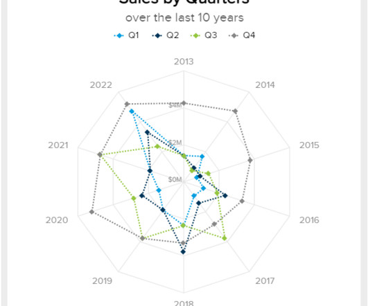
Introduction Radar charts, also referred to as spider plots or star plots, offer a distinctive method for visualizing multivariate data. Unlike traditional cartesian charts, which arrange axes linearly, radar charts position axes radially around a central point.
This article was published as a part of the Data Science Blogathon Introduction Quite often we have a requirement to visualize categorical data in a dataset. The post How To Build A Treemap In 3 Ways Using Python appeared first on Analytics Vidhya.
Introduction Pie charts, a widely used visualization tool, represent data proportions in a circular format. Each slice corresponds to a category, facilitating quick comparisons. Importance of Pie Charts in DataVisualization Pie charts play a crucial role in datavisualization for several reasons.
Introduction Datavisualization is an important step toward discovering insights and patterns. Traditional pie charts demonstrate how different categories contribute to a whole, while 3D pie charts offer depth and […] The post How to Create 3D Pie Charts? The 3D pie chart is a very handy graphic.
Announcing DataOps Data Quality TestGen 3.0: Open-Source, Generative Data Quality Software. It assesses your data, deploys production testing, monitors progress, and helps you build a constituency within your company for lasting change. Imagine an open-source tool thats free to download but requires minimal time and effort.
Introduction Datavisualization is a crucial aspect of data analysis, aiding in comprehending and communicating complex datasets. Among the myriad visualization techniques available, area charts stand out for effectively representing quantitative data over time or categories.
Visualizing the data and interacting on a single screen is no longer a luxury but a business necessity. A professional dashboard maker enables you to access data on a single screen, easily share results, save time, and increase productivity. That’s why we welcome you to the world of interactive dashboards.
The rise of innovative, interactive, data-driven dashboard tools has made creating effective dashboards – like the one featured above – swift, simple, and accessible to today’s forward-thinking businesses. Dashboard design should be the cherry on top of your business intelligence (BI) project. Now, it’s time for the fun part.
2) Pros & Cons Of Bar Charts 3) When To Use A Bar Graph 4) Types Of Bar Charts 5) Bar Graphs & Charts Best Practices 6) Bar Chart Examples In today’s fast-paced analytical landscape, datavisualization has become one of the most powerful tools organizations can benefit from to be successful with their analytical efforts.
1) What Is Data Interpretation? 2) How To Interpret Data? 3) Why Data Interpretation Is Important? 4) Data Analysis & Interpretation Problems. 5) Data Interpretation Techniques & Methods. 6) The Use of Dashboards For Data Interpretation. Business dashboards are the digital age tools for big data.
2) Charts And Graphs Categories 3) 20 Different Types Of Graphs And Charts 4) How To Choose The Right Chart Type Data and statistics are all around us. That is because graphical representations of data make it easier to convey important information to different audiences. Below we will discuss the graph and chart categories.
In our cutthroat digital age, the importance of setting the right data analysis questions can define the overall success of a business. That being said, it seems like we’re in the midst of a data analysis crisis. Your Chance: Want to perform advanced data analysis with a few clicks? Data Is Only As Good As The Questions You Ask.
“By visualizing information, we turn it into a landscape that you can explore with your eyes. 90% of the information transmitted to the brain is visual. Concerning professional growth, development, and evolution, using data-driven insights to formulate actionable strategies and implement valuable initiatives is essential.
3) The Role Of Data Drilling In Reporting. It is no secret that the business world is becoming more data-driven by the minute. Every day, more and more decision-makers rely on data coming from multiple sources to make informed strategic decisions. In general, data drills can be added to any chart or datavisualization.
Exclusive Bonus Content: Download Data Implementation Tips! It helps managers and employees to keep track of the company’s KPIs and utilizes business intelligence to help companies make data-driven decisions. Organizations can also further utilize the data to define metrics and set goals. Digital age needs digital data.
Today, there are online datavisualization tools that make it easy and fast to build powerful market-centric research dashboards. On a typical market research results example, you can interact with valuable trends, gain an insight into consumer behavior, and visualizations that will empower you to conduct effective competitor analysis.
Free datavisualization tools are professional in different categories: dashboard, chart, maps, network, and so on. Today, let’s review the top free datavisualization tools on the market. What are the Benefits of Using Free DataVisualization Tools? Category : Reports and Dashboards.
Modern dashboard software makes it simpler than ever to merge and visualizedata in a way that’s as inspiring as it is accessible. Knowing who your audience is will help you to determine what data you need. Knowing what story you want to tell (analyzing the data) tells you which datavisualization type to use.
These required specialized roles and teams to collect domain-specific data, prepare features, label data, retrain and manage the entire lifecycle of a model. Companies can enrich these versatile tools with their own data using the RAG (retrieval-augmented generation) architecture. An LLM can do that too.
2) When To Use Spider Graphs 3) Types Of Radar Charts 4) Radar Graph Best Practices 5) Spider Chart Examples If you are reading this blog post then you must be somewhat aware of the value of datavisualization. Now, it is the turn of a complex yet visually engaging visual: spider charts. What Is A Spider Chart?
2) Types Of Area Charts 3) When To Use Area Graphs 4) Area Diagram Best Practices 5) Area Chart Examples It is no secret that the human brain processes visual information way faster than text or numbers. That is why graphical representations of data have been so popular in the media, politics, research, and businesses for decades.
In our data-driven digital age, ‘business intelligent’ organizations with the ability to collate, organize, and leverage the insights that are most valuable to their ongoing commercial goals are the ones that are destined to thrive in the long-term. As humans, we respond to, and process visualdata better than anything else.
Your Chance: Want to visualize & track supply chain metrics with ease? Remember: Today , access to your metrics 24/7/365 is really important, what online data analysis tools can guarantee and ensure that your chances of long-term success increase. Your Chance: Want to visualize & track supply chain metrics with ease?
5) The Role Of Visuals In Accountant Reports. Minimize errors : You might have full trust in your accountant’s reporting abilities, however, managing data and sensitive information manually is both time-consuming and risky due to the possibility of human error. Table of Contents. 1) What Are Accounting Reports? The Balance Sheet.
First, locate the value scale axis and the category axis, to identify what is being visualised. Each category is assigned its own bar and the length of each bar is proportional to the value it represents. Colour-coding can be assigned to the bars to distinguish each category in the dataset. ” in each category.
In todays economy, as the saying goes, data is the new gold a valuable asset from a financial standpoint. A similar transformation has occurred with data. More than 20 years ago, data within organizations was like scattered rocks on early Earth.
It’s also the data source for our annual usage study, which examines the most-used topics and the top search terms. [1]. This year’s growth in Python usage was buoyed by its increasing popularity among data scientists and machine learning (ML) and artificial intelligence (AI) engineers. A drill-down into data, AI, and ML topics.
A data-driven finance report is also an effective means of remaining updated with any significant progress or changes in the status of your finances, and help you measure your financial results, cash flow, and financial position. Make predictions based on trusted data. Plan out your budget more effectively.
There is not a clear line between business intelligence and analytics, but they are extremely connected and interlaced in their approach towards resolving business issues, providing insights on past and present data, and defining future decisions. Your Chance: Want to extract the maximum potential out of your data?
This is not surprising given that DataOps enables enterprise data teams to generate significant business value from their data. Companies that implement DataOps find that they are able to reduce cycle times from weeks (or months) to days, virtually eliminate data errors, increase collaboration, and dramatically improve productivity.
Data is one of the most valued assets for the businesses today. And since every aspect of the organization creates data, which is relevant to the businesses to understand the whys and whens in the processes, companies are in a rush to gain the ability to capitalize on what data has to offer. The classification of data.
Agency analytics is the process of taking data and transforming it into valuable insights that are then displayed with a professional agency dashboard. Apart from using their data to support decision-making, agencies also use metrics as the main language in which they speak to their clients. Benefits Of A Modern Agency Report.
For each example, we point out some of the smart design decisions that make them effective in communicating the data. There is a lot of variety in styles and structures, but you may notice common elements across these well-designed datavisualizations. The two-color theme emphasizes a distinct break in the data being shown.
In todays data-driven world, securely accessing, visualizing, and analyzing data is essential for making informed business decisions. For instance, a global sports gear company selling products across multiple regions needs to visualize its sales data, which includes country-level details.
Have you nailed all the datavisualization basics? You confidently pick the right kind of chart based on what you want to emphasize in the data; ?You But what does it take to get your visualizations to the next level? Bold colors with inverted text color Readability in your datavisualizations is critical.
2) When & When Not To Use Tables 4) Types Of Table Charts 5) How To Make A Table Chart 6) Table Graph Examples Visual representations of data are all around us. This is especially valuable in a business context, where data has become a company’s biggest competitive advantage. Today, it is the turn of table charts.
I was working with a state’s public health agency to visualize their data. Two Options for Visualizing “Overall” Data or Averages on Bar Charts There are two primary ways to visualize our “overall” data or averages when we’re making bar or column charts.
Darkhorse Analytics is proud to announce that two of our projects—CORE Score DataVisualization and AIDSVu Interactive Map & Location Profiles—have been honored with Anthem Awards. These recognitions highlight our commitment to using data to create meaningful change.
A Bump Chart is a visualisation that shows how the rankings of different categories or entities change over time or between groupings. Each category or entity is represented by a connected line that “bump” up or down as their rankings change over time. Colour is often used to distinguish each category.
3) Top 15 Warehouse KPIs Examples 4) Warehouse KPI Dashboard Template The use of big data and analytics technologies has become increasingly popular across industries. With the power of data, you can boost your warehouse efficiency at the lowest possible cost. Your Chance: Want to visualize & track warehouse KPIs with ease?
Data analytics is not a new term, as it’s the same as interpreting information. Today, business data and analytical insights are the most sought-after to increase revenue and improve corporate decisions. How Are Analytical Insights Formed From Business Data? Data Collection. Visualization of Data.
When asked to submit their existing visualizations to be redesigned, one of the conference attendees sent me this dashboard (shown below). We’ll simply remove the borders that outline each of the twelve data points. Intentional alignment makes our visualizations look polished. color-coded by category.
Decision support systems definition A decision support system (DSS) is an interactive information system that analyzes large volumes of data for informing business decisions. A DSS leverages a combination of raw data, documents, personal knowledge, and/or business models to help users make decisions. Data-driven DSS.
We organize all of the trending information in your field so you don't have to. Join 42,000+ users and stay up to date on the latest articles your peers are reading.
You know about us, now we want to get to know you!
Let's personalize your content
Let's get even more personalized
We recognize your account from another site in our network, please click 'Send Email' below to continue with verifying your account and setting a password.
Let's personalize your content