This site uses cookies to improve your experience. To help us insure we adhere to various privacy regulations, please select your country/region of residence. If you do not select a country, we will assume you are from the United States. Select your Cookie Settings or view our Privacy Policy and Terms of Use.
Cookie Settings
Cookies and similar technologies are used on this website for proper function of the website, for tracking performance analytics and for marketing purposes. We and some of our third-party providers may use cookie data for various purposes. Please review the cookie settings below and choose your preference.
Used for the proper function of the website
Used for monitoring website traffic and interactions
Cookie Settings
Cookies and similar technologies are used on this website for proper function of the website, for tracking performance analytics and for marketing purposes. We and some of our third-party providers may use cookie data for various purposes. Please review the cookie settings below and choose your preference.
Strictly Necessary: Used for the proper function of the website
Performance/Analytics: Used for monitoring website traffic and interactions
Visualizing the data and interacting on a single screen is no longer a luxury but a business necessity. A professional dashboard maker enables you to access data on a single screen, easily share results, save time, and increase productivity. That’s why we welcome you to the world of interactive dashboards.
2) Pros & Cons Of Bar Charts 3) When To Use A Bar Graph 4) Types Of Bar Charts 5) Bar Graphs & Charts Best Practices 6) Bar Chart Examples In today’s fast-paced analytical landscape, datavisualization has become one of the most powerful tools organizations can benefit from to be successful with their analytical efforts.
“By visualizing information, we turn it into a landscape that you can explore with your eyes. 90% of the information transmitted to the brain is visual. Concerning professional growth, development, and evolution, using data-driven insights to formulate actionable strategies and implement valuable initiatives is essential.
Free datavisualization tools are professional in different categories: dashboard, chart, maps, network, and so on. Today, let’s review the top free datavisualization tools on the market. What are the Benefits of Using Free DataVisualization Tools? Category : Reports and Dashboards.
In todays economy, as the saying goes, data is the new gold a valuable asset from a financial standpoint. A similar transformation has occurred with data. A similar transformation has occurred with data. More than 20 years ago, data within organizations was like scattered rocks on early Earth.
Your Chance: Want to visualize & track supply chain metrics with ease? Remember: Today , access to your metrics 24/7/365 is really important, what online data analysis tools can guarantee and ensure that your chances of long-term success increase. Try our modern logistics analytics software for 14 days, completely free!
2) Types Of Area Charts 3) When To Use Area Graphs 4) Area Diagram Best Practices 5) Area Chart Examples It is no secret that the human brain processes visual information way faster than text or numbers. That is why graphical representations of data have been so popular in the media, politics, research, and businesses for decades.
Agency analytics is the process of taking data and transforming it into valuable insights that are then displayed with a professional agency dashboard. Apart from using their data to support decision-making, agencies also use metrics as the main language in which they speak to their clients. Benefits Of A Modern Agency Report.
In our data-driven digital age, ‘business intelligent’ organizations with the ability to collate, organize, and leverage the insights that are most valuable to their ongoing commercial goals are the ones that are destined to thrive in the long-term. As humans, we respond to, and process visualdata better than anything else.
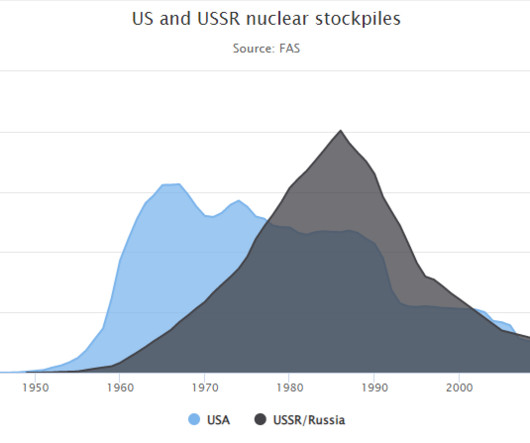
I was working with a state’s public health agency to visualize their data. Two Options for Visualizing “Overall” Data or Averages on Bar Charts There are two primary ways to visualize our “overall” data or averages when we’re making bar or column charts.
5) The Role Of Visuals In Accountant Reports. Table of Contents. 1) What Are Accounting Reports? 2) Why Do You Need Accounting Reports? 3) Types Of Accounting Reports. 4) Accounting Reports Examples. On the basis of every company’s competent management, we can find accounting reports. What Are Accounting Reports?
First, locate the value scale axis and the category axis, to identify what is being visualised. Each category is assigned its own bar and the length of each bar is proportional to the value it represents. Colour-coding can be assigned to the bars to distinguish each category in the dataset. ” in each category.
Data is one of the most valued assets for the businesses today. And since every aspect of the organization creates data, which is relevant to the businesses to understand the whys and whens in the processes, companies are in a rush to gain the ability to capitalize on what data has to offer. The classification of data.
There is not a clear line between business intelligence and analytics, but they are extremely connected and interlaced in their approach towards resolving business issues, providing insights on past and present data, and defining future decisions. Your Chance: Want to extract the maximum potential out of your data?
Branson's words are more relevant than our big data world ? I'm convinced that an important minor contributor to the business world being less data driven is the fact that we are not as awesome as we need to be when it comes to communicating clearly, logically and simply when it comes to presenting data.
Power BI is Microsoft’s interactive datavisualization and analytics tool for business intelligence (BI). With Power BI, you can pull data from almost any data source and create dashboards that track the metrics you care about the most. Explore ‘What-ifs’ Like Excel, Power BI offers slicers for comparing scenarios.
In this video, let’s make a starter dashboard in Microsoft Excel. You’ll learn how to make four quick visuals: Sparklines Data bars Symbol fonts Color scales. I use these visuals over and over in my real-life consulting projects. We might adjust the data source, type (from line to column), or color. Sparklines.
2) When & When Not To Use Tables 4) Types Of Table Charts 5) How To Make A Table Chart 6) Table Graph Examples Visual representations of data are all around us. This is especially valuable in a business context, where data has become a company’s biggest competitive advantage. Today, it is the turn of table charts.
3) Top 15 Warehouse KPIs Examples 4) Warehouse KPI Dashboard Template The use of big data and analytics technologies has become increasingly popular across industries. To help you in your journey to achieve warehousing excellence, we put together this insightful guide on warehouse KPIs. But how do you know which indicators to track?
In addition, you build in the capability to take any data set you view through the dashboard to export to Excel (a must for all financial folks!). Some of you may remember the BI visualization product Roambi created by the developers of the even more successful BI visualization tool Xcelsius.
There are three elements to our "big data" efforts, or unhyped normal data efforts: Data Collection, Data Reporting, and Data Analysis. Data presentation! The thing that is the difference between an organization that data pukes and the one that influences actions based on understandable insights.
Decision support systems definition A decision support system (DSS) is an interactive information system that analyzes large volumes of data for informing business decisions. A DSS leverages a combination of raw data, documents, personal knowledge, and/or business models to help users make decisions. Crop planning.
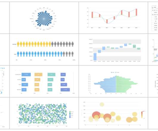
(With enough visualization methods to warrant a periodic table , it can be confusing to know what to use and when—and which visualizations are even worth considering at all. This series of posts is intended to introduce you to the visualization approaches that we find most useful, practical, and audience-friendly.).
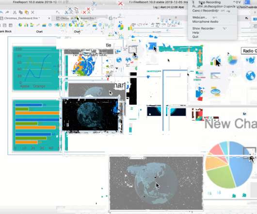
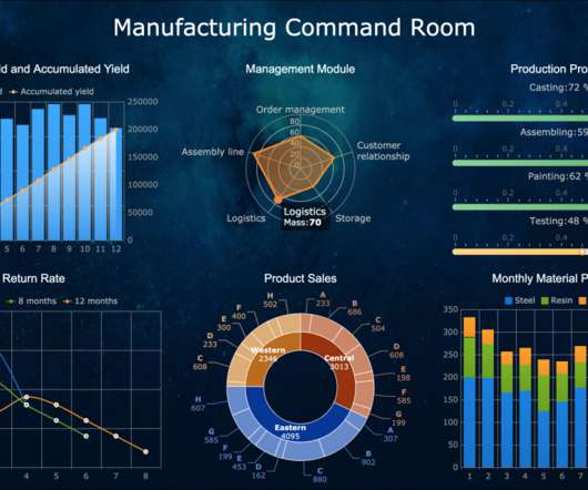
This Christmas dashboard is an online sales dashboard that I made with data from the Internet. The bar chart below shows the sales of each category of products, and the line chart above shows the annual sales of a certain category of products. This chart can be connected to a database system to update the real-time sales data.
KPIs and productivity metrics can often act as intertwining categories. Professionals in human resources, management, customer service and more can all benefit from the data in their productivity metrics. Professionals in human resources, management, customer service and more can all benefit from the data in their productivity metrics.
Analyzes previous data to make better predictions, like self-driving cars that observe directions and traffic lights. For instance, its AI content generator can create unique content in minutes by choosing a category relevant to your business. Advanced Visual Search. eCommerce businesses are no exception. Limited memory.
Architecture notation – How to visualize the enterprise in a standard manner. There are a number of popular enterprise architecture frameworks: ArchiMate – An Open Group architecture framework this is widely used and includes a notation for visualizing architecture. One such notation is ArchiMate from The Open Group.
If you need to do routine table records, data calculations and chart analysis in your daily work, you will definitely use Excel to make reports. But when it comes to business reports for corporate management, huge and complex data analysis, financial analysis, data entry, etc, Excel is far from being able to meet these needs.
When asked to submit their existing visualizations to be redesigned, one of the conference attendees sent me this dashboard (shown below). We’ll simply remove the borders that outline each of the twelve data points. Intentional alignment makes our visualizations look polished. color-coded by category.
These three basic categories of reports translate into an income statement–also known as a profit & loss (P&L)–a balance sheet, and a statement of cash flows. The terms “reporting” and “analytics” are often used interchangeably. What About Financial Analytics?
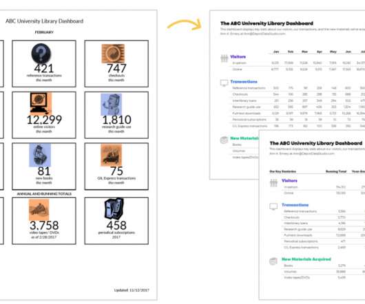
With the continuous development of the company’s business, there are more and more data in various departments, and the division of dimensions is also different. It has caused many problems for business personnel to view the data, which often takes a lot of time but still feels confused. From Google. Download template.
Data architect role Data architects are senior visionaries who translate business requirements into technology requirements and define data standards and principles, often in support of data or digital transformations. Data architects are frequently part of a data science team and tasked with leading data system projects.
Numerous data?Want Want to flee the great tidal wave of data display? Now here comes data dashboard ?Similar Similar to the instrument panel equipped in a car, it transforms obscure expertise into plain visualizations which are pleasing to both the eye and mind. What is Data Dashboard?–Definition.
e.g., If you focus on user growth, you can sort through the user categories, the key metrics of each AARRR phases, the results of products or operational activities related to user growth, ROIs, and so on. How end-users read or use data? Determine the source of the data . Which database are the data from? ERP database?
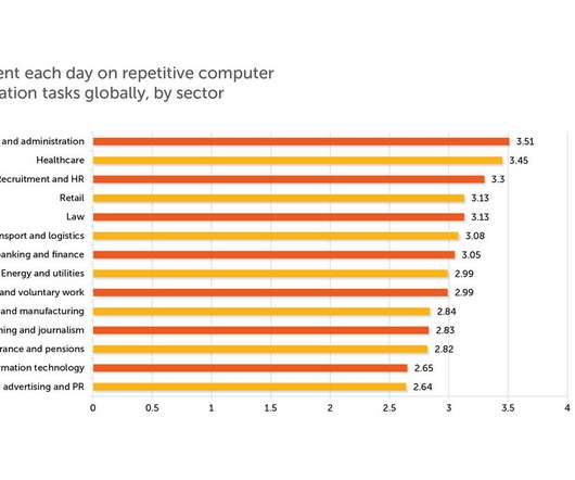
How many time do you spend on repetition work like data entry? A survey on 21 st Jan 2020, conducted by OnePoll and commissioned by Automation Anywhere, found that data entry is the most hated of tasks, and workers are wasting more than 40% of their day on manual data tasks. Convenient and Automatic Data Entry.
Data storytelling is quickly becoming a popular mode for presenting data. It combines text and graphics with datavisualizations to guide an audience. Traditionally, people have used tools like PowerPoint and Excel, as well as traditional dashboard and business intelligence platforms, to communicate in this way.
Visualizingdata in charts, graphs, dashboards, and infographics is one of the most powerful strategies for getting your numbers out of your spreadsheets and into real-world conversations. But it can be overwhelming to get started with datavisualization. If so, this step-by-step datavisualization guide is for you!
A business dashboard offers at-a-glance insights based on key performance indicators (KPIs) and is an intuitive and visually pleasing way to consume data. Unlike early predecessors, they give presenters the ability to engage audiences with real-time data. How familiar they are with the data or KPIs.
Furthermore, measuring and monitoring ESG performance required consolidating data from various instruments and functions in diverse locations. Sustainability performance information could only be gleaned by using a manual system to collect, consolidate, and analyze data.
MIS stands for the management information system, which is an information system used by most organizations to coordinate, control, and visualizedata for better decision making. . MIS reports focus on past information, current data, as well as trend analysis. Creating MIS Reports with Excel. How does MIS Report work?
Most projects at work involve lengthy and jumbled data, wherefore well-structured analytical reports are particularly important. An analytical report is a type of data analysis report that provides information, analysis, and opinions on particular business processes issues. The data should be clear and focused. Free Download.
Enterprise reporting is a process of extracting, processing, organizing, analyzing, and displaying data in the companies. It uses enterprise reporting tools to organize data into charts, tables, widgets, or other visualizations. In this way, users can gain insights from the data and make data-driven decisions. .
In the current trend of big data, datavisualization has become an interactive display mode that everyone admires. The picture below shows the characteristics of the excellent dashboard that Stephen Few listed in the Dashboard Graphic Design Competition in 2012. Prepare a datavisualization tool.
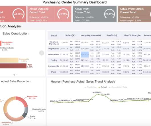
It can help enterprises make better use of data if different data can be presented by appropriate reports. The detail report is the simplest way to display the data. It is mainly for listing the data such as sales list, customer list, expenditure list. This type of report classification displays and summarizes the data.
We organize all of the trending information in your field so you don't have to. Join 42,000+ users and stay up to date on the latest articles your peers are reading.
You know about us, now we want to get to know you!
Let's personalize your content
Let's get even more personalized
We recognize your account from another site in our network, please click 'Send Email' below to continue with verifying your account and setting a password.


Let's personalize your content