This site uses cookies to improve your experience. To help us insure we adhere to various privacy regulations, please select your country/region of residence. If you do not select a country, we will assume you are from the United States. Select your Cookie Settings or view our Privacy Policy and Terms of Use.
Cookie Settings
Cookies and similar technologies are used on this website for proper function of the website, for tracking performance analytics and for marketing purposes. We and some of our third-party providers may use cookie data for various purposes. Please review the cookie settings below and choose your preference.
Used for the proper function of the website
Used for monitoring website traffic and interactions
Cookie Settings
Cookies and similar technologies are used on this website for proper function of the website, for tracking performance analytics and for marketing purposes. We and some of our third-party providers may use cookie data for various purposes. Please review the cookie settings below and choose your preference.
Strictly Necessary: Used for the proper function of the website
Performance/Analytics: Used for monitoring website traffic and interactions
Introduction Large language models (LLMs) represent a category of artificial intelligence (AI) trained on extensive datasets of text. This training enables them to excel in tasks such as text generation, language translation, creative content creation across various genres, and providing informative responses to queries.
Understanding this framework offers valuable insights into team efficiency, operational excellence, and data quality. These teams excel because they embrace process visibility and control, believing firmly in the principles of DataOps. We’ve identified two distinct types of data teams: process-centric and data-centric.
Miller, stand as a testament to innovation and excellence in this transformative field. These awards recognize the outstanding contributions of individuals and organizations across various categories, reflecting the diverse ways AI has reshaped our world.
This is both frustrating for companies that would prefer making ML an ordinary, fuss-free value-generating function like software engineering, as well as exciting for vendors who see the opportunity to create buzz around a new category of enterprise software. The new category is often called MLOps. This approach is not novel.
In his article “ Machine Learning for Product Managers ,” Neal Lathia distilled ML problem types into six categories: ranking, recommendation, classification, regression, clustering, and anomaly detection. is an excellent introduction to metrics and analytics. Avinash Kaushik’s Web Analytics 2.0
While Excel and PowerPoint, and various other spreadsheet and presentation applications, remain important business tools for many, their interactivity options are limited. There is now no need to build data visualizations for every country like you would have to do in Excel! 2) Drill-Throughs. 8) Advanced Data Options.
The skills gap is especially pronounced: While 26% of midsize enterprises said the analytical skills of the people in the finance department are excellent, 38% of those in larger companies think thats the case. Cloud-based systems, in particular, are far easier to maintain.
It’s possible they worked entirely in Excel, which should be considered a programming language but often isn’t. The most common responses to the question about tools for machine learning or statistics were “I don’t use any tools” (40%) or Excel (31%). We’re not sure what that means. Salaries by Tool and Platform.
The fine folks at Microsoft have put together an excellent Single Page Cheatsheet for Azure Machine Learning Algorithms. You want to predict “Will Purchase” or “Will Not Purchase” Thus you are trying to predict between two categories. Microsoft’s Azure Machine Learning Algorithm Cheat Sheet.
Free data visualization tools are professional in different categories: dashboard, chart, maps, network, and so on. FineReport provides more than 19 categories and 50+ styles of HTML5 charts. Category : Reports and Dashboards. Category : charts and graphs. Category : charts and graphs. From FineReport. From Google.
The categories are usually qualitative data such as products, years, product categories, countries, etc. Plus, they have enough space to plot as many categories as you need without cluttering the graph, making them way more efficient than column charts when it comes to analyzing multiple categories of data.
The finalists for the Team of the Year categories in this year’s CIO50 Australia have been announced. Part of Foundry’s global CIO awards program, the awards recognise IT teams that exemplify excellence in specific areas. The winners will be unveiled at the CSO30 & CIO50 Awards Dinner on October 17 at the Shangri-La in Sydney.
The project also garnered top prize —based on a tally of votes cast by Strata Data Conference attendees—in the open source category at the Strata Data awards in March. In our recent survey AI Adoption in the Enterprise , quite a few respondents signalled that they were giving Spark NLP a try.
INE Security is pleased to announce that it has been recognized as a 2024 SC Award finalist in the Excellence Award category for Best IT Security-Related Training Program. We are honored to be recognized as a finalist in the SC Awards for our commitment to excellence in IT security training,” said Dara Warn, CEO of INE Security.
I’ve seen people add literal lines in Excel ( Insert – Shape – Lin e). That works, but the fancier option is to use a Combo Chart in Excel. (If You can read more about my bar vs. column logic here , and you can learn how to make this quick rotation in Excel here. Add a line. Then, we adjusted the colors.
And when we talk about these processes, in addition to highlighting new platforms, we tend to ignore another program, one with an extensive legacy: Microsoft Excel. Is Microsoft Excel still relevant in the age of big data? Excel Is Collaborative. Saying that Excel is useful in the age of big data is not an uncomplicated claim.
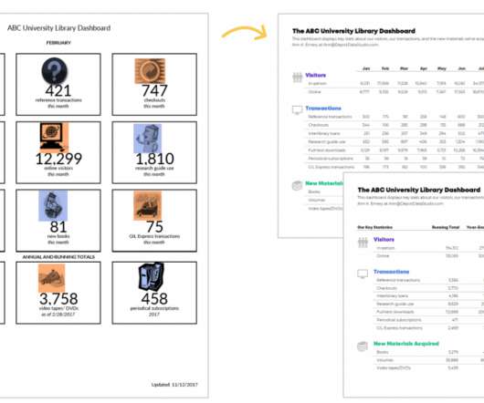
added graphs , which I created with Microsoft Excel’s spark columns. color-coded by category. I grouped the twelve data points into categories: Visitors (blue), Transactions (purple), and New Materials Acquired (turquoise). The icons are center-aligned with one another, and they’re top-aligned beside each of their categories.
First, locate the value scale axis and the category axis, to identify what is being visualised. Each category is assigned its own bar and the length of each bar is proportional to the value it represents. Colour-coding can be assigned to the bars to distinguish each category in the dataset. ” in each category.
Under Adler’s leadership, the company established an automation centre of excellence and implemented initiatives like the MinterEllison Digital Academy and Mintcoin, an internal cryptocurrency designed to incentivise participation in the firm’s digital learning and innovation programs. And coming in No.
It was not alive because the business knowledge required to turn data into value was confined to individuals minds, Excel sheets or lost in analog signals. More than 20 years ago, data within organizations was like scattered rocks on early Earth.
This year’s entrants have excelled at demonstrating how innovative data solutions can help solve real-time challenges and positively impact people around the world. . Read more about the Data for Enterprise AI category here . Read more about the Data for Good category here . Read more about the People First category here .
This designation underscores INE Security’s commitment to excellence and leadership in the cybersecurity industry. This year’s awards were presented across 33 categories, celebrating both established industry leaders and emerging innovators.
Excellence takes centerstage The Symposium promises to explore and evangelize hot-button topics around proactive cybersecurity, AI shaping the future of innovation, the takeover of low-code tech and cloud technology. CIOs who have won CIO100 Award for the last 3 or more consecutive years will move into ‘Hall of Fame’ Club.
While the collection and processing of data involves a lot of technology and expertise, creating a visual representation of the data, which can be read and understood by one and all, also requires an intuitive excellence. Such excellence predominantly is needed to select visualization formats for a specific set of sample data.
The bar chart below shows the sales of each category of products, and the line chart above shows the annual sales of a certain category of products. In the upper right corner of the dashboard is a word cloud diagram showing the categories of Christmas gifts people most want. And the data is stored in Excel file.
They’re often the first to surface data quality problems; in organizations that do not have dedicated data quality teams (or analogous resources, such as data quality centers of excellence), analysts play a leading role in cleaning up and correcting data quality issues, too. Roles of survey respondents. A switched-on C-suite?
While massive data volumes appear less frequently now in strategic discussions and are being tamed with excellent data infrastructure solutions from Pure Storage , the data velocity and data variety challenges remain in their own unique “sweet spot” of business data strategy conversations. In fact, they have grown in importance and impact.
The imperative to deliver meaningful change and value through innovation is why the Data for Enterprise AI category at the Data Impact Awards has never been more of the moment than it is today. But before we look forward to what’s to come, let’s take a look back.
Now there are dozens of vendors in the greater DataOps, which is excellent for everyone in the industry. ” The next step is for Gartner to publish a ‘magic quadrant’ … which is the final marking step for a new vendor in bringing a new software category to market. We see teams do amazing things with our software.
In addition, you build in the capability to take any data set you view through the dashboard to export to Excel (a must for all financial folks!). sliders to turn a static spreadsheet into a powerful , time-saving and useful financial tool.
For example, in sales analytics , you can use a stacked area chart to visualize sales by product category for the past 12 months. The different sizes of the areas can help you spot some months in which a particular product category saw an increase in sales and investigate the reasons behind this trend.
He described them as: "Illustrations of postage-stamp size are indexed by category or a label, sequenced over time like the frames of a movie, or ordered by a quantitative variable not used in the single image itself." What is a small multiple? Small multiples are a visualization concept introduced by Edward Tufte.
Yet as organizations figure out how generative AI fits into their plans, IT leaders would do well to pay close attention to one emerging category: multiagent systems. Multiagents make automation actionable McKinsey landed on an excellent example: booking business trips.
If you need to do routine table records, data calculations and chart analysis in your daily work, you will definitely use Excel to make reports. But when it comes to business reports for corporate management, huge and complex data analysis, financial analysis, data entry, etc, Excel is far from being able to meet these needs.
There are two ways to prepare MIS Report: one is creating reports with Excel, the other is creating reports with reporting software. Creating MIS Reports with Excel. Using Excel to create MIS reports is the traditional way that adopted by most companies. There are many categories of the Management Information System.
Procurement departments tend to be less visible to many stakeholders than sales, operations or even finance departments, but the impact they have on everything from the bottom line to product quality and service delivery shouldn’t be overlooked, which is why “procurement excellence” is a worthy pursuit.
These include Anthropics Claude 2, which excels at complex reasoning and content generation; Jurassic-2 from AI21 Labs, known for its multilingual capabilities; Stable Diffusion from Stability AI for image generation; and Amazon Titan models for various text and embedding tasks. Choose Test.
I decided because I had one time point and wanted to compare categories (i.e., I made the following dashboard using the Data Bars feature in Microsoft Excel: What I Learned about Dashboards and Excel. Not only were the steps easy to follow, but I also learned about better dashboard and Excel practices.
It is not a post about expressing your inner Excel geek with the most advanced remastered sparklines or conditional scatter plots. Then we have it for the company and its category. Next I create a simpler data presentation, God bless Excel, by creating two big clusters next to each other. An important point first.
In May, Microsoft unveiled a new category of PCs: Copilot+ PCs, the first of a new generation of AI laptops, desktops, and tablets that enable AI processing to happen at the edge. They process AI workloads with particular efficiency, providing excellent performance while consuming very little power for the amount of work they do.
These three basic categories of reports translate into an income statement–also known as a profit & loss (P&L)–a balance sheet, and a statement of cash flows. To maximize the power of reporting and analytics, companies should invest in robust, purpose-built reporting tools that can deliver on all of the categories listed above.
Blockchain ETFs Provide Excellent Growth While Mitigating Crypto Risks. The highest performing ETFs in this category have done remarkably well, with 3-year returns ranging from 50 to 150%. A key point to remember here is that these ETFs provide excellent security.
Are You Still Using the Pivot Table of Excel? People often think of the pivot table function of Excel, but with such a dense digital table, are you sure your boss can read it? And Excel’s filtering function is not efficient when faced with multi-category data, which is very boring and rigid. From Google.
To obtain the license keys, follow these steps: Share the output of the BladeBridge Analyzer report and the provided pricing calculator Excel sheet with BladeBridge. These license keys are tied to the specific SQL files you are converting, making sure that updates to the source code require the appropriate license.
We organize all of the trending information in your field so you don't have to. Join 42,000+ users and stay up to date on the latest articles your peers are reading.
You know about us, now we want to get to know you!
Let's personalize your content
Let's get even more personalized
We recognize your account from another site in our network, please click 'Send Email' below to continue with verifying your account and setting a password.


Let's personalize your content