This site uses cookies to improve your experience. To help us insure we adhere to various privacy regulations, please select your country/region of residence. If you do not select a country, we will assume you are from the United States. Select your Cookie Settings or view our Privacy Policy and Terms of Use.
Cookie Settings
Cookies and similar technologies are used on this website for proper function of the website, for tracking performance analytics and for marketing purposes. We and some of our third-party providers may use cookie data for various purposes. Please review the cookie settings below and choose your preference.
Used for the proper function of the website
Used for monitoring website traffic and interactions
Cookie Settings
Cookies and similar technologies are used on this website for proper function of the website, for tracking performance analytics and for marketing purposes. We and some of our third-party providers may use cookie data for various purposes. Please review the cookie settings below and choose your preference.
Strictly Necessary: Used for the proper function of the website
Performance/Analytics: Used for monitoring website traffic and interactions
EDA can be divided into two categories: graphical analysis and non-graphical analysis. The post Exploratory Data Analysis (EDA) in Python appeared first on Analytics Vidhya. Introduction Exploratory Data Analysis is a method of evaluating or comprehending data in order to derive insights or key characteristics.
Introduction Consider the following scenario: you are a product manager who wants to categorize customer feedback into two categories: favorable and unfavorable. The post Implementation of Gaussian Naive Bayes in Python Sklearn appeared first on Analytics Vidhya.
For visualizing such a type of data, there are several different options to choose from like the pie charts, horizontal bar charts (that indicate percentages of the categories), waffle […]. The post How To Build A Treemap In 3 Ways Using Python appeared first on Analytics Vidhya.
By transforming category data into numerical labels, label encoding enables us to use them in various algorithms. […] The post How to Perform Label Encoding in Python? However, many machine learning algorithms require numerical input. This is where label encoding comes into play. appeared first on Analytics Vidhya.
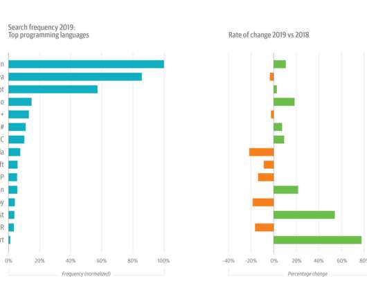
Current signals from usage on the O’Reilly online learning platform reveal: Python is preeminent. This year’s growth in Python usage was buoyed by its increasing popularity among data scientists and machine learning (ML) and artificial intelligence (AI) engineers. In programming, Python is preeminent. Figure 3 (above).
The sample is far from tech-laden, however: the only other explicit technology category—“Computers, Electronics, & Hardware”—accounts for less than 7% of the sample. The “Other” category (~22%) comprises 12 separate industries. not to mention an accessible lingua franca —Python—the bar for entry is actually pretty low.
This is both frustrating for companies that would prefer making ML an ordinary, fuss-free value-generating function like software engineering, as well as exciting for vendors who see the opportunity to create buzz around a new category of enterprise software. The new category is often called MLOps. Why: Data Makes It Different.
Attempts to define prompt engineering fall into two categories: Coming up with clever prompts to get an AI to do what you want while sitting at your laptop. It’s not programming as such, but creating a prompt that produces professional-quality output is much more like programming than “a tarsier fighting with a python.”
The project also garnered top prize —based on a tally of votes cast by Strata Data Conference attendees—in the open source category at the Strata Data awards in March. The library’s Python API now has the most users.
When we looked at the most popular programming languages for data and AI practitioners, we didn’t see any surprises: Python was dominant (61%), followed by SQL (54%), JavaScript (32%), HTML (29%), Bash (29%), Java (24%), and R (20%). The tools category includes tools for building and maintaining data pipelines, like Kafka.
First, locate the value scale axis and the category axis, to identify what is being visualised. Each category is assigned its own bar and the length of each bar is proportional to the value it represents. Colour-coding can be assigned to the bars to distinguish each category in the dataset. ” in each category.
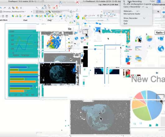
Free data visualization tools are professional in different categories: dashboard, chart, maps, network, and so on. FineReport provides more than 19 categories and 50+ styles of HTML5 charts. Category : Reports and Dashboards. Category : charts and graphs. Category : charts and graphs. From FineReport. From Google.
While there are certainly engineers and scientists who may be entrenched in one camp or another (the R camp vs. Python, for example, or SAS vs. MATLAB), there has been a growing trend towards dispersion of data science tools. Key categories of tools and a few examples include: Data Sources. They range from flat files (e.g.
Because it is such a new category, both overly narrow and overly broad definitions of DataOps abound. Studio.ML — A model management framework written in Python to help simplify and expedite your model-building experience. Omega | ML — Python AI/ML analytics deployment & collaboration for humans . Like Docker for data.
The exam can be broken down into 4 components: Machine Learning, Azure ML Studio, Azure Products, and Python. There were a number of questions from this category. Python was the language of choice for the exam, so focus on it. Scikit-learn Azure Machine Learning SDK for Python Hyperparameters. Machine Learning.
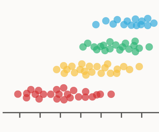
A Dot Distribution Plot visualises the data distribution across multiple categories by plotting dots along an axis. There are two variations of Dot Distribution Plot: first, the kind that plots a series of dots to compare the distributions between various categories across a single dimension.
At its peak, ChatGPT was in very exclusive company: it’s not quite on the level of Python, Kubernetes, and Java, but it’s in the mix with AWS and React, and significantly ahead of Docker. Although large language models clearly fall into the category of NLP, we suspect that most users associate NLP with older approaches to building chatbots.
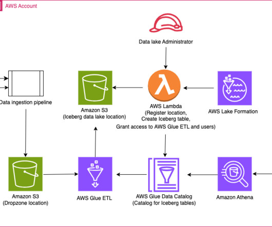
The groups for the illustration can be broadly classified into the following categories: Regional sales managers will be granted access to view sales data only for the specific country or region they manage. A Python virtual environment. Create a Python virtual environment. and v3.12.2.
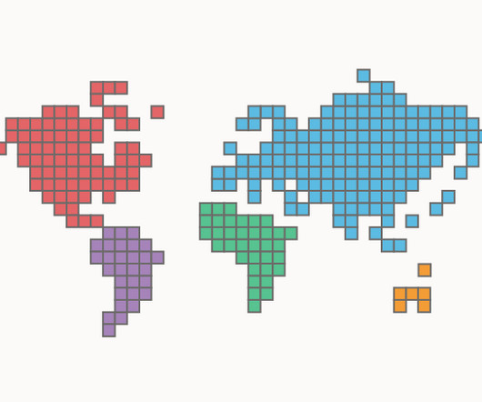
Colours can be assigned to the tiles in a Mosaic Cartogram to distinguish geographical regions, represent categories, or visualise an additional numerical variable. Tool to generate a Mosaic Cartogram: R / Python / D3.js Hence, the number of tiles assigned to a region is proportional to the data value assigned to that region.
Programming Language (R or Python). Programmers can start with either R or Python. it is overwhelming to learn data science concepts and a general-purpose language like python at the same time. Python can be added to the skill set later. Both R (ggplot2) and python (Matplotlib) have excellent graphing capabilities.
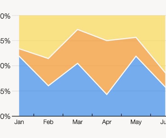
The X-axis is used for the time scale, which makes this chart ideal for showing the changing overall percentages of categories over time. The data series for each category is colour-coded, which helps to illustrate a part-to-whole relationship. One solution to this issue could be to group minor categories under an ‘other’ category.
The function of a Jitter Plot is to visualise the data distribution across multiple categories by plotting dots along a value axis. The dots in a Jitter Plot can use colour coding to distinguish categories apart or visualise an additional variable. How To Make Stripplot with Jitter in Altair Python?
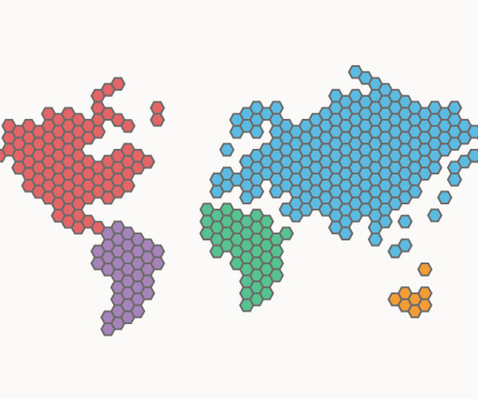
Colours can be assigned to the hexagonal tiles in a Hex Cartogram to distinguish geographical regions, represent categories, or visualise an additional numerical variable. Hence, the number of hexagonal tiles assigned to a region is proportional to the data value assigned to that region.
The bar chart below shows the sales of each category of products, and the line chart above shows the annual sales of a certain category of products. In the upper right corner of the dashboard is a word cloud diagram showing the categories of Christmas gifts people most want. We can also customize the style of the flow lines.
For Runtime stack , choose as Python. We name our resource group rg-redshift-federated-sso. Under Instance Details , enter a globally unique name. For this post, we use the name fn-entra-id-transformer. For Version , choose 3.11. For Region , choose East Us. For Operating System , select Linux.
The result is an emerging paradigm shift in how enterprises surface insights, one that sees them leaning on a new category of technology architected to help organizations maximize the value of their data. Those challenges are well-known to many organizations as they have sought to obtain analytical knowledge from their vast amounts of data.
Both Python and R are advanced coding languages that can produce beautiful images that allow humans to understand vast datasets with ease. Data Visualization in Python. There are a wide array of libraries you can use to create Python data visualizations, including Matplotlib, seaborn, Plotly , and others. Import Libraries.
Many of those are fairly normal Python and even web-related tasks (our documentation system automatically builds our website as the code changes). There are a LOT of differences from YNAB, but the overall idea is the same: put money into “spending categories” and then use those as mini bank accounts for everything you do in life.
The rich visualization capabilities of QuickSight allow you to analyze trends in metrics like worker utilization, error categories, throughput, and more. or later AWS accounts for the monitoring account and source account An AWS named profile for the monitoring account and source account The AWS CDK Toolkit 2.87.0
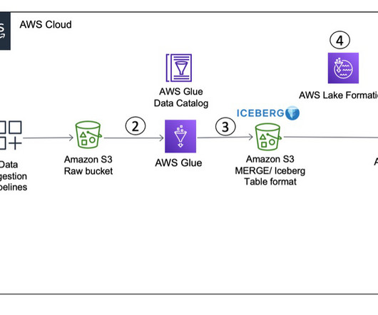
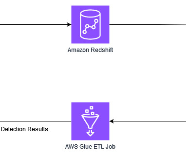
The function uses the AWS SDK for Python (Boto3) APIs to provision the resources. Let’s add the partition field category to the Iceberg table using the AWS Glue ETL job icebergdemo1-GlueETL2-partition-evolution : ALTER TABLE glue_catalog.icebergdb1.ecomorders On the Configuration tab, choose Environment variables in the left pane.
category – This column represents the category of an item. Make sure you capture this attribute, so that your ETL logic can take appropriate action while merging it. product_id – This is the primary key column in the source data table. product_name – This is the name of the product.
The CRN Tech Innovator Awards spotlight innovative products and services across 36 categories, with winners chosen by CRN staff from over 320 product applications. release was named a finalist under the category of Business Intelligence and Data Analytics. Open Data Lakehouse also offers expanded support for Python 3.10
“Code is read much more often than it is written” is a quote often attributed to the creator of Python, Guido van Rossum. This section is written with Python in mind, but the principles outlined can also apply to other coding languages such as R. Code style. An Rchaeological Commentary by Paul E. Use plurals for arrays.
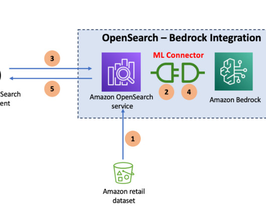
The domain has public access Fine-grained access control is enabled A master user is created Set up a Python client to interact with the OpenSearch Service domain, preferably on a Jupyter Notebook interface. OpenSearch version is 2.13 Add model access in Amazon Bedrock. For instructions, see add model access.
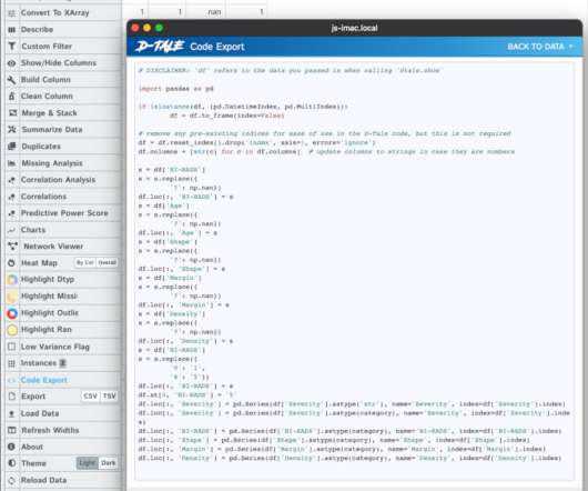
You can download the dataset or recreate it locally using the Python script provided in the repository. The X-axis shows the data quality ruleset tags as categories. Dataset details The test dataset contains 104 columns and 1 million rows stored in Parquet format. Choose Apply. The Cost and Usage report will be updated.
In these problems, we attempt to predict whether an object or an event belongs to a certain category. In this post, we will build a sentiment analyzer using Python after preparing text data using SQL. Once the filter is set up, we modify the SQL to pass the input values from a filter into Python code. Let’s get started.
This article provides a brief introduction to natural language using spaCy and related libraries in Python. This article and paired Domino project provide a brief introduction to working with natural language (sometimes called “text analytics”) in Python using spaCy and related libraries. category="democrat",?.
Language – Python For demonstration purposes, the job bookmarks option is disabled, along with the auto scaling feature. The basic and advanced properties are configured using the CloudFormation template. The basic properties are as follows: Type – Spark Glue version – Glue 4.0 We also provide custom parameters as key-value pairs.
For example, are the numbers we are seeing actually referring to categories or are the dates provided in a specific format? Python and Pandas Profiling. In this case we need to tell D-Tale to change the values into strings first, and then to categories: We can explore the missing data as before.
Prerequisites You should have the following prerequisites: Minimum knowledge of the Python programming language. A Python client set up to deploy OpenSearch Benchmark and interact with the OpenSearch Service domain. Category Metric Name Configuration 1 (3* r6g.large data nodes) Runtimes Configuration 2 (3* or1.large min 142.50
These opportunities fall under the umbrella category of climate technology and involve full-time careers, part-time jobs, and volunteer opportunities. Skills in Python, R, TensorFlow, and Apache Spark enable professionals to build predictive models for energy usage, optimize resource allocation, and analyze environmental impacts.
Analyzing the hiring behaviors of companies on its platform, freelance work marketplace Upwork has AI to be the fastest growing category for 2023, noting that posts for generative AI jobs increased more than 1000% in Q2 2023 compared to the end of 2022, and that related searches for AI saw a more than 1500% increase during the same time.
Data architect responsibilities According to Panoply , typical data architect responsibilities include: Translating business requirements into technical specifications, including data streams, integrations, transformations, databases, and data warehouses Defining the data architecture framework, standards, and principles, including modeling, metadata, (..)
We organize all of the trending information in your field so you don't have to. Join 42,000+ users and stay up to date on the latest articles your peers are reading.
You know about us, now we want to get to know you!
Let's personalize your content
Let's get even more personalized
We recognize your account from another site in our network, please click 'Send Email' below to continue with verifying your account and setting a password.


Let's personalize your content