This site uses cookies to improve your experience. To help us insure we adhere to various privacy regulations, please select your country/region of residence. If you do not select a country, we will assume you are from the United States. Select your Cookie Settings or view our Privacy Policy and Terms of Use.
Cookie Settings
Cookies and similar technologies are used on this website for proper function of the website, for tracking performance analytics and for marketing purposes. We and some of our third-party providers may use cookie data for various purposes. Please review the cookie settings below and choose your preference.
Used for the proper function of the website
Used for monitoring website traffic and interactions
Cookie Settings
Cookies and similar technologies are used on this website for proper function of the website, for tracking performance analytics and for marketing purposes. We and some of our third-party providers may use cookie data for various purposes. Please review the cookie settings below and choose your preference.
Strictly Necessary: Used for the proper function of the website
Performance/Analytics: Used for monitoring website traffic and interactions
If the work of a human’s mind can be somehow represented, interactive data visualization is the closest form of such representation right before pure art. So, what is Interactive data visualization and how are they driven by modern interactive data visualization tools? What is interactive data visualization software?
A few years ago, I had encouraged a BI Director to create a BI dashboard showing the key financial metrics of their company and to show it to the CEO. Apparently, the CEO was not impressed and told him that he didnt want to see colors and pretty interactive charts, he just wanted a spreadsheet!
As enterprises continue to plan, expand, or evolve their digital transformation efforts and shifts to the cloud, many are likely relying on IT consultants or considering hiring them for help. Here are some tips for getting the most value from using IT consultants and ensuring that the engagement is successful and aligned with your objectives.
On the other hand, if you’re in the HR industry, then an HR dashboard could be the best answer you’re looking for. If you’re confronting setbacks, it might be useful to engage with additional business intelligence consulting to be on the safe side. If you work in finance, financial analytics will be the backbone of your operations.
c) Dashboard Features. Business intelligence tools provide you with interactive BI dashboards that serve as powerful communication tools to keep teams engaged and connected. 3) Dashboards. Here you will find some of the main BI tool features related to dashboard management: a) Built-in dashboard templates.
This is possible thanks to the user-friendly approach of modern online data analysis tools that allow an average user, without the need for any technical knowledge, to use data in the shape of interactive graphs and charts in their decisions making process. Gauge charts can be effectively used with a single value or data point. d) Area chart.
They promise to revolutionize how we interact with data, generating human-quality text, understanding natural language and transforming data in ways we never thought possible. Tableau, Qlik and Power BI can handle interactivedashboards and visualizations. This article reflects some of what Ive learned. And guess what?
“Without big data, you are blind and deaf and in the middle of a freeway.” – Geoffrey Moore, management consultant, and author. A host of business intelligence concepts are executed through intuitive, interactive tools and dashboards – a centralized space that provides the ability to drill down into your data with ease.
Every transaction, customer interaction, and operational process leaves a digital footprint. This is precisely why Microsoft Dynamics 365 integration with BI dashboards has become a game-changer. With Dynamics 365 integration with your external systems, you can develop a unified BI dashboard that consolidates data from all departments.
I recently had the chance to talk with Steve Wexler, founder of Data Revelations, author of The Big Picture: How to Use Data Visualization to Make Better Decisions- Faster and co-author of The Big Book of Dashboards: Visualizing Your Data Using Real-World Business Scenarios. Ended up doing a lot of consulting on Excel and Word.
Also, limited resources make looking for qualified professionals such as data science experts, IT infrastructure professionals and consulting analysts impractical and worrisome. Check out this investor relations dashboard example below, part of our management dashboard series: **click to enlarge**.
Often this is done through innovative dashboard software , visualizing once complicated tables and graphs in such ways that more people can initiate good data driven business decisions. For example, you need to have your finances under control at all costs: Open Financial Overview Dashboard in Fullscreen. 4) Cognitive biases.
Stakeholders have hired consultants or shadow teams to do data work. A test coverage dashboard can illustrate progress in quality controls. As the data team becomes more agile, interaction with users increases in importance. The data team takes too long to deliver analytics. Be Grateful for Negative Feedback.
For example, if you enjoy computer science, programming, and data but are too extroverted to program all day long, you could work in a more human-oriented area of intelligence for business, perhaps involving more face-to-face interactions than most programmers would encounter on the job. BI consultant.
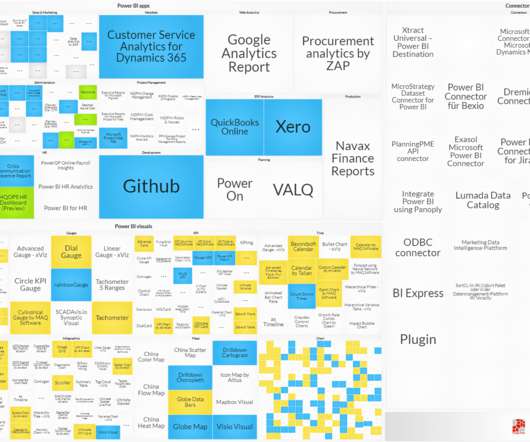
The ecosystem around Microsoft Power BI is growing fast – consultancies and software vendors are adopting the platform to offer added value in visuals, apps, connectors and data management tools. The website will consist of three innovative browser objects: Solutions, Consultants and Success Stories. What will the website offer?
That’s why so many rely on accounts receivable dashboards to provide transparency and enable oversight. Accounts receivable dashboards offer a window into everything that matters with A/R. Optimizing your dashboards is about maximizing their relevance, utility, and accessibility. Include the Right Metrics. Drill into the Data.
With this issue in mind, several BI tools have been developed to assist businesses in the generation of interactive reports with just a few clicks, enhancing the way companies make critical decisions and service insights from their most valuable data. Try our 14-day free trial & start building interactive reports today!
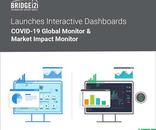
BRIDGEi2i, a leading AI consultancy, has launched two interactivedashboards that highlight the impact of COVID19 globally across businesses and communities. California/Bangalore, 16th April 2020. About BRIDGE i2i. Awards & Recognition News & Updates. www.BRIDGEi2i.com. BRIDGEi2i Analytics Solutions Contact.
The rise of SaaS business intelligence tools is answering that need, providing a dynamic vessel for presenting and interacting with essential insights in a way that is digestible and accessible. The future is bright for logistics companies that are willing to take advantage of big data. Now’s the time to strike.
. – June 15, 2020 – insightsoftware, a global provider of enterprise software solutions for the Office of the CFO, today announced a new partnership with interRel Consulting, an Oracle Enterprise Performance Management (EPM) Cloud specialist consulting company based in Arlington, Texas. About interRel. About insightsoftware.
Here’s what’s in store for 2022 related to: Online Courses, Private Training, Data Visualization Consulting, and Personal and Professional Goals. Dashboard Design. This four-course bundle teaches you to design static and interactivedashboards in Excel and Tableau. Data Visualization Consulting. Online Courses.
Forrester Research defines the ‘customer experience’ as: “How customers perceive their interactions with your company.”. Determining accurate CES, NPS, and CSAT is easier when you are using an interactive, real-time dashboard that’s capable of providing elevated visualizations coupled with concise textual details.
Decision support systems definition A decision support system (DSS) is an interactive information system that analyzes large volumes of data for informing business decisions. ERP dashboards. Dashboards and other user interfaces that allow users to interact with and view results. Clinical DSS. Knowledge-driven DSS.
Unlock the power of data visualization in your decision-making process by partnering with a data visualization consultant. Discover the pivotal role these consultants play in enhancing your business strategies and operations. In the realm of data visualization consulting, identifying key challenges is paramount to success.
One of my favorite parts of the annual IBIS event is the Dashboard Awards as every year I love to see the amazing dashboard solutions organizations have created with BI tools. Here are the categories and the winners: The 2021 Best Business Dashboard Award. The 2021 Limitless BI Dashboard Award. Congratulations!
The companies that yield BI-related tasks to internal IT teams now, are likely to hire expert consultants in the next years. interactive reports, dashboards, timesheets flexibility in creating data apps user-friendly search for data trends integration with third-parties profound search feature. SAP Lumira.
With a MySQL dashboard builder , for example, you can connect all the data with a few clicks. This hands-on classic guides readers through creating reliable queries for virtually any modern SQL-based database, which you can also use as a means to build your own SQL dashboard. It is a must-read for understanding data warehouse design.
The combined solution enables organizations to map IT capabilities to the business functions they support and determine how people, processes, data, technologies and applications interact to ensure alignment in achieving enterprise objectives.
Designing asynchronous web dashboards because the Data API lets you run long-running queries without having to wait for it to complete. This enables you to integrate web-based applications to access data from Amazon Redshift using an API to run SQL statements. For example, you can run SQL from JavaScript.
No need to be worried anymore, all these management problems could be settled with digital dashboard. Digital dashboard: definition & benefits. Digital dashboard is one of the forms of applying business intelligence in reality. Workshop application of FineReport’s digital dashboard. Digital dashboard software.
IT team members or consultants can leverage a simple, basic programming or scripting environment to define format templates and use data from Datasets and objects to produce stunning pixel perfect reports.
However, they have been a necessary evil, created by analysts and consultants. Modern business dashboard tools allow a wider audience to comprehend and disseminate the report findings. If the report is more exploratory in nature, you may want to include more granular data and options to interact with the data.
HR&A Advisors —a multi-disciplinary consultancy with extensive work in the broadband and digital equity space is helping its state, county, and municipal clients deliver affordable internet access by analyzing locally specific digital inclusion needs and building tailored digital equity plans.
Amazon QuickSight is a fully managed, cloud-native business intelligence (BI) service that makes it easy to connect to your data, create interactivedashboards, and share these with tens of thousands of users, both within QuickSight and embedded in your software as a service (SaaS) applications. Add the OR condition to RLS tags.
Following this, in 2002, it began delivering its knowledge to customers in online format, using dashboards and interactive reports that provided easier and faster access to data and analysis. Additionally, it continuously explores reams of data and modern tools to improve its capabilities and adapt to the changing data landscape.
But if you find a development opportunity, and see that your business performance can be significantly improved, then a KPI dashboard software could be a smart investment to monitor your key performance indicators and provide a transparent overview of your company’s data. Try to create a beneficial dashboard culture in your company.
Sales dashboards are an essential tool in this process. This guide provides a comprehensive overview of sales dashboards, including their definition, significance, steps for creating one, and useful tips. Additionally, we will offer various examples of sales dashboards to help you streamline your work effectively.
As we explore examples of data analysis reports and interactive report data analysis dashboards, we embark on a journey to unravel the nuanced art of transforming raw data into meaningful narratives that empower decision-makers. Try FineReport Now 1.1 To illustrate, let’s delve into specific examples within each category.
“For a CIO, or anyone in a senior position with responsibility for data, the best way to succeed is to make projects come to life,” says Caroline Carruthers, formerly a pioneering chief data officer at Network Rail, which manages train stations and infrastructure in the UK, and now CEO of data consultancy Carruthers and Jackson.
For vendors and consultancies: If you are active around Azure Analytics and offer consulting, training, other services or a software solution directly integrated in Azure Analytics products or a software solution that leverages the platform, you should be included in our market overview (official partner status at Microsoft is not required).
Our team was formed in 2019 as an informal group of four analysts who supported ad hoc analysis for a division of ProServe consultants. We’ve made a big impact with QuickSight because it doesn’t require in-depth knowledge about data visualizations to build dashboards and provide insights, empowering our users to build what they need.
As creators and experts in Apache Druid, Rill understands the data store’s importance as the engine for real-time, highly interactive analytics. Business stakeholders and metrics consumers should spend more time exploring key metrics than building and designing dashboards. Figure 1: Rill and Cloudera Architecture. More specifically: .
By 2025, it’s estimated we’ll have 463 million terabytes of data created every day,” says Lisa Thee, data for good sector lead at Launch Consulting Group in Seattle. To gain employee buy-in, Stout’s team builds BI dashboards to show them how they can easily connect to and interact with their data, as well as visualize it in a meaningful way.
By using interactive KPIs, product managers can optimize product strategies to ensure business growth. However, depending on who you are or to who you address your report to, product analytics metrics might vary: at the end of the day, stakeholders care about cash but the PM wants to figure out how customers are interacting with the product.
We organize all of the trending information in your field so you don't have to. Join 42,000+ users and stay up to date on the latest articles your peers are reading.
You know about us, now we want to get to know you!
Let's personalize your content
Let's get even more personalized
We recognize your account from another site in our network, please click 'Send Email' below to continue with verifying your account and setting a password.


Let's personalize your content