This site uses cookies to improve your experience. To help us insure we adhere to various privacy regulations, please select your country/region of residence. If you do not select a country, we will assume you are from the United States. Select your Cookie Settings or view our Privacy Policy and Terms of Use.
Cookie Settings
Cookies and similar technologies are used on this website for proper function of the website, for tracking performance analytics and for marketing purposes. We and some of our third-party providers may use cookie data for various purposes. Please review the cookie settings below and choose your preference.
Used for the proper function of the website
Used for monitoring website traffic and interactions
Cookie Settings
Cookies and similar technologies are used on this website for proper function of the website, for tracking performance analytics and for marketing purposes. We and some of our third-party providers may use cookie data for various purposes. Please review the cookie settings below and choose your preference.
Strictly Necessary: Used for the proper function of the website
Performance/Analytics: Used for monitoring website traffic and interactions
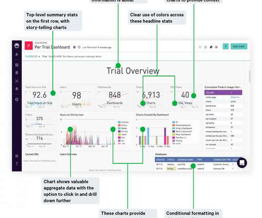
Better dashboards, better decisions. A well-constructed and organized dashboard empowers users to make better data-driven decisions. But how can you recognize readability issues in your dashboards while you build them to avoid wasting time and endlessly redoing your work? Pitfalls of a disorganized dashboard.
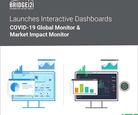
BRIDGEi2i, a leading AI consultancy, has launched two interactivedashboards that highlight the impact of COVID19 globally across businesses and communities. The Global COVID-19 Monitor gives live insights on the spread of the pandemic across the world and allows you to slice and dice data from many perspectives.
Cubes are superior to tables in that they can link and sort data by multiple dimensions, allowing for non-technical users to choose from any number of role-specific and highly contextualdata points to uncover new insights and adjust tactics and decisions on the fly. So how is the data extracted?
It also adds flexibility in accommodating new kinds of data, including metadata about existing data points that lets users infer new relationships and other facts about the data in the graph. Linking the data to related data in other collections and adding other data to this collection.
Cubes are superior to tables in that they can link and sort data by multiple dimensions, allowing for non-technical users to choose from any number of role-specific and highly contextualdata points to uncover new insights and adjust tactics and decisions on the fly. So how is the data extracted?
Google returns almost limitless examples when you search for “poor data visualization examples”. If your company has dashboards, check out the usage stats. The creator has chosen the appropriate chart or map or table, she’s showing the right data, the right amount of data, and the right contextualdata.
We organize all of the trending information in your field so you don't have to. Join 42,000+ users and stay up to date on the latest articles your peers are reading.
You know about us, now we want to get to know you!
Let's personalize your content
Let's get even more personalized
We recognize your account from another site in our network, please click 'Send Email' below to continue with verifying your account and setting a password.


Let's personalize your content