This site uses cookies to improve your experience. To help us insure we adhere to various privacy regulations, please select your country/region of residence. If you do not select a country, we will assume you are from the United States. Select your Cookie Settings or view our Privacy Policy and Terms of Use.
Cookie Settings
Cookies and similar technologies are used on this website for proper function of the website, for tracking performance analytics and for marketing purposes. We and some of our third-party providers may use cookie data for various purposes. Please review the cookie settings below and choose your preference.
Used for the proper function of the website
Used for monitoring website traffic and interactions
Cookie Settings
Cookies and similar technologies are used on this website for proper function of the website, for tracking performance analytics and for marketing purposes. We and some of our third-party providers may use cookie data for various purposes. Please review the cookie settings below and choose your preference.
Strictly Necessary: Used for the proper function of the website
Performance/Analytics: Used for monitoring website traffic and interactions
This is where the power of business dashboards comes into play. Dashboards often are the best way to gain insight into an organization and its various departments, operations and performance. Well-built, focused dashboards easily serve up summaries and reports of the BI that’s most critical to the organization.
Enter data dashboards – one of history’s best innovations in business intelligence. To help you understand this notion in full, we’re going to explore a data dashboard definition, explain the power of dashboard data, and explore a selection of data dashboard examples. What Is A Data Dashboard? click to enlarge**.
Knowing how to prepare and create one with the help of an online data analysis tool can reduce costs and time to decide on a relevant course of action. Thanks to all this information displayed on a single dashboard, your report is greatly enhanced and backed with accurate information for you to make sound decisions. click to enlarge**.
When these reports are backed up with powerful visualizations developed with a dashboard creator , no information can stay hidden, eliminating thus the possibility of human errors and negative business impact. However, the use of dashboards, big data, and predictive analytics is changing the face of this kind of reporting.
The answer is modern agency analytics reports and interactive dashboards. Starting with its definition, following with the benefits of agency reports, a list of tools, and a set of agency dashboard examples. Agencies benefit from interactive dashboard tools to prove the success of their strategies and campaigns to clients.
These reports have the power to store all your data and generate beautiful dashboards that can tell your data narrative in a simple, visual way. By creating visuals with the help of a dashboarddesigner , you can have all your KPIs on a single screen, ready to explore by utilizing powerful interactive features.
Ad hoc reporting, also known as one-time ad hoc reports, helps its users to answer critical business questions immediately by creating an autonomous report, without the need to wait for standard analysis with the help of real-time data and dynamic dashboards. Easy to use: .
Finally, we will show how to combine those metrics with the help of modern KPI software and create professional supply chain dashboards. You can even include supply delivery metrics in your performance dashboard focused on the supply chain, and monitor it more closely. Supply Chain Management Dashboard Examples. Return Reason.
An important part of my job is identifying and creating the appropriate communication products for each program, such as standard operating procedures, desk guides, fact sheets, and dashboards. When I first joined the team, we had no style guide to dictate what fonts, colors, or design to use for our signature products.
We won’t delve into details about the career prospects of this C-level position but we will present COO dashboards and reports that are critical for helping chief operating officers across the world to effectively manage their time, company, operational processes, and results. How to create a COO dashboard? What is a COO report?
Typically presented in the form of an interactive dashboard , this kind of report provides a visual representation of the data associated with your predetermined set of key performance indicators – or KPI data, for short. Set up a report which you can visualize with an online dashboard. Consider your data sources.
Because after all – a business dashboard is worth a thousand Excel sheets. A sales graph example generated with a dashboard builder that will prove invaluable regardless of your niche or sector. A sales growth graph that will help make your business robust, adaptable, and of course—profitable. How Do You Know Which Graph To Use?
Of course, this sounds incredible in theory. Often this is done through innovative dashboard software , visualizing once complicated tables and graphs in such ways that more people can initiate good data driven business decisions. We have a very strong discipline to log everything and measure everything”.
This will fundamentally change both UI design and the way software is used. Of course, such a feature would only be implemented with the consent of the employees. As this happens, the role of software architects, developers, and product designers will also evolve.
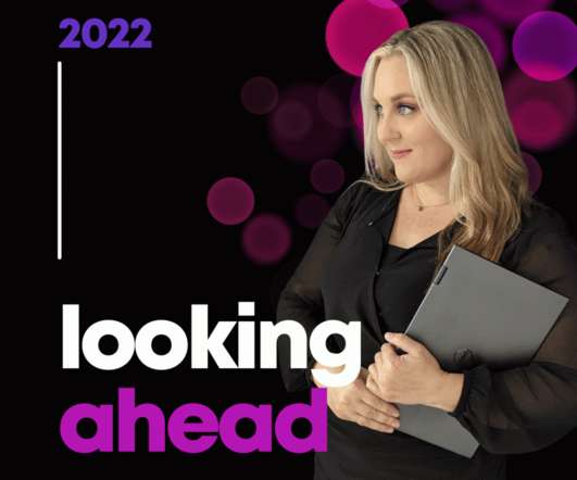
Here’s what’s in store for 2022 related to: Online Courses, Private Training, Data Visualization Consulting, and Personal and Professional Goals. Online Courses. This is our complimentary mini course. It’s a why-to mindset course that prepares you for the how-to courses you’ll take later on. DashboardDesign.
And the best way to do so is by using digital dashboards and a modern online reporting tool. What Is A Call Center Dashboard? Online data visualization tools are the fast track to improved customer service intelligence, and robust contact center dashboards exist for that very purpose. We offer a 14-day free trial.
One of the world’s most popular cloud-based customer relationship management (CRM) platforms, the software is designed to help companies across sectors plan and optimize their sales processes. Sales reports in Salesforce help companies to scale and grow. Essential Tools For Salesforce Reports. How To Create Effective Salesforce Reports?
We can see what books and courses our customers are using, and for how long. We’re talking about applications that integrate all of those sources into a single course of action, and can do so seamlessly. You analyze what your staff does to process an invoice, and then design a system to perform that process.
An online BI dashboard. Thanks to specific business intelligence best practices for dashboarddesign. Exclusive Bonus Content: Download Our Free Dashboard Checklist! Get the free guide with great tips for your dashboard implementation! What Is The Definition Of A BI Dashboard? How can you create one?
That said, when it comes to digesting and taking action upon vital financial metrics and insights, well-designed finance graphs and charts offer the best solution. Which Role Financial Dashboards Play. That said, in a time wherein less than two years, around 1.7 Let’s see this in more detail. click to enlarge**.
Data visualizations put together in intuitive dashboards can make the analysis process more dynamic and understandable while keeping the audience engaged. This style of layout is useful for network engineers, designers, and data analysts while compiling comprehensive network documentation. e) Bar or column chart.
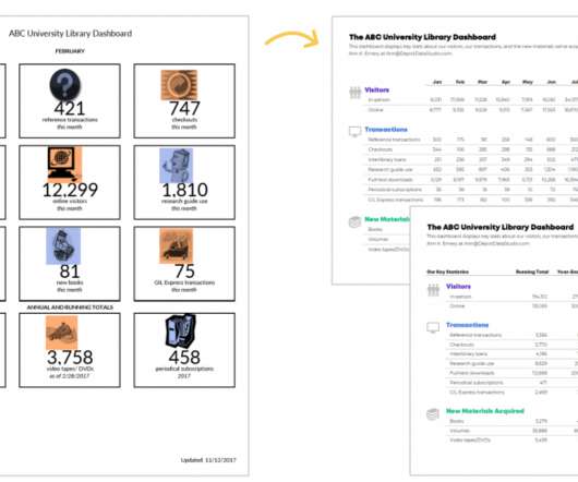
She enrolled in our DashboardDesigncourse and is sharing how she uses her new skills in real life. Save time and energy by using static Excel dashboards to design your grant deliverables. Read on to learn more about my journey implementing static dashboards in a non-profit context. Formatting Matters.
Dashboards and reports can serve as a starting point, but true strategy requires us to remix and reimagine our data continuously to reflect the current landscape. Rather than tracking course completions, what we truly need to know is who among our workforce can adapt and succeed when change occurs. So, what should we be focusing on?
That said, we will go into details of a marketing campaign report, provide a digital marketing report template, and look into marketing reporting and analysis with the help of carefully created dashboards. It shows how targets are performing in a monthly view, but the user can easily set this marketing dashboard to a yearly time frame.
BI analysts, with an average salary of $71,493 according to PayScale , provide application analysis and data modeling design for centralized data warehouses and extract data from databases and data warehouses for reporting, among other tasks. BI encompasses numerous roles. Organization: IBM. Fee: A subscription of $39 per month.
By gaining the ability to gather, organize and analyze the metrics that are most important to your organization, you stand to make your business empire more intelligent than ever before – and executive reporting and business dashboards will help you do just that. Exclusive Bonus Content: Executive Dashboards & Reports: A Summary.
6,000 total participants in our dataviz training academy so far (with 5 cohorts going through our Full Courses in 2021 alone). Of course not. He was a guest speaker inside our data analysis course, Simple Spreadsheets , and is a big, big deal in the Excel community! Are you familiar with The Big Book of Dashboards ??
In addition, we will see how online dashboards have overthrown the static nature of classic reports and given way to a much faster, more interactive way of working with data. Here we will cover 15 useful dashboard examples from different industries and functions to put the value of dashboard reporting into perspective.
So, I sufficed with Ann’s free Soar Beyond the Dusty Shelf Report course and blog posts. Ann’s DashboardDesign was one of the first courses I wanted to sign up for. I registered for the DashboardDesigncourse along with Simple Spreadsheets , Great Graphs: Design Principles , and Great Graphs: Excel How-To’s.
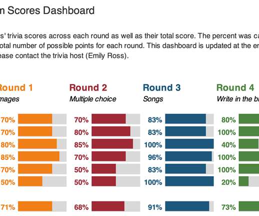
She enrolled in our DashboardDesigncourse and is sharing how she used her new skills in her personal life. I decided to apply some of the lessons I learned in the DashboardDesigncourse to make the sheet more accessible. After: My Trivia Night Dashboard. Now it was time to make the dashboard.
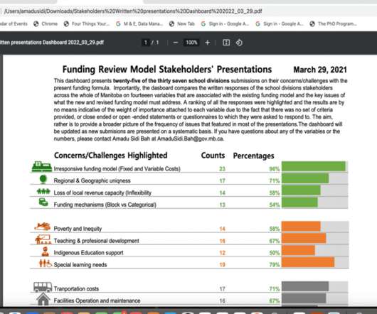
This guest post comes from Amadu Sidi Bah, who’s graduated from our Simple Spreadsheets, Great Graphs, Report Redesign, and DashboardDesigncourses. I then wasted no time in deciding on a one-pager dashboard. The Final Dashboard. Great work, Amadu! — Ann K. Enough of this long story.
Visual marketing dashboards are prime examples of using big data effectively in marketing. In this day and age, all businesses must pay especially close consideration to the performance of their marketing metrics dashboard. In this article, we will discuss what l needs to be included in marketing reporting dashboards.
For this purpose, it is necessary to consider the goals of your analysis, the type of data you are trying to represent, and, of course, the audience. click to enlarge** Tools such as datapine, give users some design options to use a column chart with longer labels by changing the orientation of the labels.
Is a dashboard a data story? A dashboard is about providing visibility to monitor data. We have a collection of lessons to teach you the skills for designing good data stories. 11 Best Data Storytelling Courses ?? Is a data visualization a data story? Not in and of itself. Generally not. Ready to learn more?
As quality issues are often highlighted with the use of dashboard software , the change manager plays an important role in the visualization of data quality. This should be designed to follow a natural process of data rule enforcement. This ratio should of course increase over time, proving that the quality of your data gets better.
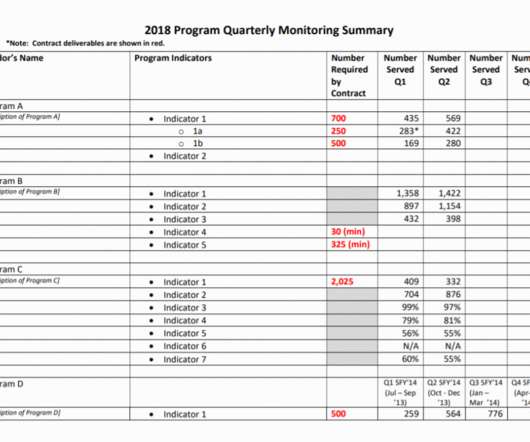
She enrolled in our DashboardDesigncourse and is sharing how she uses her new skills in real life. —– Using a dashboard has been central to my work as a program evaluator. Even before taking Ann’s DashboardDesigncourse, I knew Excel was the smarter choice just for the ability to use formulas.
Mobile technology has changed the way we interact with the world around us, and when it comes to analyzing valuable business insights, mobile dashboards offer the freedom and flexibility to turn stats into success while you’re on the go. What Is A Mobile Dashboard? Why Are Mobile Dashboards Important?
As part of that process, we redesigned several of their existing reports and dashboards. When asked to submit their existing visualizations to be redesigned, one of the conference attendees sent me this dashboard (shown below). I typically see “dashboards” that drone on for way too many pages. The icons were also working well.
The group had put significant effort into developing a (really good) interactive dashboard for their website. Dashboards are great for specific audiences. Dashboards can reach some, but not all, of our intended audiences. As a group, we reached consensus that we needed more than just a report, or more than just a dashboard.
I just finished re-recording DashboardDesign ! I’ve had 10,000+ students in my online courses since 2018, and I get a lot of questions about this process, like… How did you turn your keynote into a full-length online course? How did you turn your private, on-site workshop into an asynchronous online course?
Customers across diverse industries rely on Amazon OpenSearch Service for interactive log analytics, real-time application monitoring, website search, vector database, deriving meaningful insights from data, and visualizing these insights using OpenSearch Dashboards. The requested data is sent to the OpenSearch Dashboards server.
These reports are more digestible when they are generated through online data visualization tools that have numerous interactive dashboard features, to ensure that your business has the right meaningful financial data. Quantity does not, of course, mean quality, but on monitored daily, it can reveal bottlenecks or under-production problems.
To successfully gain control and improve a company’s technological needs, CTO dashboards and reports are needed as invaluable tools that consolidate multiple data points and support chief officers in strategic developments as well as online data analysis efforts, empowering their status of champions for new solutions.
Now here comes data dashboard ?Similar What is Data Dashboard?–Definition. A data dashboard is a useful tool that could display and analyze users’ complex data by means of data visualization so that the user gains a deep insight into the value of data. Data Dashboard Tool. Why Data Dashboard? Free Download.
We organize all of the trending information in your field so you don't have to. Join 42,000+ users and stay up to date on the latest articles your peers are reading.
You know about us, now we want to get to know you!
Let's personalize your content
Let's get even more personalized
We recognize your account from another site in our network, please click 'Send Email' below to continue with verifying your account and setting a password.


Let's personalize your content