This site uses cookies to improve your experience. To help us insure we adhere to various privacy regulations, please select your country/region of residence. If you do not select a country, we will assume you are from the United States. Select your Cookie Settings or view our Privacy Policy and Terms of Use.
Cookie Settings
Cookies and similar technologies are used on this website for proper function of the website, for tracking performance analytics and for marketing purposes. We and some of our third-party providers may use cookie data for various purposes. Please review the cookie settings below and choose your preference.
Used for the proper function of the website
Used for monitoring website traffic and interactions
Cookie Settings
Cookies and similar technologies are used on this website for proper function of the website, for tracking performance analytics and for marketing purposes. We and some of our third-party providers may use cookie data for various purposes. Please review the cookie settings below and choose your preference.
Strictly Necessary: Used for the proper function of the website
Performance/Analytics: Used for monitoring website traffic and interactions
Soon businesses of all sizes will have so much amount of information that dashboard software will be the most invaluable resource a company can have. Visualizing the data and interacting on a single screen is no longer a luxury but a business necessity. That’s why we welcome you to the world of interactivedashboards.
We won’t delve into details about the career prospects of this C-level position but we will present COO dashboards and reports that are critical for helping chief operating officers across the world to effectively manage their time, company, operational processes, and results. How to create a COO dashboard? What is a COO report?
We will discuss report examples and templates you can use to create your own report, use its features in an interactive way, and discover relevant inputs for your specific industry. In the process, we will use an online data visualization software that lets us interact with, and drill deeper into bits and pieces of relevant data.
To successfully gain control and improve a company’s technological needs, CTO dashboards and reports are needed as invaluable tools that consolidate multiple data points and support chief officers in strategic developments as well as online data analysis efforts, empowering their status of champions for new solutions.
Today, there are online data visualization tools that make it easy and fast to build powerful market-centric research dashboards. On a typical market research results example, you can interact with valuable trends, gain an insight into consumer behavior, and visualizations that will empower you to conduct effective competitor analysis.
Working with a team who knows the data you are working with opens the door to helpful and insightful feedback. Democratizing data empowers all people, regardless of their technical skills, to access it and help make informed decisions. 3) Gather data now. Gathering the right data is as crucial as asking the right questions.
Businesses have never had access to more data than they do today. Every transaction, customer interaction, and operational process leaves a digital footprint. Because data without intelligence is just noise. Its not that the data doesnt existits that it isnt connected. Take a mid-sized company trying to track performance.
2) How To Interpret Data? 3) Why Data Interpretation Is Important? 4) Data Analysis & Interpretation Problems. 5) Data Interpretation Techniques & Methods. 6) The Use of Dashboards For Data Interpretation. Business dashboards are the digital age tools for big data. What is the keyword?
Beyond the autonomous driving example described, the “garbage in” side of the equation can take many forms—for example, incorrectly entered data, poorly packaged data, and datacollected incorrectly, more of which we’ll address below. Why is high-quality and accessible data foundational?
The rise of SaaS business intelligence tools is answering that need, providing a dynamic vessel for presenting and interacting with essential insights in a way that is digestible and accessible. The future is bright for logistics companies that are willing to take advantage of big data. Now’s the time to strike.
For instance, when it comes to Human Resources, a digital transformation entails streamlining operations and digitizing personnel data. An accounting department may consider leveraging electronic contracts, datacollecting, and reporting as a part of the digital transition. Interactivity-driven Social Marketing.
GenAI as ubiquitous technology In the coming years, AI will evolve from an explicit, opaque tool with direct user interaction to a seamlessly integrated component in the feature set. This will fundamentally change both UI design and the way software is used.
In business intelligence, we are evolving from static reports on what has already happened to proactive analytics with a live dashboard assisting businesses with more accurate reporting. Such innovations offer the ability to transfer data over a network, creating valuable experiences for both the consumer and the business itself.
The strategic decision-making in the future of business intelligence will be shaped by faster reports, deeper data insights, broader areas of datacollection. BI software will gauge internal data on performance, sales and marketing, social media and other sources to build actionable recommendations for your business.
The Internet of Things (IoT) has revolutionized the way we interact with devices and gather data. Among the tools that have emerged from this digital transformation, IoT dashboards stand out as invaluable assets. IoT dashboards What is IoT Dashboard? You can download FineReport for free and have a try!
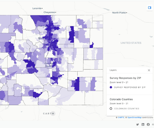
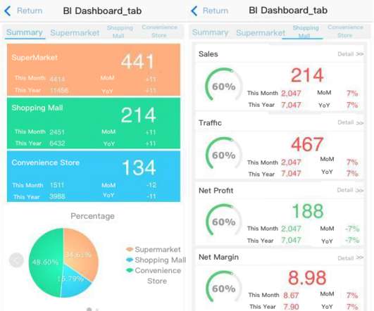
HR&A has used Amazon Redshift Serverless and CARTO to process survey findings more efficiently and create custom interactivedashboards to facilitate understanding of the results. The following are sample screenshots of the dashboards that show survey responses by zip code.
Before going all-in with datacollection, cleaning, and analysis, it is important to consider the topics of security, privacy, and most importantly, compliance. Businesses deal with massive amounts of data from their users that can be sensitive and needs to be protected. Rely on interactivedata visualizations.
Are you still using the traditional cumbersome and redundant datacollection methods? Have you ever neglected key indicators because of irrelevant data in your decision-making? No need to be worried anymore, all these management problems could be settled with digital dashboard. Digital dashboard software.
Overall, as users’ data sources become more extensive, their preferences for BI are changing. They prefer self-service development, interactivedashboards, and self-service data exploration. To put it bluntly, users increasingly want to do their own data analysis without having to find support from the IT department.
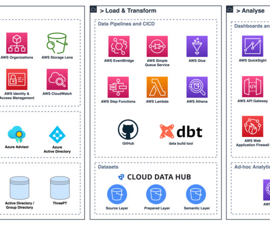
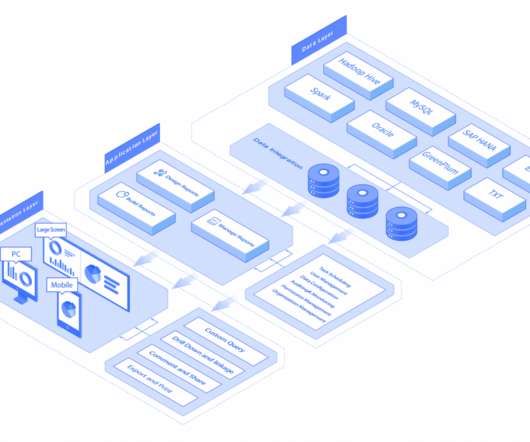
QuickSight meets varying analytics needs with modern interactivedashboards, paginated reports, natural language queries, ML-insights, and embedded analytics, from one unified service. Solution overview The following highly simplified architectural diagram illustrates the smart sensor datacollection and processing.
As we explore examples of data analysis reports and interactive report data analysis dashboards, we embark on a journey to unravel the nuanced art of transforming raw data into meaningful narratives that empower decision-makers. Try FineReport Now 1.1
The first was becoming one of the first research companies to move its panels and surveys online, reducing costs and increasing the speed and scope of datacollection. Additionally, it continuously explores reams of data and modern tools to improve its capabilities and adapt to the changing data landscape.
In addition to its user-friendliness, Splunk is also touted for its ability to create visual representations of data (graphs, etc.) They also offer an interactive online support forum where users can help each other and also request input from Splunk employees. that can be easily digested and shared with your team.
BI software uses algorithms to extract actionable insights from a company’s data and guide its strategic decisions. BI users analyze and present data in the form of dashboards and various types of reports to visualize complex information in an easier, more approachable way.
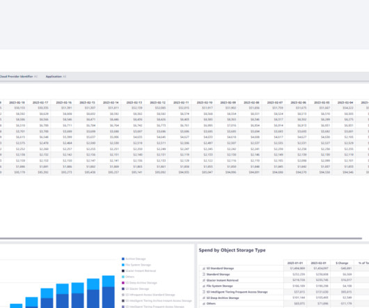
The CLEA dashboards were built on the foundation of the Well-Architected Lab. For more information on this foundation, refer to A Detailed Overview of the Cost Intelligence Dashboard. These ingested datasets are used as a source in CLEA dashboards. This is done at the group level.
Email and client interaction; task routing Airslate Document-centric tasks such as PDF editing or generating eSignatures for contracts are one of the focuses for Airslate. The focus is interacting with web pages, databases, and Excel spreadsheets. The focus is interacting with web pages, databases, and Excel spreadsheets.
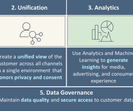
Customer 360 (C360) provides a complete and unified view of a customer’s interactions and behavior across all touchpoints and channels. This view is used to identify patterns and trends in customer behavior, which can inform data-driven decisions to improve business outcomes. Then, you transform this data into a concise format.
Engineering leadership chose Amazon QuickSight , which allowed Vega to add insightful analytics into its platform with customized interactive visuals and dashboards, while scaling at a lower cost without the need to manage infrastructure. The Vega Cloud Platform uses QuickSight APIs to seamlessly onboard new users.
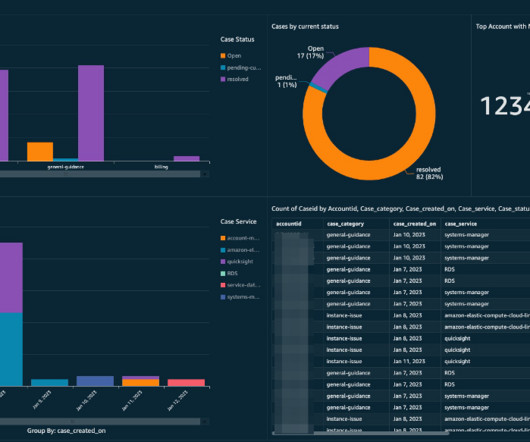
This post describes how Amazon QuickSight dashboards can help you visualize your support cases in a single pane of glass using data extracts from Systems Manager. Enable QuickSight in your datacollection account. The data source for the dashboard will be an Athena view of your existing support_cases database.
Residents want the ability to pay their taxes online, report a pothole from their phone, and generally make it easier to interact with their local officials and services. This can be accomplished with dashboards and constituent portals.
Relational databases emerged in the 1970s, enabling more advanced data management. In the 1990s, OLAP tools allowed multidimensional data analysis. The early 2000s brought self-service BI solutions for user-created reports and dashboards. Follower growth and demographics shed light on the reach and composition of your audience.
Several hospitals have also employed data intelligence tools in their services and operational processes. These hospitals are making use of dashboards that provide summary information on hospital patient trends, treatment costs, and waiting times. DataOps will make business data processes more efficient and agile. Healthcare.
This blog series follows the manufacturing and operations data lifecycle stages of an electric car manufacturer – typically experienced in large, data-driven manufacturing companies. The first blog introduced a mock vehicle manufacturing company, The Electric Car Company (ECC) and focused on DataCollection.
Every data professional knows that ensuring data quality is vital to producing usable query results. Streaming data can be extra challenging in this regard, as it tends to be “dirty,” with new fields that are added without warning and frequent mistakes in the datacollection process. Step 4: Query.
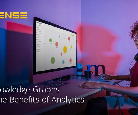
They recommend and expand queries, thereby improving the users experience of Sisense NLQ , which allows users to ask questions of their data in straightforward language and interact with it themselves. Sisense’s recommendation engine delivers accurate responses to queries and suggests new ideas that enhance data analysis.
Its pre-configured, expandable data model streamlines compliance while supporting various reporting frameworks. Key features include: Effortless DataCollection & Consolidation: Pre-configured, future-proof data model simplifies gathering of all data types (narrative, numeric, and calculated) for CSRD compliance.
As a result, CDP-enabled data products can meet multiple and varying functional and non-functional requirements that correspond to product attributes, each fulfilling specific customer needs. A single pane for visual analytic s is being delivered by bringing together analytical outputs produced by teams using different data experiences.
And using real-time systems as a foundation, managers finally get dashboards with all the information they need to run every aspect of the business, in real time, at their fingertips. Compliance drives true data platform adoption, supported by more flexible data management. Looking forward to 2020 and beyond.
And how can the datacollected across multiple touchpoints, from retail locations to the supply chain to the factory be easily integrated? Enter data warehousing. So how is the data extracted? By using Structured Query Language, or SQL, the language used to manipulate and extract data stored in cubes.
For example: Observing the frequency of missing data across a dataset’s features often tells one which features can be used for the purposes of modeling out of the box (e.g., Computing interactions of all features on a pairwise basis can be useful for selecting, or de-selecting, for further research. imputation of missing values).
How to present data more hierarchically within a limited screen? Want more interaction with data? You can make the data more three-dimensional by adding interactive actions to the entire template or to a single component. For example, you can use the tab to segment the data into several parts. Interactive .
Enterprise reporting is a process of extracting, processing, organizing, analyzing, and displaying data in the companies. It uses enterprise reporting tools to organize data into charts, tables, widgets, or other visualizations. Via the interactive analysis such as drill-down, the problems in business can be located. .
Additionally, we will provide real-life examples of KPI tracking dashboards and a step-by-step guide to setting up your own dashboard. This approach not only helps extract additional value from organizational data but also facilitates setting targets and measuring incremental progress in crucial areas of the business.
Originally, Excel has always been the “solution” for various reporting and data needs. However, along with the diffusion of digital technology, the amount of data is getting larger and larger, and datacollection and cleaning work have become more and more time-consuming.
We organize all of the trending information in your field so you don't have to. Join 42,000+ users and stay up to date on the latest articles your peers are reading.
You know about us, now we want to get to know you!
Let's personalize your content
Let's get even more personalized
We recognize your account from another site in our network, please click 'Send Email' below to continue with verifying your account and setting a password.


Let's personalize your content