This site uses cookies to improve your experience. To help us insure we adhere to various privacy regulations, please select your country/region of residence. If you do not select a country, we will assume you are from the United States. Select your Cookie Settings or view our Privacy Policy and Terms of Use.
Cookie Settings
Cookies and similar technologies are used on this website for proper function of the website, for tracking performance analytics and for marketing purposes. We and some of our third-party providers may use cookie data for various purposes. Please review the cookie settings below and choose your preference.
Used for the proper function of the website
Used for monitoring website traffic and interactions
Cookie Settings
Cookies and similar technologies are used on this website for proper function of the website, for tracking performance analytics and for marketing purposes. We and some of our third-party providers may use cookie data for various purposes. Please review the cookie settings below and choose your preference.
Strictly Necessary: Used for the proper function of the website
Performance/Analytics: Used for monitoring website traffic and interactions
2) How To Measure Productivity? For years, businesses have experimented and narrowed down the most effective measurements for productivity. Today, employee output is no longer represented by vague descriptions, but by isolated figures that offer insight for improvement in specific areas, which can be found on an HR dashboard.
We won’t delve into details about the career prospects of this C-level position but we will present COO dashboards and reports that are critical for helping chief operating officers across the world to effectively manage their time, company, operational processes, and results. How to create a COO dashboard? What is a COO report?
By implementing the right reporting tools and understanding how to analyze as well as to measure your data accurately, you will be able to make the kind of data driven decisions that will drive your business forward. What Is Data Driven Decision Making? Quantitative data analysis focuses on numbers and statistics.
To successfully gain control and improve a company’s technological needs, CTO dashboards and reports are needed as invaluable tools that consolidate multiple data points and support chief officers in strategic developments as well as online data analysis efforts, empowering their status of champions for new solutions.
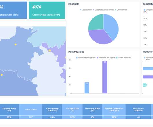
The importance of this finance dashboard lays within the fact that every finance manager can easily track and measure the whole financial overview of a specific company while gaining insights into the most valuable KPIs and metrics. SaaS management dashboard. click to enlarge**. Explore our 14-day free trial.
By articulating fitness functions automated tests tied to specific quality attributes like reliability, security or performance teams can visualize and measure system qualities that align with business goals. Documentation and diagrams transform abstract discussions into something tangible.
2) How To Interpret Data? 3) Why Data Interpretation Is Important? 4) Data Analysis & Interpretation Problems. 5) Data Interpretation Techniques & Methods. 6) The Use of Dashboards For Data Interpretation. Business dashboards are the digital age tools for big data.
Datacollection is nothing new, but the introduction of mobile devices has made it more interesting and efficient. But now, mobile datacollection means information can be digitally recording on the mobile device at the source of its origin, eliminating the need for data entry after the information is collected.
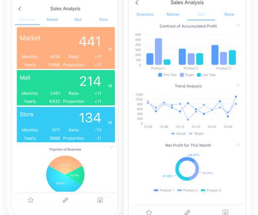
Today, there are online data visualization tools that make it easy and fast to build powerful market-centric research dashboards. How To Present Your Results: 3 Market Research Example Dashboards. When it comes to sharing the most important information, research dashboards are invaluable. Let’s take a closer look.
Its not that the data doesnt existits that it isnt connected. This is precisely why Microsoft Dynamics 365 integration with BI dashboards has become a game-changer. Beyond DataCollection: Why Dynamics 365 Integration is Critical Most businesses today use Dynamics 365 for managing sales, finance, customer service, or operations.
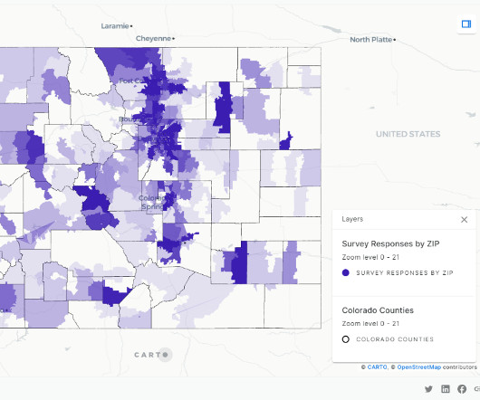
HR&A has used Amazon Redshift Serverless and CARTO to process survey findings more efficiently and create custom interactive dashboards to facilitate understanding of the results. The following are sample screenshots of the dashboards that show survey responses by zip code.
The big data market is expected to exceed $68 billion in value by 2025 , a testament to its growing value and necessity across industries. According to studies, 92% of data leaders say their businesses saw measurable value from their data and analytics investments.
The process helps businesses and decision-makers measure the success of their strategies toward achieving company goals. How does Company A measure the success of each individual effort so that it can isolate strengths and weaknesses? Key performance indicators enable businesses to measure their own ability to set and achieve goals.
To reduce its carbon footprint and mitigate climate change, the National Hockey League (NHL) has turned to data and analytics to gauge the sustainability performance of the arenas where its teams play. The most important thing about any sustainability platform is you cannot impact what you cannot measure,” Mitchell says.
This includes defining the main stakeholders, assessing the situation, defining the goals, and finding the KPIs that will measure your efforts to achieve these goals. A planned BI strategy will point your business in the right direction to meet its goals by making strategic decisions based on real-time data.
Measurement, tracking, and logging is less of a priority in enterprise software. Consumer product management is typically more bottom-up, driven by large volumes of user feedback and usage tracking data. It turns out that type of data infrastructure is also the foundation needed for building AI products.
Datacollection is nothing new, but the introduction of mobile devices has made it more interesting and efficient. But now, mobile datacollection means information can be digitally recording on the mobile device at the source of its origin, eliminating the need for data entry after the information is collected.
An Operations Key Performance Indicator (KPI) or metric is a discrete measurement that a company uses to monitor and evaluate the efficiency of its day-to-day operations. Leading companies make use of KPIs and KPI dashboards to measure their efficiency in real time. What is an Operations KPI?
Among the tools that have emerged from this digital transformation, IoT dashboards stand out as invaluable assets. In this article, we will explore the concept of IoT dashboards, delve into their benefits, examine real-life examples, and highlight the essential features that make them indispensable in the IoT landscape.
Because things are changing and becoming more competitive in every sector of business, the benefits of business intelligence and proper use of data analytics are key to outperforming the competition. BI software uses algorithms to extract actionable insights from a company’s data and guide its strategic decisions. The results?
How to measure your data analytics team? So it’s Monday, and you lead a data analytics team of perhaps 30 people. Like most leaders of data analytic teams, you have been doing very little to quantify your team’s success. The Active Data Ratio metric determines the percentage of datasets that deliver value.
A finance department Key Performance Indicator (KPI) or metric is a clearly defined quantifiable measure used to evaluate a company’s financial performance. How to Build Finance Department KPI Dashboards. To do this, the metric analyzes the number of days to sell inventory, collect receivables, and pay its bills. View Guide Now.
In today’s dynamic business environment, gaining comprehensive visibility into financial data is crucial for making informed decisions. This is where the significance of a financial dashboard shines through. What is A Financial Dashboard? You can download FineReport for free and have a try!
Business analytics can help you improve operational efficiency, better understand your customers, project future outcomes, glean insights to aid in decision-making, measure performance, drive growth, discover hidden trends, generate leads, and scale your business in the right direction, according to digital skills training company Simplilearn.
Why not just measure Profit?" " That is right, we will measure it. Where I've implemented a simple where you able to complete your task qualitative datacollection mechanism, I always pair Conversion Rate with Task Completion Rate. It should be immediately adjacent. Two simple reasons. Likes – ?
Most data management conferences and forums focus on AI, governance and security, with little emphasis on ESG-related data strategies. If sustainability-related data projects fail to demonstrate a clear financial impact, they risk being deprioritized in favor of more immediate business concerns.
As we explore examples of data analysis reports and interactive report data analysis dashboards, we embark on a journey to unravel the nuanced art of transforming raw data into meaningful narratives that empower decision-makers. Try FineReport Now 1.1
QuickSight meets varying analytics needs with modern interactive dashboards, paginated reports, natural language queries, ML-insights, and embedded analytics, from one unified service. Solution overview The following highly simplified architectural diagram illustrates the smart sensor datacollection and processing.
An engineering Key Performance Indicator (KPI) or metric is a clearly defined quantifiable measure that an engineering firm uses to gauge its success over time. We will also discuss how engineering dashboards are imperative for tracking KPIs and can streamline a reporting process. How to Build Useful KPI Dashboards.
The first was becoming one of the first research companies to move its panels and surveys online, reducing costs and increasing the speed and scope of datacollection. According to Mohammed, the results of this digital transformation journey are measurable and impressive. js and React.js.
The organization functions off a clearly defined Digital Marketing & Measurement Model. #1. In service of report creation the job includes: Pulling data, writing queries, fulfilling ad-hoc requests, scheduling data outputs (reports, dashboards), liaising with script implementers / IT teams to collect more data, etc.
Hilburn's Law of Data Intentionality identifies the existence of a positive correlation between the intentionality of datacollection and and the intentionality of data communication [citation needed]. The following diagram represents this relationship between intentional datacollection and intentional data presentation.
Provide a new way of data discovery. New datacollection technologies like devices for Internet of Things (IoT) are providing companies with massive amounts of real-time data. This is different from any previous ways of collectingdata. The dashboard made by FineReport shows dynamic cost.
Overall, as users’ data sources become more extensive, their preferences for BI are changing. They prefer self-service development, interactive dashboards, and self-service data exploration. To put it bluntly, users increasingly want to do their own data analysis without having to find support from the IT department.
Data only becomes valuable when you start to get insights from it and apply those insights to actions. The answer is not simply a better dashboard or more carefully designed data visualizations. The foundation of getting value from data depends on creating a data fluent culture in your organization.
Every data professional knows that ensuring data quality is vital to producing usable query results. Streaming data can be extra challenging in this regard, as it tends to be “dirty,” with new fields that are added without warning and frequent mistakes in the datacollection process. Step 4: Query.
Its pre-configured, expandable data model streamlines compliance while supporting various reporting frameworks. Key features include: Effortless DataCollection & Consolidation: Pre-configured, future-proof data model simplifies gathering of all data types (narrative, numeric, and calculated) for CSRD compliance.
A financial Key Performance Indicator (KPI) or metric is a quantifiable measure that a company uses to gauge its financial performance over time. Under modern day reporting standards, companies are formally obligated to present their financial data in the following statements: balance sheet, income statement, and cash flow statement.
However, companies operation generates numerous and complicated data every day, beyond traditional manual reporting capacity. Profit analysis: measure the company’s operating profit and profit distribution. It’s best to look at the financial data for 5-15 years. DataCollection and Report Drawing.
Additionally, we will provide real-life examples of KPI tracking dashboards and a step-by-step guide to setting up your own dashboard. By regularly and automatically measuring KPIs, you can enhance productivity and reduce costs. What Is KPI Tracking? Tracking KPIs enables you to acquire valuable business intelligence.
Helpful post: You Are What You Measure, So Choose Your KPIs (Incentives) Wisely! ]. As we develop more sophistication to our measurement, they'll morph from being attributes of a Visitor to those of a Person. ." You'll find it here: Strategic & Tactical Dashboards: Best Practices, Tips, Examples. Definition?
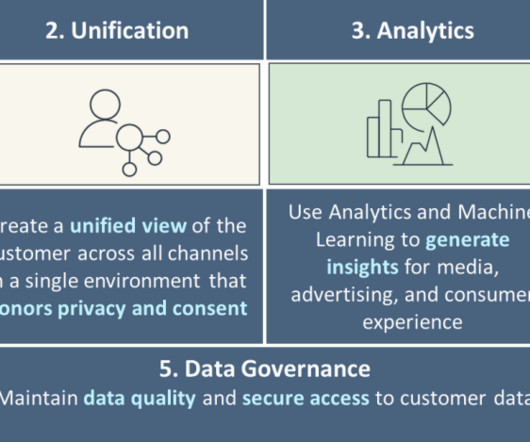
In this post, we discuss how you can use purpose-built AWS services to create an end-to-end data strategy for C360 to unify and govern customer data that address these challenges. We recommend building your data strategy around five pillars of C360, as shown in the following figure.
Relational databases emerged in the 1970s, enabling more advanced data management. In the 1990s, OLAP tools allowed multidimensional data analysis. The early 2000s brought self-service BI solutions for user-created reports and dashboards.
Prometheus metrics provide data points that consist of the metric name, label, timestamp and value by using a query language called PromQL. PromQL allows developers and IT departments to aggregate data metrics and turn them into histograms–graphs and dashboards for greater visualization.
We organize all of the trending information in your field so you don't have to. Join 42,000+ users and stay up to date on the latest articles your peers are reading.
You know about us, now we want to get to know you!
Let's personalize your content
Let's get even more personalized
We recognize your account from another site in our network, please click 'Send Email' below to continue with verifying your account and setting a password.


Let's personalize your content