This site uses cookies to improve your experience. To help us insure we adhere to various privacy regulations, please select your country/region of residence. If you do not select a country, we will assume you are from the United States. Select your Cookie Settings or view our Privacy Policy and Terms of Use.
Cookie Settings
Cookies and similar technologies are used on this website for proper function of the website, for tracking performance analytics and for marketing purposes. We and some of our third-party providers may use cookie data for various purposes. Please review the cookie settings below and choose your preference.
Used for the proper function of the website
Used for monitoring website traffic and interactions
Cookie Settings
Cookies and similar technologies are used on this website for proper function of the website, for tracking performance analytics and for marketing purposes. We and some of our third-party providers may use cookie data for various purposes. Please review the cookie settings below and choose your preference.
Strictly Necessary: Used for the proper function of the website
Performance/Analytics: Used for monitoring website traffic and interactions
Typically presented in the form of an interactive dashboard , this kind of report provides a visual representation of the data associated with your predetermined set of key performance indicators – or KPI data, for short. Consider your data sources. Set up a report which you can visualize with an online dashboard.
They help in making the right decision: To ensure positive business results, data-enabled decisions are critical. What are key metrics in this case enabling – is an environment that focuses on making the right decision at the right time since they will present the data, and help you derive insights.
Benefits Of Big Data In Logistics Before we look at our selection of practical examples and applications, let’s look at the benefits of big data in logistics – starting with the (not so) small matter of costs. Big dataenables automated systems by intelligently routing many data sets and data streams.
Data scientists derive insights from data while business analysts work closely with and tend to the data needs of business units. Business analysts sometimes perform data science, but usually, they integrate and visualize data and create reports and dashboards from data supplied by other groups.
While drilling down provides granular information within a specific chart or data set, drill throughs display another aspect of the data that might be relevant and it does it by opening a pop-up chart. For example, the image above shows a management dashboard with 5 number charts on the top. click to enlarge**. Total revenue.
Imagine a data team of one or two dozen data professionals serving the analytics needs of hundreds of sales and marketing team members. They submit an endless list of requests for new data sets, dashboards, segmentations, cached data sets and nearly anything else they think will help them meet business goals.
Orchestrated pipelines that span teams, toolchains, data centers and organizational boundaries emanate from the data lake to create analytics platforms used by data scientists and business users to generate on-demand insights. . The Hub-Spoke architecture is part of a dataenablement trend in IT.
– Kurt Zimmer, AstraZeneca, Head of Data Engineering inside DataEnablement (CDO Summit 2021). Meta-orchestration is problematic for some because it requires an orchestration tool to connect seamlessly with data professionals’ vast ecosystem of tools.
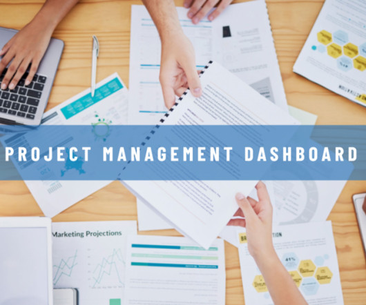
Thus, one tool that has gained significant popularity in recent years is the Project Management Dashboard. Moreover, the implementation of an effective Project Management Dashboard facilitates data-driven decision-making and sustainable business success. What Is A Project Management Dashboard?
Digital data, by its very nature, paints a clear, concise, and panoramic picture of a number of vital areas of business performance, offering a window of insight that often leads to creating an enhanced business intelligence strategy and, ultimately, an ongoing commercial success. 2) Uncovering Fresh Business Insights.
This delivery takes the form of purpose-built data warehouses/marts and other forms of aggregation and star views tailored to analyst requirements. When these builds are complete, notifications trigger refreshes of dashboards, Tableau workbooks, and whatever standard reports the business unit requires.
In OpenSearch Dashboards, choose Security in the navigation pane. Navigate to Dev Tools in OpenSearch Dashboards and run the following command: GET _cat/templates This confirms that the scripts were successful. You can use the visualizations after you start importing data. Choose Import.
Visualizing data with CloudWatch dashboards The solution also provides a sample CloudWatch dashboard to visualize the collected metrics. The provided helper script simplifies the set up and deployment of the dashboard. To see the complete list of metrics, go to the GitHub repository.
While designing a website, it is necessary to allocate resources for site search analysis through an in-built site bot or a dashboard to analyze data and make modifications. Advantages of Using Big Data for Web Design. Web Traffic Analysis.
Cloudera’s customers in the financial services industry have realized greater business efficiencies and positive outcomes as they harness the value of their data to achieve growth across their organizations. Dataenables better informed critical decisions, such as what new markets to expand in and how to do so.
Instead, continuous reporting, in which information is updated in real time on easy-to-read dashboards, means finance teams will always have the latest figures at their fingertips. Tip 3: Make decisions with operational data. Without leveraging the power of operational data, a finance team is essentially flying blind.
Data limitations in Microsoft Excel. PHE uses an automated process to transfer COVID-19 positive lab results as a CSV file into Excel templates used by reporting dashboards and for contact tracing. Like all other big retailers, Target had been collecting data on its customers via shopper codes, credit cards, surveys, and more.
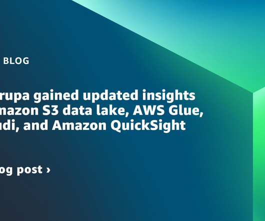
The data lake implemented by Ruparupa uses Amazon S3 as the storage platform, AWS Database Migration Service (AWS DMS) as the ingestion tool, AWS Glue as the ETL (extract, transform, and load) tool, and QuickSight for analytic dashboards. The audience of these few reports was limited—a maximum of 20 people from management.
Her team’s objectives are to, first, make it easier for analysts to explore data, enabling them to uncover interesting trends in product features and performance. A second objective is to make it easier for less technical users to interpret data through the creation of dashboards.
Operational reports have the potential to greatly enhance business performance through the utilization of data-driven insights. These reports offer a structured and comprehensible representation of data, enabling a clearer understanding of complex issues that might otherwise remain elusive. Book a Free Demo 1.
With the ability to represent complex datasets in an easily understandable format, visualizations enable analysts to navigate through extensive data seamlessly. The dynamic nature of visualizations allows for swift changes in perspectives, enabling users to switch between different views or layers of information effortlessly.
When combined, SaaS BI tools enable users to conduct comprehensive data analysis using modern cloud BI technology , providing access to all data sources and the ability to compile online dashboards from mobile devices. Tableau , developed by Salesforce, is another prominent player in the realm of SaaS BI software.
At IBM, we believe it is time to place the power of AI in the hands of all kinds of “AI builders” — from data scientists to developers to everyday users who have never written a single line of code. Watsonx, IBM’s next-generation AI platform, is designed to do just that.
Soon businesses of all sizes will have so much amount of information that dashboard software will be the most invaluable resource a company can have. Visualizing the data and interacting on a single screen is no longer a luxury but a business necessity. That’s why we welcome you to the world of interactive dashboards.
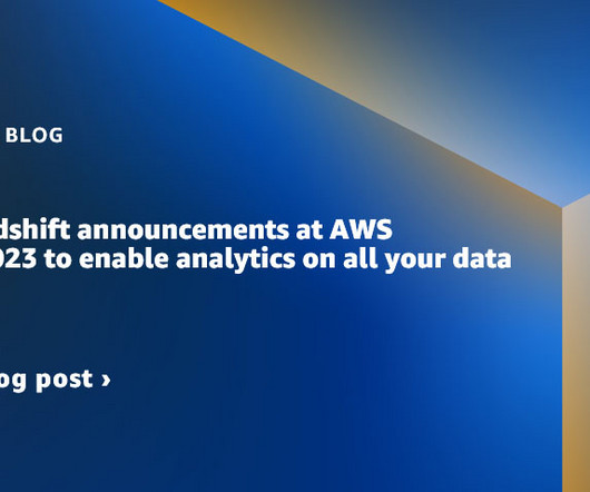
These announcements drive forward the AWS Zero-ETL vision to unify all your data, enabling you to better maximize the value of your data with comprehensive analytics and ML capabilities, and innovate faster with secure data collaboration within and across organizations.
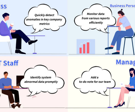
When key indicators show abnormal fluctuations or significant outlier values are detected in key data, it is necessary to promptly communicate risk information to business leaders for effective risk alerting. In response to this scenario, the data alert function has emerged and has now been officially released.
Application teams that embed dashboards and reports drive revenue, reduce customer churn, and differentiate their software from the competition. While embedded dashboards create real value, they can also come with real costs. The challenge is collecting all that data into one place and making it understandable.
Oerthle, Head of Analytics Reporting & Infrastructure, ALH Gruppe shared, “With the new IBM Analytics Content Hub, we are able to connect internal stakeholders to multiple different BI solutions for easier, faster access to self-service data, enabling better outcomes for our end customers.”.
InsightOut's data cleansing services tackle common issues such as duplicate entries, inconsistent formatting, and incomplete records.This ensures that the data e-commerce companies rely on is accurate and trustworthy. Key Advantages: Improved Data Accuracy: Minimize errors that could lead to misguided business decisions.
Similarly, Kyle outlined how Flexport , the world’s first international freight forwarder and customs brokerage built around an online dashboard, uses Periscope Data to analyze billions of records, and get answers in seconds. Kongregate has been using Periscope Data since 2013.
Furthermore, MES systems provide organizations with comprehensive and accurate production data, enablingdata-driven decision-making to continuously enhance business processes and optimize resource utilization. User-friendliness: The software should be easy to use, with intuitive dashboards and user interfaces.
Designers should allow for the integration of more data into the charts (excluding non-essential data), enabling interested users to delve deeper into the dataset. This bubble chart showcases effective features of data visualization, representing a successful example of a visually appealing chart. js or Highcharts.
These include single consoles or dashboards that help create a single pane of glass (SPOG) so teams can easily view and control resources. Also known as “k8s” or “kube,” Kubernetes is a container orchestration platform for scheduling and automating the deployment, management and scaling of containerized applications.
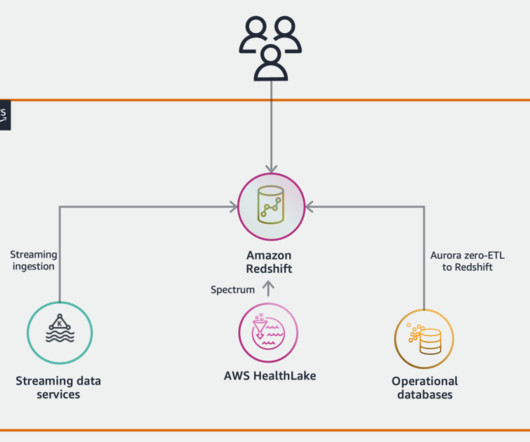
This means you can seamlessly combine information such as clinical data stored in HealthLake with data stored in operational databases such as a patient relationship management system, together with data produced from wearable devices in near real-time.
AI-driven software services include big dataenabled CRM systems , custom dashboards, system integrations, booking platforms and any other systems meant to make any action easier for both you and your users. Understand how your customers interact with your website, see where they get stuck.
Streaming data facilitates the constant flow of diverse and up-to-date information, enhancing the models’ ability to adapt and generate more accurate, contextually relevant outputs. OpenSearch Service offers visualization capabilities powered by OpenSearch Dashboards and Kibana (1.5
Visualizing Healthcare Data for Actionable Insights In addition to predictive analytics and data mining, healthcare data visualization plays a crucial role in empowering healthcare providers with real-time insights into patient conditions and treatment effectiveness.
Decision optimization: Streamline the selection and deployment of optimization models and enable the creation of dashboards to share results, enhance collaboration and recommend optimal action plans. AutoML tools: Automated machine learning, or autoML, supports faster model creation with low-code and no-code functionality.
It includes the reports, charts, dashboards, and terminology unique to your organization. ISL helps today's business leaders understand how data answers business questions. Choosing the best analytics and BI platform for solving business problems requires non-technical workers to “speak data.”.
Relational databases emerged in the 1970s, enabling more advanced data management. In the 1990s, OLAP tools allowed multidimensional data analysis. The early 2000s brought self-service BI solutions for user-created reports and dashboards. Role of BI in Modern Enterprises What’s the goal and role of this data giant?
For EA professionals, relying on people and manual processes to provision, manage, and govern data simply does not scale. Enterprises are waking up to this fact and turning to data catalogs to democratize access to data, enable tribal data knowledge to curate information, apply data policies, and activate all data for business value quickly.[2]
Remember, it’s not about how many records were cleaned up or how many dashboards were generated, it’s about how much of an impact on the outcome the worm of D&A has that counts. What are the new trends around the Data solution architecture (centralized vs de-centralized?). I didn’t mean to imply this. Would you agree?
This feature enables users to save calculations from a Tableau dashboard directly to Tableau’s metrics layer so they can monitor and track the information over time. Tableau says a user working in hospitality could click “Draft with Einstein” for data about travel. Metrics Bootstrapping.
A data pipeline is a series of processes that move raw data from one or more sources to one or more destinations, often transforming and processing the data along the way. Data pipelines support data science and business intelligence projects by providing data engineers with high-quality, consistent, and easily accessible data.
We organize all of the trending information in your field so you don't have to. Join 42,000+ users and stay up to date on the latest articles your peers are reading.
You know about us, now we want to get to know you!
Let's personalize your content
Let's get even more personalized
We recognize your account from another site in our network, please click 'Send Email' below to continue with verifying your account and setting a password.


Let's personalize your content