This site uses cookies to improve your experience. To help us insure we adhere to various privacy regulations, please select your country/region of residence. If you do not select a country, we will assume you are from the United States. Select your Cookie Settings or view our Privacy Policy and Terms of Use.
Cookie Settings
Cookies and similar technologies are used on this website for proper function of the website, for tracking performance analytics and for marketing purposes. We and some of our third-party providers may use cookie data for various purposes. Please review the cookie settings below and choose your preference.
Used for the proper function of the website
Used for monitoring website traffic and interactions
Cookie Settings
Cookies and similar technologies are used on this website for proper function of the website, for tracking performance analytics and for marketing purposes. We and some of our third-party providers may use cookie data for various purposes. Please review the cookie settings below and choose your preference.
Strictly Necessary: Used for the proper function of the website
Performance/Analytics: Used for monitoring website traffic and interactions
The Race For DataQuality In A Medallion Architecture The Medallion architecture pattern is gaining traction among data teams. It is a layered approach to managing and transforming data. It sounds great, but how do you prove the data is correct at each layer? How do you ensure dataquality in every layer ?
1) What Is DataQuality Management? 4) DataQuality Best Practices. 5) How Do You Measure DataQuality? 6) DataQualityMetrics Examples. 7) DataQuality Control: Use Case. 8) The Consequences Of Bad DataQuality. 9) 3 Sources Of Low-QualityData.
Is Your Team in Denial of DataQuality? Here’s How to Tell In many organizations, dataquality problems fester in the shadowsignored, rationalized, or swept aside with confident-sounding statements that mask a deeper dysfunction. That’s not dataquality; that’s data folklore.
If you’re part of a growing SaaS company and are looking to accelerate your success, leveraging the power of data is the way to gain a real competitive edge. That’s where SaaS dashboards enter the fold. A SaaS dashboard is a powerful business intelligence tool that offers a host of benefits for ambitious tech businesses.
AWS Glue DataQuality allows you to measure and monitor the quality of data in your data repositories. It’s important for business users to be able to see quality scores and metrics to make confident business decisions and debug dataquality issues.
Data exploded and became big. Spreadsheets finally took a backseat to actionable and insightful data visualizations and interactive business dashboards. The rise of self-service analytics democratized the data product chain. 1) DataQuality Management (DQM). We all gained access to the cloud.
As such, the data on labor, occupancy, and engagement is extremely meaningful. Here, CIO Patrick Piccininno provides a roadmap of his journey from data with no integration to meaningful dashboards, insights, and a data literate culture. You ’re building an enterprise data platform for the first time in Sevita’s history.
Since humans process visual information 60.000 times faster than text , the workflow can be significantly increased by utilizing smart intelligence in the form of interactive, and real-time visual data. Each information can be gathered into a single, live dashboard , that will ultimately secure a fast, clear, simple, and effective workflow.
While sometimes it’s okay to follow your instincts, the vast majority of your business-based decisions should be backed by metrics, facts, or figures related to your aims, goals, or initiatives that can ensure a stable backbone to your management reports and business operations. In most cases, this can prove detrimental to the business.
As technology and business leaders, your strategic initiatives, from AI-powered decision-making to predictive insights and personalized experiences, are all fueled by data. Yet, despite growing investments in advanced analytics and AI, organizations continue to grapple with a persistent and often underestimated challenge: poor dataquality.
So it’s Monday, and you lead a data analytics team of perhaps 30 people. But wait, she asks you for your team metrics. Like most leaders of data analytic teams, you have been doing very little to quantify your team’s success. Where is your metrics report? What should be in that report about your data team?
RightData – A self-service suite of applications that help you achieve DataQuality Assurance, Data Integrity Audit and Continuous DataQuality Control with automated validation and reconciliation capabilities. QuerySurge – Continuously detect data issues in your delivery pipelines. Data breaks.
The purpose is not to track every statistic possible, as you risk being drowned in data and losing focus. Using an IT analytics software is extremely useful in the matter: by gathering all your data in a single point-of-truth, you can easily analyze everything at once and create actionable IT dashboards.
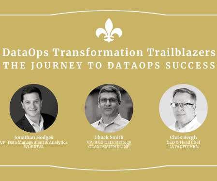
Similarly, Workiva was driven to DataOps due to an increased need for analytics agility to meet a range of organizational needs, such as real-time dashboard updates or ML model training and monitoring. There are a limited number of folks on the data team that can manage all of these things. Multiple Metrics for Success.
In a previous post , we noted some key attributes that distinguish a machine learning project: Unlike traditional software where the goal is to meet a functional specification, in ML the goal is to optimize a metric. Quality depends not just on code, but also on data, tuning, regular updates, and retraining.
Data consumers lose trust in data if it isn’t accurate and recent, making dataquality essential for undertaking optimal and correct decisions. Evaluation of the accuracy and freshness of data is a common task for engineers. Currently, various tools are available to evaluate dataquality.
In the following section, two use cases demonstrate how the data mesh is established with Amazon DataZone to better facilitate machine learning for an IoT-based digital twin and BI dashboards and reporting using Tableau. This is further integrated into Tableau dashboards. This led to a complex and slow computations.
Because after all – a business dashboard is worth a thousand Excel sheets. A sales graph example generated with a dashboard builder that will prove invaluable regardless of your niche or sector. 11) Sales KPI Dashboard. And rather than using Excel or Google Sheets to do so, you can focus on these charts instead.
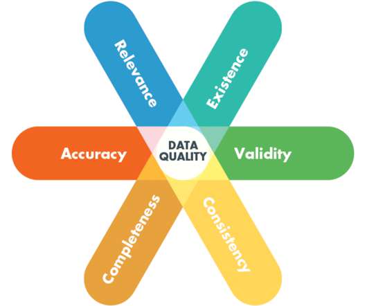
These layers help teams delineate different stages of data processing, storage, and access, offering a structured approach to data management. In the context of Data in Place, validating dataquality automatically with Business Domain Tests is imperative for ensuring the trustworthiness of your data assets.
Otherwise, you will burn money paying external services for labeled data, and that up-front cost–before you can do your first demo–can easily be the most expensive part of the project. Without large amounts of good raw and labeled training data, solving most AI problems is not possible. Is the product something that customers need?
This process is critical as it ensures dataquality from the onset. Data Ingestion: Continuous monitoring of data ingestion ensures that updates to existing data sources are consistent and accurate. Examples include regular loading of CRM data and anomaly detection. Do I Have A Troublesome Data Supplier?
At Juice, we are working everyday to create these habits and we wanted to share how we are building a data-first mindset and where we look for inspiration. Habit 1: Define shared metricsData fluency requires getting everyone on the same page as to what matters most.
In this blog post, we’ll discuss how the metadata layer of Apache Iceberg can be used to make data lakes more efficient. You will learn about an open-source solution that can collect important metrics from the Iceberg metadata layer. This ensures real-time metrics collection every time a transaction is committed to an Iceberg table.
“There is no doubt that today, self-service BI tools have well and truly taken root in many business areas with business analysts now in control of building their own reports and dashboards rather than waiting on IT to develop everything for them.”. Ineffective dashboards can be easily updated to focus on business needs.
It’s necessary to say that these processes are recurrent and require continuous evolution of reports, online data visualization , dashboards, and new functionalities to adapt current processes and develop new ones. Discover the available data sources. Data changes. Identify defects and enhancements.
But there are common pitfalls , such as selecting the wrong KPIs , monitoring too many metrics, or not addressing poor dataquality. Consider how it looks to nontechnical executives when every digital transformation initiative has customized dashboards, different KPIs, and metrics with underlying dataquality issues.
A manufacturing Key Performance Indicator (KPI) or metric is a well defined and quantifiable measure that the manufacturing industry uses to gauge its performance over time. The only way to stay ahead in this fiercely competitive industry is through the implementation of manufacturing KPIs and metrics. What Is A Manufacturing KPI?
However, it is often unclear where the data needed for reporting is stored and what quality it is in. Often the dataquality is insufficient to make reliable statements. Insufficient or incorrect data can even lead to wrong decisions, says Kastrati.
For example, McKinsey suggests five metrics for digital CEOs , including the financial return on digital investments, the percentage of leaders’ incentives linked to digital, and the percentage of the annual tech budget spent on bold digital initiatives. As a result, outcome-based metrics should be your guide.
Data errors impact decision-making. When analytics and dashboards are inaccurate, business leaders may not be able to solve problems and pursue opportunities. Data errors infringe on work-life balance. Data errors also affect careers. You and your data team can accomplish the same thing at your organization.
She applies some calculations and forwards the file to a data engineer who loads the data into a database and runs a Talend job that performs ETL to dimensionalize the data and produce a Data Mart. The data engineer then emails the BI Team, who refreshes a Tableau dashboard. Adding Tests to Reduce Stress.
That said, data and analytics are only valuable if you know how to use them to your advantage. Poor-qualitydata or the mishandling of data can leave businesses at risk of monumental failure. In fact, poor dataquality management currently costs businesses a combined total of $9.7 million per year.
Alation and Bigeye have partnered to bring data observability and dataquality monitoring into the data catalog. Read to learn how our newly combined capabilities put more trustworthy, qualitydata into the hands of those who are best equipped to leverage it. trillion each year due to poor dataquality.
Data without context is just meaningless noise, and any effort to improve or extract value from your data without considering the larger business context is doomed to fall short.? Unfortunately, traditional approaches to data remediation often focus on technical dataquality in isolation from the broader data and business ecosystem.
A CIO Service Quality Index (SQI) defines the key operational capabilities a CIO is responsible for delivering, the relative weight of the capability through the eyes of the customers, and the corresponding metrics that determine quality. Share the first draft of dimensions and metrics with your constituents.
Beyond mere data collection, BI consulting helps businesses create a cohesive data strategy that aligns with organizational goals. This approach involves everything from identifying key metrics to implementing analytics systems and designing dashboards.
Clean data in, clean analytics out. Cleaning your data may not be quite as simple, but it will ensure the success of your BI. It is crucial to guarantee solid dataquality management , as it will help you maintain the cleanest data possible for better operational activities and decision-making made relying on that data.
In today’s dynamic business environment, gaining comprehensive visibility into financial data is crucial for making informed decisions. This is where the significance of a financial dashboard shines through. What is A Financial Dashboard? You can download FineReport for free and have a try!
An HR dashboard functions as an advanced analytics tool that utilizes interactive data visualizations to present crucial HR metrics. Similar to various other business departments, human resources is gradually transforming into a data-centric function. What is an HR Dashboard?
The application supports custom workflows to allow demand and supply planning teams to collaborate, plan, source, and fulfill customer orders, then track fulfillment metrics via persona-based operational and management reports and dashboards. The final validated CSV files are loaded into the temp raw zone S3 folder.
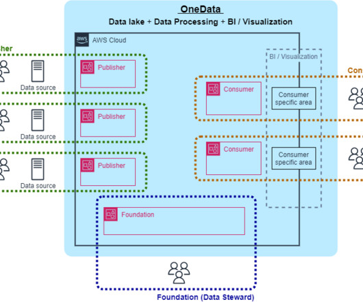
To achieve data-driven management, we built OneData, a data utilization platform used in the four global AWS Regions, which started operation in April 2022. The platform consists of approximately 370 dashboards, 360 tables registered in the data catalog, and 40 linked systems. Promote and expand the use of databases.
BI software uses algorithms to extract actionable insights from a company’s data and guide its strategic decisions. BI users analyze and present data in the form of dashboards and various types of reports to visualize complex information in an easier, more approachable way. 5) Find improvement opportunities through predictions.
Another way to look at the five pillars is to see them in the context of a typical complex data estate. Initially, the infrastructure is unstable, but then we look at our source data and find many problems. Our customers start looking at the data in dashboards and models and then find many issues. Was it on time?
Unless you take the necessary precautions, you run the risk of having to deal with multiple non-common data entries that may make your stats, facts, figures, and metrics inconsistent. Such inconsistencies can have a huge effect on the way data is organized through a host of different management systems within a company.
We organize all of the trending information in your field so you don't have to. Join 42,000+ users and stay up to date on the latest articles your peers are reading.
You know about us, now we want to get to know you!
Let's personalize your content
Let's get even more personalized
We recognize your account from another site in our network, please click 'Send Email' below to continue with verifying your account and setting a password.


Let's personalize your content