This site uses cookies to improve your experience. To help us insure we adhere to various privacy regulations, please select your country/region of residence. If you do not select a country, we will assume you are from the United States. Select your Cookie Settings or view our Privacy Policy and Terms of Use.
Cookie Settings
Cookies and similar technologies are used on this website for proper function of the website, for tracking performance analytics and for marketing purposes. We and some of our third-party providers may use cookie data for various purposes. Please review the cookie settings below and choose your preference.
Used for the proper function of the website
Used for monitoring website traffic and interactions
Cookie Settings
Cookies and similar technologies are used on this website for proper function of the website, for tracking performance analytics and for marketing purposes. We and some of our third-party providers may use cookie data for various purposes. Please review the cookie settings below and choose your preference.
Strictly Necessary: Used for the proper function of the website
Performance/Analytics: Used for monitoring website traffic and interactions
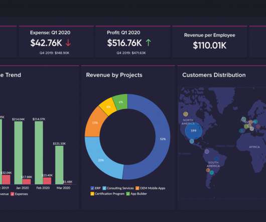
The rise of innovative, interactive, data-driven dashboard tools has made creating effective dashboards – like the one featured above – swift, simple, and accessible to today’s forward-thinking businesses. Dashboard design should be the cherry on top of your business intelligence (BI) project. Consider your end goal.
This is where the power of business dashboards comes into play. Dashboards often are the best way to gain insight into an organization and its various departments, operations and performance. Well-built, focused dashboards easily serve up summaries and reports of the BI that’s most critical to the organization.
By taking an online data visualization approach to handling your company’s strategic activities, big or small, you will make your business more cohesive, collaborative, intelligent and profitable – and project management dashboards will help you do just that. Download right here our free guide and get started with dashboards!
Exclusive Bonus Content: Reap the benefits of dashboards for CEOs! Download our short summary and become the best leader you can be! CEO dashboards and CEO reports are the answer. By leveraging the power of an online dashboard , an executive story can be written effortlessly, and within minutes. What Is A CEO Dashboard?
That said, if you’re looking to evolve your empire, increase brand awareness, and boost your bottom line, embracing business performancedashboards and big data should be at the top of your priority list. Exclusive Bonus Content: Stay on top of your business performance! The Link Between Data And Business Performance.
A business intelligence dashboard coupled with a dynamic dashboard display will allow you to squeeze every last drop of value from the insights that matter most. But before we delve any deeper, let’s consider the definition of this kind of a dashboard and its role in the modern workplace. What Is A TV Dashboard?
I'm excited about the power of a well created dashboard. Dashboards are every where, we will look at a lot of them in this post and they are all digital. Here's a great dashboard, for the Museum of Art… take a minute to ponder it… Isn't it pretty awesome? And data pukes are not dashboards.
By combining the art of storytelling with the technological capabilities of dashboard software , it’s possible to develop powerful, meaningful, data-backed presentations that not only move people but also inspire them to take action or make informed, data-driven decisions that will benefit your business. What Is Dashboard Storytelling?
By gaining the ability to gather, organize and analyze the metrics that are most important to your organization, you stand to make your business empire more intelligent than ever before – and executive reporting and business dashboards will help you do just that. Exclusive Bonus Content: Executive Dashboards & Reports: A Summary.
Download here the top benefits cheat sheet, and start reporting! Each information can be gathered into a single, live dashboard , that will ultimately secure a fast, clear, simple, and effective workflow. Download here the top benefits cheat sheet, and start reporting! What Is BI Reporting? click to enlarge**.
An online BI dashboard. Thanks to specific business intelligence best practices for dashboard design. Exclusive Bonus Content: Download Our Free Dashboard Checklist! Get the free guide with great tips for your dashboard implementation! What Is The Definition Of A BI Dashboard? How can you create one?
Download our bite-sized guide and unlock your fullest analysis potential! To help you set the best possible KPIs for your initiatives and activities, explore our collection of keyperformanceindicator examples. Download our bite-sized guide and unlock your fullest analysis potential! Omit useless data.
As important parts of business intelligence, scorecard and dashboard can both play an obvious role in promoting enterprise development. However, limited by factors such as cost and corporate strategies, sometimes companies need to make a choice between scorecard vs dashboard. Definition of scorecard and dashboard. Free trial.
Now here comes data dashboard ?Similar What is Data Dashboard?–Definition. A data dashboard is a useful tool that could display and analyze users’ complex data by means of data visualization so that the user gains a deep insight into the value of data. Data Dashboard Tool. Why Data Dashboard? Free Download.
In a world where we are overwhelmed with data and metrics and keyperformanceindicators and reports and dashboards and. Not only will I tell you about them, I'll give you downloadable links so you can get going right away! add that to the report you'll download here, then 4. celebrate.].
Download our free executive summary and boost your sales strategy! Because after all – a business dashboard is worth a thousand Excel sheets. Setting goals and then keeping track of whether those goals are being met is a hallmark of high-performing teams. Download our free executive summary and boost your sales strategy!
Here, we’ll explore the unrivaled power of data storytelling in the digital age while looking at a mix of powerful data storytelling examples generated with a modern dashboard creator. Download our free executive summary and start creating your stories! Download our free executive summary and start creating your stories!
As important parts of business intelligence, scorecards and dashboards can both play an obvious role in promoting enterprise performance management. However, many users are confused with the difference between scorecard vs. dashboard. Definition of scorecard and dashboard. What is a dashboard? What is a scorecard?
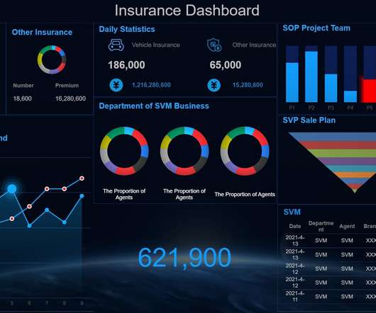
Download: A pocket-sized guide to operational and strategic reports! To put the power of operational reports into perspective, here’s one of our most efficient operational report examples for your browsing pleasure: Operational report example: Warehouse KPI dashboard. Let’s begin. What Is Operational Reporting? click to enlarge**.
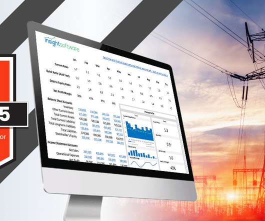
To put it plainly, companies can’t understand how well they’re actually doing without tracking keyperformanceindicators. Our team at insightsoftware has created a free downloadable template illustrating what a best-in-class dashboard looks like. Where Do Dashboards Fit In?
Dashboard reporting refers to putting the relevant business metrics and KPIs in one interface, presenting them visually, dynamic, and in real-time, in the dashboard formats. This article will review the best 10 dashboard tools covering different areas, including open source and free software. What Makes a Great Dashboard?
Using the right marketing KPIs (keyperformanceindicators) is a good start – what is now left is finding a way to organize it all in a way that makes sense and brings value. Download our short & sweet guide to daily, weekly and monthly reports. How do you know that? Or drastically change for another path?
Download our executive, pocket-sized guide to real time BI and analytics! Usually the process is done through a BI dashboard software that helps users directly interact with the data and generate insights instantaneously. It’s the art of using live dashboards to respond to data promptly. a) IT project management dashboard.
6) The Use of Dashboards For Data Interpretation. Business dashboards are the digital age tools for big data. Through the art of streamlined visual communication, data dashboards permit businesses to engage in real-time and informed decision-making and are key instruments in data interpretation. 2) How To Interpret Data?
Download our short executive guide to daily, weekly and monthly reports! At its core, a finance report is a management tool used for communicating a company’s key financial information to both internal and external stakeholders by covering every aspect of financial affairs with the goal of improving efficiency as well as financial fluency.
Download our game-changing summary and see your company grow! There is no doubt that today, self-service BI tools have well and truly taken root in many business areas with business analysts now in control of building their own reports and dashboards rather than waiting on IT to develop everything for them.”. Let’s get started!
Exclusive Bonus Content: Helpdesk performance metrics: A summary! Download our overview and improve your helpdesk performance today! A helpdesk KPI (or service desk KPI) is a performance metric centered on your business’s customer service and support activities. What Is A Helpdesk KPI? ” – Jeff Bezos.
Create a Customized Dashboard – Earn Love, Drive Change. #2. Create a Customized Dashboard – Earn Love, Drive Change! Who does not love dashboards? Pledge to shift away from a one-size-fits-all data puke, and use your web analytics tool to create a customized dashboard. Then click on Dashboards, and what do you see?
Download our bite-sized guide and learn everything you need to know! With dynamic data reports, users can log into a dashboard from anywhere across multiple devices for instant insight and analysis. Digestibility: Every robust dynamic reporting tool offers a multitude of stimulating visuals based on clearcut keyperformanceindicators.
What is Dashboard? What Is Dashboard?Actually, Actually, it, to be specific, is a type of graphical user interface that often offers intelligent views of keyperformanceindicators (KPIs) related to certain objectives or business processes. Dashboard ?from Dashboard examples. KPI dashboard.
If the ratio is rising, it indicates the company is adding full-time employees and adding labor costs. Combined with other keyperformanceindicators, the payroll headcount ratio reveals how financial performance drives the staffing mix, and vice versa. Here’s an example.
Dare I say, a keyperformanceindicator. But if 80 to 90 percent of all downloaded apps are used only once , should we have an immediate adjacent contextual metric that will be more insightful? Oh, and you can easily put all this together in a very simple dashboard… Throw in your pretty pie charts (no!)
An Operations KeyPerformanceIndicator (KPI) or metric is a discrete measurement that a company uses to monitor and evaluate the efficiency of its day-to-day operations. Leading companies make use of KPIs and KPI dashboards to measure their efficiency in real time. Download Now. What is an Operations KPI?
Among all reports, the dashboard report is the most typical application that uses various visual elements. So it is often used as a visual representation of the company’s keyperformanceindicators (KPI). Dashboard Reporting (by FineReport). Free Download. Sales Analysis Dashboard(by FineReport).
People ask me this seemingly simple question all the time: What KeyPerformanceIndicators should we use for our business ? and tell you what are the best keyperformanceindicators (metrics) for them. Here are six O, B, A metrics I would recommend for Betabrand’s strategic dashboard.
Modern dashboard software makes it simpler than ever to merge and visualize data in a way that’s as inspiring as it is accessible. But while doing so is easy, a great dashboard still requires a certain amount of strategic planning and design thinking. Download our list of different data visualization types you should know.
What is Dashboard APP? A dashboard app is a data management software application. With it, you could visually track, analyze and display graph, charts, keyperformanceindicators to monitor the progress of your business. Dashboard Examples. Square Dashboard App. Clover Dashboard App.
Have no idea how to select keyperformanceindicators from piles of indicators? KPI dashboard releases you from your worries and troubles. What is a KPI dashboard? Definition of KPI dashboard. Reality Use of KPI Dashboard. Importance & Benefits of KPI dashboard.
Keyperformanceindicators have never been more important for those in the utilities industry. Utility companies will need to report and monitor their KPIs obsessively to understand how these new approaches to energy are positively and negatively affecting their financial performance. 1) Liquidity.
How to effectively manage complex data indicators? Performancedashboard can help you deal with various business problems. What is a performancedashboard? Performancedashboard is mainly composed of two main entities, keyperformanceindicators (KPI) and dimensions.
You can download them into your Google Analytics account via one click (along with some lovely Advanced Segments and a Dashboard). You can download a bunch more, that are not yet in the bundle above, by following the links at the end of this post. You'll see it all as one report when you download it below.
Definition of a Metrics Dashboard. A metrics dashboard is a tool that collects, integrates and displays keyperformanceindicators in a single place in order to analyze marketing, project quality status or other business efforts in real-time. Metrics Dashboard Examples. Sales metrics dashboard.
Definition of a Metrics Dashboard. A metrics dashboard is a tool that collects, integrates and displays keyperformanceindicators in a single place in order to analyze marketing, project quality status or other business efforts in real-time. Metrics Dashboard Examples. Sales metrics dashboard.
To grasp Java Dashboard, we need to mention Java first. Thus, a Java dashboard is a type of dashboard that is designed with the Java programming language. Thus, a Java dashboard is a type of dashboard that is designed with the Java programming language. Now, I will introduce four Java-based dashboard examples.
We organize all of the trending information in your field so you don't have to. Join 42,000+ users and stay up to date on the latest articles your peers are reading.
You know about us, now we want to get to know you!
Let's personalize your content
Let's get even more personalized
We recognize your account from another site in our network, please click 'Send Email' below to continue with verifying your account and setting a password.


Let's personalize your content