This site uses cookies to improve your experience. To help us insure we adhere to various privacy regulations, please select your country/region of residence. If you do not select a country, we will assume you are from the United States. Select your Cookie Settings or view our Privacy Policy and Terms of Use.
Cookie Settings
Cookies and similar technologies are used on this website for proper function of the website, for tracking performance analytics and for marketing purposes. We and some of our third-party providers may use cookie data for various purposes. Please review the cookie settings below and choose your preference.
Used for the proper function of the website
Used for monitoring website traffic and interactions
Cookie Settings
Cookies and similar technologies are used on this website for proper function of the website, for tracking performance analytics and for marketing purposes. We and some of our third-party providers may use cookie data for various purposes. Please review the cookie settings below and choose your preference.
Strictly Necessary: Used for the proper function of the website
Performance/Analytics: Used for monitoring website traffic and interactions
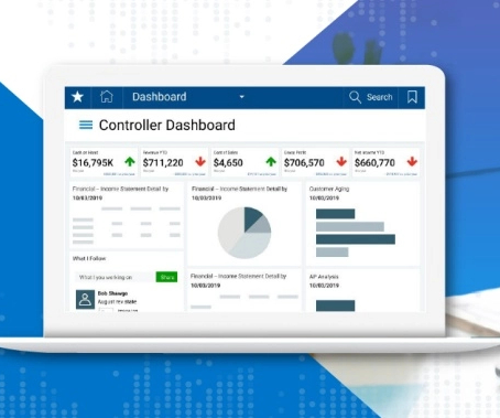
The rise of innovative, interactive, data-driven dashboard tools has made creating effective dashboards – like the one featured above – swift, simple, and accessible to today’s forward-thinking businesses. Dashboard design should be the cherry on top of your business intelligence (BI) project. Consider your end goal.
This is where the power of business dashboards comes into play. Dashboards often are the best way to gain insight into an organization and its various departments, operations and performance. Well-built, focused dashboards easily serve up summaries and reports of the BI that’s most critical to the organization.
Exclusive Bonus Content: Reap the benefits of dashboards for CEOs! Download our short summary and become the best leader you can be! CEO dashboards and CEO reports are the answer. By leveraging the power of an online dashboard , an executive story can be written effortlessly, and within minutes. What Is A CEO Dashboard?
By taking an online data visualization approach to handling your company’s strategic activities, big or small, you will make your business more cohesive, collaborative, intelligent and profitable – and project management dashboards will help you do just that. Download right here our free guide and get started with dashboards!
Dashboard design can mean the difference between users excitedly embracing your product or ignoring it altogether. Great dashboards lead to richer user experiences and significant return on investment (ROI), while poorly designed dashboards distract users, suppress adoption, and can even tarnish your project or brand.
Now With Actionable, Automatic, Data Quality Dashboards Imagine a tool that can point at any dataset, learn from your data, screen for typical data quality issues, and then automatically generate and perform powerful tests, analyzing and scoring your data to pinpoint issues before they snowball. New Quality Dashboard & Score Explorer.
That said, if you’re looking to evolve your empire, increase brand awareness, and boost your bottom line, embracing business performance dashboards and big data should be at the top of your priority list. Download our pocket-sized summary and improve your operations! What Is A Performance Dashboard In Business?
This integration enables our customers to seamlessly explore data with AI in Tableau, build visualizations, and uncover insights hidden in their governed data, all while leveraging Amazon DataZone to catalog, discover, share, and govern data across AWS, on premises, and from third-party sources—enhancing both governance and decision-making.”
Data is most effective when it’s visual, easy to analyze, and accessible to everyone in the organization. A business intelligence dashboard coupled with a dynamic dashboard display will allow you to squeeze every last drop of value from the insights that matter most. What Is A TV Dashboard?
Think your customers will pay more for data visualizations in your application? But today, dashboards and visualizations have become commonplace. Which analytics features are replacing visualizations as “the next big thing”. Five years ago they may have. You’ll learn: The 3 benefits of deeply embedding BI.
By gaining the ability to gather, organize and analyze the metrics that are most important to your organization, you stand to make your business empire more intelligent than ever before – and executive reporting and business dashboards will help you do just that. Exclusive Bonus Content: Executive Dashboards & Reports: A Summary.
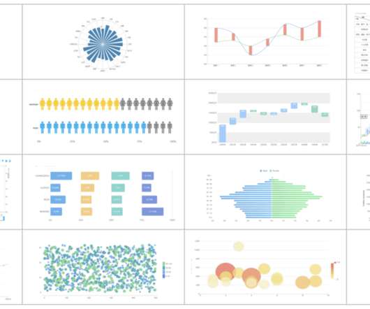
Modern dashboard software makes it simpler than ever to merge and visualize data in a way that’s as inspiring as it is accessible. But while doing so is easy, a great dashboard still requires a certain amount of strategic planning and design thinking. Download our list of different data visualization types you should know.
An online BI dashboard. Thanks to specific business intelligence best practices for dashboard design. Exclusive Bonus Content: Download Our Free Dashboard Checklist! Get the free guide with great tips for your dashboard implementation! What Is The Definition Of A BI Dashboard? How can you create one?
Amazon DataZone recently announced the expansion of data analysis and visualization options for your project-subscribed data within Amazon DataZone using the Amazon Athena JDBC driver. Prerequisites To get started, complete these steps: Download and install the latest Athena JDBC driver for Tableau. Install the driver.
Think your customers will pay more for data visualizations in your application? But today, dashboards and visualizations have become table stakes. Download this white paper to discover which features will differentiate your application and maximize the ROI of your analytics. Five years ago, they may have.
Download the list of the 11 essential steps to implement your BI strategy! As a direct result, less IT support is required to produce reports, trends, visualizations, and insights that facilitate the data decision making process. This is a testament to the importance of online data visualization in decision making.
Download here the top benefits cheat sheet, and start reporting! One additional element to consider is visualizing data. Since humans process visual information 60.000 times faster than text , the workflow can be significantly increased by utilizing smart intelligence in the form of interactive, and real-time visual data.
In todays data-driven world, securely accessing, visualizing, and analyzing data is essential for making informed business decisions. For instance, a global sports gear company selling products across multiple regions needs to visualize its sales data, which includes country-level details. A Python virtual environment.
Download our free executive summary and boost your sales strategy! Because after all – a business dashboard is worth a thousand Excel sheets. This gives to that sales graph an overall sense of visual contrast which makes it much more digestible at a glance. Download our free executive summary and boost your sales strategy!
Think your customers will pay more for data visualizations in your application? But today, dashboards and visualizations have become table stakes. Five years ago they may have. Discover which features will differentiate your application and maximize the ROI of your embedded analytics. Brought to you by Logi Analytics.
I'm excited about the power of a well created dashboard. Dashboards are every where, we will look at a lot of them in this post and they are all digital. Here's a great dashboard, for the Museum of Art… take a minute to ponder it… Isn't it pretty awesome? And data pukes are not dashboards.
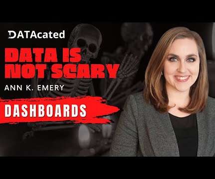
Dashboards aren’t scary! In this video, let’s make a starter dashboard in Microsoft Excel. You’ll learn how to make four quick visuals: Sparklines Data bars Symbol fonts Color scales. I use these visuals over and over in my real-life consulting projects. if we want each category in our dashboard to have its own color).
1) What Is A Small Business Dashboard? 3) Why Do You Need Small Business Dashboards. 4) Small Business Dashboard & KPIs Examples. Enter small business dashboards and metrics. BI dashboard tools provide smaller businesses with valuable insights regarding their operations thanks to real-time access to data.
By gaining centralized access to business data and presenting it in a visual way that follows a logical path and provides invaluable insights on a particular area or subject, you stand to set yourself apart from your competitors and become a leader in your field. Download our free executive summary and start creating your stories!
6) The Use of Dashboards For Data Interpretation. Business dashboards are the digital age tools for big data. Through the art of streamlined visual communication, data dashboards permit businesses to engage in real-time and informed decision-making and are key instruments in data interpretation. 2) How To Interpret Data?
Mobile technology has changed the way we interact with the world around us, and when it comes to analyzing valuable business insights, mobile dashboards offer the freedom and flexibility to turn stats into success while you’re on the go. Download our bite-sized guide and unlock your fullest mobile potential!
Free data visualization tools are professional in different categories: dashboard, chart, maps, network, and so on. Today, let’s review the top free data visualization tools on the market. What are the Benefits of Using Free Data Visualization Tools? Some of the free data visualization tools have their paid version.
Now here comes data dashboard ?Similar Similar to the instrument panel equipped in a car, it transforms obscure expertise into plain visualizations which are pleasing to both the eye and mind. What is Data Dashboard?–Definition. Data Dashboard Tool. Why Data Dashboard? How many kinds of Data Dashboards?
Download our free guide! We gave you a curated list of our top 15 data analytics books , top 18 data visualization books , top 16 SQL books – and, as promised, we’re going to tell you all about the world’s best books on data science. Download our free guide! Download our free guide! Read on and find out.
Download our bite-sized guide and unlock your fullest analysis potential! Download our bite-sized guide and unlock your fullest analysis potential! For a look at the power of software for the purpose of data analysis and to enhance your methods of analyzing data, glance over our selection of dashboard examples.
Online data visualization is taking precedence in business operations, creating more efficient and faster workspaces. Download: A pocket-sized guide to invaluable financial graphs and charts. As humans, we respond to, and process visual data better than anything else. Which Role Financial Dashboards Play.
In this post, we will explain what is a KPI scorecard, when to use it, what is the difference between scorecard and dashboard, and KPI scorecard examples and templates from business scenarios that can be applied to different departments and organizations or used as a roadmap for online data analysis. Let’s start with a simple definition.
Download our short executive guide to daily, weekly and monthly reports! Our monthly reports are on top illustrated with beautiful data visualizations that provide a better understanding of the metrics tracked. Download our short executive guide to daily, weekly and monthly reports! What Is A Finance Report? click to enlarge**.
Dashboard is the core function of data products. Therefore, dashboard design, also called dashboard navigation, is very important for navigating users to better apply dashboards. Therefore, dashboard design, also called dashboard navigation, is very important for navigating users to better apply dashboards.
Visuals, because if I can paint a simple picture about something complex it means I understand it and in turn I can explain it to others. Each of the six visuals re-frames a unique facet of the digital opportunity/challenge, and shares how to optimally take advantage of the opportunity/challenge. And you have!). People and companies.
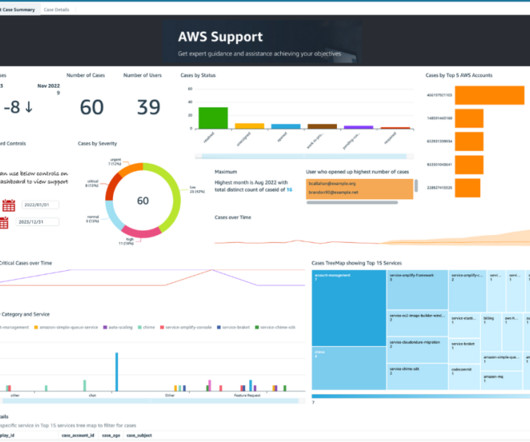
Imagine having to manage support cases for these accounts without a unified dashboard. We also show you how to build an analytics dashboard to gain visibility and insights on all support cases created in various accounts within your organization. Visualize the data in a QuickSight dashboard in the central account.
Why We Need a Management Dashboard? Therefore, in-flight, trust our dashboard.” The management dashboard is a “one-step” decision support management information center system for executives. In layman’s terms, executives can instantly see all the important data needed to make decisions from a dashboard.
Project dashboard, also known as project management dashboard, helps show the current project progress like a car dashboard and provide feedback to the team. What is a project dashboard? As mentioned above, project dashboard is similar to the car dashboard. reality use of dashboard . Free trial.
As important parts of business intelligence, scorecard and dashboard can both play an obvious role in promoting enterprise development. However, limited by factors such as cost and corporate strategies, sometimes companies need to make a choice between scorecard vs dashboard. Definition of scorecard and dashboard.
Among amounts of intelligent choices, business intelligence(BI) dashboard software is an awesome one. BI dashboard software definition. Business intelligence dashboard is a common module that general business intelligence has to realize data visualization. Sales analysis dashboard(by FineReport). FineReport.
To fully leverage the power of data science, scientists often need to obtain skills in databases, statistical programming tools, and data visualizations. Exclusive Bonus Content: Download Our Free Data & Science Checklist! provides the user with visualizations, code editor, and debugging. Let’s get started.
Nowadays, almost all businesses from all works believe in the potential of excellent BI tools to create stunning visualizations and effectively convey business information. There are many BI tools on the market that have potentially efficient visualization capabilities for customers to use. What are BI Visualization Tools?
Dashboard reporting refers to putting the relevant business metrics and KPIs in one interface, presenting them visually, dynamic, and in real-time, in the dashboard formats. This article will review the best 10 dashboard tools covering different areas, including open source and free software. What Makes a Great Dashboard?
Download our guide about the top 18 KPIs your social platforms need! to brand mentions and platform traffic, all through the use of a marketing dashboard (or social media KPI dashboard, as it’s also known). Download our guide about the top 18 KPIs your social platforms need! With social media KPIs, of course.
We organize all of the trending information in your field so you don't have to. Join 42,000+ users and stay up to date on the latest articles your peers are reading.
You know about us, now we want to get to know you!
Let's personalize your content
Let's get even more personalized
We recognize your account from another site in our network, please click 'Send Email' below to continue with verifying your account and setting a password.


Let's personalize your content