This site uses cookies to improve your experience. To help us insure we adhere to various privacy regulations, please select your country/region of residence. If you do not select a country, we will assume you are from the United States. Select your Cookie Settings or view our Privacy Policy and Terms of Use.
Cookie Settings
Cookies and similar technologies are used on this website for proper function of the website, for tracking performance analytics and for marketing purposes. We and some of our third-party providers may use cookie data for various purposes. Please review the cookie settings below and choose your preference.
Used for the proper function of the website
Used for monitoring website traffic and interactions
Cookie Settings
Cookies and similar technologies are used on this website for proper function of the website, for tracking performance analytics and for marketing purposes. We and some of our third-party providers may use cookie data for various purposes. Please review the cookie settings below and choose your preference.
Strictly Necessary: Used for the proper function of the website
Performance/Analytics: Used for monitoring website traffic and interactions
At the same time, inventory metrics are needed to help managers and professionals in reaching established goals, optimizing processes, and increasing business value. In the matter, data analysis and dashboard designer software is a precious ally. What Are Inventory Metrics? How To Choose The Right Inventory KPIs?
We won’t delve into details about the career prospects of this C-level position but we will present COO dashboards and reports that are critical for helping chief operating officers across the world to effectively manage their time, company, operational processes, and results. How to create a COO dashboard? What is a COO report?
6) Data Quality Metrics Examples. Reporting being part of an effective DQM, we will also go through some data quality metrics examples you can use to assess your efforts in the matter. The data quality analysis metrics of complete and accurate data are imperative to this step. Table of Contents. 2) Why Do You Need DQM?
In this post, we explore how to combine AWS Glue usage information and metrics with centralized reporting and visualization using QuickSight. You have metrics available per job run within the AWS Glue console, but they don’t cover all available AWS Glue job metrics, and the visuals aren’t as interactive compared to the QuickSight dashboard.
Read here how these metrics can drive your customers’ satisfaction up! Customer satisfaction metrics evaluate how the products or services supplied by a company meet or surpass a customer’s expectations. Some examples for triggering event data include time since signup for a product, or complete user onboarding.
Rename the CloudWatch event timestamp to mark the observed timestamp when the log was generated using the rename_keys processor , and add the current timestamp as the processed timestamp when OpenSearch Ingestion handled the record using the date processor : # Processor logic is used to change how log data is parsed for OpenSearch.
Hydro is powered by Amazon MSK and other tools with which teams can move, transform, and publish data at low latency using event-driven architectures. Solution overview The MSK clusters in Hydro are configured with a PER_TOPIC_PER_BROKER level of monitoring, which provides metrics at the broker and topic levels.
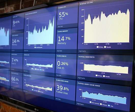
Real-time dashboards provide a single view to the most important performance metrics for an organization. Real-time dashboards show up on big screens in call centers, monitors in marketing departments, or the desk of a fictitious Private Equity titan on the TV show ‘Billions’. Dashboard from Motadata. staffing levels).
Before we drown in dashboard dystopia, let’s swing the pendulum back to create meaningful metrics and measurement that will move your business forward and at the same time drive the outcomes that your customers want.
Cloudera has partnered with Rill Data, an expert in metrics at any scale, as Cloudera’s preferred ISV partner to provide technical expertise and support services for Apache Druid customers. Deploying metrics shouldn’t be so hard. Intuitive metrics, simple design. Co-author: Mike Godwin, Head of Marketing, Rill Data.
Spreadsheets finally took a backseat to actionable and insightful data visualizations and interactive business dashboards. That way, any unexpected event will be immediately registered and the system will notify the user. Data exploded and became big. We all gained access to the cloud.
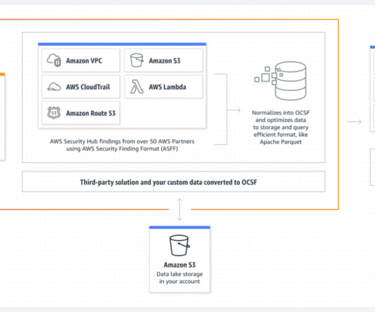
When it comes to near-real-time analysis of data as it arrives in Security Lake and responding to security events your company cares about, Amazon OpenSearch Service provides the necessary tooling to help you make sense of the data found in Security Lake. Under Log and event sources , specify what the subscriber is authorized to ingest.
These reports have the power to store all your data and generate beautiful dashboards that can tell your data narrative in a simple, visual way. By creating visuals with the help of a dashboard designer , you can have all your KPIs on a single screen, ready to explore by utilizing powerful interactive features.
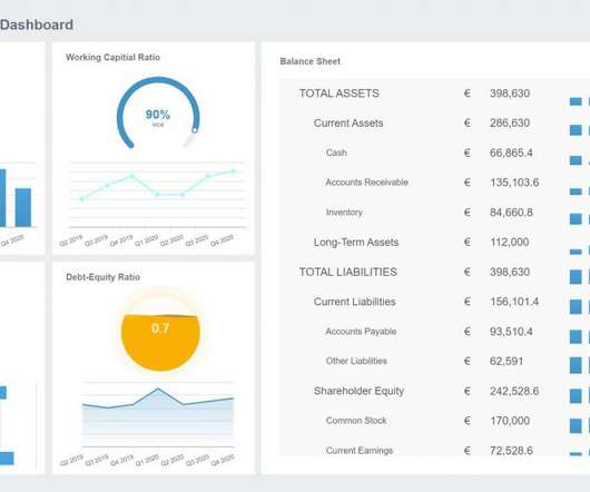
A financial Key Performance Indicator (KPI) or metric is a quantifiable measure that a company uses to gauge its financial performance over time. These three statements are data rich and full of financial metrics. How to Build Useful KPI Dashboards. The Fundamental Finance KPIs and Metrics – Cash Flow.
An extraordinary amount of time, effort, $$$ are spent on building dashboards/scorecards for CMOs… Yet, the end result, nearly always, is a useless data puke. CMO dashboards end up being useless when capabilities exceed needs. Personal Bias: I prefer the word Scorecard over Dashboard. It turns out boiling the ocean is hard.
Existing tools and dashboards are effective for observing standard metrics; however, they do not address follow-up questions, such as why things are happening or how those events impact performance. Organizations also struggle to derive complete value from big data.
In the following section, two use cases demonstrate how the data mesh is established with Amazon DataZone to better facilitate machine learning for an IoT-based digital twin and BI dashboards and reporting using Tableau. The applications are hosted in dedicated AWS accounts and require a BI dashboard and reporting services based on Tableau.
But, while data offers us invaluable insight in more ways than one, with so much to analyze and such little time, it’s becoming increasingly difficult to understand which metrics offer real value. Usually the process is done through a BI dashboard software that helps users directly interact with the data and generate insights instantaneously.
A manufacturing Key Performance Indicator (KPI) or metric is a well defined and quantifiable measure that the manufacturing industry uses to gauge its performance over time. The only way to stay ahead in this fiercely competitive industry is through the implementation of manufacturing KPIs and metrics. What Is A Manufacturing KPI?
Sales Analytics in Event Industry – A Perspective View. In the event industry, respondents are recognizing the importance of leveraging tools to streamline their attendees’ experiences with already existing event technologies. Image Source: [link]. It can help the wider company management team in making better decisions.
When it comes to data analysis, you are usually more likely to see me share guidance on advanced segmentation or custom reports or advanced social metrics or controlled experiments or economic value or competitive intelligence or web analytics maturity or one of an infinite number of difficult, if hugely rewarding, things. New Dashboard.
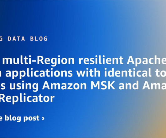
In the event of a failure to communicate to MSK cluster due to primary region impairment, you need to fail over the clients to the secondary MSK cluster. For Replication starting position , we choose Earliest , so that we can get all the events from the start of the source topics. The primary Region MSK cluster handles client requests.
Dashboard monitoring tool can be your wonderful aid. What is dashboard monitoring tool? Dashboard monitoring tool enables enterprises to monitor digital marketing channels and business performance easily and effectively. All companies have to do to achieve this function is to combine data into a single, beautiful dashboard.
It’s important for business users to be able to see quality scores and metrics to make confident business decisions and debug data quality issues. It provides insights and metrics related to the performance and effectiveness of data quality processes. We can analyze the data quality score and metrics using Athena SQL queries.
To help you get started with the topic, we put together this insightful guide on modern performance reporting using professional online dashboards. These examples of performance reports were generated with datapine’s dashboard creator , and they offer an interactive and visually appealing view of critical performance data.
Near-real-time streaming analytics captures the value of operational data and metrics to provide new insights to create business opportunities. These metrics help agents improve their call handle time and also reallocate agents across organizations to handle pending calls in the queue.
What’s on your data dashboard as the most important metrics? From an IT security perspective, dashboards of the past were traditionally used to indicate metrics like system status (i.e., From an IT security perspective, dashboards of the past were traditionally used to indicate metrics like system status (i.e.,
By using dbt Cloud for data transformation, data teams can focus on writing business rules to drive insights from their transaction data to respond effectively to critical, time sensitive events. Solution overview Let’s consider TICKIT , a fictional website where users buy and sell tickets online for sporting events, shows, and concerts.
With Power BI, you can pull data from almost any data source and create dashboards that track the metrics you care about the most. Power BI’s rich reports or dashboards can be embedded into reporting portals you already use. But with Power BI, you can simply drag a slider bar to show the impact of changes.
In this post, we show how to ingest CSV files from Amazon Simple Storage Service (Amazon S3) into Amazon OpenSearch Service using the Amazon OpenSearch Ingestion feature and visualize the ingested data using OpenSearch Dashboards. Additionally, we demonstrate how to visualize the ingested data using OpenSearch Dashboards.
As he thinks through the various journeys that data take in his company, Jason sees that his dashboard idea would require extracting or testing for events along the way. So, the only way for a data journey to truly observe what’s happening is to get his tools and pipelines to auto-report events. An event or rules engine.
It allows developers to interactively design data flows in a drag and drop designer, which can be deployed as continuously running, auto-scaling flow deployments or event-driven serverless functions. CDF-PC comes with a monitoring dashboard out of the box for data flow health and performance monitoring.
You will learn about an open-source solution that can collect important metrics from the Iceberg metadata layer. Based on collected metrics, we will provide recommendations on how to improve the efficiency of Iceberg tables. Key features This solution uses an AWS Lambda deployment package to collect metrics from Apache Iceberg tables.
One of my favorite parts of the annual IBIS event is the Dashboard Awards as every year I love to see the amazing dashboard solutions organizations have created with BI tools. Here are the categories and the winners: The 2021 Best Business Dashboard Award. The 2021 Limitless BI Dashboard Award. Congratulations!
6) The Use of Dashboards For Data Interpretation. Business dashboards are the digital age tools for big data. Through the art of streamlined visual communication, data dashboards permit businesses to engage in real-time and informed decision-making and are key instruments in data interpretation. 2) How To Interpret Data?
Clearly defined metrics with target thresholds: Using performance metrics allows for an unbiased reading of the performance from a security program process. Metrics should be based on the key objectives of a security process. Ideally, these performance metrics already exist for security processes.
In this post, we demonstrate how to publish detailed Spark metrics from Amazon EMR to Amazon CloudWatch. By default, Amazon EMR sends basic metrics to CloudWatch to track the activity and health of a cluster. Solution overview This solution includes Spark configuration to send metrics to a custom sink.
Moreover, advanced metrics like Percentage Regional Sales Growth can provide nuanced insights into business performance. Problems can manifest in various ways, such as Model Prediction Errors in machine learning applications, empty dashboards in BI tools, or row counts in exported data falling short of expectations.
For example, McKinsey suggests five metrics for digital CEOs , including the financial return on digital investments, the percentage of leaders’ incentives linked to digital, and the percentage of the annual tech budget spent on bold digital initiatives. As a result, outcome-based metrics should be your guide.
Emission factor mapping and other capabilities As part of Oracle Fusion Cloud Sustainability, enterprises would get access to features such as automated transaction records, contextualized data, pre-built dashboards, emission factor mapping, and audit capabilities.
CDF-PC enables Apache NiFi users to run their existing data flows on a managed, auto-scaling platform with a streamlined way to deploy NiFi data flows and a central monitoring dashboard making it easier than ever before to operate NiFi data flows at scale in the public cloud. Use KPIs to track important data flow metrics.
It automates dashboards. IBM Instana not only captures every performance metric in real-time, it automates tracing every single user request and profiles every process. IBM Instana not only captures every performance metric in real-time, it automates tracing every single user request and profiles every process.
We will partition and format the server access logs with Amazon Web Services (AWS) Glue , a serverless data integration service, to generate a catalog for access logs and create dashboards for insights. These logs can track activity, such as data access patterns, lifecycle and management activity, and security events.
The data engineer then emails the BI Team, who refreshes a Tableau dashboard. The delays impact delivery of the reports to senior management, who are responsible for making business decisions based on the dashboard. Imagine receiving a call from your CEO because sales on the CEO dashboard were off by a million dollars.
We organize all of the trending information in your field so you don't have to. Join 42,000+ users and stay up to date on the latest articles your peers are reading.
You know about us, now we want to get to know you!
Let's personalize your content
Let's get even more personalized
We recognize your account from another site in our network, please click 'Send Email' below to continue with verifying your account and setting a password.


Let's personalize your content