This site uses cookies to improve your experience. To help us insure we adhere to various privacy regulations, please select your country/region of residence. If you do not select a country, we will assume you are from the United States. Select your Cookie Settings or view our Privacy Policy and Terms of Use.
Cookie Settings
Cookies and similar technologies are used on this website for proper function of the website, for tracking performance analytics and for marketing purposes. We and some of our third-party providers may use cookie data for various purposes. Please review the cookie settings below and choose your preference.
Used for the proper function of the website
Used for monitoring website traffic and interactions
Cookie Settings
Cookies and similar technologies are used on this website for proper function of the website, for tracking performance analytics and for marketing purposes. We and some of our third-party providers may use cookie data for various purposes. Please review the cookie settings below and choose your preference.
Strictly Necessary: Used for the proper function of the website
Performance/Analytics: Used for monitoring website traffic and interactions
Enter data dashboards – one of history’s best innovations in business intelligence. To help you understand this notion in full, we’re going to explore a data dashboard definition, explain the power of dashboard data, and explore a selection of data dashboard examples. What Is A Data Dashboard? click to enlarge**.
This is where the power of business dashboards comes into play. Dashboards often are the best way to gain insight into an organization and its various departments, operations and performance. Well-built, focused dashboards easily serve up summaries and reports of the BI that’s most critical to the organization.
That said, if you’re looking to evolve your empire, increase brand awareness, and boost your bottom line, embracing business performance dashboards and big data should be at the top of your priority list. You need data-driven decisions, and a dashboard for business performance will make sure you reap the best possible rewards.
Soon businesses of all sizes will have so much amount of information that dashboard software will be the most invaluable resource a company can have. That’s why we welcome you to the world of interactive dashboards. Your Chance: Want to test interactive dashboard software for free? What Is An Interactive Dashboard?
A customer retention dashboard and metrics depicted in a neat visual will help you in monitoring, analyzing, and managing multiple customer-centric points and how they echo in your business. Your Chance: Want to build a dashboard for customer retention? Try our professional dashboard software for 14 days, completely free!
Whatever your sector or niche, if you want to remain adaptable and get one step ahead of the competition, working with the right data-driven tools and utilizing a corporate dashboard is essential. That’s where corporate dashboards come in. Your Chance: Want to create your own dynamic corporate dashboard? 1) CFO dashboard.
A few years ago, I had encouraged a BI Director to create a BI dashboard showing the key financial metrics of their company and to show it to the CEO. Its not that finance people dont want or need BI dashboards, its that their needs are different to say someone in sales, marketing, operations or HR.
Here, CIO Patrick Piccininno provides a roadmap of his journey from data with no integration to meaningful dashboards, insights, and a data literate culture. For the first time, we’re consolidating data to create real-time dashboards for revenue forecasting, resource optimization, and labor utilization.
This is precisely why Microsoft Dynamics 365 integration with BI dashboards has become a game-changer. But when BI dashboards are seamlessly linked, organizations can: Monitor business health in real-time : When BI dashboards are fully integrated, businesses can move beyond relying on outdated, end-of-month reports.
They also use trend forecasting and customer behavioral analysis to adapt their business models to boost business. However, none of these features would be viable without web dashboards. We talked about the benefits of business dashboards before , but web dashboards have their own benefits. What is a web dashboard?
Project dashboard, also known as project management dashboard, helps show the current project progress like a car dashboard and provide feedback to the team. What is a project dashboard? As mentioned above, project dashboard is similar to the car dashboard. reality use of dashboard . Free trial.
Each information can be gathered into a single, live dashboard , that will ultimately secure a fast, clear, simple, and effective workflow. As seen in the example above, this sales performance dashboard can give you a complete overview of sales targets and insights on whether the team is completing their individual objectives.
Spreadsheets finally took a backseat to actionable and insightful data visualizations and interactive business dashboards. Then, calculations will be run and come back to you with growth/trends/forecast, value driver, key segments correlations, anomalies, and what-if analysis. Data exploded and became big.
For example, at a company providing manufacturing technology services, the priority was predicting sales opportunities, while at a company that designs and manufactures automatic test equipment (ATE), it was developing a platform for equipment production automation that relied heavily on forecasting. And guess what?
Purchasing analysis is usually represented as dashboards, reports, and data graphs, analyzing the company’s spending on suppliers by category or location. Purchase Reporting Dashboard(from FineReport). Purchasing Center Dashboard. Purchasing Dashboard/Report & Key Metrics. Purchasing Reports Samples.
Business intelligence (BI) dashboards have grown very popular over the past few years as a means of communicating key organizational objectives and tracking performance against them. BI dashboards provide a vivid visual representation that can be intuitively understood by virtually anyone in the organization, very quickly.
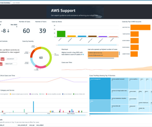
Imagine having to manage support cases for these accounts without a unified dashboard. We also show you how to build an analytics dashboard to gain visibility and insights on all support cases created in various accounts within your organization. Visualize the data in a QuickSight dashboard in the central account.
Today, there are online data visualization tools that make it easy and fast to build powerful market-centric research dashboards. How To Present Your Results: 3 Market Research Example Dashboards. When it comes to sharing the most important information, research dashboards are invaluable. Let’s take a closer look.
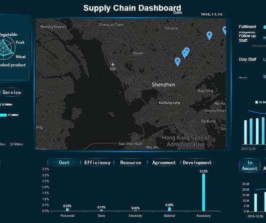
Using the right dashboard and data visualizations, it’s possible to hone in on any trends or patterns that uncover inefficiencies within your processes. That said, working with the right applications and data dashboard tools will facilitate goods management planning as well as geographical coverage between different locations in the network.
Finally, we will show how to combine those metrics with the help of modern KPI software and create professional supply chain dashboards. You can even include supply delivery metrics in your performance dashboard focused on the supply chain, and monitor it more closely. Supply Chain Management Dashboard Examples. Return Reason.
To help you get started with the topic, we put together this insightful guide on modern performance reporting using professional online dashboards. These examples of performance reports were generated with datapine’s dashboard creator , and they offer an interactive and visually appealing view of critical performance data.
While they are connected and cannot function without each other, as mentioned earlier, BI is mainly focused on generating business insights, whether operational or strategic efficiency such as product positioning and pricing to goals, profitability, sales performance, forecasting, strategic directions, and priorities on a broader level.
Typically presented in the form of an interactive dashboard , this kind of report provides a visual representation of the data associated with your predetermined set of key performance indicators – or KPI data, for short. Set up a report which you can visualize with an online dashboard. Consider your data sources.
While using a business dashboard, all your information can be simplified into a single place, making the time for meaningful decisions much faster. In a business context, this method identifies patterns and trends and can forecast inventory, predict customer responses to new products, assess risks, among others.
Because after all – a business dashboard is worth a thousand Excel sheets. 2) Sales Target (Actual Revenue vs Forecasted Revenue). A sales graph example generated with a dashboard builder that will prove invaluable regardless of your niche or sector. 11) Sales KPI Dashboard. How Do You Know Which Graph To Use?
One of those areas is called predictive analytics, where companies extract information from existing data to determine buying patterns and forecast future trends. This technology is being used in every industry, from banking to retail to determine customer responses or purchases, forecast inventory, manage resources, and even detect fraud.
This is where sales dashboards have proven to be highly effective. In sales, dashboards play a huge role in managing day-to-day operations, measuring performance, and adapting quickly to changing conditions. To set you up for success in analytics, we have created a quick guide on how to create the ultimate sales dashboard.
c) Dashboard Features. Business intelligence tools provide you with interactive BI dashboards that serve as powerful communication tools to keep teams engaged and connected. As its name suggests, the predictive analytics feature aims to generate forecasts about future performance. 3) Dashboards. Table of Contents.
With advanced analytics, flexible dashboarding and effective data visualization, FP&A storytelling has become both an art and science. Dashboards and analytics have been around for a long, long time. I’ve worked with hundreds of dashboard and data visualization projects over the years. First, because uncertainty exploded.
In addition, we will see how online dashboards have overthrown the static nature of classic reports and given way to a much faster, more interactive way of working with data. Here, we’re going to explore the 14 most common types of reports in business and provide some examples of when to use them to your brand-boosting advantage.
In a slightly more technically-driven role, a BI developer is responsible for building, creating, or improving BI-driven solutions that help analysts transform data into knowledge, including data dashboards. They can help a company forecast demand, or anticipate fraud. SAS BI: SAS can be considered the “mother” of all BI tools.
Even if figures diverge somewhat, the many forecasts conducted on SaaS industry trends 2020 demonstrate an obvious reality: the SaaS market is going to get bigger and bigger. SaaS Industry is forecasted to reach $55 billion by 2026. Our second forecast for SaaS trends in 2020 is Vertical SaaS. 2) Vertical SaaS.
3) Top 15 Warehouse KPIs Examples 4) Warehouse KPI Dashboard Template The use of big data and analytics technologies has become increasingly popular across industries. By analyzing historical demand, they can forecast the inventory level they will need and avoid having high levels of unsold products. 2) Why Do You Need Warehouse KPIs?
The example above shows us a visual of the drag and drop interface created in datapine for a 6 months forecast based on past and current data. It offers many statistics and machine learning functionalities such as predictive models for future forecasting. Let’s get started. Source: mathworks.com.
Epicor Grow AI applications include multiple capabilities such as inventory forecasting, AI generated sales orders from emails, personalized product suggestions based on order history, predictive maintenance recommendations for fleets, and more, within the context of familiar Epicor products.
They submit an endless list of requests for new data sets, dashboards, segmentations, cached data sets and nearly anything else they think will help them meet business goals. Figure 3 shows various data sources and stakeholders for analytics, including forecasts, stocking, sales, physician, claims, payer promotion, finance and other reports.
-based company, which claims to be the top-ranked supplier of renewable energy sales to corporations, turned to machine learning to help forecast renewable asset output, while establishing an automation framework for streamlining the company’s operations in servicing the renewable energy market. million in its first year, contributed a $5.5
Here, the dashboard could include project health elements such as cost, schedule, scope, ROIs, feedback, value to the partner, evaluation of meaningful outcomes, and management hierarchy to name a few. For most organizations, it sets the narrative for project forecasting, recruiting, scaling, and others. Conclusion.
A proven means of effectively presenting the complex key figures, measures and risks of a personnel plan is the use of index barometer dashboards, which offer intuitive visualization. A central measure here is the definition and visualization of control and monitoring key figures.
In the future of business intelligence, it will also be more common to break data-based forecasts into actionable steps to achieve the best strategy of business development. In the future of business intelligence, eliminating waste will be easier thanks to better statistics, timely reporting on defects and improved forecasts.
The results appear in a collection of dashboards or automated graphical visualizations. Companies that need forecasting can produce forward-looking reports that depend on any mixture of statistics and machine learning algorithms, something SAS calls “composite AI.” Extras are priced by the sales team.
ERP dashboards. Forecasting models. Dashboards and other user interfaces that allow users to interact with and view results. It boasts more than 250 statistical features, including data visualization, statistical modeling, data mining, stat tests, forecasting methods, machine learning, conjoint analysis, and more.
Predictive analytics is the use of techniques such as statistical modeling, forecasting, and machine learning to make predictions about future outcomes. Business analytics dashboard components. Forecasting: Forecasting analyzes historical data from a specific period to make informed estimates predictive of future events or behaviors.
We will cover this more in detail later in the post with a few financial dashboard examples, but first, let’s look at the main benefits coming from these analytical tools. Accounting statements will let you keep track of business transactions, but they will also help you maintain a budget, predict cash flow, and forecast revenue.
We organize all of the trending information in your field so you don't have to. Join 42,000+ users and stay up to date on the latest articles your peers are reading.
You know about us, now we want to get to know you!
Let's personalize your content
Let's get even more personalized
We recognize your account from another site in our network, please click 'Send Email' below to continue with verifying your account and setting a password.


Let's personalize your content