This site uses cookies to improve your experience. To help us insure we adhere to various privacy regulations, please select your country/region of residence. If you do not select a country, we will assume you are from the United States. Select your Cookie Settings or view our Privacy Policy and Terms of Use.
Cookie Settings
Cookies and similar technologies are used on this website for proper function of the website, for tracking performance analytics and for marketing purposes. We and some of our third-party providers may use cookie data for various purposes. Please review the cookie settings below and choose your preference.
Used for the proper function of the website
Used for monitoring website traffic and interactions
Cookie Settings
Cookies and similar technologies are used on this website for proper function of the website, for tracking performance analytics and for marketing purposes. We and some of our third-party providers may use cookie data for various purposes. Please review the cookie settings below and choose your preference.
Strictly Necessary: Used for the proper function of the website
Performance/Analytics: Used for monitoring website traffic and interactions
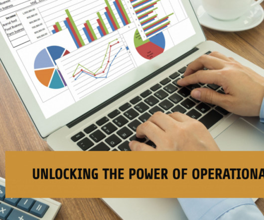
Here, we will consider the question ‘ What are operationalreports,’ delve deeper into strategic reports, and examine a host of best operationalreporting analysis practices. Download: A pocket-sized guide to operational and strategic reports! What Is OperationalReporting? Let’s begin.
This is where the power of business dashboards comes into play. Dashboards often are the best way to gain insight into an organization and its various departments, operations and performance. Well-built, focused dashboards easily serve up summaries and reports of the BI that’s most critical to the organization.
Often, companies generate written monthly, quarterly, or yearly reports that serve a number of purposes, but they do not provide the level of detailed insights that businesses require in order to succeed and stay ahead of their competition. This is where interactive weekly reports come into the picture. What Is A Weekly Report?
Automated reports completely eliminate traditional means of communicating data since they rely on business reporting software that uses cutting edge business intelligence, technology and smart features such as interactivity, a drag-and-drop interface, and predictive analytics, among others.
However, it wouldn’t be wise to display an excessive number of metrics on our monitoring dashboards because that could lead to less clarity and slower insights on the cluster. Capacity monitoring dashboards As part of our platform management process, we conduct monthly operational reviews to maintain optimal performance.
In fact, a survey about management reports performed by Deloitte says that 50% of managers are unsatisfied with the speed of delivery and the quality of the reports they receive. But, with so many types of reports used on a daily basis, how can you know when to use them effectively? What Is The Report Definition?
Operationalreports have the potential to greatly enhance business performance through the utilization of data-driven insights. These reports offer a structured and comprehensible representation of data, enabling a clearer understanding of complex issues that might otherwise remain elusive. What Is An OperationalReport?
—April 11, 2022— insightsoftware , a global provider of reporting, analytics, and performance management solutions that drive greater financial intelligence, today expanded the Angles product line , with the launch of new solutions for no-code operationalreporting for NetSuite and Deltek. Angles streamlines the process.
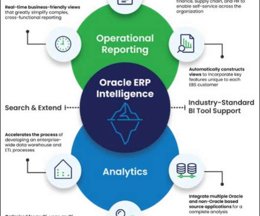
Recognizing a need for better operational analytics, insightsoftware leveraged award-winning technology from Logi Analytics to provide Oracle ERP Cloud users the ability to customize, create, and share interactivedashboards and reports across all departments of a business.
Although Oracle ERP Cloud provides very robust functionality, for the users in your organization who need to design, run, and distribute operationalreports, the ERP’s complexity presents some significant challenges. Speeding up financial and operationalreporting brings significant benefits to the organization as a whole.
In the dashboard, the company summarized the performance of all 71 data points with a single grade on a 0-100 scale. Once the SQI was published, FedEx executives could monitor the dashboard to identify trends and understand how well the company was serving its customers. The beauty of FedEx’s SQI is in its simplicity.
Through Modak Nabu’s profiling and indexing, Modak Nabu provides a comprehensive view of the curated datasets that are easily accessible to end-users — whether it’s Data Scientists building machine learning models or Data Analysts building operationalreports.
Event 1 Software delivers award-winning products—such as flagship solutions Office Connector and Liberty Reports—that enable CFOs and finance teams to transform Excel into an intuitive and interactivereporting engine for business data. Based in Vancouver, Wash.,
Mix of ad hoc exploration, dashboarding, and alert monitoring. It is very hard to maintain interactive performance, over large amounts of data that is arriving very fast, some of which might need updates, with a large number of queries of varying patterns. Fast ingest of streaming data, interactive queries, very high scale.
Key Benefits and Deliverables: Real-time report for Stocks, Sales, Returns, Regions etc., Key Benefits and Deliverables: Real-time report for Stocks, Sales, Returns, Regions etc., Download the Case study
The Smarten Augmented Analytics solution allows the Client users to interact with data to identify overall profitability at various levels in the organization. It also allowed the Client team to measure tactical and operational results at a summary level, and at a detailed level for an individual task, or a group achievement.
Smart View Reports provide a familiar, Excel-based spreadsheet environment in which you can interactively analyze General Ledger balances and define reports. You need a high level of specialized IT expertise to design OTBI reports, and they only work with Oracle Cloud Applications.
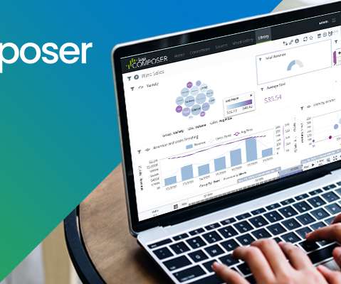
Raleigh, N.C – August 4, 2022 – insightsoftware , a global provider of reporting, analytics, and performance management solutions, today announced the release of Logi Composer 7. Logi Composer offers completely customizable, low-code dashboards and interactive data visualizations. Enhanced data connectivity and security support.
Despite serving as a vital reflection of a company’s operational health, financial statements offer a more direct and nuanced portrayal of its operations compared to operationalreports. Users experience a well-designed and interactive page, showcasing simplicity in a two-dimensional layout.
Power Query 101 (for Power BI Dashboard). Creating Interactive Visualisation for Actionable Analytics. Publishing and Administering Dashboards and Reports in Power BI for the Organisation. Power Query 101 (For Power BI Dashboard). Power BI Dashboard Preview has just been introduced very late in 2014.
Power Query 101 (for Power BI Dashboard). Creating Interactive Visualisation for Actionable Analytics. Publishing and Administering Dashboards and Reports in Power BI for the Organisation. Power Query 101 (For Power BI Dashboard). Power BI Dashboard Preview has just been introduced very late in 2014.
Power Query 101 (for Power BI Dashboard). Creating Interactive Visualisation for Actionable Analytics. Publishing and Administering Dashboards and Reports in Power BI for the Organisation. Power Query 101 (For Power BI Dashboard). Power BI Dashboard Preview has just been introduced very late in 2014.
Power Query 101 (for Power BI Dashboard). Creating Interactive Visualisation for Actionable Analytics. Publishing and Administering Dashboards and Reports in Power BI for the Organisation. Power Query 101 (For Power BI Dashboard). Power BI Dashboard Preview has just been introduced very late in 2014.
When used as a data source for BI, such a model presents complex ERP data in a more consumable and understandable fashion, freeing BI reporting development from the significant complexity of ERP data structures, speeding development projects, and making BI reports and dashboards more relevant and more intuitive.
Workday plans to embed Platfora technology into its technology foundation to complement existing operationalreporting, dashboarding and scorecarding capabilities with Platfora’s ad hoc exploration features targeted specifically for Workday’s HR and Finance application customers.
Beyond the Dashboard: Transforming Data Into Business Impact Download Now The Role of Data in Business Transformation For many organizations, dashboards have become the cornerstone of data analysis. However, static dashboards alone cannot meet the needs of a dynamic business environment.
Finance teams are increasingly being asked for timely, recurring operationalreports to support day-to-day decision making. The most common challenges your finance team probably faces are: lengthy report creation time, existing tool complexity, and the inability to drill into transactional data. Download Now.
Their dashboards were visually stunning. In turn, end users were thrilled with the bells and whistles of charts, graphs, and dashboards. As rich, data-driven user experiences are increasingly intertwined with our daily lives, end users are demanding new standards for how they interact with their business data.
Enter operationalreporting, the change agent in our story. In the past year alone, a staggering 66% of IT decision-makers have witnessed a surge in requests for operationalreports. Recent findings highlight the increasing importance of operationalreporting and the significant impact it has on organizations.
As Business Intelligence (BI) tools, data warehousing solutions, and enterprise data and application landscapes have advanced, it’s worth taking the time to rethink that old model, starting with the dichotomy between operationalreporting (OR) and strategic analytics. OperationalReporting: Trends, Challenges, and the Key to Success.
Analytics are the gateway to understanding, enabling users to interact with and interpret the insights generated through data collection, preparation, and analysis. Time Loss in the Wees of Ad Hoc Requests A key hidden cost of suboptimal analytics is the drain on development resources caused by ad hoc reporting requests.
Understanding embedded analytics dashboards starts with knowing what the term itself means—so let’s break it down. Dashboards are screens or pages that display information in a unified view that makes data easily digestible for end users. What Are Embedded Dashboards?
Todays decision-makers and data-driven applications demand more than static dashboards and generic insightsthey need a system that evolves with their business and delivers contextually precise, actionable analytics. Dashboards need actionable insights, not guesswork. In the BI world, where data must be precise, this is unacceptable.
Surprisingly, according to insightsoftware and Hanover Research’s report on operationalreporting , 98% of businesses still distribute reports via a static PDF. Web-based reports can be refreshed at any time, allowing your stakeholders to independently explore the latest data to get fast answers to their key questions.
Whether from your Oracle ERP Cloud or EBS (on-premises or implemented in a public or private cloud like Oracle Cloud Infrastructure or Azure), you must have the ability to efficiently transform that data into a format that works for your BI tools — for true, enterprise-wide reporting. Interested in Financial Reporting. Access Resource.
OperationalReporting Trends Report Download Now That’s why having the right reporting software is so important. With easily customizable dashboards in hand, you’ll be able to intuitively grasp what is happening in your business at a glance, instead of becoming lost in a sea of spreadsheet data.
Logi Symphony is designed to provide developers with the capabilities they seek in a comprehensive embedded analytics solution, from data preparation to customizable dashboards, with customization that satisfies builders’ specific needs.
It automates repeatable tasks, streamlines your ability to create reports and analyze data, and sheds clarity on sales, marketing, human resources, supply chain management, and even manufacturing. Tools to configure custom views for the remaining 20 percent their reporting needs. Self-service, customizable reporting.
Finance teams who struggle to meet the demand for recurring operationalreports are increasingly adopting Oracle ERP Cloud for ease of access to real-time data. Why are nearly 90% of teams unhappy with their operationalreporting tools ? Reporting is slow. Building custom reports takes time.
Working in restrictive conditions is tough, especially when your reporting software doesn’t do enough to limit those restraints. Finance teams are regularly tasked with creating operationalreports for their own use or to share with other business areas (departmental expenditure, open invoices, performance against budget).
Working in restrictive conditions is tough, especially when your reporting software doesn’t do enough to limit those restraints. Finance teams are regularly tasked with creating operationalreports for their own use or to share with other business areas (departmental expenditure, open invoices, performance against budget).
Because out-of-the-box features are limited, it’s all-too common for organizations to settle for static reports without deeper analytics or drill-down options. This means reporting stakeholders dont have access to real-time or refreshable data to delve deeper and answer their own questions.
Here are some board report best practices to follow that can help you create a report that resonates with members, as well as tips on how to leverage the power of board report software to help streamline your reporting. Executive Dashboards and Reports in Five Minutes. What Is a Board Report?
Enter Vizlib by insightsoftware —a game-changing solution that transforms how you interact with and present your Qlik data. Vizlib enhances Qlik by adding advanced features like predictive analytics, trend analysis, and automation, enabling businesses to make faster, more informed decisions within their existing dashboards.
We organize all of the trending information in your field so you don't have to. Join 42,000+ users and stay up to date on the latest articles your peers are reading.
You know about us, now we want to get to know you!
Let's personalize your content
Let's get even more personalized
We recognize your account from another site in our network, please click 'Send Email' below to continue with verifying your account and setting a password.


Let's personalize your content