This site uses cookies to improve your experience. To help us insure we adhere to various privacy regulations, please select your country/region of residence. If you do not select a country, we will assume you are from the United States. Select your Cookie Settings or view our Privacy Policy and Terms of Use.
Cookie Settings
Cookies and similar technologies are used on this website for proper function of the website, for tracking performance analytics and for marketing purposes. We and some of our third-party providers may use cookie data for various purposes. Please review the cookie settings below and choose your preference.
Used for the proper function of the website
Used for monitoring website traffic and interactions
Cookie Settings
Cookies and similar technologies are used on this website for proper function of the website, for tracking performance analytics and for marketing purposes. We and some of our third-party providers may use cookie data for various purposes. Please review the cookie settings below and choose your preference.
Strictly Necessary: Used for the proper function of the website
Performance/Analytics: Used for monitoring website traffic and interactions
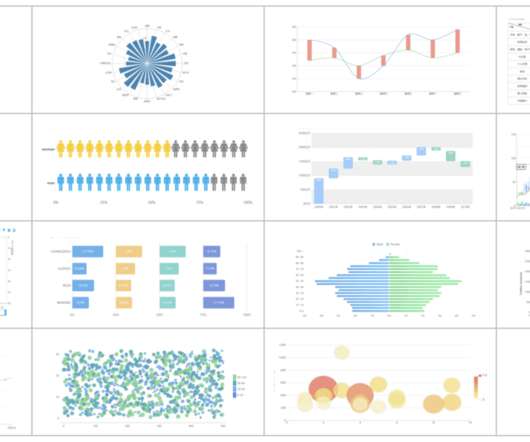
Soon businesses of all sizes will have so much amount of information that dashboard software will be the most invaluable resource a company can have. Visualizing the data and interacting on a single screen is no longer a luxury but a business necessity. That’s why we welcome you to the world of interactivedashboards.
The rise of innovative, interactive, data-driven dashboard tools has made creating effective dashboards – like the one featured above – swift, simple, and accessible to today’s forward-thinking businesses. Dashboard design should be the cherry on top of your business intelligence (BI) project. Consider your end goal.
CFO dashboards exist to enhance the strategic as well as the analytical efforts related to every financial aspect of your business. Here, we’ll explore the dynamics of reports for CFOs, look at CFO reporting tools, and consider real-world examples of both CFO dashboards and reports. Benefit from great CFO dashboards & reports!
Digital dashboards not only help you to drill down into the insights that matter most to your business, but they also offer an interactive visual representation that assists in swifter, more informed decision-making as well as the discovery of priceless new insights. Try our professional dashboard software for 14 days, completely free!
2) What Is A Content Dashboard? 4) Content Dashboards Examples. Modern content performance reports in the shape of an interactive online dashboard present an intuitive and accessible way to assess your content’s success and its ROI in real-time and in one centralized location. What Is A Content Dashboard?
A customer retention dashboard and metrics depicted in a neat visual will help you in monitoring, analyzing, and managing multiple customer-centric points and how they echo in your business. Your Chance: Want to build a dashboard for customer retention? Try our professional dashboard software for 14 days, completely free!
2) Benefits Of White Label Reports 3) Key White Label Reporting Features 4) White Label Dashboards & Report Examples In today’s competitive business environment, building a brand that is trusted, recognizable, and loved by many is not an easy task. Your Chance: Want to build your own white label reports & dashboards?
A chief technology officer (also referred to as chief technical officer or chief technologist), has an immense responsibility to drive a company forward and lead the technological advancements, research, development, and management in order to generate business value and increase the return on investment (ROI). What Is A CTO Dashboard?
An online BI dashboard. Thanks to specific business intelligence best practices for dashboard design. Exclusive Bonus Content: Download Our Free Dashboard Checklist! Get the free guide with great tips for your dashboard implementation! What Is The Definition Of A BI Dashboard? How can you create one?
Customers across diverse industries rely on Amazon OpenSearch Service for interactive log analytics, real-time application monitoring, website search, vector database, deriving meaningful insights from data, and visualizing these insights using OpenSearch Dashboards. The requested data is sent to the OpenSearch Dashboards server.
Business intelligence concepts refer to the usage of digital computing technologies in the form of data warehouses, analytics and visualization with the aim of identifying and analyzing essential business-based data to generate new, actionable corporate insights. Data dashboarding and reporting. 4) Data dashboarding and reporting.
However, none of these features would be viable without web dashboards. We talked about the benefits of business dashboards before , but web dashboards have their own benefits. These interfaces enable organizations to seamless analysis their content and provide GUI interaction capabilities. What is a web dashboard?
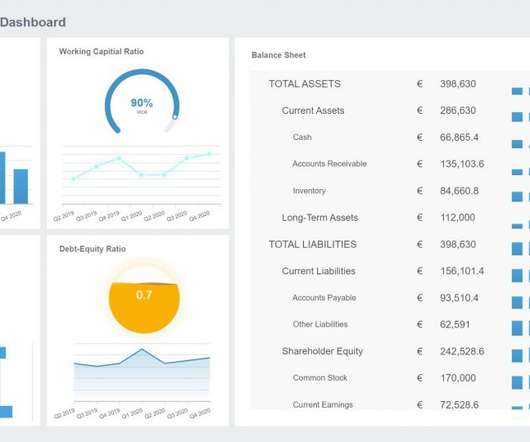
It is of utmost importance to create a compact BI project plan that you can refer to periodically and track your progress. On the other hand, if you’re in the HR industry, then an HR dashboard could be the best answer you’re looking for. A testament to the supremacy of using a financial dashboard to enhance internal performance.
c) Dashboard Features. Business intelligence tools provide you with interactive BI dashboards that serve as powerful communication tools to keep teams engaged and connected. 3) Dashboards. Here you will find some of the main BI tool features related to dashboard management: a) Built-in dashboard templates.
Data visualization methods refer to the creation of graphical representations of information. Data visualizations put together in intuitive dashboards can make the analysis process more dynamic and understandable while keeping the audience engaged. Gauge charts can be effectively used with a single value or data point.
Spreadsheets finally took a backseat to actionable and insightful data visualizations and interactive business dashboards. It’s an extension of data mining which refers only to past data. Today, managers and workers need to interact differently as they face an always-more competitive environment.
Now here comes data dashboard ?Similar What is Data Dashboard?–Definition. A data dashboard is a useful tool that could display and analyze users’ complex data by means of data visualization so that the user gains a deep insight into the value of data. Data Dashboard Tool. Why Data Dashboard? Free Download.
Having bestowed your data analysis techniques and methods with true purpose and defined your mission, you should explore the raw data you’ve collected from all sources and use your KPIs as a reference for chopping out any information you deem to be useless. A data analytics methodology you can count on. Answer your questions.
Through visual KPI tracking tools such as a KPI dashboard , you uncover greater insights than you ever thought possible, streamlining your organization for success in an increasingly competitive digital landscape. Communication: KPI reports and trackers are visual and interactive, which means that they are incredibly inclusive.
In today’s data-driven world, businesses rely heavily on their dashboards to make informed decisions. However, traditional dashboards often lack the intuitive interface needed to truly harness the power of data. Say goodbye to static dashboards and hello to a whole new level of engagement.
Dashboard reporting refers to putting the relevant business metrics and KPIs in one interface, presenting them visually, dynamic, and in real-time, in the dashboard formats. This article will review the best 10 dashboard tools covering different areas, including open source and free software. What Makes a Great Dashboard?
They can be fun and interactive, too. 3) “The Big Book Of Dashboards: Visualizing Your Data Using Real-World Business Scenarios” by Steve Waxler, Jeffrey Shaffer, and Andy Cotgreave. Our next best book to learn data visualization is the “The Big Book Of Dashboards”. click for book source**. click for book source**.
6) The Use of Dashboards For Data Interpretation. Business dashboards are the digital age tools for big data. Through the art of streamlined visual communication, data dashboards permit businesses to engage in real-time and informed decision-making and are key instruments in data interpretation. 2) How To Interpret Data?
You have metrics available per job run within the AWS Glue console, but they don’t cover all available AWS Glue job metrics, and the visuals aren’t as interactive compared to the QuickSight dashboard. In the following sections, we show you how to set up the solution, explore the dashboards, and configure alarms.
Refer to Easy analytics and cost-optimization with Amazon Redshift Serverless to get started. To enable the feature, complete the following steps: On the Amazon Redshift console, open the Redshift Serverless dashboard. Let’s try logging in with a different user and see how Amazon Q generative SQL interacts with that user.
AI refers to the autonomous intelligent behavior of software or machines that have a human-like ability to make decisions and to improve over time by learning from experience. The device mesh refers to an expanding set of endpoints people use to access applications and information. Voice-as-User Interface (VUI).
With this issue in mind, several BI tools have been developed to assist businesses in the generation of interactive reports with just a few clicks, enhancing the way companies make critical decisions and service insights from their most valuable data. Try our 14-day free trial & start building interactive reports today!
In a single data dashboard, QuickSight can include AWS data, third-party data, big data, spreadsheet data, SaaS data, B2B data, and more. QuickSight gives decision-makers the opportunity to explore and interpret information in an interactive visual environment.
Dashboard monitoring tool can be your wonderful aid. What is dashboard monitoring tool? Dashboard monitoring tool enables enterprises to monitor digital marketing channels and business performance easily and effectively. All companies have to do to achieve this function is to combine data into a single, beautiful dashboard.
That’s why so many rely on accounts receivable dashboards to provide transparency and enable oversight. Accounts receivable dashboards offer a window into everything that matters with A/R. Users can quickly reference key metrics, see updated data in real time, and immediately understand the positives and negatives of performance.
In the current trend of big data, data visualization has become an interactive display mode that everyone admires. And dashboards are widely used to display business performance in enterprises. So how can we create a good dashboard, especially for beginners? This time I plan to create a simple salesperson performance dashboard.
By gaining access to highly-visual interactive insights, you can: Make swift, informed decisions, often in real-time. To put the power of operational reports into perspective, here’s one of our most efficient operational report examples for your browsing pleasure: Operational report example: Warehouse KPI dashboard. click to enlarge**.
White labeling and embedding analytics tools and methodologies enhance interpretive capabilities, solve targeted challenges, address risks, and offer personalized real-time analytical solutions through smart modern real-time dashboard tools. This means the login page, at the top of the dashboards, the favicon, and other relevant spots.
For example, dashboarding applications are a very common use case in Redshift customer environments where there is high concurrency and queries require quick, low-latency responses. First query response times for dashboard queries have significantly improved by optimizing code execution and reducing compilation overhead.
Data quality refers to the assessment of the information you have, relative to its purpose and its ability to serve that purpose. While the digital age has been successful in prompting innovation far and wide, it has also facilitated what is referred to as the “data crisis” – low-quality data.
Free data visualization tools are professional in different categories: dashboard, chart, maps, network, and so on. I listed 10 Free and Open Source data visualization tools for you as a reference. FineReport is a data visualization tool free for personal use, which supports visualizing your data into reports and dashboards. .
In this post, we provide a solution architecture that describes how you can process data from three different types of sources—streaming, transactional, and third-party reference data—and aggregate them in Amazon Redshift for business intelligence (BI) reporting. Refer to Streaming ingestion considerations for details. version cluster.
You can create temporary tables once and reference them throughout, without having to constantly refresh database connections and restart from scratch. Designing asynchronous web dashboards because the Data API lets you run long-running queries without having to wait for it to complete. Please refer to Redshift Quotas and Limits here.
For example, if you enjoy computer science, programming, and data but are too extroverted to program all day long, you could work in a more human-oriented area of intelligence for business, perhaps involving more face-to-face interactions than most programmers would encounter on the job. BI Project Manager.
Companies usually visualize these measurements together with the help of interactive KPI reports. Get a centralized view with an interactivedashboard. Today, there are several online data visualization tools that offer a range of dashboard options to visualize your KPIs and metrics in a centralized way. What Are Metrics?
He’s here to explain his vision of the future with dashboards and workspaces from utilising virtual reality (VR) technology. Even though I had charts and dashboards at my disposal, it was still tough to make sense of it all. DataView provides relevant regression statistics related to the model and relevant 2D charts for reference.
These reports are more digestible when they are generated through online data visualization tools that have numerous interactivedashboard features, to ensure that your business has the right meaningful financial data. This metric is also referred to as “EBIT”, for “earnings before interest and tax”.
Forrester Research defines the ‘customer experience’ as: “How customers perceive their interactions with your company.”. Determining accurate CES, NPS, and CSAT is easier when you are using an interactive, real-time dashboard that’s capable of providing elevated visualizations coupled with concise textual details.
With a MySQL dashboard builder , for example, you can connect all the data with a few clicks. This hands-on classic guides readers through creating reliable queries for virtually any modern SQL-based database, which you can also use as a means to build your own SQL dashboard. Would highly recommend for SQL experts.”.
We organize all of the trending information in your field so you don't have to. Join 42,000+ users and stay up to date on the latest articles your peers are reading.
You know about us, now we want to get to know you!
Let's personalize your content
Let's get even more personalized
We recognize your account from another site in our network, please click 'Send Email' below to continue with verifying your account and setting a password.


Let's personalize your content