This site uses cookies to improve your experience. To help us insure we adhere to various privacy regulations, please select your country/region of residence. If you do not select a country, we will assume you are from the United States. Select your Cookie Settings or view our Privacy Policy and Terms of Use.
Cookie Settings
Cookies and similar technologies are used on this website for proper function of the website, for tracking performance analytics and for marketing purposes. We and some of our third-party providers may use cookie data for various purposes. Please review the cookie settings below and choose your preference.
Used for the proper function of the website
Used for monitoring website traffic and interactions
Cookie Settings
Cookies and similar technologies are used on this website for proper function of the website, for tracking performance analytics and for marketing purposes. We and some of our third-party providers may use cookie data for various purposes. Please review the cookie settings below and choose your preference.
Strictly Necessary: Used for the proper function of the website
Performance/Analytics: Used for monitoring website traffic and interactions
CFO dashboards exist to enhance the strategic as well as the analytical efforts related to every financial aspect of your business. Here, we’ll explore the dynamics of reports for CFOs, look at CFO reporting tools, and consider real-world examples of both CFO dashboards and reports. Benefit from great CFO dashboards & reports!
With a powerful dashboard maker , each point of your customer relations can be optimized to maximize your performance while bringing various additional benefits to the picture. Your Chance: Want to build professional CRM reports & dashboards? Your Chance: Want to build professional CRM reports & dashboards?
One of the most effective means of doing this is by utilizing KPI reporting tools. Exclusive Bonus Content: Understanding KPIs & reports – A summary! Let’s start by considering what KPIs are and what they mean in a business context. What Is A KPI? What Is A KPI Report? Why Are KPI Reports Important?
While there are numerous KPI examples you can choose from, you should pick only the most important ones and focus on the right ones for your business. That said, using the right KPIs is essential to both your immediate and long-term business activities. But first, let’s ask ourselves the question, ‘ What is KPI tracking?’.
Soon businesses of all sizes will have so much amount of information that dashboard software will be the most invaluable resource a company can have. That’s why we welcome you to the world of interactive dashboards. Your Chance: Want to test interactive dashboard software for free? What Is An Interactive Dashboard?
With so much data available to today’s brands and businesses, to extract every drop of value from an ever-growing raft of digital insights and set the kind of KPIs that will drive your venture forward, having an easy to use, a visually-stunning dashboard is key. Exclusive Bonus Content: 15 Powerful Dashboard Ideas: A Summary.
And the best way to do so is by using digital dashboards and a modern online reporting tool. What Is A Call Center Dashboard? Online data visualization tools are the fast track to improved customer service intelligence, and robust contact center dashboards exist for that very purpose. We offer a 14-day free trial.
That said, if you’re looking to evolve your empire, increase brand awareness, and boost your bottom line, embracing business performance dashboards and big data should be at the top of your priority list. You need data-driven decisions, and a dashboard for business performance will make sure you reap the best possible rewards.
In this post, we will cover essential supply chain KPIs and deliver bits and details about the top 15 that you should track. Finally, we will show how to combine those metrics with the help of modern KPI software and create professional supply chain dashboards. But first, let’s start with the basic definition.
Today, there are online data visualization tools that make it easy and fast to build powerful market-centric research dashboards. How To Present Your Results: 3 Market Research Example Dashboards. When it comes to sharing the most important information, research dashboards are invaluable. Let’s take a closer look.
By gaining the ability to gather, organize and analyze the metrics that are most important to your organization, you stand to make your business empire more intelligent than ever before – and executive reporting and business dashboards will help you do just that. Exclusive Bonus Content: Executive Dashboards & Reports: A Summary.
I'm excited about the power of a well created dashboard. Dashboards are every where, we will look at a lot of them in this post and they are all digital. Here's a great dashboard, for the Museum of Art… take a minute to ponder it… Isn't it pretty awesome? And data pukes are not dashboards.
By combining the art of storytelling with the technological capabilities of dashboard software , it’s possible to develop powerful, meaningful, data-backed presentations that not only move people but also inspire them to take action or make informed, data-driven decisions that will benefit your business. What Is Dashboard Storytelling?
When these reports are backed up with powerful visualizations developed with a dashboard creator , no information can stay hidden, eliminating thus the possibility of human errors and negative business impact. However, the use of dashboards, big data, and predictive analytics is changing the face of this kind of reporting.
Download our guide about the top 18 KPIs your social platforms need! What Are Social Media KPIs? Social media KPIs are values that measure the performance of social media marketing (SMM) campaigns. It’s possible to measure a wealth of KPIs for social media, from post engagements (likes, shares, etc.) Let’s get going.
Because after all – a business dashboard is worth a thousand Excel sheets. A sales graph example generated with a dashboard builder that will prove invaluable regardless of your niche or sector. Number 6 on our list is a sales graph example that offers a detailed snapshot of sales conversion rates. 6) Sales Conversion.
If you want to convey crucial information to decision-makers in the easiest and most effective way possible, you need to embrace the power of interactive dashboards. A business dashboard offers at-a-glance insights based on key performance indicators (KPIs) and is an intuitive and visually pleasing way to consume data.
They give a snapshot of the company’s exercise at a specific moment in time to assess the situation and determine the best decision to make and the type of action to undertake. As long as you’re not overloading your team with too many sales KPIs , by using reports you can show your staff, “Hey, these numbers are crucial to our success.
When the presentation becomes interactive, clicks will provide even deeper insights into your financial KPIs, findings, and desired outcomes to make a company healthy in its financial operations. Calculating and communicating KPIs about the overall company situation is what this investors’ relationship dashboard tries to focus on.
Here, we’ll explore the unrivaled power of data storytelling in the digital age while looking at a mix of powerful data storytelling examples generated with a modern dashboard creator. To get under the skin of this most priceless concept, read our guide to data-driven dashboard presentation. Employee Performance Dashboard Example.
By choosing from various KPI examples to help track and measure the success of your company’s customer-facing activities, you stand to set yourself apart from the competition in a big way. Working with service desk metrics and KPI reports will help you make the improvements you need for continual growth and success.
These reports are more digestible when they are generated through online data visualization tools that have numerous interactive dashboard features, to ensure that your business has the right meaningful financial data. This KPI is a crucial measurement of production efficiency within your organization. click to enlarge**.
If you apply that same logic to the financial sector or a finance department, it’s clear that financial reporting tools could serve to benefit your business by giving you a more informed snapshot of your activities. it’s great to have an investor relations dashboard at hand: **click to enlarge**.
Thanks to the right KPI software , it is much easier to identify trends and setting goals that will ultimately increase productivity, drive growth, and boost profits. With the help of a dashboard designer , you can simply drag-and-drop your values and create interactive visualizations that will point out errors immediately.
Each information can be gathered into a single, live dashboard , that will ultimately secure a fast, clear, simple, and effective workflow. As seen in the example above, this sales performance dashboard can give you a complete overview of sales targets and insights on whether the team is completing their individual objectives.
Today, more and more businesses are turning to online data visualizations such as a dashboard creator that is user-friendly and accessible for everyone. For instance, the top part of the dashboard provides insights into the performance of your sales team. Let’s kick it off with the definition. Weekly Marketing Report.
Better yet, implement a team KPIdashboard that will show you immediately how your team is performing and where do you need to allocate more resources ( educational materials or workshops ) so that the whole department has more chance to improve their results. Choose your KPIs carefully.
Here we explore the meaning and value of incremental sales in the world of business, as well as the additional KPI examples and metrics you should track to ensure ongoing success. Incremental sales is a KPI used by marketers to assess the financial value of various promotional activities. What Are Incremental Sales?
While traditional reports often include a summary, body, and conclusion in a written format, this post will focus on interactive monthly reports created with a professional dashboard creator. All these reports were carefully created with an intuitive BI dashboard software. Our next example is a dashboard focusing on retention metrics.
By understanding your core business goals and selecting the right key performance indicator ( KPI ) and metrics for your specific needs, you can use an information technology report sample to visualize your most valuable data at a glance, developing initiatives and making pivotal decisions swiftly and with confidence.
A static report offers a snapshot of trends, data, and information over a predetermined period to provide insight and serve as a decision-making guide. A KPI reporting software can even automate and offer the most recent data in all your reports. Exclusive Bonus Content: Get our free summary to create better reports!
You can start by simply choosing from various KPI examples relevant to your business, or continue reading to delve into the benefits and real-life business scenarios of utilizing intelligence and data. Moreover, an excellent example of data intelligence technologies in healthcare comes in the form of our hospital dashboard.
To effectively monitor and analyze these metrics, businesses utilize KPI reports. In this article, we will explore the concept of KPI reports, highlight their significance, provide examples and templates, discuss the essential components, and offer valuable insights on creating KPI reports efficiently.
HR managers are using supportive data and quantifiable measurements, like KPIs and metrics, to back up their employee hiring and retention related decisions. between a KPI and a metric is? To measure the effectiveness of your HR department, not all KPIs are relevant. Start Building Your HR KPIDashboard.
Among all reports, the dashboard report is the most typical application that uses various visual elements. So it is often used as a visual representation of the company’s key performance indicators (KPI). Dashboard Reporting (by FineReport). Sales Analysis Dashboard(by FineReport). CFO Dashboard (by FineReport).
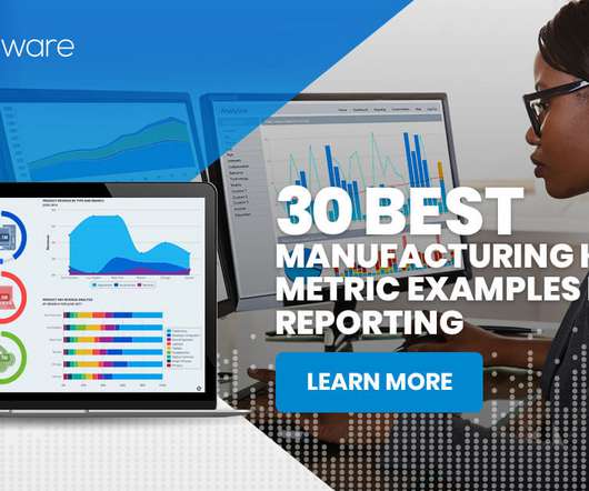
What Is A Manufacturing KPI? A manufacturing Key Performance Indicator (KPI) or metric is a well defined and quantifiable measure that the manufacturing industry uses to gauge its performance over time. This is where KPIs for the manufacturing industry come into play. How to Build Useful KPIDashboards.
This is where the significance of a financial dashboard shines through. In this article, we will explore the concept of a financial dashboard, highlight its numerous benefits, and provide various kinds of financial dashboard examples for you to employ and explore. What is A Financial Dashboard?
What is a Financial KPI? A financial Key Performance Indicator (KPI) or metric is a quantifiable measure that a company uses to gauge its financial performance over time. How to Build Useful KPIDashboards. The Fundamental Finance KPIs and Metrics – Cash Flow. Number of Monthly Active Users. Quick Ratio.
With concrete data monitoring principles, you are well prepared to get all your key metrics out of your data with a smart KPI software like datapine. It’s worth investing in customer data management software that allows you to collect, curate, and drill down into your consumer insights from one central location or live dashboard.
Sales dashboards are an essential tool in this process. This guide provides a comprehensive overview of sales dashboards, including their definition, significance, steps for creating one, and useful tips. Additionally, we will offer various examples of sales dashboards to help you streamline your work effectively.
This includes the expected response time limits for dashboard queries or analytical queries, elapsed runtime for daily ETL jobs, desired elapsed time for data sharing with consumers, total number of tenants with concurrency of loads and reports, and mission-critical reports for executives or factory operations.
Really pick any report with any dimension you want to look at, we spend our time (and valuable space on our dashboards) looking at the top ten. Why keep reporting the top ten keywords on you Executive Management Global KPIDashboard? Let me share two snapshots to make that point. Referring URL's. Pages viewed.
Flash reports are short, executive-level, summaries that provide a snapshot of a company’s key operational and financial metrics at regular time intervals. Since the advent of KPIdashboards , data has become much more accessible, making flash reports readily accessible to middle management. How to Build Useful KPIDashboards.
The result is made available to the application by querying the latest snapshot. The snapshot constantly updates through stream processing; therefore, the up-to-date data is provided in the context of a user prompt to the model. OpenSearch Service offers visualization capabilities powered by OpenSearch Dashboards and Kibana (1.5
We organize all of the trending information in your field so you don't have to. Join 42,000+ users and stay up to date on the latest articles your peers are reading.
You know about us, now we want to get to know you!
Let's personalize your content
Let's get even more personalized
We recognize your account from another site in our network, please click 'Send Email' below to continue with verifying your account and setting a password.


Let's personalize your content