Remove Dashboards Remove Magazine Remove Reporting
article thumbnail

Take Advantage Of The Top 16 Sales Graphs And Charts To Boost Your Business

datapine

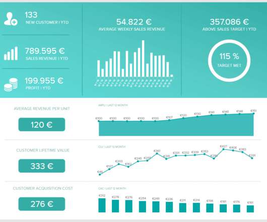
The question and answer we included come from an actual interview that Fortune magazine did with billionaire Tilman Fertitta. Because after all – a business dashboard is worth a thousand Excel sheets. Let’s examine how you can do so with the following sales KPIs, created for a comprehensive sales report. From Fiction To Reality.

Sales 235
article thumbnail

How To Create Data Reports That Will Skyrocket Your Business Performance

datapine

Historically, the terms data report or business report haven’t got the crowds excited. Data reports have always been important for businesses. The business intelligence industry has been revolutionized over the past decade and data reports are in on the fun. Exclusive Bonus Content: Get our data reporting recommendations!

Reporting 127
Insiders

Sign Up for our Newsletter

This site is protected by reCAPTCHA and the Google Privacy Policy and Terms of Service apply.

article thumbnail

Marie Kondo Has Some Advice for Your Dashboard

Juice Analytics

In our workshops on data storytelling, dashboard design, and data visualization, we are always emphasing the need to simplify. Instead of staring dejectedly into that mess of a closet, shift your gaze to that dashboard or report that you know needs some tough love. That’s right: it is time to fix that dashboard.

article thumbnail

Storytelling for CIOs: From niche to bestseller

CIO Business Intelligence

The late Richard Sykes, CIO of pharmaceuticals giant ICI in the 1990s and later a columnist for CIO magazine, famously scripted starkly different scenarios of the future of ICI for board members early in his IT role. Why tell stories? Often, CIOs use stories as a form of Esperanto or a translation layer.

article thumbnail

BRIDGEi2i Newsletter: May 2020 Recap

bridgei2i

This report guides data and analytics leaders in the evaluation phase of service providers. by Analytics India Magazine (AIM). COVID Visualization Dashboards. Don’t forget to subscribe… we have an exciting lineup of industry leaders and influencers in these episodes. Recognitions. SCM Whitepaper.

article thumbnail

How To Suck At Social Media: An Indispensable Guide For Businesses

Occam's Razor

Using a tool like True Social Metrics , you can quickly create a glorious centralized dashboard like this one for your Social Media efforts… Please see the post for more details on how to calculate each metric. If you truly, gloriously suck on TV, perhaps there's a report on some paper out there. All you measure are GRPs.

B2B 167
article thumbnail

Crushing It With Competitive Intelligence Analysis: Best Metrics, Reports

Occam's Razor

The post outlines eight sources vendors use to collect data: Toolbars, panels, ISP data, search engines, self reported, scraped/indexed, hybrid, and external voc. I tend to use Hitwise a lot less, or not at all, because it is a very hard to use, it is slow, the UX/UI, metrics and reports have not really evolved over the years.

Metrics 156