This site uses cookies to improve your experience. To help us insure we adhere to various privacy regulations, please select your country/region of residence. If you do not select a country, we will assume you are from the United States. Select your Cookie Settings or view our Privacy Policy and Terms of Use.
Cookie Settings
Cookies and similar technologies are used on this website for proper function of the website, for tracking performance analytics and for marketing purposes. We and some of our third-party providers may use cookie data for various purposes. Please review the cookie settings below and choose your preference.
Used for the proper function of the website
Used for monitoring website traffic and interactions
Cookie Settings
Cookies and similar technologies are used on this website for proper function of the website, for tracking performance analytics and for marketing purposes. We and some of our third-party providers may use cookie data for various purposes. Please review the cookie settings below and choose your preference.
Strictly Necessary: Used for the proper function of the website
Performance/Analytics: Used for monitoring website traffic and interactions
Also, implementing effective management reports will create a data-driven approach to making business decisions and obtaining sustainable business success. Here, we explain the fundamental dynamics of project dashboard software, explore the benefits of project dashboards, and ask the question: what is a project dashboard?
The rise of innovative, interactive, data-driven dashboard tools has made creating effective dashboards – like the one featured above – swift, simple, and accessible to today’s forward-thinking businesses. Dashboard design should be the cherry on top of your business intelligence (BI) project. Consider your end goal.
CFO dashboards exist to enhance the strategic as well as the analytical efforts related to every financial aspect of your business. Here, we’ll explore the dynamics of reports for CFOs, look at CFO reporting tools, and consider real-world examples of both CFO dashboards and reports. Benefit from great CFO dashboards & reports!
Soon businesses of all sizes will have so much amount of information that dashboard software will be the most invaluable resource a company can have. That’s why we welcome you to the world of interactive dashboards. Your Chance: Want to test interactive dashboard software for free? What Is An Interactive Dashboard?
Digital dashboards not only help you to drill down into the insights that matter most to your business, but they also offer an interactive visual representation that assists in swifter, more informed decision-making as well as the discovery of priceless new insights. Your Chance: Want to build your own digital dashboard with a few clicks?
If you’re already a software product manager (PM), you have a head start on becoming a PM for artificial intelligence (AI) or machine learning (ML). But there’s a host of new challenges when it comes to managing AI projects: more unknowns, non-deterministic outcomes, new infrastructures, new processes and new tools.
A customer retention dashboard and metrics depicted in a neat visual will help you in monitoring, analyzing, and managing multiple customer-centric points and how they echo in your business. Your Chance: Want to build a dashboard for customer retention? Try our professional dashboard software for 14 days, completely free!
2) What Is A Content Dashboard? 4) Content Dashboards Examples. As a content manager, you most likely spend most of your time writing quality blogs, email newsletters, and social media posts, all in an effort to ensure the business is growing and achieving its goals. What Is A Content Dashboard? Table of Contents.
By implementing a robust snapshot strategy, you can mitigate risks associated with data loss, streamline disaster recovery processes and maintain compliance with data management best practices. This post provides a detailed walkthrough about how to efficiently capture and manage manual snapshots in OpenSearch Service.
3) Top 15 Warehouse KPIs Examples 4) Warehouse KPI Dashboard Template The use of big data and analytics technologies has become increasingly popular across industries. Keep on reading to learn a definition, benefits, and a warehouse KPI list with the most prominent examples any manager should be tracking to achieve operational success.
2) Benefits Of White Label Reports 3) Key White Label Reporting Features 4) White Label Dashboards & Report Examples In today’s competitive business environment, building a brand that is trusted, recognizable, and loved by many is not an easy task. Your Chance: Want to build your own white label reports & dashboards?
1) What Is Data Quality Management? However, with all good things comes many challenges and businesses often struggle with managing their information in the correct way. Enters data quality management. What Is Data Quality Management (DQM)? Why Do You Need Data Quality Management? Table of Contents.
Customers across diverse industries rely on Amazon OpenSearch Service for interactive log analytics, real-time application monitoring, website search, vector database, deriving meaningful insights from data, and visualizing these insights using OpenSearch Dashboards. The requested data is sent to the OpenSearch Dashboards server.
With the help of online data analysis tools , these kinds of projects have become easy to manage and agile in performance. It is of utmost importance to create a compact BI project plan that you can refer to periodically and track your progress. Is it intended for analysts, C-level executives or department’s managers?
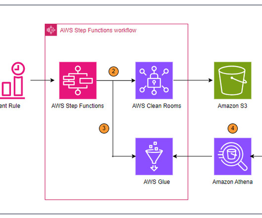
Amazon SageMaker Lakehouse now supports attribute-based access control (ABAC) with AWS Lake Formation , using AWS Identity and Access Management (IAM) principals and session tags to simplify data access, grant creation, and maintenance. You can then query, analyze, and join the data using Redshift, Amazon Athena , Amazon EMR , and AWS Glue.
Table of Contents 1) What Is KPI Management? 4) How to Select Your KPIs 5) Avoid These KPI Mistakes 6) How To Choose A KPI Management Solution 7) KPI Management Examples Fact: 100% of statistics strategically placed at the top of blog posts are a direct result of people studying the dynamics of Key Performance Indicators, or KPIs.
.’ Observability delivers actionable insights, context-enriched data sets, early warning alert generation, root cause visibility, active performance monitoring, predictive and prescriptive incident management, real-time operational deviation detection (6-Sigma never had it so good!), Reference ) Splunk Enterprise 9.0
“Without big data, you are blind and deaf and in the middle of a freeway.” – Geoffrey Moore, management consultant, and author. A host of business intelligence concepts are executed through intuitive, interactive tools and dashboards – a centralized space that provides the ability to drill down into your data with ease.
From customer portals to internal dashboards and mobile apps, this API-driven approach makes enterprise-grade data analysis accessible to everyone in your organization. Create an AWS Identity and Access Management (IAM) role. For instructions, refer to Creating a general purpose bucket.
Amazon OpenSearch Service is a fully managed service offered by AWS that enables you to deploy, operate, and scale OpenSearch domains effortlessly. This process can be programmatically scheduled using an AWS Lambda function, as described in Unleash the power of Snapshot Management to take automated snapshots using Amazon OpenSearch Service.
Data processing and management Once data is collected, it must be processed and managed efficiently. Advanced data management techniques, including big data technologies and distributed databases, are integral to handling vast amounts of data. Implement robust data management processes to ensure data integrity.
Spreadsheets finally took a backseat to actionable and insightful data visualizations and interactive business dashboards. 2020 will be the year of data quality management and data discovery: clean and secure data combined with a simple and powerful presentation. 1) Data Quality Management (DQM). Data exploded and became big.
At the same time, inventory metrics are needed to help managers and professionals in reaching established goals, optimizing processes, and increasing business value. In the matter, data analysis and dashboard designer software is a precious ally. Inventory Metrics Examples For Better Management. Inventory accuracy.
For example, dashboarding applications are a very common use case in Redshift customer environments where there is high concurrency and queries require quick, low-latency responses. First query response times for dashboard queries have significantly improved by optimizing code execution and reducing compilation overhead.
Organizations with legacy, on-premises, near-real-time analytics solutions typically rely on self-managed relational databases as their data store for analytics workloads. We introduce you to Amazon Managed Service for Apache Flink Studio and get started querying streaming data interactively using Amazon Kinesis Data Streams.
To overcome these challenges, businesses need a solution that can provide near-real-time analytics on transactional data with services that don’t lead to latent processing and bloat from managing the pipeline. DynamoDB is a managed NoSQL database solution that acts as a key-value store for transactional data.
You have metrics available per job run within the AWS Glue console, but they don’t cover all available AWS Glue job metrics, and the visuals aren’t as interactive compared to the QuickSight dashboard. In the following sections, we show you how to set up the solution, explore the dashboards, and configure alarms.
Amazon DataZone is a data management service that makes it faster and easier for customers to catalog, discover, share, and govern data stored across AWS, on premises, and from third-party sources. Refer to the detailed blog post on how you can use this to connect through various other tools.
Amazon Redshift is a fast, scalable, secure, and fully managed cloud data warehouse that lets you analyze your data at scale. If you prefer to manage your Amazon Redshift resources manually, you can create provisioned clusters for your data querying needs. For more information, refer to Amazon Redshift clusters.
Federated users of Amazon OpenSearch Service often need access to OpenSearch Dashboards with roles based on their user profiles. However, when an enterprise-wide identity provider (IdP) manages the users, the mapping of users to OpenSearch Service roles often needs to happen dynamically based on IdP user attributes.
Amazon Redshift is a fully managed, AI-powered cloud data warehouse that delivers the best price-performance for your analytics workloads at any scale. Refer to Easy analytics and cost-optimization with Amazon Redshift Serverless to get started. It can help optimize the generation process by reducing unnecessary table references.
Amazon Redshift is a fast, scalable, secure, and fully managed cloud data warehouse that you can use to analyze your data at scale. Reusing database sessions to simplify the connection management logic in your API implementation, reducing the complexity of the code and making it more straightforward to maintain and scale.
3) “The Big Book Of Dashboards: Visualizing Your Data Using Real-World Business Scenarios” by Steve Waxler, Jeffrey Shaffer, and Andy Cotgreave. Our next best book to learn data visualization is the “The Big Book Of Dashboards”. It is a definitive reference for anyone who wants to master the art of dashboarding.
Having bestowed your data analysis techniques and methods with true purpose and defined your mission, you should explore the raw data you’ve collected from all sources and use your KPIs as a reference for chopping out any information you deem to be useless. Build a data management roadmap.
Amazon AppFlow is a fully managed integration service that you can use to securely transfer data from software as a service (SaaS) applications, such as Google BigQuery, Salesforce, SAP, HubSpot, and ServiceNow, to Amazon Web Services (AWS) services such as Amazon Simple Storage Service (Amazon S3) and Amazon Redshift, in just a few clicks.
c) Dashboard Features. Taking all these into consideration, it is impossible to ignore the benefits that your business can endure from implementing BI tools into their data management process. Thus, you will be able to create formulas for any data analysis scenario, giving you a lot more control over your data management.
Through visual KPI tracking tools such as a KPI dashboard , you uncover greater insights than you ever thought possible, streamlining your organization for success in an increasingly competitive digital landscape. KPI Tracking In Action: 3 Real-World Dashboards. Management KPI dashboard. . click to enlarge**.
When running Apache Flink applications on Amazon Managed Service for Apache Flink , you have the unique benefit of taking advantage of its serverless nature. With Managed Service for Apache Flink, you can add and remove compute with the click of a button. Each KPU also comes with 50 GB of storage attached to the application.
Data visualization methods refer to the creation of graphical representations of information. Data visualizations put together in intuitive dashboards can make the analysis process more dynamic and understandable while keeping the audience engaged. However, this is no longer the case thanks to modern dashboard technology.
In fact, a survey about management reports performed by Deloitte says that 50% of managers are unsatisfied with the speed of delivery and the quality of the reports they receive. They serve as a communication tool between managers and team members that need to stay connected and work together for common goals.
Instead, they rely on up-to-date dashboards that help them visualize data insights to make informed decisions quickly. Manually handling repetitive daily tasks at scale poses risks like delayed insights, miscataloged outputs, or broken dashboards. AWS Management Console access to launch AWS CloudFormation templates.
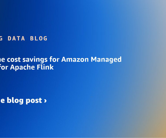
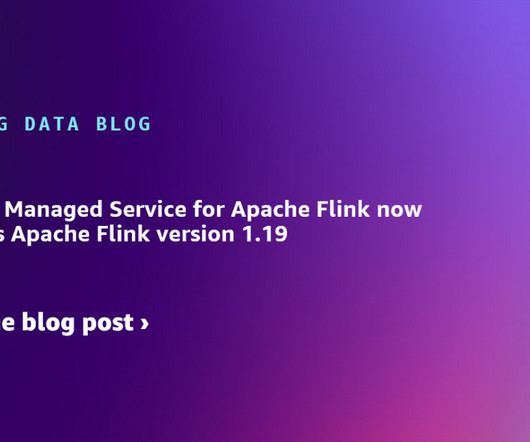
Amazon Managed Service for Apache Flink offers a fully managed, serverless experience in running Apache Flink applications and now supports Apache Flink 1.19.1 , the latest stable version of Apache Flink at the time of writing. Managed Service for Apache Flink currently uses the Python 3.11 SQL Apache Flink 1.19 Python 3.11
The pipelines and workflows that ingest data, process it and output charts, dashboards, or other analytics resemble a production pipeline. Figure 2: The DataKitchen Platform helps you reduce time spent managing errors and executing manual processes from about half to 15%. Multiple management approvals. Production DataOps.
Amazon Redshift features like streaming ingestion, Amazon Aurora zero-ETL integration , and data sharing with AWS Data Exchange enable near-real-time processing for trade reporting, risk management, and trade optimization. Database cluster – For this solution, we use an Amazon Aurora MySQL-Compatible Edition 8.0 version cluster.
We organize all of the trending information in your field so you don't have to. Join 42,000+ users and stay up to date on the latest articles your peers are reading.
You know about us, now we want to get to know you!
Let's personalize your content
Let's get even more personalized
We recognize your account from another site in our network, please click 'Send Email' below to continue with verifying your account and setting a password.


Let's personalize your content