This site uses cookies to improve your experience. To help us insure we adhere to various privacy regulations, please select your country/region of residence. If you do not select a country, we will assume you are from the United States. Select your Cookie Settings or view our Privacy Policy and Terms of Use.
Cookie Settings
Cookies and similar technologies are used on this website for proper function of the website, for tracking performance analytics and for marketing purposes. We and some of our third-party providers may use cookie data for various purposes. Please review the cookie settings below and choose your preference.
Used for the proper function of the website
Used for monitoring website traffic and interactions
Cookie Settings
Cookies and similar technologies are used on this website for proper function of the website, for tracking performance analytics and for marketing purposes. We and some of our third-party providers may use cookie data for various purposes. Please review the cookie settings below and choose your preference.
Strictly Necessary: Used for the proper function of the website
Performance/Analytics: Used for monitoring website traffic and interactions
Now With Actionable, Automatic, Data Quality Dashboards Imagine a tool that can point at any dataset, learn from your data, screen for typical data quality issues, and then automatically generate and perform powerful tests, analyzing and scoring your data to pinpoint issues before they snowball. New Quality Dashboard & Score Explorer.
This integration enables our customers to seamlessly explore data with AI in Tableau, build visualizations, and uncover insights hidden in their governed data, all while leveraging Amazon DataZone to catalog, discover, share, and govern data across AWS, on premises, and from third-party sources—enhancing both governance and decision-making.”
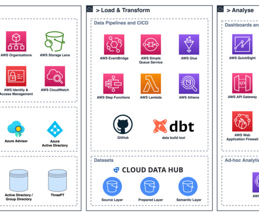
In the following section, two use cases demonstrate how the data mesh is established with Amazon DataZone to better facilitate machine learning for an IoT-based digital twin and BI dashboards and reporting using Tableau. From here, the metadata is published to Amazon DataZone by using AWS Glue Data Catalog.
In this blog post, we’ll discuss how the metadata layer of Apache Iceberg can be used to make data lakes more efficient. You will learn about an open-source solution that can collect important metrics from the Iceberg metadata layer. This ensures that each change is tracked and reversible, enhancing data governance and auditability.
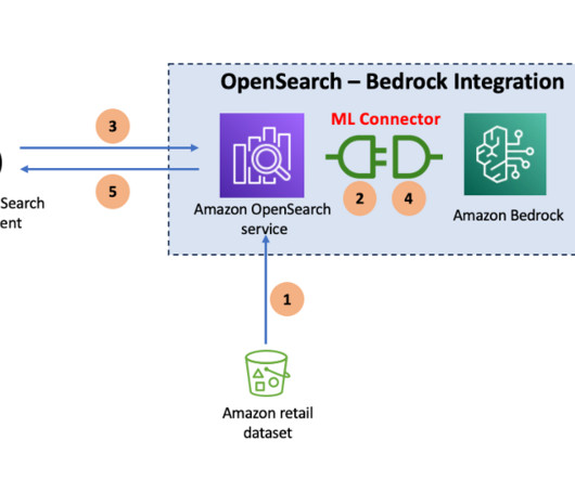
OpenSearch Service stores different types of stored objects, such as dashboards, visualizations, alerts, security roles, index templates, and more, within the domain. Open the Amazon OpenSearch Service dashboard using the OpenSearch Dashboards URL. In the navigation panel, choose Security , then choose Roles.
In this post, we explore how to combine AWS Glue usage information and metrics with centralized reporting and visualization using QuickSight. You have metrics available per job run within the AWS Glue console, but they don’t cover all available AWS Glue job metrics, and the visuals aren’t as interactive compared to the QuickSight dashboard.
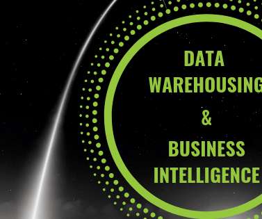
In this post, we will explain the definition, connection, and differences between data warehousing and business intelligence , provide a BI architecture diagram that will visually explain the correlation of these terms, and the framework on which they operate. But first, let’s start with basic definitions. click to enlarge**.
Instead, they rely on up-to-date dashboards that help them visualize data insights to make informed decisions quickly. Manually handling repetitive daily tasks at scale poses risks like delayed insights, miscataloged outputs, or broken dashboards. At a large volume, it would require around-the-clock staffing, straining budgets.
Grafana provides powerful customizable dashboards to view pipeline health. QuickSight makes it straightforward for business users to visualize data in interactive dashboards and reports. QuickSight makes it straightforward for business users to visualize data in interactive dashboards and reports.
Content management systems: Content editors can search for assets or content using descriptive language without relying on extensive tagging or metadata. This makes it possible to create dynamic, graphical user interfaces that visually represent complex information. and immediately receive relevant answers and visualizations.
These include internet-scale web and mobile applications, low-latency metadata stores, high-traffic retail websites, Internet of Things (IoT) and time series data, online gaming, and more. Table metadata, such as column names and data types, is stored using the AWS Glue Data Catalog. You don’t need to write any code. Choose Next.
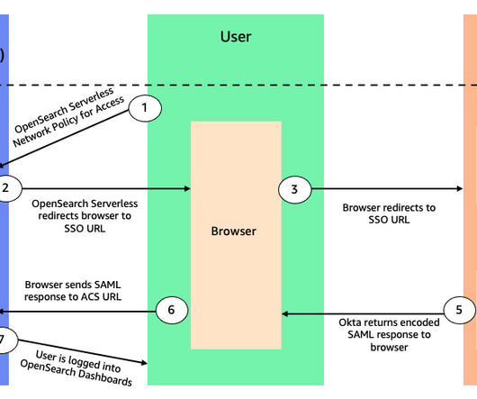
Amazon OpenSearch Serverless provides an installation of OpenSearch Dashboards with every collection created. This network access setting can be defined separately for the collection’s OpenSearch endpoint (used for data operations) and its corresponding OpenSearch Dashboards endpoint (used for visualizing and analyzing data).
Business intelligence tools can include data warehousing, data visualizations, dashboards, and reporting. Business intelligence tools have the ability to visualize and automate queries to save time while reducing errors. It comes with embedded dashboards privately and publicly. The best business intelligence tools today.
As quality issues are often highlighted with the use of dashboard software , the change manager plays an important role in the visualization of data quality. It involves: Reviewing data in detail Comparing and contrasting the data to its own metadata Running statistical models Data quality reports. 2 – Data profiling.
Metadata is at the heart of every report, dashboard, data warehouse, visualization, and anything else the BI team produces. Without an understanding of the organization’s metadata, the BI team can’t match the data from multiple sources to produce a single view of the business. Money Loser #1: Manual Data Discovery.
Key performance indicators (KPIs) of interest for a call center from a near-real-time platform could be calls waiting in the queue, highlighted in a performance dashboard within a few seconds of data ingestion from call center streams. The near-real-time insights can then be visualized as a performance dashboard using OpenSearch Dashboards.
For example, dashboarding applications are a very common use case in Redshift customer environments where there is high concurrency and queries require quick, low-latency responses. First query response times for dashboard queries have significantly improved by optimizing code execution and reducing compilation overhead.
However, people generally don’t know which graphs, charts, or visualizations to ask for or how to discover initial data to prepare data for their dashboards. GenBI can generate complex, dynamic visualizations that you can manipulate, zoom in and out, or continue investigating a particular subset of data.
Execution of this mission requires the contribution of several groups: data center/IT, data engineering, data science, data visualization, and data governance. Data Visualization, Preparation – Self-service tools sucha as Tableau, Alteryx. Data Visualization, Preparation – Self-service tools sucha as Tableau, Alteryx.
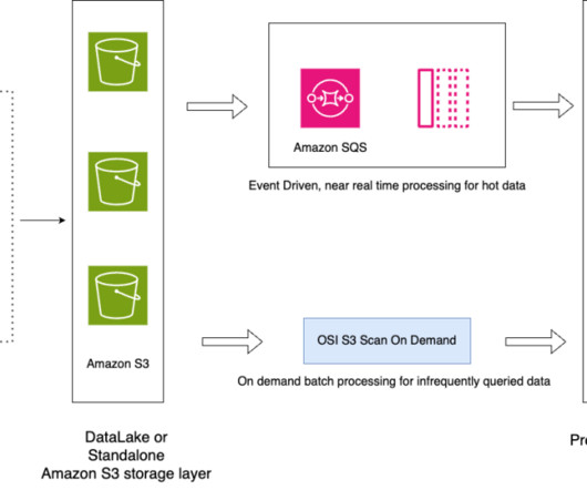
A common use case that we see amongst customers is to search and visualize data. In this post, we show how to ingest CSV files from Amazon Simple Storage Service (Amazon S3) into Amazon OpenSearch Service using the Amazon OpenSearch Ingestion feature and visualize the ingested data using OpenSearch Dashboards.
They prefer self-service development, interactive dashboards, and self-service data exploration. Metadata management. Users can centrally manage metadata, including searching, extracting, processing, storing, sharing metadata, and publishing metadata externally. Analytics dashboards. Support mobile display.
BI users analyze and present data in the form of dashboards and various types of reports to visualize complex information in an easier, more approachable way. What’s more, visualizing their data helped them see how much revenue a given seat is producing during a season, and compare the different areas of the stadium.
Amazon SageMaker Unified Studio brings together functionality and tools from the range of standalone studios, query editors, and visual tools available today in Amazon EMR , AWS Glue , Amazon Redshift , Amazon Bedrock , and the existing Amazon SageMaker Studio. With AWS Glue 5.0,
Visualize the problem. Once you have accounted for all the CRM’s data, and metadata type, administrators will then need to take a comprehensive snapshot of the account,” added Mercer. There are several different metadata asset types that can end up being left behind because of configuration settings within CRMs,” added Fitzgerald.
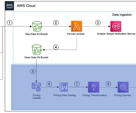
We will partition and format the server access logs with Amazon Web Services (AWS) Glue , a serverless data integration service, to generate a catalog for access logs and create dashboards for insights. Using Amazon Athena and Amazon QuickSight, we query and create dashboards for insights.
Most of the time we think about data fields & files, columns & tables, reports & dashboards. Active metadata will play a critical role in automating such updates as they arise. His work produced control-flow graphs with nodes and edges as a visual representation of complexity. But what data things are interconnected?
OpenSearch is an open-source search and analytics suite that enables you to ingest, store, analyze, and visualize full text and log data. When you navigate to OpenSearch Dashboards, the workflow steps are as follows: OpenSearch Serverless generates a SAML authentication request. You should see the metadata for the Okta application.
The CLEA dashboards were built on the foundation of the Well-Architected Lab. For more information on this foundation, refer to A Detailed Overview of the Cost Intelligence Dashboard. Once released, consumers use datasets from different providers for analysis, machine learning (ML) workloads, and visualization.
BI software helps companies do just that by shepherding the right data into analytical reports and visualizations so that users can make informed decisions. To gain employee buy-in, Stout’s team builds BI dashboards to show them how they can easily connect to and interact with their data, as well as visualize it in a meaningful way.
It also integrates with other OpenSearch integrations so you can install prepackaged queries and visualizations to analyze your data, making it straightforward to quickly get started. You can now analyze data in cloud object stores and simultaneously use the operational analytics and visualizations of OpenSearch Service.
Data in Use pertains explicitly to how data is actively employed in business intelligence tools, predictive models, visualization platforms, and even during export or reverse ETL processes. ” For example, these tools may offer metadata-based notifications.
It provides a natural language prompt to generate visualizations and it describes computations and can have your copilot generate the calculation.” This feature enables users to save calculations from a Tableau dashboard directly to Tableau’s metrics layer so they can monitor and track the information over time. Metrics Bootstrapping.
The platform consists of approximately 370 dashboards, 360 tables registered in the data catalog, and 40 linked systems. Provide and keep up to date with technical metadata for loaded data. Configure business intelligence (BI) dashboards to provide data-driven insights to end-users targeted by the consumer’s project.
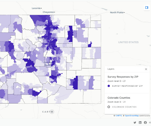
HR&A has used Amazon Redshift Serverless and CARTO to process survey findings more efficiently and create custom interactive dashboards to facilitate understanding of the results. Figure 1: Workflow illustrating data ingesting, transformation, and visualization using Redshift and CARTO.
The Query Editor V2 offers a user-friendly interface for connecting to your Redshift clusters, executing queries, and visualizing results. Save the federation metadata XML file You use the federation metadata file to configure the IAM IdP in a later step. Save this file locally. Choose Add provider. Choose Add provider.
Using machine learning (ML) and data visualization tools, these datasets can be transformed into actionable insights that can inform decision-making. The architecture approach is split into a data intake layer, a data analysis layer, and a data visualization layer. The Data Catalog now contains references to the machine-readable data.
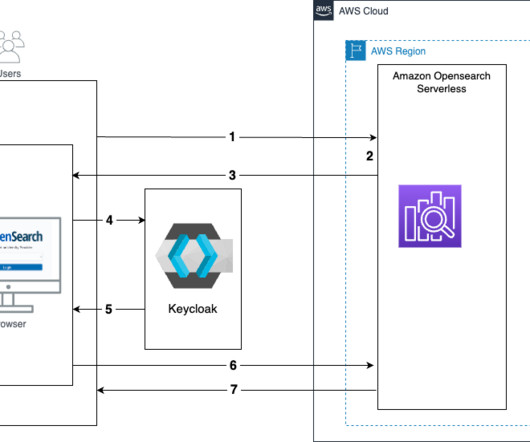
With OpenSearch Serverless, you can configure SAML to enable users to access data through OpenSearch Dashboards using an external SAML identity provider (IdP). In this post, we show you how to configure SAML authentication for OpenSearch Dashboards using IAM Identity Center as its IdP. application. Choose Next.
Enabling teams to build their own analyses at scale The Insights team builds dashboards and supports thousands of internal consultants and hundreds of analysts and engineers across the globe who drive local products and insights. Last year, this team also reported over 29,600 distinct views on their 19 dashboards.
Octopai’s metadata discovery and management suite provides visualization tools that empower you to see and report everything about sensitive customer data. Octopai's Automated Metadata Management Platform can make CCPA compliance a breeze. Keeping the Lights On with Automated Metadata Management. Not Yet CCPA Compliant?
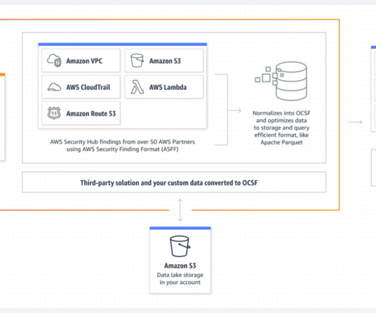
OpenSearch Service is a fully managed and scalable log analytics framework that is used by customers to ingest, store, and visualize data. We also walk you through how to use a series of prebuilt visualizations to view events across multiple AWS data sources provided by Security Lake.
With OpenSearch Ingestion, you can filter, enrich, transform, and deliver your data for downstream analysis and visualization. You can now analyze infrequently queried data in cloud object stores and simultaneously use the operational analytics and visualization capabilities of OpenSearch Service.
To enable multimodal search across text, images, and combinations of the two, you generate embeddings for both text-based image metadata and the image itself. Text embeddings capture document semantics, while image embeddings capture visual attributes that help you build rich image search applications.
The new SAP Datasphere catalog provides data lineage, metadata information, and quick searching capabilities across your SAP landscape. The semantic layer is an abstraction layer between the raw data stored in databases and the end-users or business analysts who need to access, analyze, and visualize that data.
With the search relevance plugin, you can now view a side-by-side comparison of results in OpenSearch Dashboards. Take Observability to the next level Observability in OpenSearch is a collection of plugins and features that let you explore, query and visualize telemetry data stored in OpenSearch. Additional field types OpenSearch 2.7
We organize all of the trending information in your field so you don't have to. Join 42,000+ users and stay up to date on the latest articles your peers are reading.
You know about us, now we want to get to know you!
Let's personalize your content
Let's get even more personalized
We recognize your account from another site in our network, please click 'Send Email' below to continue with verifying your account and setting a password.


Let's personalize your content