This site uses cookies to improve your experience. To help us insure we adhere to various privacy regulations, please select your country/region of residence. If you do not select a country, we will assume you are from the United States. Select your Cookie Settings or view our Privacy Policy and Terms of Use.
Cookie Settings
Cookies and similar technologies are used on this website for proper function of the website, for tracking performance analytics and for marketing purposes. We and some of our third-party providers may use cookie data for various purposes. Please review the cookie settings below and choose your preference.
Used for the proper function of the website
Used for monitoring website traffic and interactions
Cookie Settings
Cookies and similar technologies are used on this website for proper function of the website, for tracking performance analytics and for marketing purposes. We and some of our third-party providers may use cookie data for various purposes. Please review the cookie settings below and choose your preference.
Strictly Necessary: Used for the proper function of the website
Performance/Analytics: Used for monitoring website traffic and interactions
Dashboards are the lifeblood of modern businesses, providing a clear, concise view of critical metrics. This article explores 20 diverse Power BI dashboard examples, showcasing how data can be transformed into actionable insights.
The rise of innovative, interactive, data-driven dashboard tools has made creating effective dashboards – like the one featured above – swift, simple, and accessible to today’s forward-thinking businesses. Dashboard design should be the cherry on top of your business intelligence (BI) project. Now, it’s time for the fun part.
CFO dashboards exist to enhance the strategic as well as the analytical efforts related to every financial aspect of your business. Here, we’ll explore the dynamics of reports for CFOs, look at CFO reporting tools, and consider real-world examples of both CFO dashboards and reports. Benefit from great CFO dashboards & reports!
Enter data dashboards – one of history’s best innovations in business intelligence. To help you understand this notion in full, we’re going to explore a data dashboard definition, explain the power of dashboard data, and explore a selection of data dashboard examples. What Is A Data Dashboard? click to enlarge**.
At the same time, inventory metrics are needed to help managers and professionals in reaching established goals, optimizing processes, and increasing business value. In the matter, data analysis and dashboard designer software is a precious ally. What Are Inventory Metrics? How To Choose The Right Inventory KPIs?
By establishing clear operational metrics and evaluate performance, companies have the advantage of using what is crucial to stay competitive in the market, and that’s data. Your Chance: Want to visualize & track operational metrics with ease? What Are Metrics And Why Are They Important?
That’s where recruitment metrics come in. By utilizing recruiting KPIs presented through the medium of visual and interactive HR dashboards , it’s possible to use recruitment metrics to better interpret and evaluate a variety of talent acquisition factors that aid in hiring processes. And why should you care? Let’s get started.
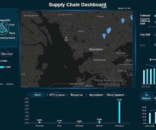
That’s why it’s critical to monitor and optimize relevant supply chain metrics. Finally, we will show how to combine those metrics with the help of modern KPI software and create professional supply chain dashboards. Your Chance: Want to visualize & track supply chain metrics with ease?
This is where the power of business dashboards comes into play. Dashboards often are the best way to gain insight into an organization and its various departments, operations and performance. Well-built, focused dashboards easily serve up summaries and reports of the BI that’s most critical to the organization.
As a CEO, you’re responsible for overseeing every aspect of your business, from the people and the internal culture all the way through to key sales, marketing, and financial strategies. Exclusive Bonus Content: Reap the benefits of dashboards for CEOs! CEO dashboards and CEO reports are the answer. What Is A CEO Dashboard?
With a powerful dashboard maker , each point of your customer relations can be optimized to maximize your performance while bringing various additional benefits to the picture. Your Chance: Want to build professional CRM reports & dashboards? Your Chance: Want to build professional CRM reports & dashboards?
Using daily and/or weekly sales reports with your team may be the single most powerful action you can take to increase your team’s performance. Get our checklist of the 8 KPIs to track and skyrocket your sales! What Is A Sales Report? What Is The Purpose Of Sales Reports? Don’t believe us?
1) What Are Productivity Metrics? 3) Productivity Metrics Examples. 4) The Value Of Workforce Productivity Metrics. Productivity can be measured in many different ways and at different levels, from the raw industrial output of an asset in a manufacturing facility to the specific individual sales performance of a vendor.
That said, if you’re looking to evolve your empire, increase brand awareness, and boost your bottom line, embracing business performance dashboards and big data should be at the top of your priority list. You need data-driven decisions, and a dashboard for business performance will make sure you reap the best possible rewards.
The good news is that you can utilize both with the help of a modern and professional SQL dashboard. That said, in this post, we will take a detailed look into what is a SQL dashboard, how to create one (or several), and provide you with visual examples that will represent the undeniable power that SQL has on offer.
3) Top 15 Warehouse KPIs Examples 4) Warehouse KPI Dashboard Template The use of big data and analytics technologies has become increasingly popular across industries. Making the use of warehousing metrics a huge competitive advantage. That is where warehouse metrics and KPIs come into play. 2) Why Do You Need Warehouse KPIs?
As the head of sales at your small company, you’ve prepared for this moment. “Mr. Download our free executive summary and boost your sales strategy! That’s why, in this post, we’re going to go over 16 sales graphs and charts that will fuel your imagination and give you some useful resources. 1) Sales Performance.
My last post, perhaps provocatively, called for a reduction of data in executive dashboards (digital, online, offline). Here's the post: Strategic & Tactical Dashboards: Best Practices, Examples. In the post Adil commented that he's observed that attribution modeling is missing from most web analytics dashboards.
2) What Are Metrics? 3) KPIs vs Metrics: Main Differences. 4) Tips For KPI & Metrics Tracking. This is done with the help of KPI and metrics. KPIs and metrics are often considered the same thing in day-to-day business contexts. Let’s quick it off with the definition of metrics and KPIs! What Are Metrics?
We won’t delve into details about the career prospects of this C-level position but we will present COO dashboards and reports that are critical for helping chief operating officers across the world to effectively manage their time, company, operational processes, and results. How to create a COO dashboard? What is a COO report?
Digital dashboards not only help you to drill down into the insights that matter most to your business, but they also offer an interactive visual representation that assists in swifter, more informed decision-making as well as the discovery of priceless new insights. Your Chance: Want to build your own digital dashboard with a few clicks?
With so much data available to today’s brands and businesses, to extract every drop of value from an ever-growing raft of digital insights and set the kind of KPIs that will drive your venture forward, having an easy to use, a visually-stunning dashboard is key. Exclusive Bonus Content: 15 Powerful Dashboard Ideas: A Summary.
Visual marketing dashboards are prime examples of using big data effectively in marketing. In this day and age, all businesses must pay especially close consideration to the performance of their marketing metricsdashboard. In this article, we will discuss what l needs to be included in marketing reporting dashboards.
Table of Contents 1) What Are Incremental Sales? A loyal, high-value repeat customer is worth more than a cheap sale, and by implementing the right strategy, setting the right goals, and working with the right KPIs, you will achieve the results you desire. What Are Incremental Sales? Keep reading to find out!
That’s where SaaS dashboards enter the fold. A SaaS dashboard is a powerful business intelligence tool that offers a host of benefits for ambitious tech businesses. Exclusive Bonus Content: Your Definitive Guide to SaaS & Dashboards! Geet our bite-sized free summary and start building your dashboards!
Whatever your sector or niche, if you want to remain adaptable and get one step ahead of the competition, working with the right data-driven tools and utilizing a corporate dashboard is essential. That’s where corporate dashboards come in. Your Chance: Want to create your own dynamic corporate dashboard? 1) CFO dashboard.
By gaining the ability to gather, organize and analyze the metrics that are most important to your organization, you stand to make your business empire more intelligent than ever before – and executive reporting and business dashboards will help you do just that. Exclusive Bonus Content: Executive Dashboards & Reports: A Summary.
In your daily business, many different aspects and ‘activities’ are constantly changing – sales trends and volume, marketing performance metrics, warehouse operational shifts, or inventory management changes. Tracking them and visualizing them through a modern dashboard is a competitive advantage for your investors’ report.
1) What Is A Small Business Dashboard? 3) Why Do You Need Small Business Dashboards. 4) Small Business Dashboard & KPIs Examples. Enter small business dashboards and metrics. BI dashboard tools provide smaller businesses with valuable insights regarding their operations thanks to real-time access to data.
A business intelligence dashboard coupled with a dynamic dashboard display will allow you to squeeze every last drop of value from the insights that matter most. But before we delve any deeper, let’s consider the definition of this kind of a dashboard and its role in the modern workplace. What Is A TV Dashboard?
2) What Is A Content Dashboard? 4) Content Dashboards Examples. Modern content performance reports in the shape of an interactive online dashboard present an intuitive and accessible way to assess your content’s success and its ROI in real-time and in one centralized location. What Is A Content Dashboard?
6) Data Quality Metrics Examples. Reporting being part of an effective DQM, we will also go through some data quality metrics examples you can use to assess your efforts in the matter. The data quality analysis metrics of complete and accurate data are imperative to this step. Table of Contents. 2) Why Do You Need DQM?
2) Benefits Of White Label Reports 3) Key White Label Reporting Features 4) White Label Dashboards & Report Examples In today’s competitive business environment, building a brand that is trusted, recognizable, and loved by many is not an easy task. Your Chance: Want to build your own white label reports & dashboards?
Such issues often go unnoticed until a user or analyst reports missing information in a dashboard or report, by which point the delay has already impacted business decision-making. Similarly, downstream business metrics in the Gold layer may appear skewed due to missing segments, which can impact high-stakes decisions.
Use digital dashboards: When considering the question “what is an analytical report,” it’s important to think about the best medium in terms of usability and presentation. By using an online dashboard , you will be able to gain access to dynamic metrics and data in a way that’s digestible, actionable, and accurate.
Typically presented in the form of an interactive dashboard , this kind of report provides a visual representation of the data associated with your predetermined set of key performance indicators – or KPI data, for short. Set up a report which you can visualize with an online dashboard. Consider your data sources. 2) Select your KPIs.
There are many chart types available and each one of them plays an important role in a professional BI dashboard. It uses various colors to divide a scale into segments that represent different values of the same metric, and it uses a needle to point at a certain value over the pivot point. Benefits Of Using Gauge Charts.
We live in a data-driven age, and the ability to use financial insights and metrics to your advantage will set you apart from the pack. Our monthly reports are on top illustrated with beautiful data visualizations that provide a better understanding of the metrics tracked. The reporting tools to do that exist for that very purpose.
While traditional reports often include a summary, body, and conclusion in a written format, this post will focus on interactive monthly reports created with a professional dashboard creator. All these reports were carefully created with an intuitive BI dashboard software. Our next example is a dashboard focusing on retention metrics.
Approaches to communication are changing, and success in today’s technology-driven world correlates directly to the quantity rather than the quality of one’s information—metrics relating to the business, the client, the competitor, and the market. An online BI dashboard. Exclusive Bonus Content: Download Our Free Dashboard Checklist!
If you want to convey crucial information to decision-makers in the easiest and most effective way possible, you need to embrace the power of interactive dashboards. A business dashboard offers at-a-glance insights based on key performance indicators (KPIs) and is an intuitive and visually pleasing way to consume data.
Typically, weekly status reports are used to track progress or performance for different business scenarios, such as projects, sales, finances, marketing campaigns, human resources, or any other area that might be relevant. Let’s kick it off with the definition. Your Chance: Want to build great weekly status reports on your own?
Purchasing analysis is usually represented as dashboards, reports, and data graphs, analyzing the company’s spending on suppliers by category or location. Purchase Reporting Dashboard(from FineReport). Purchasing Center Dashboard. Purchasing Dashboard/Report & Key Metrics. Purchasing Reports Samples.
I'm excited about the power of a well created dashboard. Dashboards are every where, we will look at a lot of them in this post and they are all digital. Here's a great dashboard, for the Museum of Art… take a minute to ponder it… Isn't it pretty awesome? And data pukes are not dashboards.
We organize all of the trending information in your field so you don't have to. Join 42,000+ users and stay up to date on the latest articles your peers are reading.
You know about us, now we want to get to know you!
Let's personalize your content
Let's get even more personalized
We recognize your account from another site in our network, please click 'Send Email' below to continue with verifying your account and setting a password.


Let's personalize your content