This site uses cookies to improve your experience. To help us insure we adhere to various privacy regulations, please select your country/region of residence. If you do not select a country, we will assume you are from the United States. Select your Cookie Settings or view our Privacy Policy and Terms of Use.
Cookie Settings
Cookies and similar technologies are used on this website for proper function of the website, for tracking performance analytics and for marketing purposes. We and some of our third-party providers may use cookie data for various purposes. Please review the cookie settings below and choose your preference.
Used for the proper function of the website
Used for monitoring website traffic and interactions
Cookie Settings
Cookies and similar technologies are used on this website for proper function of the website, for tracking performance analytics and for marketing purposes. We and some of our third-party providers may use cookie data for various purposes. Please review the cookie settings below and choose your preference.
Strictly Necessary: Used for the proper function of the website
Performance/Analytics: Used for monitoring website traffic and interactions
CFO dashboards exist to enhance the strategic as well as the analytical efforts related to every financial aspect of your business. Here, we’ll explore the dynamics of reports for CFOs, look at CFO reporting tools, and consider real-world examples of both CFO dashboards and reports. Benefit from great CFO dashboards & reports!
With a powerful dashboard maker , each point of your customer relations can be optimized to maximize your performance while bringing various additional benefits to the picture. Your Chance: Want to build professional CRM reports & dashboards? Your Chance: Want to build professional CRM reports & dashboards?
That’s why it’s critical to monitor and optimize relevant supply chain metrics. Finally, we will show how to combine those metrics with the help of modern KPI software and create professional supply chain dashboards. Your Chance: Want to visualize & track supply chain metrics with ease?
That said, if you’re looking to evolve your empire, increase brand awareness, and boost your bottom line, embracing business performance dashboards and big data should be at the top of your priority list. You need data-driven decisions, and a dashboard for business performance will make sure you reap the best possible rewards.
And the best way to do so is by using digital dashboards and a modern online reporting tool. What Is A Call Center Dashboard? Online data visualization tools are the fast track to improved customer service intelligence, and robust contact center dashboards exist for that very purpose. We offer a 14-day free trial.
Soon businesses of all sizes will have so much amount of information that dashboard software will be the most invaluable resource a company can have. That’s why we welcome you to the world of interactive dashboards. Your Chance: Want to test interactive dashboard software for free? What Is An Interactive Dashboard?
Here, we’ll examine 18 essential KPIs for social media, explore the dynamics and demonstrate the importance of social metrics in the modern business age with the help of a KPI software , and, finally, wrapping up with tips on how to set KPIs and make the most of your social platforms. Let’s get going. What Are Social Media KPIs?
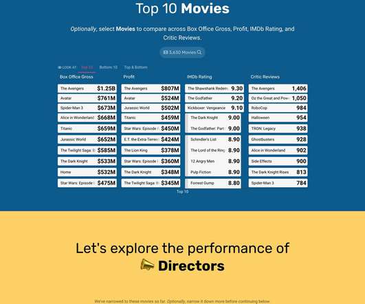
I'm excited about the power of a well created dashboard. Dashboards are every where, we will look at a lot of them in this post and they are all digital. Here's a great dashboard, for the Museum of Art… take a minute to ponder it… Isn't it pretty awesome? And data pukes are not dashboards.
By gaining the ability to gather, organize and analyze the metrics that are most important to your organization, you stand to make your business empire more intelligent than ever before – and executive reporting and business dashboards will help you do just that. Exclusive Bonus Content: Executive Dashboards & Reports: A Summary.
In your daily business, many different aspects and ‘activities’ are constantly changing – sales trends and volume, marketing performance metrics, warehouse operational shifts, or inventory management changes. Tracking them and visualizing them through a modern dashboard is a competitive advantage for your investors’ report.
If you want to convey crucial information to decision-makers in the easiest and most effective way possible, you need to embrace the power of interactive dashboards. A business dashboard offers at-a-glance insights based on key performance indicators (KPIs) and is an intuitive and visually pleasing way to consume data.
When these reports are backed up with powerful visualizations developed with a dashboard creator , no information can stay hidden, eliminating thus the possibility of human errors and negative business impact. However, the use of dashboards, big data, and predictive analytics is changing the face of this kind of reporting.
The one-page dashboard was once the predominant form of visualizing data. With touch screens, mobile devices, on-demand data, and interfaces crafted for interaction and user experience, the one-page dashboard is a relic. Use cases for one-page dashboards exist, but they are increasingly rare. It seldom is.
Here, we will consider what it takes to track KPI metrics, explore the dynamics or a contemporary KPI tracker, and look at how to track KPIs. If you use a KPI tracker to its full potential and work with metrics that are relevant to your business’s core mission, you will reap incredible rewards.
Today, there are online data visualization tools that make it easy and fast to build powerful market-centric research dashboards. How To Present Your Results: 3 Market Research Example Dashboards. When it comes to sharing the most important information, research dashboards are invaluable. Let’s take a closer look.
Each information can be gathered into a single, live dashboard , that will ultimately secure a fast, clear, simple, and effective workflow. As seen in the example above, this sales performance dashboard can give you a complete overview of sales targets and insights on whether the team is completing their individual objectives.
While traditional reports often include a summary, body, and conclusion in a written format, this post will focus on interactive monthly reports created with a professional dashboard creator. All these reports were carefully created with an intuitive BI dashboard software. Our next example is a dashboard focusing on retention metrics.
Typically presented in the form of an interactive dashboard , this kind of report provides a visual representation of the data associated with your predetermined set of key performance indicators – or KPI data, for short. Set up a report which you can visualize with an online dashboard. Consider your data sources. 2) Select your KPIs.
Today, more and more businesses are turning to online data visualizations such as a dashboard creator that is user-friendly and accessible for everyone. This is an important metric to monitor weekly as it lets you understand if your cost goals are actually in line with what is feasible. Let’s kick it off with the definition.
Because after all – a business dashboard is worth a thousand Excel sheets. A sales graph example generated with a dashboard builder that will prove invaluable regardless of your niche or sector. Number 6 on our list is a sales graph example that offers a detailed snapshot of sales conversion rates. 11) Sales KPI Dashboard.
We live in a data-driven age, and the ability to use financial insights and metrics to your advantage will set you apart from the pack. Our monthly reports are on top illustrated with beautiful data visualizations that provide a better understanding of the metrics tracked. The reporting tools to do that exist for that very purpose.
You will learn about an open-source solution that can collect important metrics from the Iceberg metadata layer. Based on collected metrics, we will provide recommendations on how to improve the efficiency of Iceberg tables. Additionally, you will learn how to use Amazon CloudWatch anomaly detection feature to detect ingestion issues.
Dashboard reporting refers to putting the relevant business metrics and KPIs in one interface, presenting them visually, dynamic, and in real-time, in the dashboard formats. This article will review the best 10 dashboard tools covering different areas, including open source and free software. What Makes a Great Dashboard?
Here, we’ll explore the unrivaled power of data storytelling in the digital age while looking at a mix of powerful data storytelling examples generated with a modern dashboard creator. a) Turn metrics into actionable concepts. To get under the skin of this most priceless concept, read our guide to data-driven dashboard presentation.
Our previous solution offered visualization of key metrics, but point-in-time snapshots produced only in PDF format. We chose Amazon QuickSight because it gave us dynamic and interactive dashboards embedded in our application, while saving us money and development time.
In today’s business world, competition is fierce across all industries and sectors, which means that to survive and thrive, working with measurable online data analysis and performance metrics is essential. Working with service desk metrics and KPI reports will help you make the improvements you need for continual growth and success.
By understanding your core business goals and selecting the right key performance indicator ( KPI ) and metrics for your specific needs, you can use an information technology report sample to visualize your most valuable data at a glance, developing initiatives and making pivotal decisions swiftly and with confidence.
A procurement report allows an organization to demonstrate how its procurement activities deliver value for money, contribute to the realization of its broader goals and objectives, and provide a panoramic snapshot of the effectiveness of its procurement strategy. c) Increase the efficiency of crucial KPIs. Clean your data.
A financial Key Performance Indicator (KPI) or metric is a quantifiable measure that a company uses to gauge its financial performance over time. These three statements are data rich and full of financial metrics. How to Build Useful KPI Dashboards. The Fundamental Finance KPIs and Metrics – Cash Flow.
By increasing the service levels, customer satisfaction, and loyalty, among many other metrics, organizations can ultimately generate business value and increase profits. We have written a bit more on the average response time as one of our metrics examples below in our article, but the main point is to keep it as short as possible.
Here we explore the meaning and value of incremental sales in the world of business, as well as the additional KPI examples and metrics you should track to ensure ongoing success. To ensure you yield the results you desire, first establish your goals, then decide on the metrics that you will need to track to measure your performance.
A manufacturing Key Performance Indicator (KPI) or metric is a well defined and quantifiable measure that the manufacturing industry uses to gauge its performance over time. The only way to stay ahead in this fiercely competitive industry is through the implementation of manufacturing KPIs and metrics. What Is A Manufacturing KPI?
Usually, these reports are considered to be financial statements which include: a balance sheet: is a snapshot of a business at a specific time and shows the ending assets, liability, and equity balances as of the balance sheet date. The balance sheet is a snapshot of your business finances at a moment in time, showing assets and liabilities.
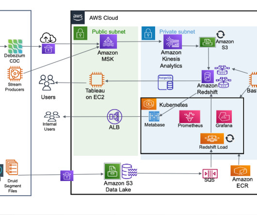
The vector engine uses approximate nearest neighbor (ANN) algorithms from the Non-Metric Space Library (NMSLIB) and FAISS libraries to power k-NN search. With the search relevance plugin, you can now view a side-by-side comparison of results in OpenSearch Dashboards. SS4O complies with the OTEL schema for logs, traces, and metrics.
BI tools access and analyze data sets and present analytical findings in reports, summaries, dashboards, graphs, charts, and maps to provide users with detailed intelligence about the state of the business. Business intelligence examples Reporting is a central facet of BI and the dashboard is perhaps the archetypical BI tool.
A static report offers a snapshot of trends, data, and information over a predetermined period to provide insight and serve as a decision-making guide. With dynamic data reports, users can log into a dashboard from anywhere across multiple devices for instant insight and analysis. What Is Static Reporting?
Managed Service for Apache Flink manages the underlying infrastructure and Apache Flink components that provide durable application state, metrics, logs, and more. The third cost component is durable application backups, or snapshots. The cost of durable application backup (snapshots) is $0.023 per GB per month.
In addition, logs, metrics, application tags, application configurations, VPCs, and other settings are retained between version upgrades. Some things to keep in mind: Stateful downgrades are not compatible and will not be accepted due to snapshot incompatibility. You don’t need to create a new application in order to upgrade in-place.
By leveraging the Amazon Redshift materialized views, Gupshup has been able to dramatically improve query performance on recurring and predictable workloads, such as dashboard queries from Business Intelligence (BI) tools. They also use Redshift to directly power some of their high-concurrency dashboards.
This is where the significance of a financial dashboard shines through. In this article, we will explore the concept of a financial dashboard, highlight its numerous benefits, and provide various kinds of financial dashboard examples for you to employ and explore. What is A Financial Dashboard?
Near-real-time streaming analytics captures the value of operational data and metrics to provide new insights to create business opportunities. These metrics help agents improve their call handle time and also reallocate agents across organizations to handle pending calls in the queue.
Unless you take the necessary precautions, you run the risk of having to deal with multiple non-common data entries that may make your stats, facts, figures, and metrics inconsistent. With concrete data monitoring principles, you are well prepared to get all your key metrics out of your data with a smart KPI software like datapine.
A vast majority of occasions where data is presented (reports, executive dashboards, conference presentations, or just plain here's a automated emailed thingy from Google Analytics ) end up being abject failures because most of the discussion is still about the data. Yes, cost per click is metric. Or, both. : ). Don't rush.
We organize all of the trending information in your field so you don't have to. Join 42,000+ users and stay up to date on the latest articles your peers are reading.
You know about us, now we want to get to know you!
Let's personalize your content
Let's get even more personalized
We recognize your account from another site in our network, please click 'Send Email' below to continue with verifying your account and setting a password.


Let's personalize your content