This site uses cookies to improve your experience. To help us insure we adhere to various privacy regulations, please select your country/region of residence. If you do not select a country, we will assume you are from the United States. Select your Cookie Settings or view our Privacy Policy and Terms of Use.
Cookie Settings
Cookies and similar technologies are used on this website for proper function of the website, for tracking performance analytics and for marketing purposes. We and some of our third-party providers may use cookie data for various purposes. Please review the cookie settings below and choose your preference.
Used for the proper function of the website
Used for monitoring website traffic and interactions
Cookie Settings
Cookies and similar technologies are used on this website for proper function of the website, for tracking performance analytics and for marketing purposes. We and some of our third-party providers may use cookie data for various purposes. Please review the cookie settings below and choose your preference.
Strictly Necessary: Used for the proper function of the website
Performance/Analytics: Used for monitoring website traffic and interactions
The rise of innovative, interactive, data-driven dashboard tools has made creating effective dashboards – like the one featured above – swift, simple, and accessible to today’s forward-thinking businesses. Dashboard design should be the cherry on top of your business intelligence (BI) project. Consider your end goal.
CFO dashboards exist to enhance the strategic as well as the analytical efforts related to every financial aspect of your business. Here, we’ll explore the dynamics of reports for CFOs, look at CFO reporting tools, and consider real-world examples of both CFO dashboards and reports. Benefit from great CFO dashboards & reports!
Now that you’re sold on the power of data analytics in addition to data-driven BI, it’s time to take your journey a step further by exploring how to effectively communicate vital metrics and insights in a concise, inspiring, and accessible format through the power of visualization. That’s a colossal number of books on visualization.
By taking an online data visualization approach to handling your company’s strategic activities, big or small, you will make your business more cohesive, collaborative, intelligent and profitable – and project management dashboards will help you do just that. Download right here our free guide and get started with dashboards!
Soon businesses of all sizes will have so much amount of information that dashboard software will be the most invaluable resource a company can have. Visualizing the data and interacting on a single screen is no longer a luxury but a business necessity. That’s why we welcome you to the world of interactive dashboards.
“By visualizing information, we turn it into a landscape that you can explore with your eyes. 90% of the information transmitted to the brain is visual. Data visualization methods refer to the creation of graphical representations of information. That’s where data visualization comes in. Did you know?
Digital dashboards not only help you to drill down into the insights that matter most to your business, but they also offer an interactive visual representation that assists in swifter, more informed decision-making as well as the discovery of priceless new insights. Try our professional dashboard software for 14 days, completely free!
A customer retention dashboard and metrics depicted in a neat visual will help you in monitoring, analyzing, and managing multiple customer-centric points and how they echo in your business. Your Chance: Want to build a dashboard for customer retention? Try our professional dashboard software for 14 days, completely free!
An online BI dashboard. Thanks to specific business intelligence best practices for dashboard design. Exclusive Bonus Content: Download Our Free Dashboard Checklist! Get the free guide with great tips for your dashboard implementation! What Is The Definition Of A BI Dashboard? How can you create one?
2) Benefits Of White Label Reports 3) Key White Label Reporting Features 4) White Label Dashboards & Report Examples In today’s competitive business environment, building a brand that is trusted, recognizable, and loved by many is not an easy task. Your Chance: Want to build your own white label reports & dashboards?
2) What Is A Content Dashboard? 4) Content Dashboards Examples. Modern content performance reports in the shape of an interactive online dashboard present an intuitive and accessible way to assess your content’s success and its ROI in real-time and in one centralized location. What Is A Content Dashboard?
It is of utmost importance to create a compact BI project plan that you can refer to periodically and track your progress. On the other hand, if you’re in the HR industry, then an HR dashboard could be the best answer you’re looking for. A testament to the supremacy of using a financial dashboard to enhance internal performance.
A chief technology officer (also referred to as chief technical officer or chief technologist), has an immense responsibility to drive a company forward and lead the technological advancements, research, development, and management in order to generate business value and increase the return on investment (ROI). What Is A CTO Dashboard?
Business intelligence concepts refer to the usage of digital computing technologies in the form of data warehouses, analytics and visualization with the aim of identifying and analyzing essential business-based data to generate new, actionable corporate insights. They enable powerful data visualization. But more on that later.
Data analytics and visualization help with many such use cases. Here is where data analytics and visualization come into play. While most people are unfamiliar with these terms, investing in data analytics and visualization can mean the difference between success and failure. How can dashboards help them overcome obstacles?
Customers across diverse industries rely on Amazon OpenSearch Service for interactive log analytics, real-time application monitoring, website search, vector database, deriving meaningful insights from data, and visualizing these insights using OpenSearch Dashboards. The requested data is sent to the OpenSearch Dashboards server.
Collecting big amounts of data is not the only thing to do; knowing how to process, analyze, and visualize the insights you gain from it is key. In the matter, data analysis and dashboard designer software is a precious ally. Your Chance: Want to visualize & track inventory KPIs with ease? What Are Inventory Metrics?
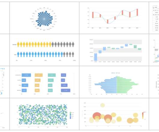
Free data visualization tools are professional in different categories: dashboard, chart, maps, network, and so on. Today, let’s review the top free data visualization tools on the market. What are the Benefits of Using Free Data Visualization Tools? Some of the free data visualization tools have their paid version.
Spreadsheets finally took a backseat to actionable and insightful data visualizations and interactive business dashboards. Companies are no longer wondering if data visualizations improve analyses but what is the best way to tell each data-story. 2) Data Discovery/Visualization. Data exploded and became big.
6) The Use of Dashboards For Data Interpretation. Business dashboards are the digital age tools for big data. Through the art of streamlined visual communication, data dashboards permit businesses to engage in real-time and informed decision-making and are key instruments in data interpretation. 2) How To Interpret Data?
In todays data-driven world, securely accessing, visualizing, and analyzing data is essential for making informed business decisions. For instance, a global sports gear company selling products across multiple regions needs to visualize its sales data, which includes country-level details. A Python virtual environment.
However, none of these features would be viable without web dashboards. We talked about the benefits of business dashboards before , but web dashboards have their own benefits. Big data and web dashboards go hand in hand. Big Data is Critical to Developing Web Dashboards. What is a web dashboard?
Why We Need a Management Dashboard? Therefore, in-flight, trust our dashboard.” The management dashboard is a “one-step” decision support management information center system for executives. In layman’s terms, executives can instantly see all the important data needed to make decisions from a dashboard.
Now here comes data dashboard ?Similar Similar to the instrument panel equipped in a car, it transforms obscure expertise into plain visualizations which are pleasing to both the eye and mind. What is Data Dashboard?–Definition. Data Dashboard Tool. Why Data Dashboard? How many kinds of Data Dashboards?
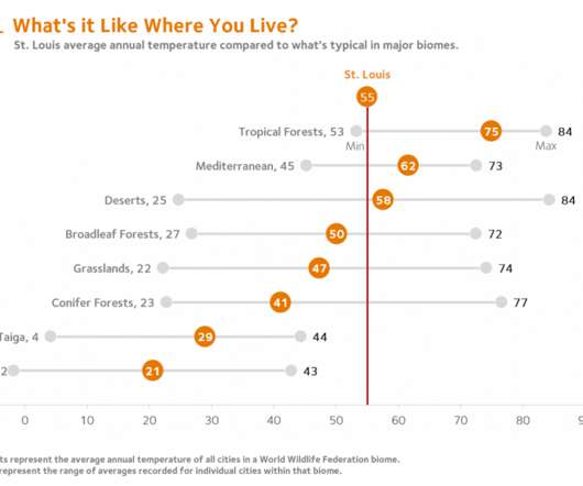
For the past few months, I’ve been developing dashboards to support students’ understanding of local ecology and equip them to use that local understanding as a baseline to explore the rest of the world. By combining a single point scatter plot and error bars, a reference line can be inserted to mark local conditions. First Forays.
Having bestowed your data analysis techniques and methods with true purpose and defined your mission, you should explore the raw data you’ve collected from all sources and use your KPIs as a reference for chopping out any information you deem to be useless. Visualize your data. A data analytics methodology you can count on.
Amazon DataZone recently announced the expansion of data analysis and visualization options for your project-subscribed data within Amazon DataZone using the Amazon Athena JDBC driver. Refer to the detailed blog post on how you can use this to connect through various other tools. Get started with our technical documentation.
As important parts of business intelligence, scorecard and dashboard can both play an obvious role in promoting enterprise development. However, limited by factors such as cost and corporate strategies, sometimes companies need to make a choice between scorecard vs dashboard. Definition of scorecard and dashboard.
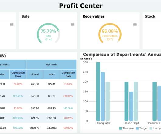
Among amounts of intelligent choices, business intelligence(BI) dashboard software is an awesome one. BI dashboard software definition. Business intelligence dashboard is a common module that general business intelligence has to realize data visualization. Sales analysis dashboard(by FineReport). FineReport.
c) Dashboard Features. Business intelligence tools provide you with interactive BI dashboards that serve as powerful communication tools to keep teams engaged and connected. Essentially, the drag and drop feature enables you, or anyone in your organization, to query and visualize data without writing a single line of SQL code.
Dashboard reporting refers to putting the relevant business metrics and KPIs in one interface, presenting them visually, dynamic, and in real-time, in the dashboard formats. This article will review the best 10 dashboard tools covering different areas, including open source and free software. FineReport.
The four C’s for alerts Context Cogency Communication Control The tendency with reporting, and information dashboard design in particular, is to cram as much information on the page as possible. Whether embedded in the dashboard or presented separately, alerts can be the extra layer of abstraction that makes a dashboard useful.
By selecting the right KPIs for various areas of the business, it’s possible to use them to arrange as well as visualize large datasets. Communication: KPI reports and trackers are visual and interactive, which means that they are incredibly inclusive. KPI Tracking In Action: 3 Real-World Dashboards.
Project dashboard, also known as project management dashboard, helps show the current project progress like a car dashboard and provide feedback to the team. What is a project dashboard? As mentioned above, project dashboard is similar to the car dashboard. reality use of dashboard . Free trial.
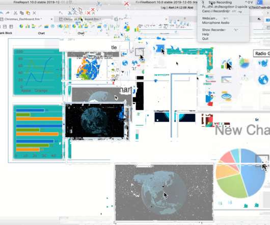
The answers to these questions are in the Christmas sales dashboard I made below. This Christmas dashboard is an online sales dashboard that I made with data from the Internet. In the upper right corner of the dashboard is a word cloud diagram showing the categories of Christmas gifts people most want. Let’s take a look.
In today’s data-driven world, businesses rely heavily on their dashboards to make informed decisions. However, traditional dashboards often lack the intuitive interface needed to truly harness the power of data. Say goodbye to static dashboards and hello to a whole new level of engagement.
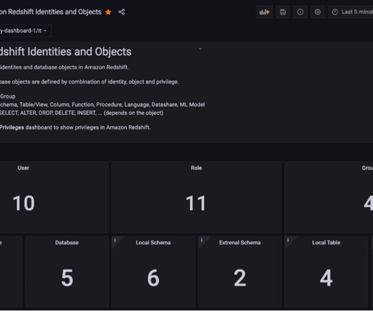
Although Amazon Redshift provides a broad capability of managing access to database objects, we have heard from customers that they want to visualize and monitor privileges without using a SQL interface. In this post, we introduce predefined dashboards using Grafana which visualizes database privileges without writing SQL.
Exciting and futuristic, the concept of computer vision is based on computing devices or programs gaining the ability to extract detailed information from visual images. Visual analytics: Around three million images are uploaded to social media every single day. Artificial Intelligence (AI).
While the collection and processing of data involves a lot of technology and expertise, creating a visual representation of the data, which can be read and understood by one and all, also requires an intuitive excellence. Such excellence predominantly is needed to select visualization formats for a specific set of sample data.
As important parts of business intelligence, scorecards and dashboards can both play an obvious role in promoting enterprise performance management. However, many users are confused with the difference between scorecard vs. dashboard. This article aims to provide a reference for the choice of enterprises. What is a dashboard?
In this post, we explore how to combine AWS Glue usage information and metrics with centralized reporting and visualization using QuickSight. You have metrics available per job run within the AWS Glue console, but they don’t cover all available AWS Glue job metrics, and the visuals aren’t as interactive compared to the QuickSight dashboard.
In addition, we will see how online dashboards have overthrown the static nature of classic reports and given way to a much faster, more interactive way of working with data. Let’s see it more in detail with a visual example. Progress reports are often used as visual materials to support meetings and discussions.
Data analysis and visualization After the data pipeline is set up, the last piece is data analysis with Amazon QuickSight to visualize the changes in consumer behavior. In a single data dashboard, QuickSight can include AWS data, third-party data, big data, spreadsheet data, SaaS data, B2B data, and more.
Our monthly reports are on top illustrated with beautiful data visualizations that provide a better understanding of the metrics tracked. These reports offer detailed visual insights into the following areas: Cash management: A comprehensive overview of your organization’s liquidity and existing cash flow situation.
We organize all of the trending information in your field so you don't have to. Join 42,000+ users and stay up to date on the latest articles your peers are reading.
You know about us, now we want to get to know you!
Let's personalize your content
Let's get even more personalized
We recognize your account from another site in our network, please click 'Send Email' below to continue with verifying your account and setting a password.


Let's personalize your content