This site uses cookies to improve your experience. To help us insure we adhere to various privacy regulations, please select your country/region of residence. If you do not select a country, we will assume you are from the United States. Select your Cookie Settings or view our Privacy Policy and Terms of Use.
Cookie Settings
Cookies and similar technologies are used on this website for proper function of the website, for tracking performance analytics and for marketing purposes. We and some of our third-party providers may use cookie data for various purposes. Please review the cookie settings below and choose your preference.
Used for the proper function of the website
Used for monitoring website traffic and interactions
Cookie Settings
Cookies and similar technologies are used on this website for proper function of the website, for tracking performance analytics and for marketing purposes. We and some of our third-party providers may use cookie data for various purposes. Please review the cookie settings below and choose your preference.
Strictly Necessary: Used for the proper function of the website
Performance/Analytics: Used for monitoring website traffic and interactions
T ools/Models/Dashboards. Is my dashboard displaying the correct data? How many models and dashboards were deployed? How do other organizations solve this risk problem? The biggest risk of all is space flight. How do SpaceX and NASA manage risk? Learn more, watch our on-demand webinar. Root Cause.
Blogs Podcasts Whitepapers and Guides Tools and Calculators Webinars Sample Reports The Evolution of the CFO into the Chief Data Storyteller View Insight Now Our Favorite CFO Blogs The Venture CFO Blog Link: [link] Are you looking for blog posts for CFOs by CFOs? Check out a sample report from our dynamic dashboard solution.
Today, AI presents an enormous opportunity to turn data into insights and actions, to amplify human capabilities, decrease risk and increase ROI by achieving break through innovations. Manual processes that introduce risk and make it hard to scale. Challenges around managing risk. Register for AI Governance webinar.
On January 4th I had the pleasure of hosting a webinar. The webinar was very popular and I was not able to respond to all the questions during the live recording. You can of course listen and watch the webinar from this link. Hopefully this helps, and I hope you enjoy/enjoyed the webinar. It really does. Governance.
Speaker: Dr. Karen Hardy, CEO and Chief Risk Officer of Strategic Leadership Advisors LLC
Communication is a core component of a resilient organization's risk management framework. However, risk communication involves more than just reporting information and populating dashboards, and we may be limiting our skillset. Storytelling is the ability to express ideas and convey messages to others, including stakeholders.
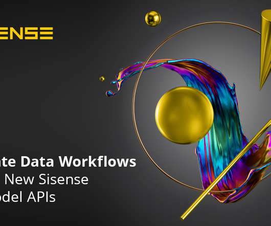
The Sisense REST APIs, in particular, enable advanced users and developers to programmatically automate workflows and access server functionalities like user and security management, dashboard/widget, branding, and administration settings. Minimized Risks. Introducing the Sisense Data Model APIs. Automate your data workflows.
High risk means high reward but there are certain steps you can take that almost guarantee commercial success, particularly when it comes to an online business. You can also use your own data analytics dashboards to see what customers are telling you. Create Webinars. However, it doesn’t come without its difficulties.
If the client is looking at a particular campaign (“Campaign XYZ”) in your application (the host app), a tightly integrated experience would deliver up an embedded analytic dashboard, filtered to the same campaign XYZ, automatically without forcing the user to navigate to it every time within the embedded dashboard.
The full webinar is available on-demand and contains even more tips, implementation guidance, and future plans for AI from these companies. See the dashboards that Eric Wright FM uses to differentiate its services: >>Watch the the full on-demand webinar. Watch Webinar. Watch Webinar.
Can we also have interactive dashboards? There are four red flags to really look for with reports (or slideshows or dashboards, etc.). I used to look for examples of great graphs, dashboards, infographics, etc. Don’t risk losing your audience. . Infographics? Amazing things are being done. Creating a Dataviz Wall of Fame.
We invite you to join one of our upcoming webinars on Domino 4.2 By allowing data science teams to focus on monitoring of potential “at-risk” models, they have more time for experimentation and problem-solving. Attend the live webinar on June 25 to learn more about Domino 4.2. Try Domino.
Don’t rely too heavily on dashboard data: Learning data is most useful when it’s analyzed, embraced, and acted upon (ideally by being infused into user workflows when and where it’s most relevant). Insights creates AI-powered dashboards built specifically for learning data analysis.
Comprehensive BI and Analytics empower organizations to create interactive reports and dashboards, gaining deeper insights to proactively monitor and improve their ESG performance. Complete Picture, Simplified Workflow: Manage all reporting entities, data collection and consolidation processes in a single, user-friendly platform.
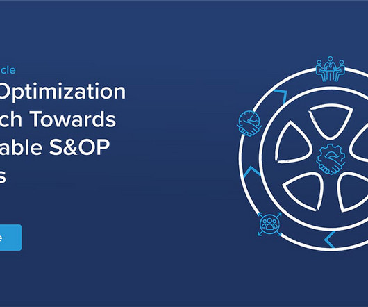
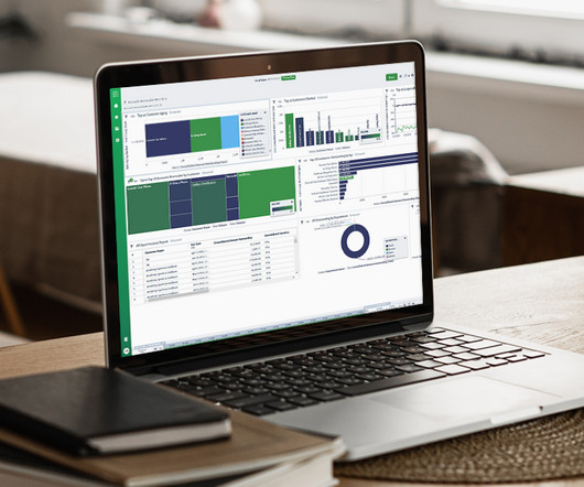
The analyses and dashboards shown below are from the best-practice smartPM.solutions S&OP solution based on technology from Jedox (see Figure 1). Figure 7 shows such a forecasting dashboard and details of the error values for each forecasting method. Figure 7: Demand forecast dashboard. Figure 2: Go-to-market planning.
If your business is using big data and putting dashboards in front of analysts, you’re missing the point.”. Clearly in these situations, becoming model-driven addresses an existential risk and that’s the point Nick Elprin made in his keynote. Being model-driven is like using GPS.”. “If Because of compliance. Worse than flipping a coin!
For data science and machine learning teams, this means the data used in machine learning models is optimized, always-on, and perpetually accurate — enabling more AI use cases with lower risk for decision-makers. Build, Deploy, and Operate ML Models Faster with CDP Machine Learning.
It takes a lot of concentration and requires the dancer to slow down plus the risk of dropping a hoop is high. There was a great SpeakBO PLUS webinar based on an actual customer case study that you can check out here. But trying to set up 15 hoops around your body while dancing and staying in beat to the drums is not easy.
Our CTO, Ryan Trollip, recently gave a webinar on claims automation with our partner Red Hat. We set up a simulation environment and a decision outcomes dashboard so the claims team could see how decisions were being made and how a change to their rules would impact results.
As a CFO, it is your job to address the financial risk of your business. This blog post talks about the benefits of having an external CFO conduct risk analysis on your business for you. CFO.com also features webinars and whitepapers to help increase your knowledge base. Whitepapers and Guides. Tools and Calculators.
To hear more on Infor Dynamic Science Labs analytic methodologies, watch this on-demand webinar. Business Intelligence tools support this iterative process: data may be available or made available in a data warehouse, and its Analytics tools such as charts, reports, and dashboards provide the visual support for the business discussions.
This helps our customers mitigate the risks and costs of managing complex ecosystems of tooling built around the mostly single-host SQL database technologies that existed at the time. The use case of this bank required tracking of portfolio risk using high speed joins of position risk, index and fund composition, and other risk factors.
Or the data potentially puts them at risk every day. Organization-wide dashboards that show progress on a cadence are successful at creating engagement… no one wants to be part of the team that’s lagging behind! Or they are spending too much time preparing the data for proper use. These are serious challenges!
Recognizing a need for better operational analytics, insightsoftware leveraged award-winning technology from Logi Analytics to provide Oracle ERP Cloud users the ability to customize, create, and share interactive dashboards and reports across all departments of a business.
On Thursday January 6th I hosted Gartner’s 2022 Leadership Vision for Data and Analytics webinar. There were 80 or so questions or comments posted and I was not able to respond to all of them live in the webinar so here are the verbatim questions and an individual response to each on. I hope they are helpful. It’s “in” again.
Having the ability to build and use models in this way is fundamental to managing supply chain and financial risk through activities like “what-if scenario planning”, as explained in this blog post. Time matters too: your models must be quick to run, so analysis can be done before the assumptions are out-of-date.
Without leveraging this information, businesses can easily fall into the same patterns that can stunt growth–failing to attract new customers and even leaving themselves open to security risks. Dashboards that are easy to customize and share across departments allow institutions to tailor their analysis and ask better questions of their data.
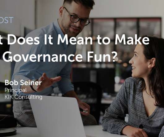
Five of the top 10 webinars hosted by Dataversity in 2020 were about data governance, including the #1 webinar, “ Taking an Active Approach to Data Governance ” (which, incidentally, was hosted by Alation and featured Alation customer Riot Games and data governance expert Bob Seiner , whose insights we’ll discuss later in this post).
Typically, users have to pull specific data out of the ERP and import it into Excel, which is a time-consuming process that drastically increases the risk of human error. Spreadsheet Server automates data collection, integration, and importing to allow more time for analysis. 3 – Give Depth and Context to Each Report.
These tools provide a window to the performance of the organization, with the ability to look at high-level summary data and dashboards (“the 50,000-foot view”) as well as the detailed granular data that make up that picture. Businesses can no longer afford to be fixated on the rear-view mirror.
Then, join me and your fellow students live webinars twice each month. advanced techniques like applying data visualization principles to reports, slideshows, infographics, and dashboards. You’ll think about which format–a report, dashboard, infographic, one-pager, etc.–is Pause the videos. What’s Included.
When the HR department or executives have data about organizational diversity flowing into a dashboard, they’re able to track issues like pay disparity and team makeup closely instead of just getting an occasional update. Could technology compromise diversity in any way? Technology gives you the “what” but not the “why.”
Everyone has to know what direction they are headed, and have the information they need to get the job done, or your success will be at risk. Think of your team as an army. The right IT consultant will have a plan to keep the augmented analytics products evergreen and grow with the field of technology and innovation.
Their dashboards were visually stunning. In turn, end users were thrilled with the bells and whistles of charts, graphs, and dashboards. Yes—but basic dashboards won’t be enough. CFO Priorities Manage expenses and cash flow Enable profitable growth Contain risk Plan for the future Connect the Dots Do the math.
This article will outline the key financial, operation, and staffing performance indicators that a CEO should be tracking in 2021, as well as the benefits of tracking these using a dashboard to streamline the reporting process. Financial KPIs for the CEO’s Dashboard. How to Develop a KPI for a CEO KPI Dashboard.
By using these metrics with our interactive accounting KPI dashboard, you will easily be able to identify areas for improvement and optimize your 2021 reporting. How to Build Useful KPI Dashboards. Or have they implemented specialized financial reporting software, like a dashboard? Learn More.
When analytics capabilities are limited, teams often receive a constant stream of custom requests for reports, dashboards, and data analysis. Additionally, 80% found customizable dashboards to be an important part of what influenced their decision to buy analytics. Ready to learn more?
This task might seem daunting at first, but insightsoftware’s how-to guide on creating useful KPI dashboards can help expedite this process. This tool will help you understand what performance measures to track, and which dashboards best suit your needs. Operational KPIs for the Public Sector.
With that being said, the wrong financial program chosen for your company does have the risk of doing more harm than good. Remember to tick off all of these criteria (possibly on an Excel month-end close checklist) before closing your books, otherwise, you risk leaving out important information. #1. How to Build Useful KPI Dashboards.
The Risks of Staying with Outdated Reporting Solutions Many long-standing reporting tools have served businesses well over the years, providing robust business intelligence organizations have grown to trust. With sensitive business data at risk, the cost of a breachboth financial and reputationalcan far outweigh the effort of upgrading.
By regularly updating and monitoring cash flow forecasts, business owners can proactively manage their bank account cash position, optimize liquidity, and mitigate financial risks. Treasury Management: Cash flow forecasting is essential for treasury management , which involves managing a company’s cash, investments, and financial risks.
Unless there is a compelling reason to move their financials onto a cloud financial platform, companies may choose to not take the risk. Ripping the band-aid off and adapting all processes to something new runs huge risk of killing efficiency and productivity across the board. Thus, finance data remains on-premises.
With regular bank account reconciliation, businesses can identify and rectify errors promptly, reducing the risk of financial misstatements and fraud. Check out our webinar on self-service subledger reconciliations for a quick primer on when and how to best use self-service subledger reconciliations for your organization.
Project reporting not only equips you to navigate market turbulence, but it also mitigates risk and empowers your stakeholders with the insights they need to make critical decisions that drive business growth. Increased Risk: Spreadsheets expose the business to fraud and errors due to weak access control and version control.
At insightsoftware, we deliver advanced analytics with Logi Symphony , which offers powerful self-service and managed dashboards, AI-driven assistance, and broader accessibility to users at every level. Tune into our on-demand webinar on how to evolve your analytics with trusted foundations and future-ready innovations.
We organize all of the trending information in your field so you don't have to. Join 42,000+ users and stay up to date on the latest articles your peers are reading.
You know about us, now we want to get to know you!
Let's personalize your content
Let's get even more personalized
We recognize your account from another site in our network, please click 'Send Email' below to continue with verifying your account and setting a password.


Let's personalize your content