This site uses cookies to improve your experience. To help us insure we adhere to various privacy regulations, please select your country/region of residence. If you do not select a country, we will assume you are from the United States. Select your Cookie Settings or view our Privacy Policy and Terms of Use.
Cookie Settings
Cookies and similar technologies are used on this website for proper function of the website, for tracking performance analytics and for marketing purposes. We and some of our third-party providers may use cookie data for various purposes. Please review the cookie settings below and choose your preference.
Used for the proper function of the website
Used for monitoring website traffic and interactions
Cookie Settings
Cookies and similar technologies are used on this website for proper function of the website, for tracking performance analytics and for marketing purposes. We and some of our third-party providers may use cookie data for various purposes. Please review the cookie settings below and choose your preference.
Strictly Necessary: Used for the proper function of the website
Performance/Analytics: Used for monitoring website traffic and interactions
Tracking the success metrics based on your needs, and the time frame you select while comparing your values can be done with simple yet effective scorecards. What Is A KPI Scorecard? A KPI scorecard is a term used to describe a statistical record that measures progress or achievement towards a set performance indicator.
Now With Actionable, Automatic, Data Quality Dashboards Imagine a tool that can point at any dataset, learn from your data, screen for typical data quality issues, and then automatically generate and perform powerful tests, analyzing and scoring your data to pinpoint issues before they snowball. New Quality Dashboard & Score Explorer.
Gathering data and information from one or multiple platforms and creating a comprehensive social media dashboard is equally important as creating the social content itself. Here we will present a social media dashboard definition, a guide on how to create one, and finalize with social media dashboard templates at the end of the article.
As important parts of business intelligence, scorecard and dashboard can both play an obvious role in promoting enterprise development. However, limited by factors such as cost and corporate strategies, sometimes companies need to make a choice between scorecard vs dashboard. Definition of scorecard and dashboard.
As important parts of business intelligence, scorecards and dashboards can both play an obvious role in promoting enterprise performance management. However, many users are confused with the difference between scorecard vs. dashboard. Definition of scorecard and dashboard. What is a scorecard?
Whatever your sector or niche, if you want to remain adaptable and get one step ahead of the competition, working with the right data-driven tools and utilizing a corporate dashboard is essential. That’s where corporate dashboards come in. Your Chance: Want to create your own dynamic corporate dashboard? 1) CFO dashboard.
Collecting big amounts of data is not the only thing to do; knowing how to process, analyze, and visualize the insights you gain from it is key. In the matter, data analysis and dashboard designer software is a precious ally. Your Chance: Want to visualize & track inventory KPIs with ease? What Are Inventory Metrics?
I’m normally very zen about data visualization. But with some behind-the-scenes editing, we can still make powerful visualizations inside Excel.”. I started to teach the Baruch College students about exploratory data visualization with conditional formatting. Conditional Formatting is a fancy way of saying “if-then visuals.”.
In addition, we will see how online dashboards have overthrown the static nature of classic reports and given way to a much faster, more interactive way of working with data. Let’s see it more in detail with a visual example. Progress reports are often used as visual materials to support meetings and discussions.
An extraordinary amount of time, effort, $$$ are spent on building dashboards/scorecards for CMOs… Yet, the end result, nearly always, is a useless data puke. CMO dashboards end up being useless when capabilities exceed needs. Personal Bias: I prefer the word Scorecard over Dashboard. Easy existence.
Power BI is Microsoft’s interactive data visualization and analytics tool for business intelligence (BI). With Power BI, you can pull data from almost any data source and create dashboards that track the metrics you care about the most. Power BI’s rich reports or dashboards can be embedded into reporting portals you already use.
An operational scorecard is a mechanism used to evaluate and measure the quality of data processed and validated by AWS Glue Data Quality rulesets. We can query and submit the Athena data to QuickSight to create visuals for the dashboard. The following architecture diagram shows an overview of the complete pipeline.
Several marketing dashboard tools allow you to generate automated online dashboards and reports to track your most relevant KPIs in one place. The image above is an example of a scorecard report tracking the performance of 4 social channels. The value of this tool lies in its visual nature.
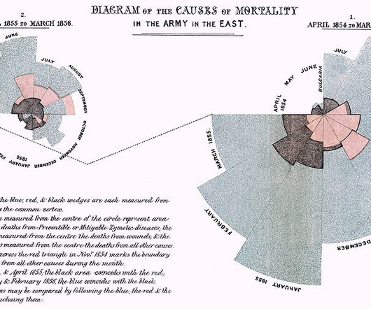
Editors note: This blog was originally published in October 2013, and has been completely revamped and updated for accuracy, relevancy, and comprehensiveness in September 2019 Prior to the 17th century, data visualization existed mainly in the realm of maps, displaying land markers, cities, roads, and resources.
Produce built-in visualization magic. Create a Customized Dashboard – Earn Love, Drive Change. #2. Create a Customized Dashboard – Earn Love, Drive Change! Who does not love dashboards? Pledge to shift away from a one-size-fits-all data puke, and use your web analytics tool to create a customized dashboard.
Business metrics – Providing KPIs, scorecards, and business-relevant benchmarks. Internal dashboards – Providing analytics that are relevant to stakeholders across the organization for internal use. The results of the queries are updated in real time in the Tableau dashboard.
Moreover, BI platform allows users to customize dashboards, create beautiful data visualizations, build scorecards, and compare them with key performance indicators (KPIs). In addition, BI platform provides capabilities in three categories:analysis, information delivery and platform integration.
With the help of KPI reports , all of these targets can be visualized together to get a complete picture across departments. Online dashboard tools make this possible by providing a centralized view of all your most relevant KPIs to make informed decisions considering the full picture. Average Transaction Size.
OBIEE is a strategic BI tool that provides a web platform with attractive dashboards suitable for C-level needs. Interactive dashboards that provide reports with a rich variety of visualization tools. Nice UI – Great dashboards for C-level executives. Good aggregation – Impressive summary data.
As the data visualization, big data, Hadoop, Spark and self-service hype gives way to IoT, AI and Machine Learning, I dug up an old parody post on the business intelligence market circa 2007-2009 when cloud analytics was just a disruptive idea. Balanced scorecards, GIS, analytic apps, extranets. Data warehouse, what the hell!
” This type of Analytics includes traditional query and reporting settings with scorecards and dashboards. Having visually appealing graphics can also increase user adoption. The tool is designed to be intuitive, so even users with limited technical expertise can create reports and dashboards quickly and easily.
The platform then automatically finds, visualizes and narrates important findings or the story in the data such as correlations, exceptions, clusters, links and predictions that are relevant to them without requiring them to build models, or write algorithms. The user explores data via visualizations and natural language generated narration.
It is a collection of advanced segments, custom reports, and dashboards. Ignore the eminently useless Reverse Goal Path report (I don't even know why this is still in GA after years of uselessness) and Funnel Visualization (almost totally useless in context of almost all Goals). Start with the scorecard in the overview report.
1) What Is A Monitoring Dashboard? 2) Why Do You Need Monitoring Dashboards? 3) Tips For Monitoring Dashboard Design. 4) Monitoring Dashboard Templates. Enter monitoring dashboards. Your Chance: Want to test a modern monitoring dashboard software? What Is A Monitoring Dashboard? Table of Contents.
With the introduction of Artificial Intelligence and Machine Learning, as well as data visualization tools, designed for charting, dashboards and performance scorecards. Can they easily define access, manage dashboards, etc. The market is forecasted to achieve nearly a 23% growth over the next three years.
These tools allowed users to monitor key performance indicators (KPIs), reports and other metrics in a dashboard environment using many of the same features and tools they enjoyed in a desktop based application. Can they easily define access, manage dashboards, etc.
Enabling teams to build their own analyses at scale The Insights team builds dashboards and supports thousands of internal consultants and hundreds of analysts and engineers across the globe who drive local products and insights. Last year, this team also reported over 29,600 distinct views on their 19 dashboards.
Your content creators can customize even the tiniest details of the dashboards, data visualizations, interactions, scorecards, labels, and more that they use. Flexibility Logi Symphony uses modern HTML5 and fully open APIs, meaning you can customize and enhance the platform in its entirety.
Visualizations in business intelligence software are often dismissed as a commodity interchangeable and easy to overlook. Visualizations are the gateway to understanding; theyre how users interact with and interpret the insights derived from all the data gathering, preparation, and analysis. But this perspective misses the mark.
We organize all of the trending information in your field so you don't have to. Join 42,000+ users and stay up to date on the latest articles your peers are reading.
You know about us, now we want to get to know you!
Let's personalize your content
Let's get even more personalized
We recognize your account from another site in our network, please click 'Send Email' below to continue with verifying your account and setting a password.


Let's personalize your content