This site uses cookies to improve your experience. To help us insure we adhere to various privacy regulations, please select your country/region of residence. If you do not select a country, we will assume you are from the United States. Select your Cookie Settings or view our Privacy Policy and Terms of Use.
Cookie Settings
Cookies and similar technologies are used on this website for proper function of the website, for tracking performance analytics and for marketing purposes. We and some of our third-party providers may use cookie data for various purposes. Please review the cookie settings below and choose your preference.
Used for the proper function of the website
Used for monitoring website traffic and interactions
Cookie Settings
Cookies and similar technologies are used on this website for proper function of the website, for tracking performance analytics and for marketing purposes. We and some of our third-party providers may use cookie data for various purposes. Please review the cookie settings below and choose your preference.
Strictly Necessary: Used for the proper function of the website
Performance/Analytics: Used for monitoring website traffic and interactions
This article was published as a part of the Data Science Blogathon Introduction Dash is an open-source web framework for creating analytical dashboards and datavisualizations. It helps data analysts to deploy dashboards and serve these dashboards to the main web application.
This article was published as a part of the Data Science Blogathon. Introduction In DataVisualization, Dashboard is the great Graphical User Interfaces that. The post Create Interactive Dashboards with Streamlit and Python appeared first on Analytics Vidhya.
ArticleVideo Book Objective The dashboard is a powerful concept that allows the user to see the insights hidden deeper in the data. The post Create Your First Dashboard in Tableau appeared first on Analytics Vidhya.
The post Space Weather Dashboard – Build Your Own Custom Dashboard to Analyze and Predict Space Weather appeared first on Analytics Vidhya. Introduction – Part 1 As the collective global human population is working to get through the pandemic caused by Covid-19, it offers a stark.
ArticleVideo Book This article was published as a part of the Data Science Blogathon. Introduction Tableau is a powerful DataVisualization software, and much. The post Building a Covid-19 Vaccination Dashboard in Tableau appeared first on Analytics Vidhya.
They can also automate report generation and interpret data nuances that traditional methods might miss. Imagine generating complex narratives from datavisualizations or using conversational BI tools that respond to your queries in real time. Tableau, Qlik and Power BI can handle interactive dashboards and visualizations.
ArticleVideo Book This article was published as a part of the Data Science Blogathon. Introduction Visual analytics can tell the users the story of data. The post Data Preparation for Analysis : Towards Creating your Tableau Dashboard?—?Part Part 1 appeared first on Analytics Vidhya.
Business intelligence concepts refer to the usage of digital computing technologies in the form of data warehouses, analytics and visualization with the aim of identifying and analyzing essential business-based data to generate new, actionable corporate insights. They enable powerful datavisualization.
Use digital dashboards: When considering the question “what is an analytical report,” it’s important to think about the best medium in terms of usability and presentation. It is possible to structuredata across a broad range of spreadsheets, but the final result can be more confusing than productive.
In the following section, two use cases demonstrate how the data mesh is established with Amazon DataZone to better facilitate machine learning for an IoT-based digital twin and BI dashboards and reporting using Tableau. This is further integrated into Tableau dashboards. This led to a complex and slow computations.
In a world increasingly dominated by data, users of all kinds are gathering, managing, visualizing, and analyzing data in a wide variety of ways. One of the downsides of the role that data now plays in the modern business world is that users can be overloaded with jargon and tech-speak, which can be overwhelming.
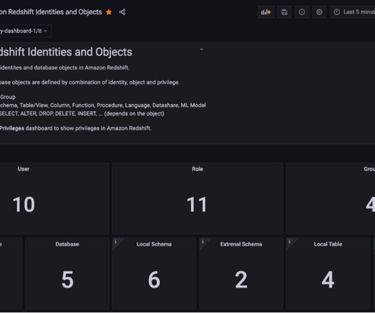
Amazon Redshift is a fully managed, petabyte-scale data warehouse service in the cloud. Amazon Redshift enables you to use SQL for analyzing structured and semi-structureddata with best price performance along with secure access to the data. Grafana provides a predefined dashboard to visualize database privileges.
Gaining insights from complex data Another example that illustrates the power of LLMs in analyzing complex data is intelligent alarm management for cooling systems. Structured outputs: In addition to reports in natural language, LLMs can also output structureddata (such as JSON).
Industry-leading price-performance Amazon Redshift offers up to three times better price-performance than alternative cloud data warehouses. Amazon Redshift scales linearly with the number of users and volume of data, making it an ideal solution for both growing businesses and enterprises.
ERP dashboards. They emphasize access to and manipulation of large databases of structureddata, often a time-series of internal company data and sometimes external data. Dashboards and other user interfaces that allow users to interact with and view results. Clinical DSS. Model-driven DSS. Parmenides Edios.
First of all, there’s the question of what data is currently available within their organization, where it is, and how it can be accessed. Data scientists might want to do some SQL – based profiling, or visualize the data to better understand the distributions, veracity, and hidden nuances.
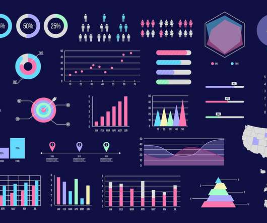
Learn DataVisualization Understanding the Importance of VisualizingDataDatavisualization is a powerful tool for conveying complex information in a clear and impactful manner. Understanding the principles of effective bar chart design is crucial for conveying information accurately and compellingly.
Overall, as users’ data sources become more extensive, their preferences for BI are changing. They prefer self-service development, interactive dashboards, and self-service data exploration. To put it bluntly, users increasingly want to do their own data analysis without having to find support from the IT department.
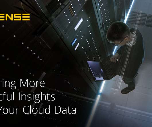
They hold structureddata from relational databases (rows and columns), semi-structureddata ( CSV , logs, XML , JSON ), unstructured data (emails, documents, PDFs), and binary data (images, audio , video). Sisense provides instant access to your cloud data warehouses. Building dashboards and widgets.
With the advent of Business Intelligence Dashboard (BI Dashboard), access to information is no longer limited to IT departments. Every user can now create interactive reports and utilize datavisualization to disseminate knowledge to both internal and external stakeholders.
Cost: Free (for <20 docs, 1000 rows of data); $200/month. Tableau Software by Salesforce This powerful visual analytics and dashboarding solution includes integrated features for exporting to PowerPoint. Turn your high-intensity visualizations into impressive slides. Cost: $70/user/month. Try Juicebox -- It's Free!
In today’s data-driven world, the datavisualization specialist plays a pivotal role in transforming complex information into visually appealing formats. The demand for skilled professionals in this field is rapidly increasing as businesses rely more on data for decision-making and operations.
As we explore examples of data analysis reports and interactive report data analysis dashboards, we embark on a journey to unravel the nuanced art of transforming raw data into meaningful narratives that empower decision-makers. Try FineReport Now 1.1 This will be elaborated on in the third part of this article.
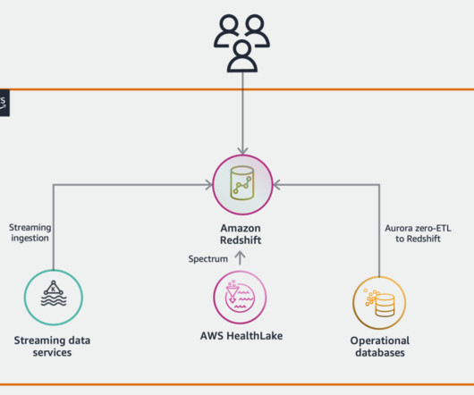
With this zero-ETL approach, Amazon Redshift Streaming Ingestion enables you to connect to multiple Kinesis data streams or Amazon Managed Streaming for Apache Kafka (Amazon MSK) data streams and pull data directly to Amazon Redshift without staging data in Amazon Simple Storage Service (Amazon S3).
To store the data you collect from that survey in a database, you need to define the property name and its specific type. This way, the data will be ready to be efficiently analyzed in a customer service dashboard without any errors.
A data analyst might help an organization better understand how its customers use its product in the present moment — what works and doesn’t work for them, whereas a data scientist might use the insights generated from that work to help design a new product that anticipates future customer needs.
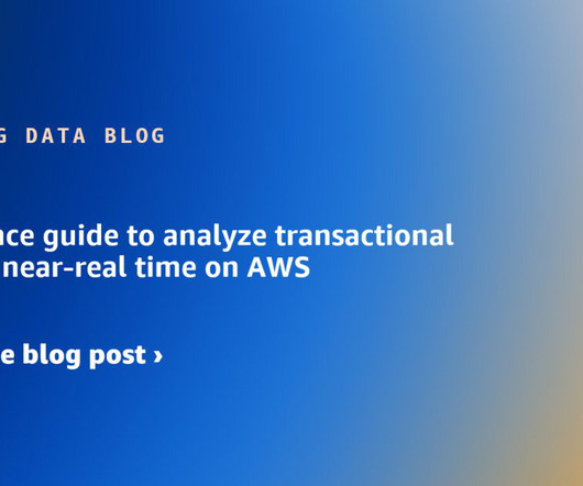
You’ll learn how to implement a transformative solution that empowers your organization with near-real-time data indexing and visualization capabilities. Solution overview The architecture diagram of FIS’s near-real-time data indexing and visualization solution incorporates various AWS services for specific functions.
All BI software capabilities, functionalities, and features focus on data. Data preparation and data processing. Initially, data has to be collected. Then, once it has turned the raw, unstructured data into a structureddata set, it can analyze that data. Datavisualization analysis.
The next generation of SageMaker also introduces new capabilities, including Amazon SageMaker Unified Studio (preview) , Amazon SageMaker Lakehouse , and Amazon SageMaker Data and AI Governance. This feature is now available in all the AWS commercial Regions where Amazon DataZone is supported.
You can use the same capabilities to serve financial reporting, measure operational performance, or even monetize data assets. Strategize based on how your teams explore data, run analyses, wrangle data for downstream requirements, and visualizedata at different levels.
Dashboards and visualizations are the primary user interfaces of many tools and platforms. Usually, enterprise BI incorporates relatively rigid, well-structureddata models on data warehouses or data marts. Moreover, dashboards use auditable, trusted, and consistent definitions of data.
“This ability to pull data sets together from a cloud-native environment for better transparency and faster decision making, in turn, can give analysts the speed they need to answer questions quickly and more accurately with more data collaboration,” Lee added. Deeper insights from bigger data sets.
Data lakes are centralized repositories that can store all structured and unstructured data at any desired scale. The power of the data lake lies in the fact that it often is a cost-effective way to store data. Data in healthcare industry can be broadly classified into two sources: clinical data and claims data.
Overview: Data science vs data analytics Think of data science as the overarching umbrella that covers a wide range of tasks performed to find patterns in large datasets, structuredata for use, train machine learning models and develop artificial intelligence (AI) applications.
The features you or your company need are core factors influencing your selection of the data analytics tool. For example, if you want the features of datavisualization , such as stunning dashboards and rich charts, business intelligence tools are more suitable for you than a pure programming tool. From FineBI.
It is a skill that combines elements of artistic expression and structured methods. Then we will discuss how to structuredata stories to guide your audience through data. Part 1: Lessons in Data Storytelling from Pixar Pixar is the gold standard in storytelling.
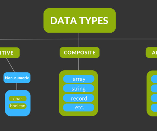
Admittedly, it’s still pretty difficult to visualize this difference. Consider data types. How is it possible to manage the data lifecycle, especially for extremely large volumes of unstructured data? Here is how Cloudera visualizes and controls the data lifecycle. Let’s take it to space.
It includes business intelligence (BI) users, canned and interactive reports, dashboards, data science workloads, Internet of Things (IoT), web apps, and third-party data consumers. Popular consumption entities in many organizations are queries, reports, and data science workloads.
The following are key attributes of our platform that set Cloudera apart: Unlock the Value of Data While Accelerating Analytics and AI The data lakehouse revolutionizes the ability to unlock the power of data. LLMs in our Cloudera Machine Learning (CML) service intelligently assist you in data science and AI projects.
Accompanying this acceleration is the increasing complexity of data. Many organizations continue to handle structureddata, transactional data, and log data. Complex data management is on the rise. She has written hundreds of articles on data mining and information technology.
Hidden patterns in your data are illuminated in real-time, fostering intuitive, interactive exploration that unlocks the true narrative within your numbers. No longer passive consumers of information, you become master storytellers, captivating audiences with visual masterpieces crafted from data.
Cloud-based data warehouses can also perform complex analytical queries much faster due to the use of massively parallel processing (MPP), which uses multiple processors—each with its own operating system and memory—to simultaneously perform a set of coordinated computations.
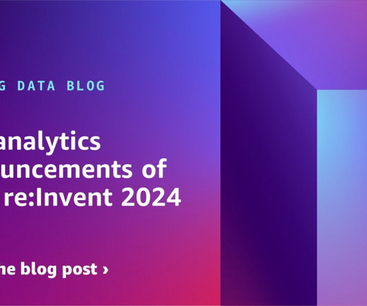
A discovery data warehouse is a modern data warehouse that easily allows for augmentation of existing reports and structureddata with new unstructured data types, and that can flexibly scale with volume and compute needs. Stay tuned for the next blog post that will dive deeper into this topic!
The Data Catalog objects are listed under the awsdatacatalog database. FHIR data stored in AWS HealthLake is highly nested. To learn about how to un-nest semi-structureddata with Amazon Redshift, see Tutorial: Querying nested data with Amazon Redshift Spectrum. Use the following query to flatten data: SELECT data."
We organize all of the trending information in your field so you don't have to. Join 42,000+ users and stay up to date on the latest articles your peers are reading.
You know about us, now we want to get to know you!
Let's personalize your content
Let's get even more personalized
We recognize your account from another site in our network, please click 'Send Email' below to continue with verifying your account and setting a password.


Let's personalize your content